
04
TRADING UP
The Art of Seduction. The Art of Ulrich Pracht.
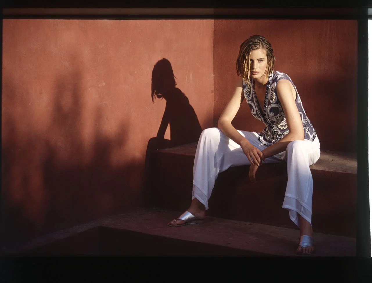
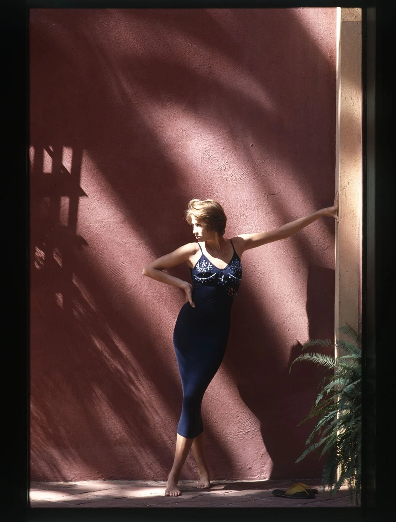
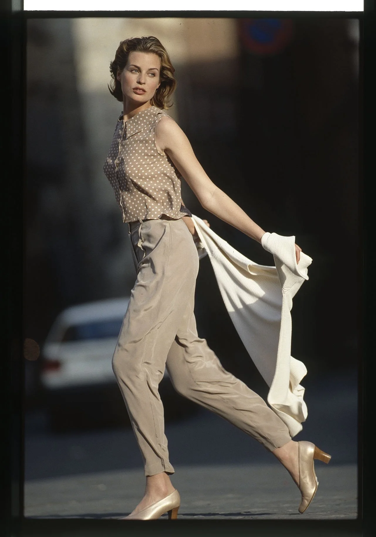
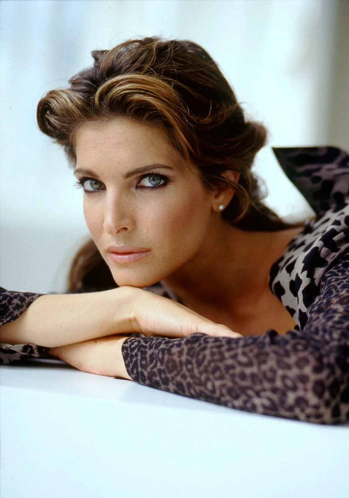
Combining art and commerce is an exciting challenge; the art of seduction—a challenge Ulrich Pracht set for himself—is a far more difficult one. Through creativity, humor, aesthetics, and harmony, he transforms ordinary mainstream fashion into something truly special. His mastery of craftsmanship—his ability to work with fabrics and materials—is not merely a product of his training as a textile decorator; it is also driven by an inner impulse: the desire to constantly rediscover and reinvent the essence of "fashion." His innovative concepts—featuring dreamlike product presentations distinguished by their attention to detail, cut, silhouette, and quality across various experiential realms—combined with a passionate artistic sensibility, constitute the "Art of Ulrich Pracht." Supported by his team—comprising stylists, makeup artists, hairdressers, layout artists, graphic designers, and, last but not least, his studio manager, Stan Kaizler—Ulrich Pracht has mastered the art of orchestrating that singular, exceptional photograph: one that marries a brilliant concept with the perfect, target-audience-specific model, all set against the backdrop of an impeccable global location. "I was always only as good as my team," he emphasizes, while adding: "Working with me wasn't always easy. Whatever I undertook, I possessed a singular ability to become completely immersed—to lose myself entirely—in the various projects and tasks I was striving to bring to life at any given moment. The deep appreciation I held for whatever work was currently before me stemmed from one simple fact: I loved what I did."
04.1
SCHLOSS BRÄU
Not His Business. Concepts – AHEAD OF THEIR TIME.
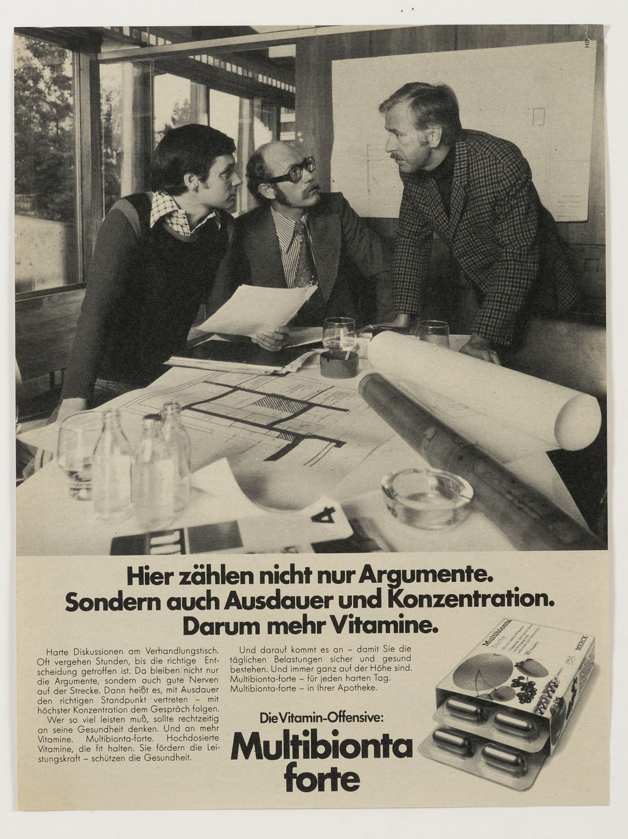
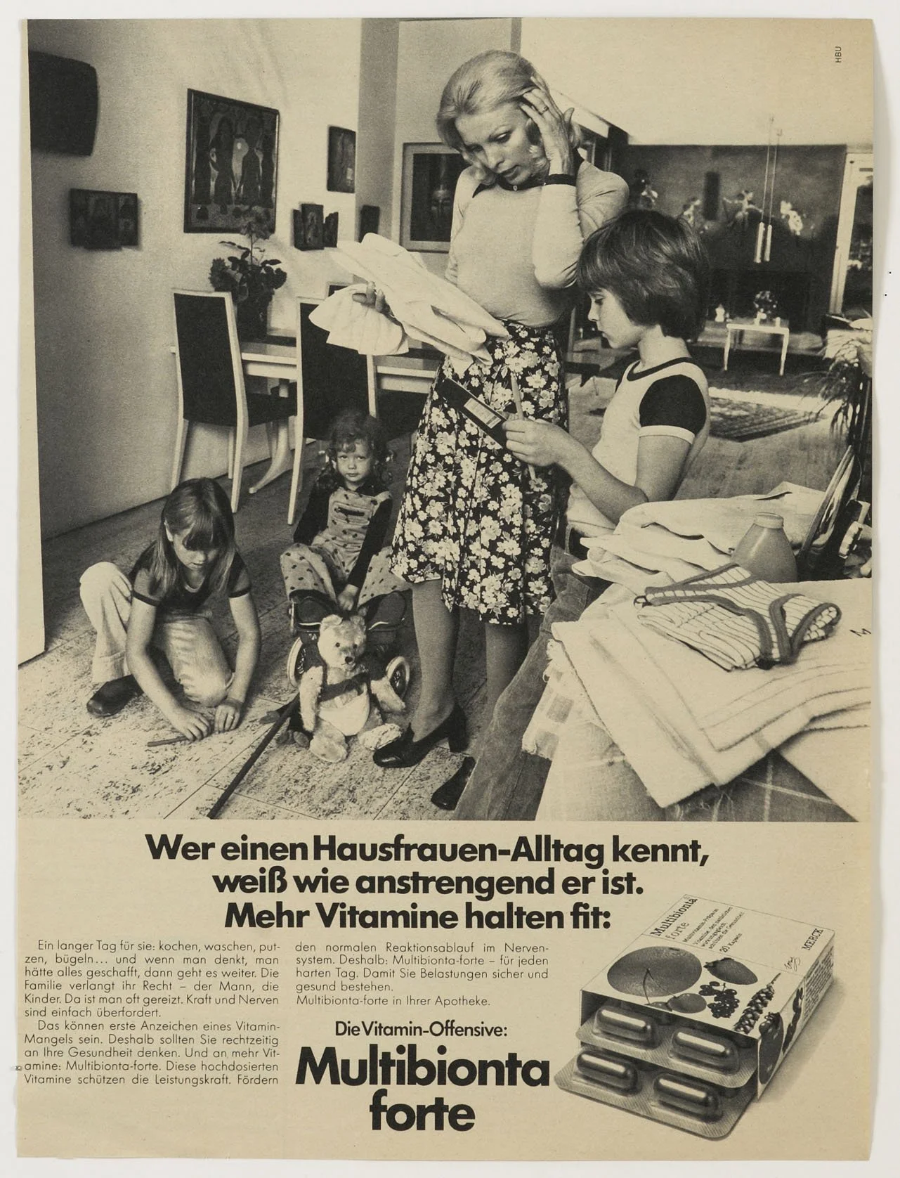
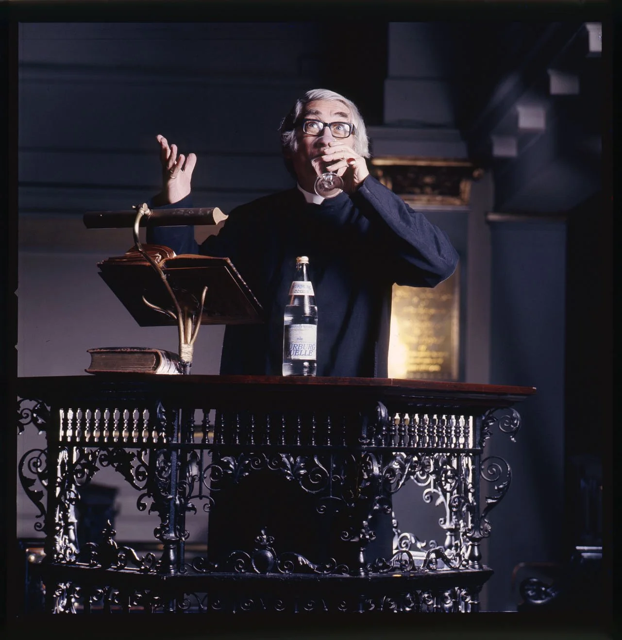
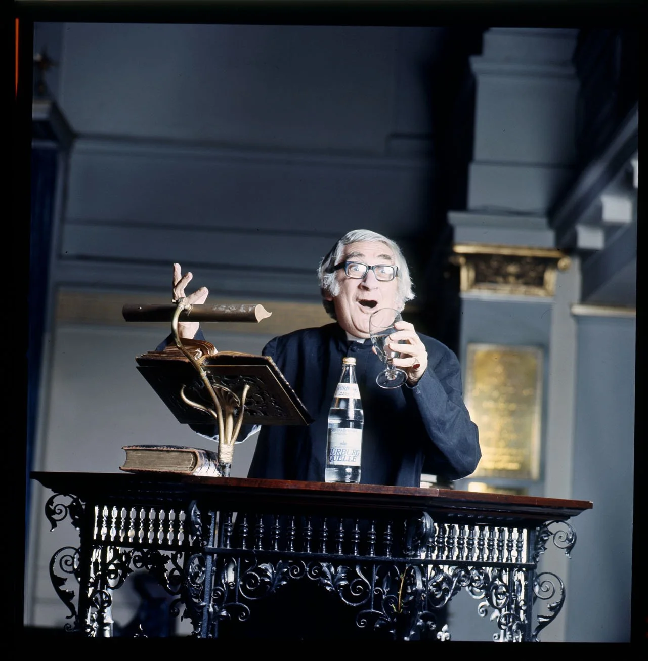
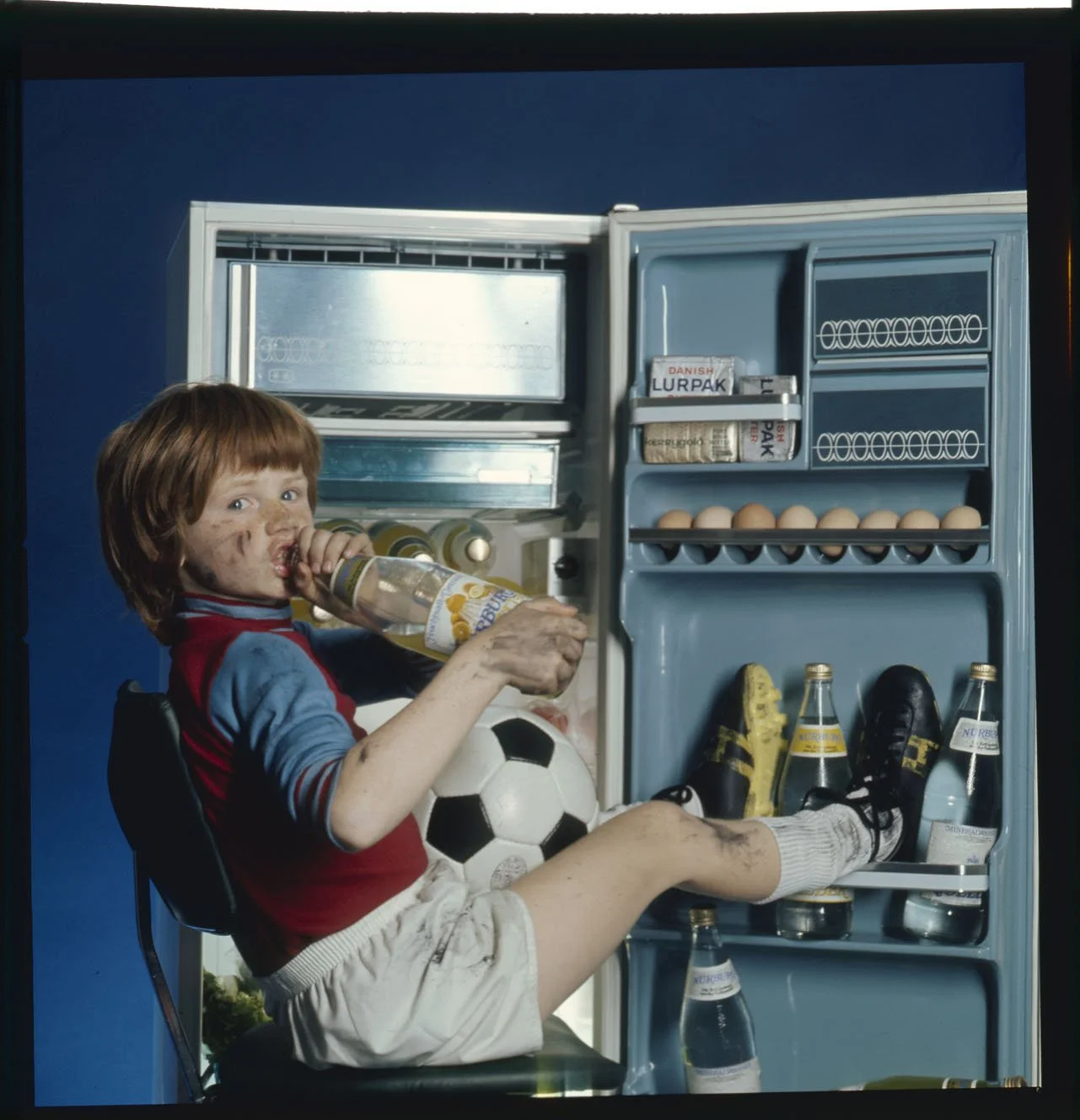
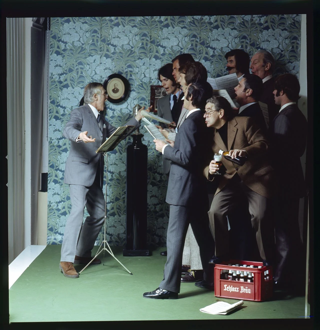
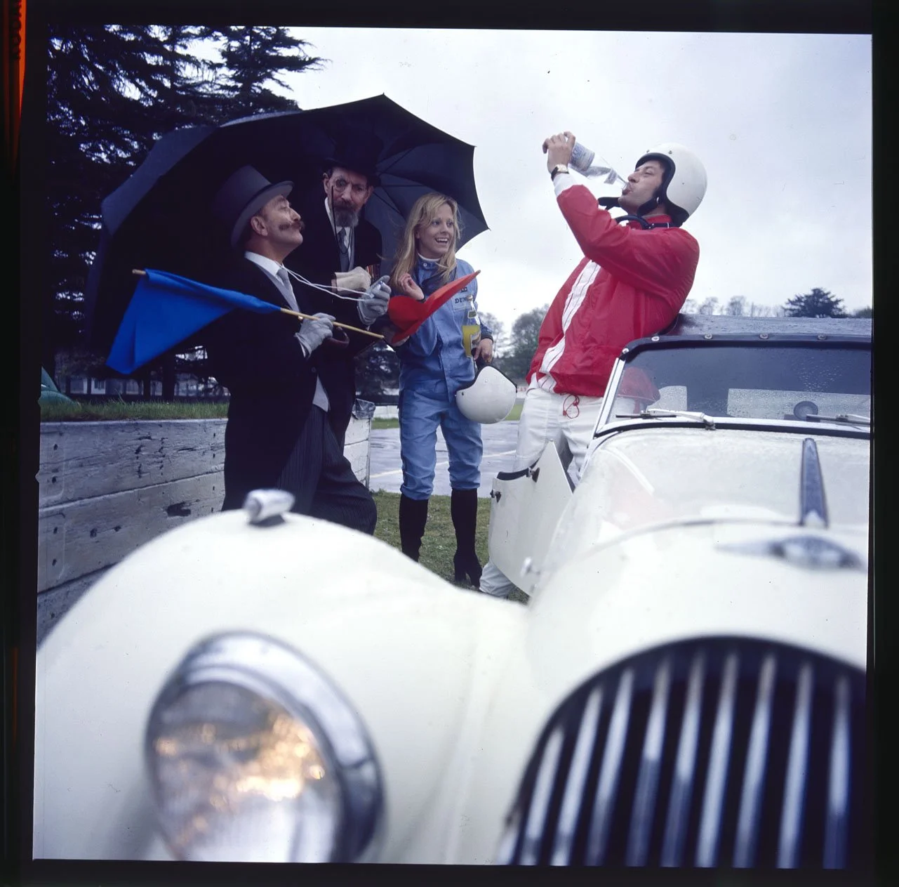
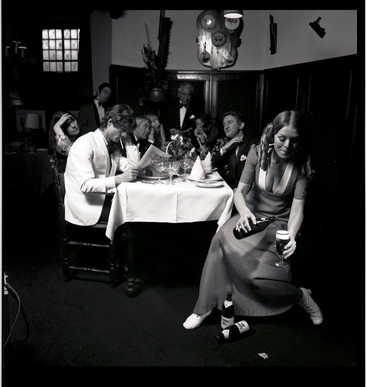
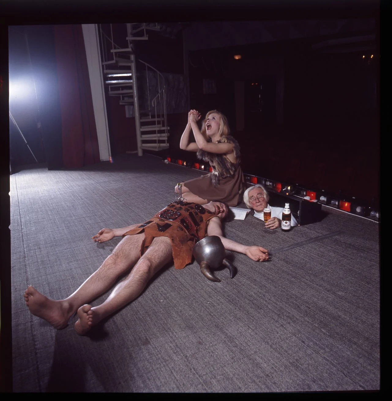
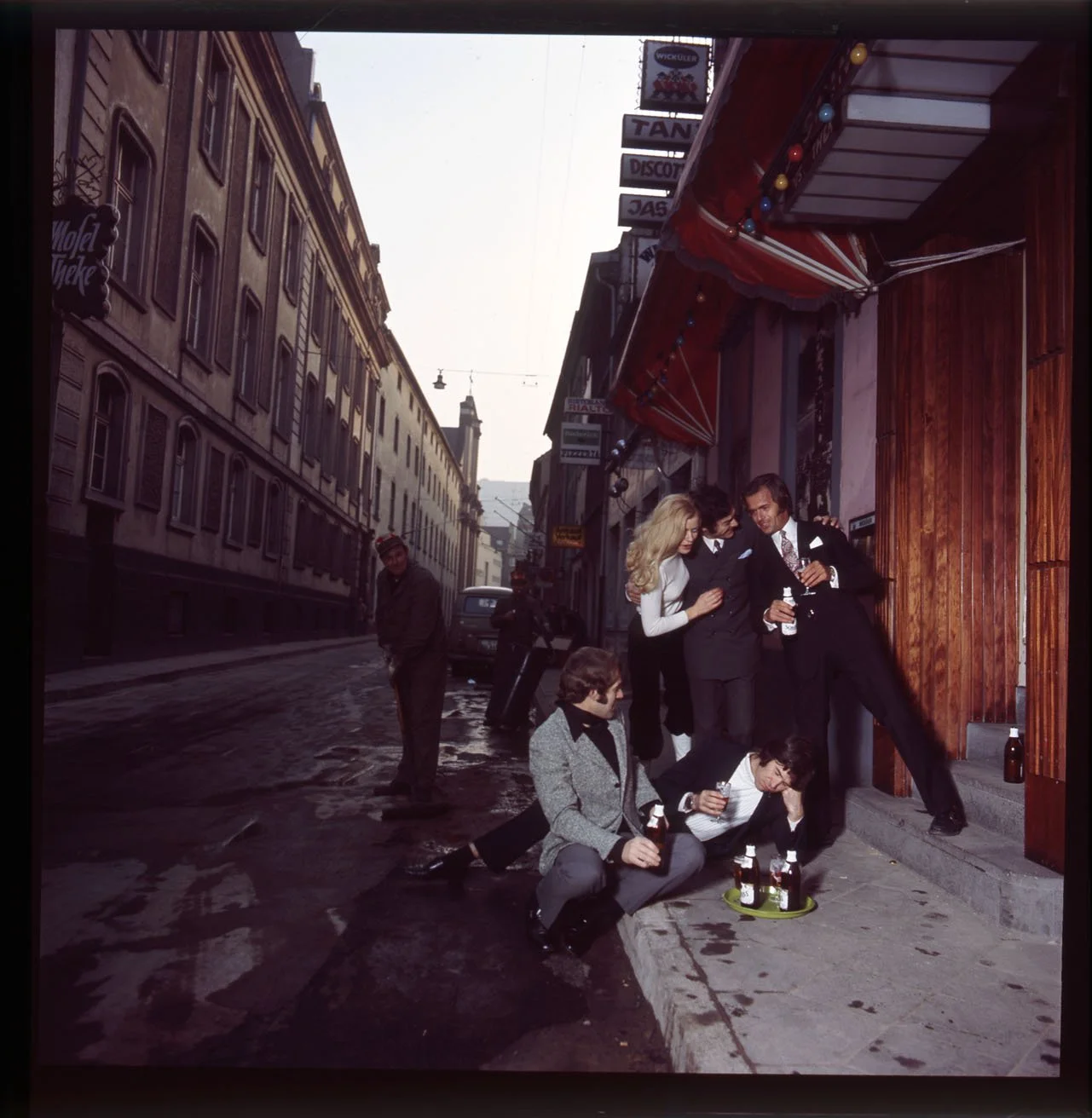
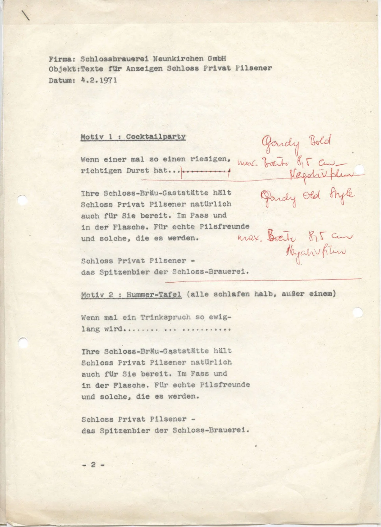
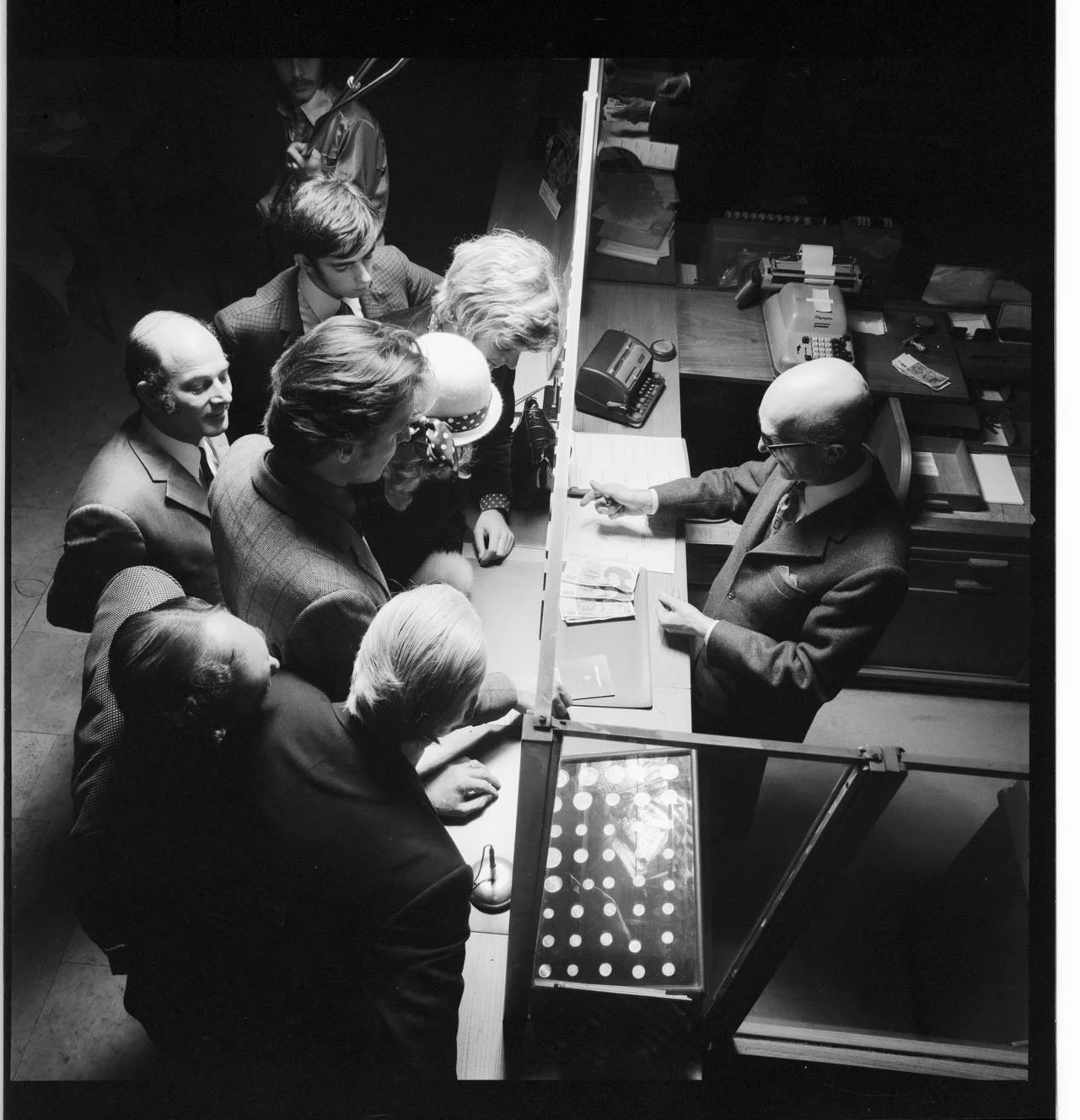
The legendary reputation as a creative polymath that Ulrich Pracht enjoys also made him an attractive figure to advertising agencies in the 1970s and 80s—agencies whose clients hailed from other industries entirely. Ulrich Pracht—who is truly at home in the worlds of glamour, fashion, and cosmetics, as well as lifestyle, TV, and entertainment—did not shy away from taking risks, venturing onto entirely unfamiliar terrain to try his hand at commercial work, albeit with a touch of artistic flair. His philosophy: “Taking risks always presents a great opportunity. Should things go awry, at least you have gained the invaluable experience.” Despite producing excellent results for clients such as Schlossbräu, Multibionta, and Nürburg Quelle, these forays into the realm of so-called "advertising photography" remained few and far between; ultimately, Pracht drew his own personal conclusion: “That kind of advertising photography just wasn’t my cup of tea!”
Even setbacks are part of the journey for successful men. With remarkable consistency—right up to the present day—Ulrich Pracht creates concepts that can shape a distinct fashion brand’s identity for decades on end, as was the case with Hettlage. Yet not every one of his project ideas is destined for such lasting glory. In the late 1990s, Pracht received a commission from Quelle to design a cover for the mail-order retailer’s special 70th-anniversary catalog edition. He fulfilled this assignment with a rather kitschy floral arrangement and a glass-sculpted “70”—a design tailored to the retailer’s aging clientele. “For me, that marked the end of the era of these analog shopping habits. Thanks to my many years of production work in the U.S., I was already well aware of the emerging trends and early major successes in online retail—particularly among renowned American fashion brands like J. Crew, Banana Republic, and Abercrombie & Fitch.” Consequently, to shape the digital future of the great German mail-order houses of the last century—Quelle and Otto—Ulrich Pracht developed Die Ideen-Quelle and Der andere Otto: concepts for the perfect online retail experience—unfortunately, a few years too early. One of these projects was shot down while still in the discussion phase, met with the words of Quelle’s then-CEO, Klaus Zumwinkel: “Very good, very good, Mr. Pracht. But as you know, Quelle is like an oil tanker. And steering it off course is a very difficult task.” The other project failed due to budgetary constraints: “They wanted to buy the concept for peanuts!”






04.2

THAT´S ME
I love life.
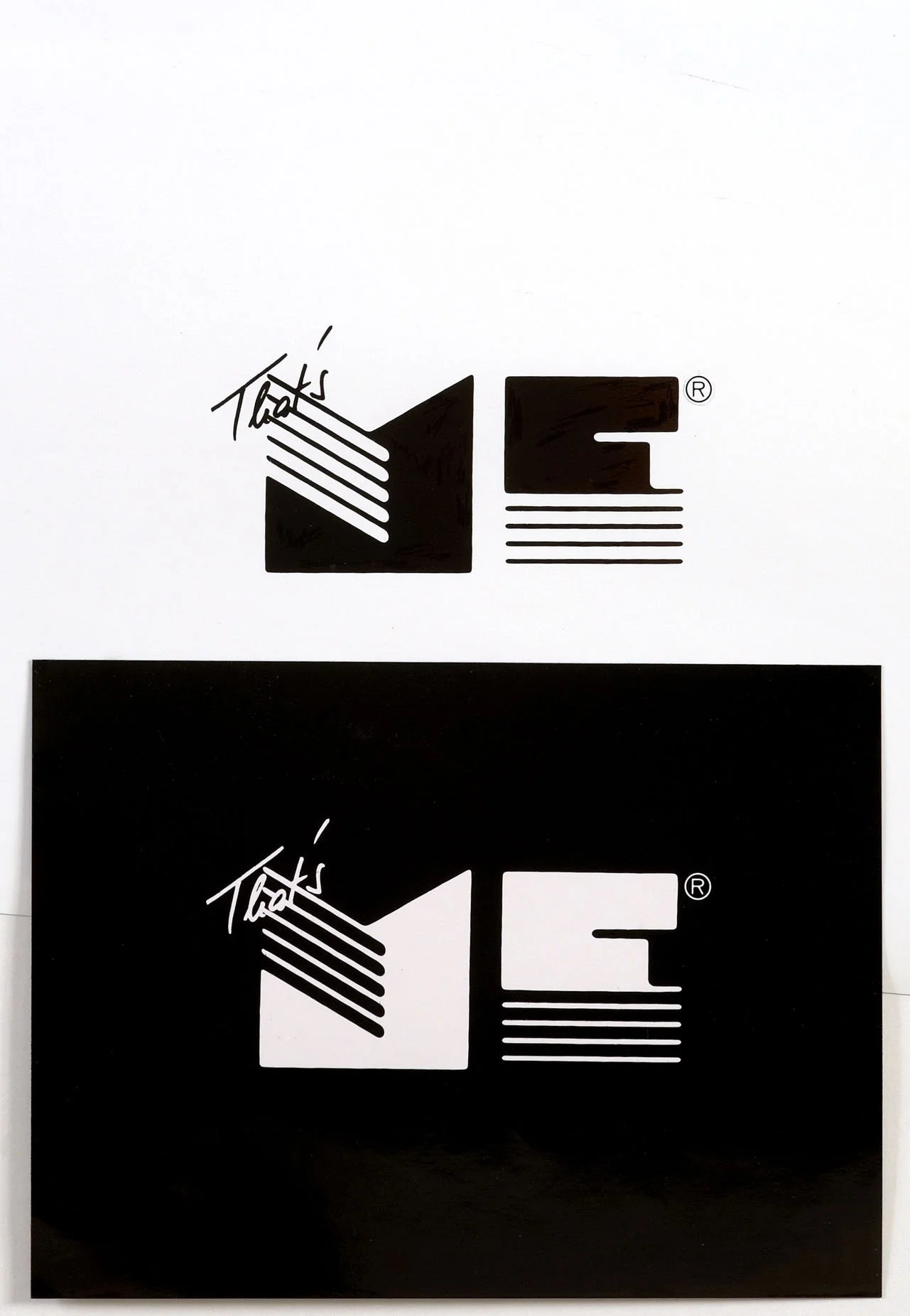
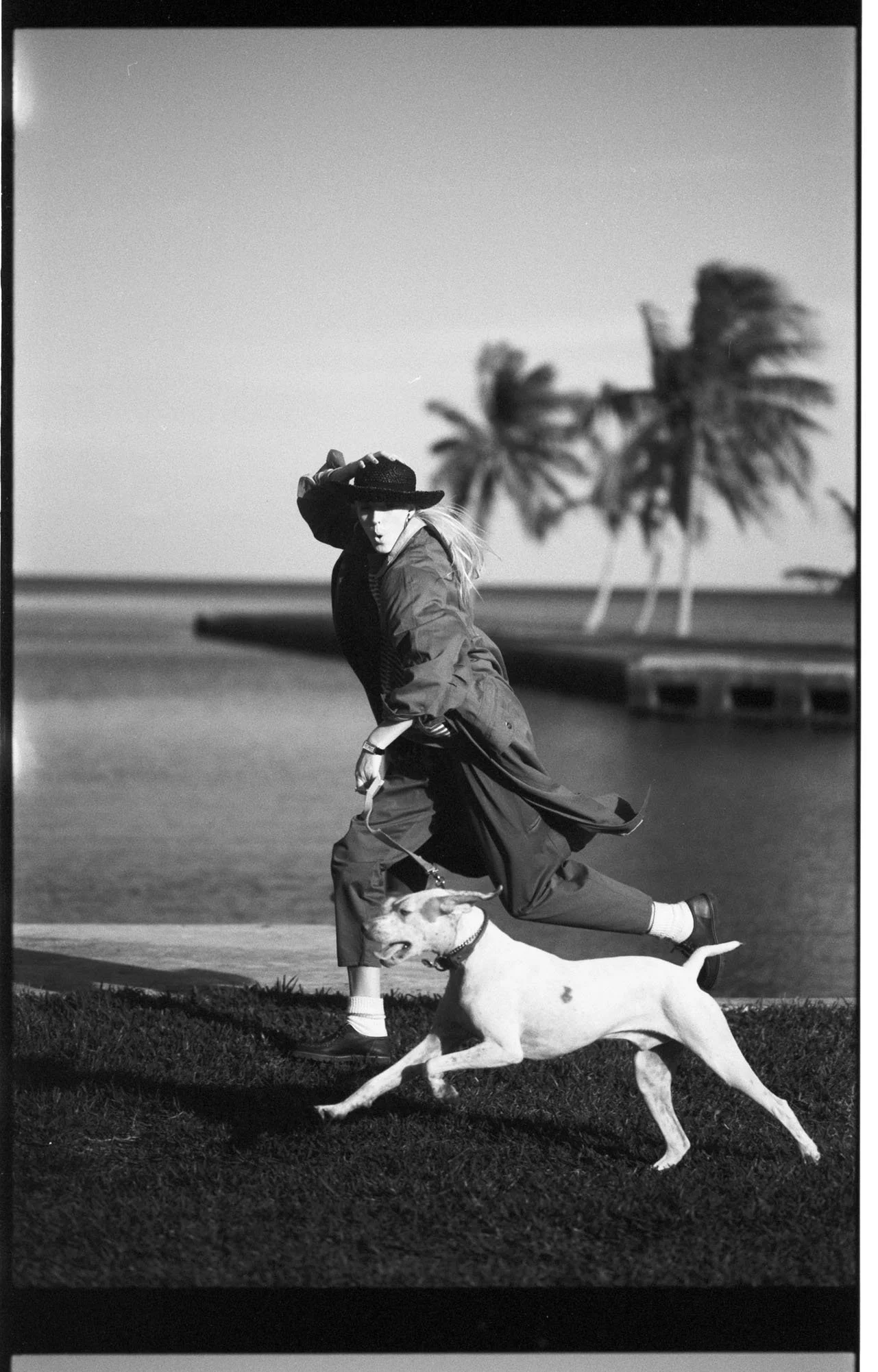
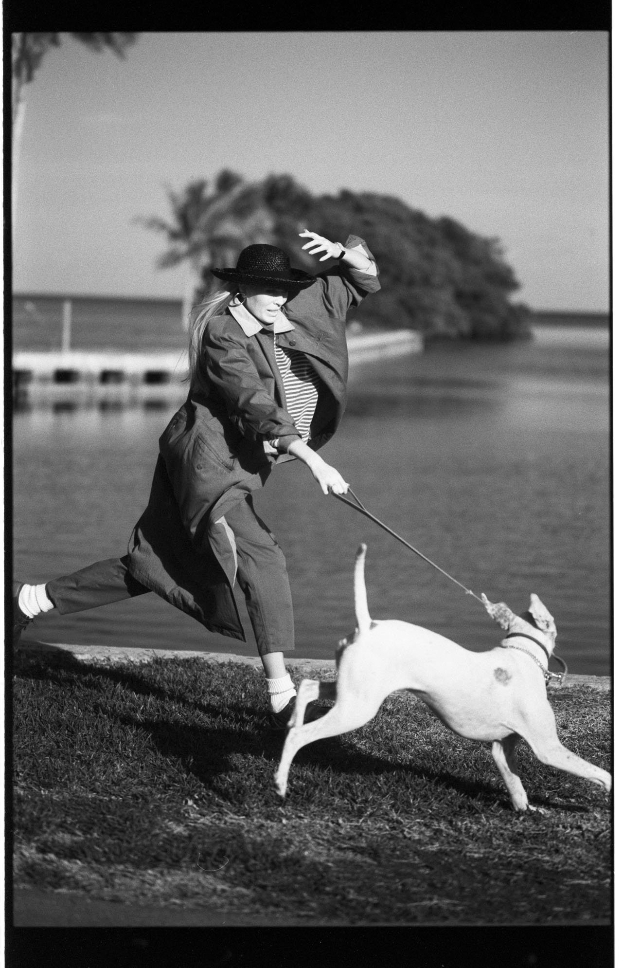
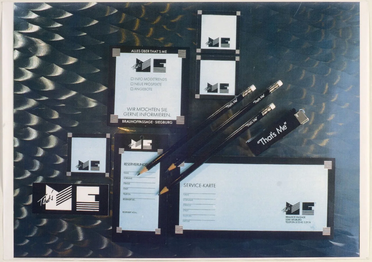
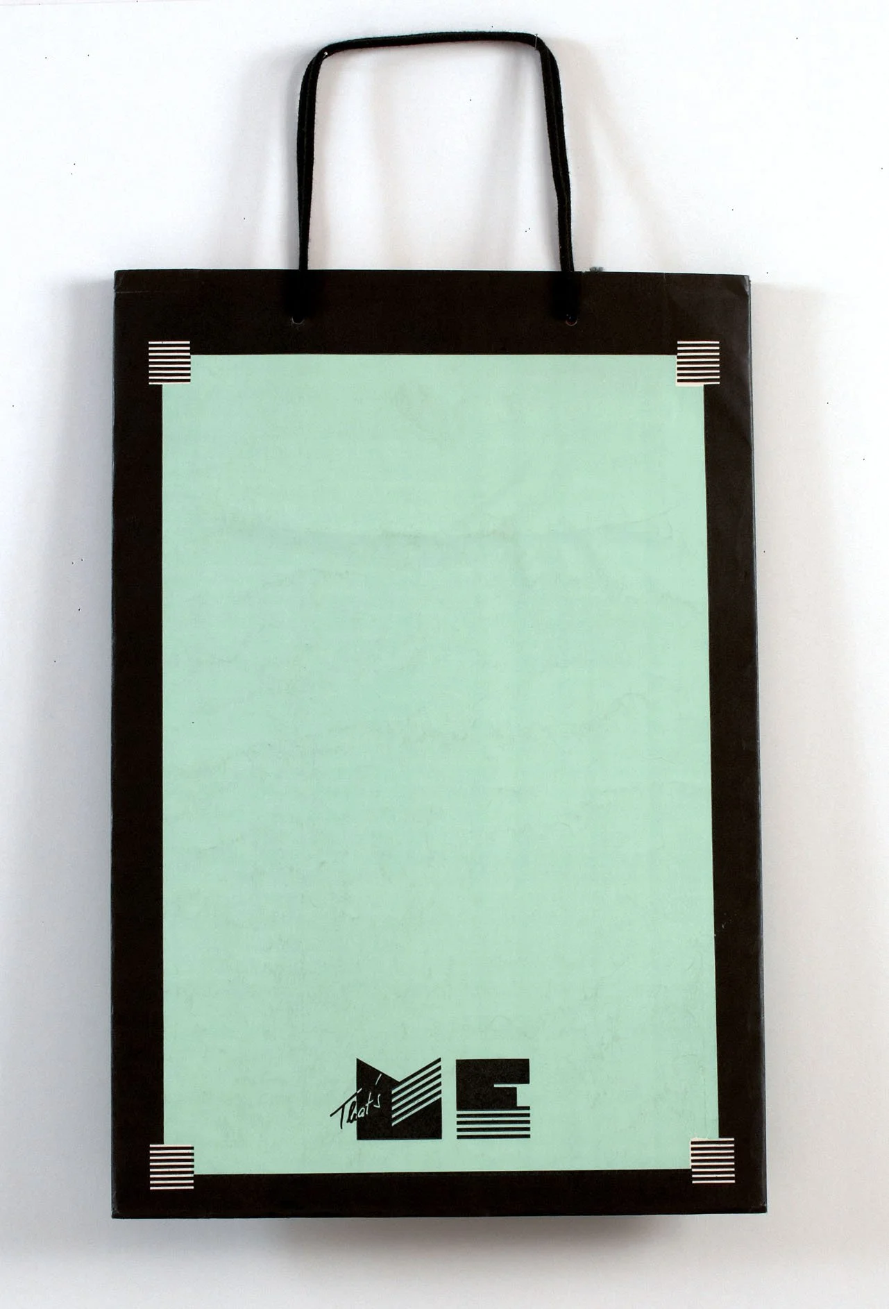
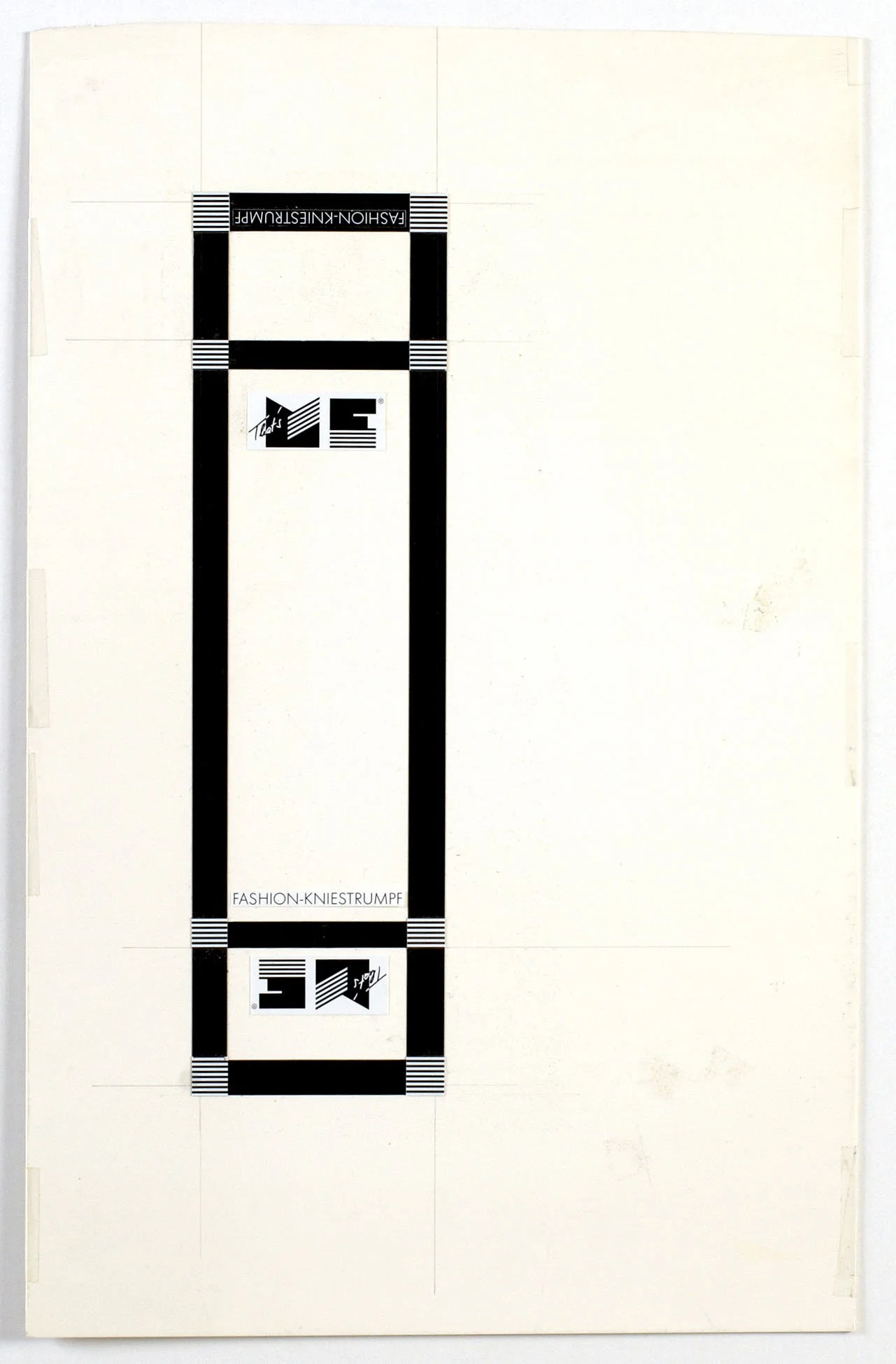
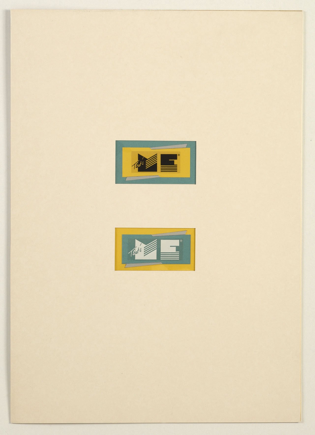
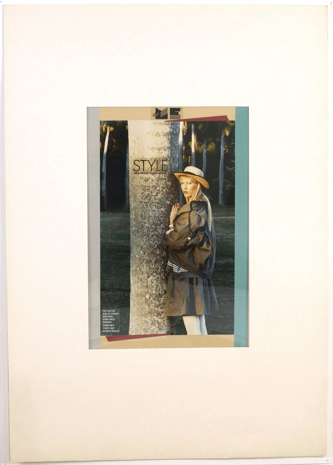
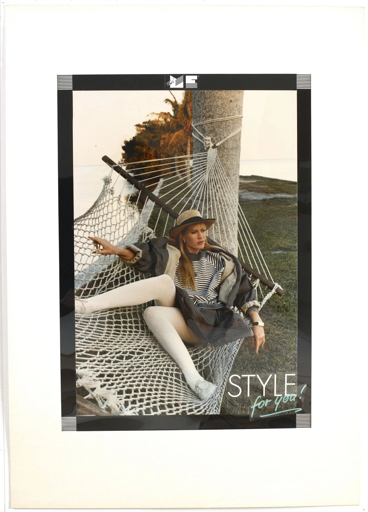
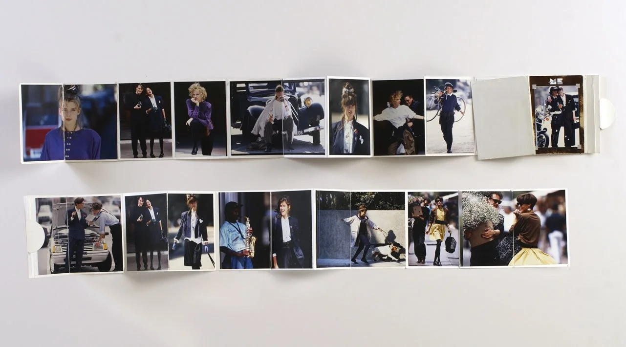
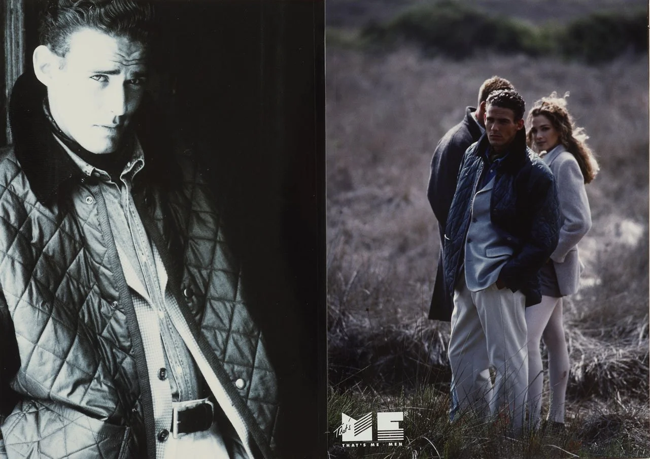
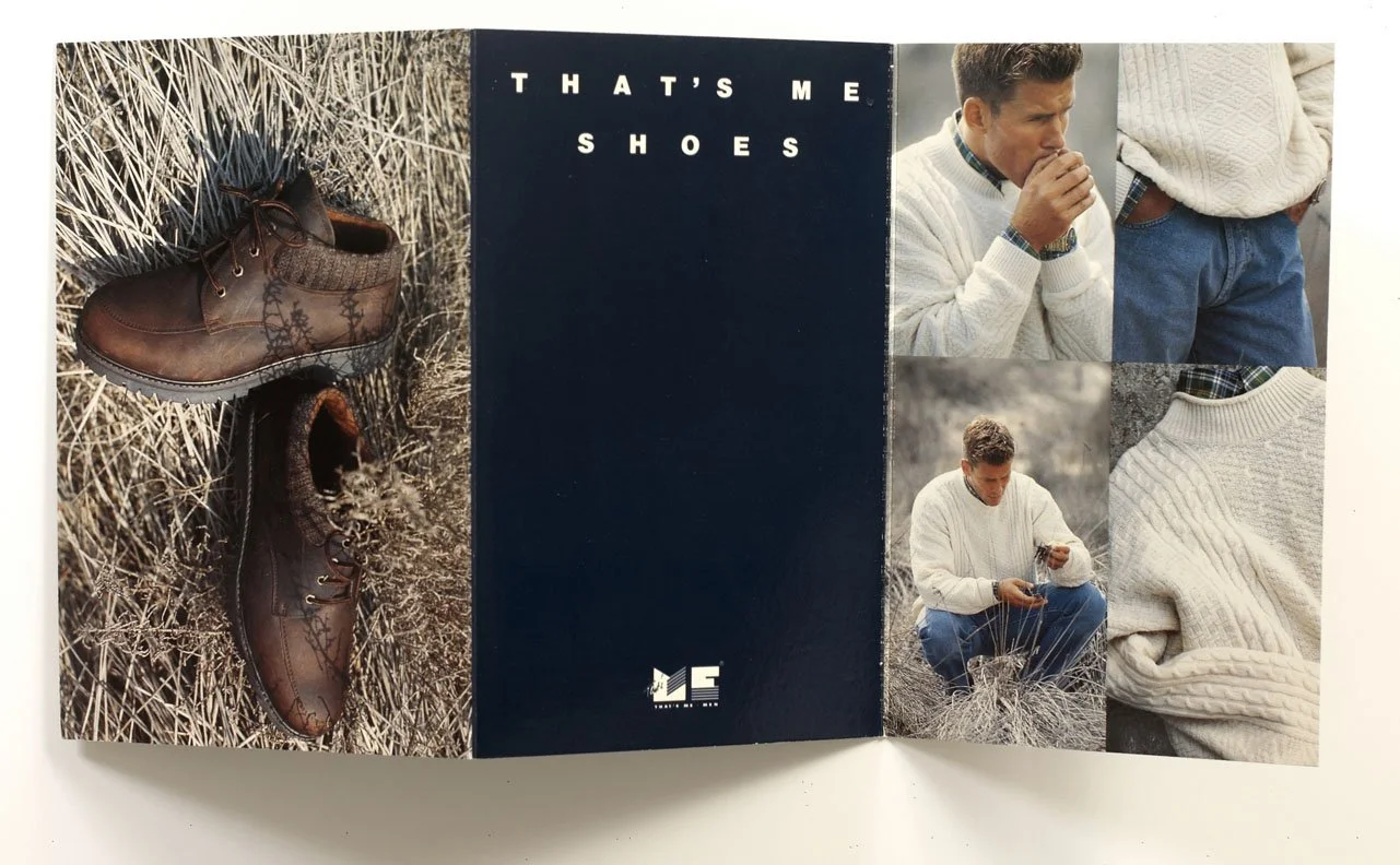
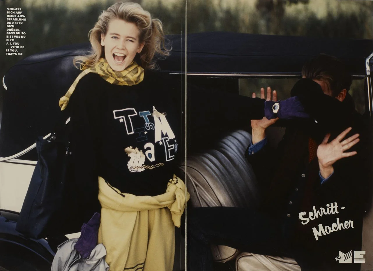
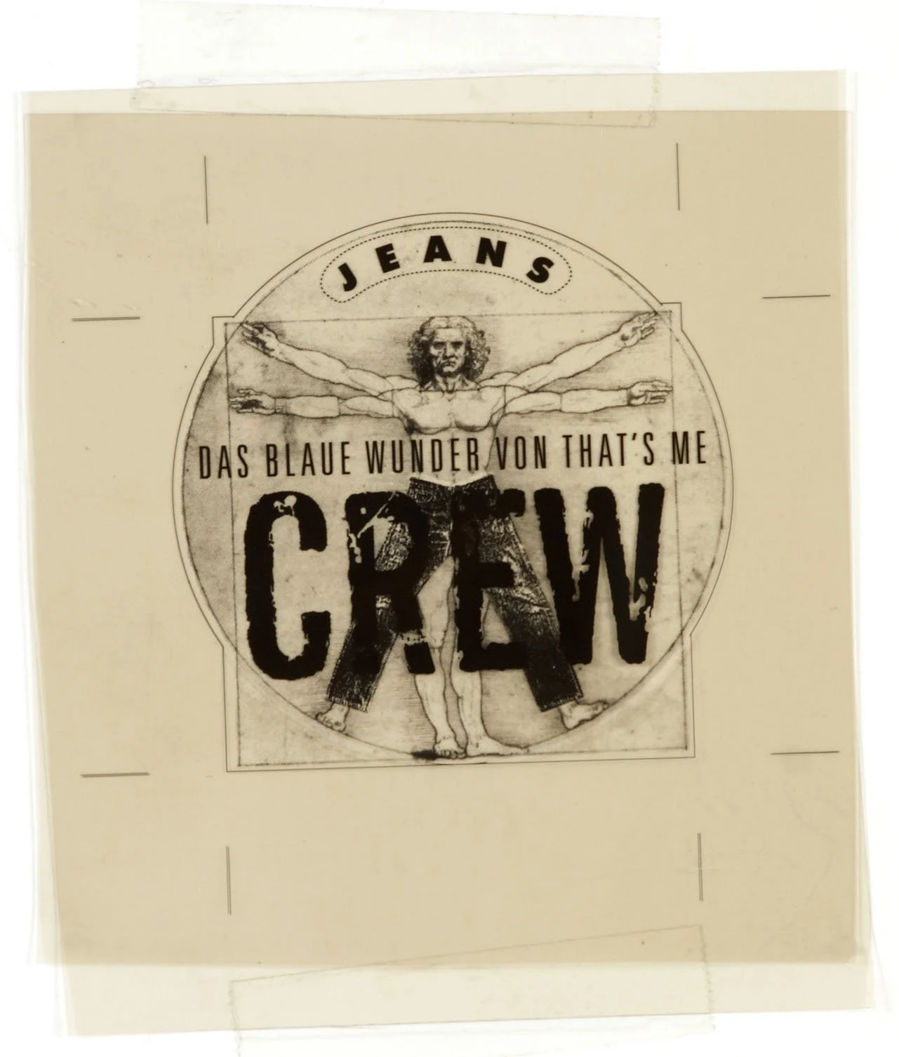
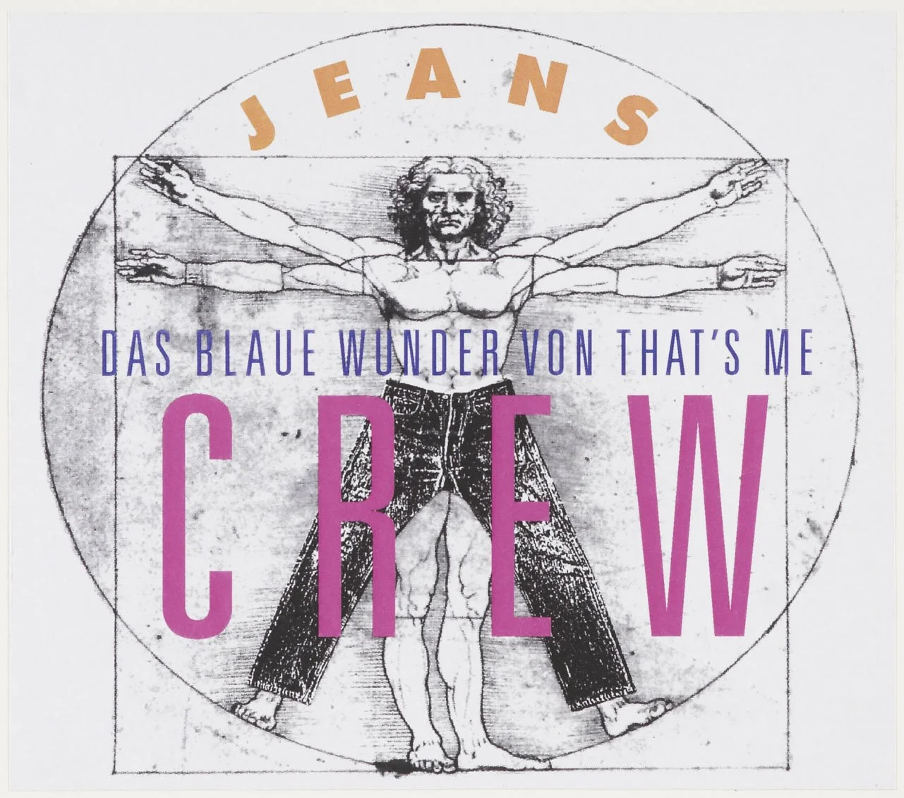
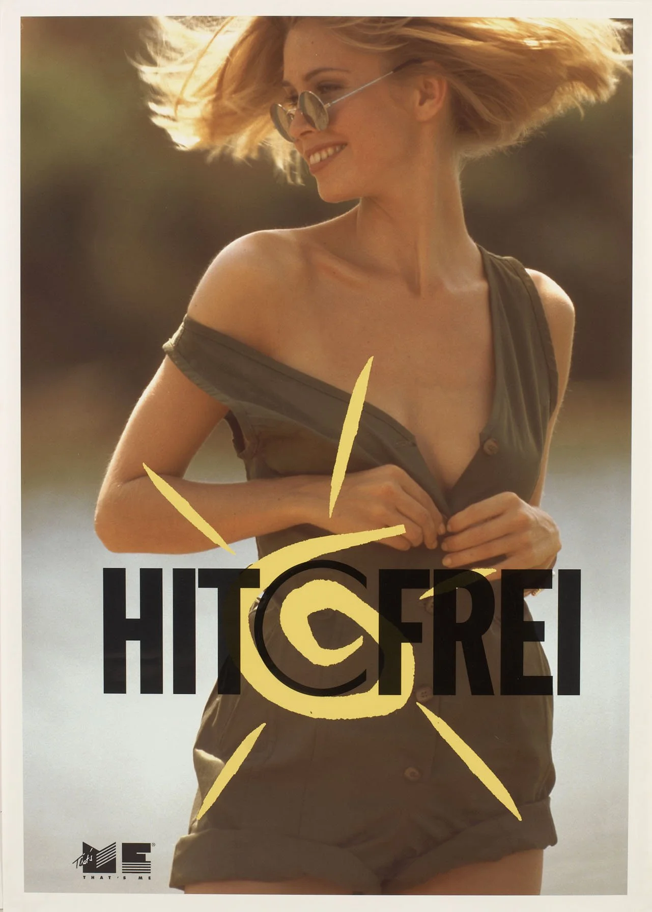
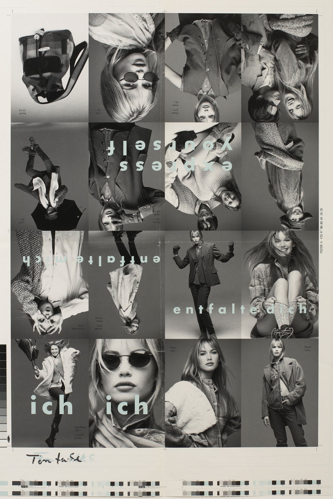
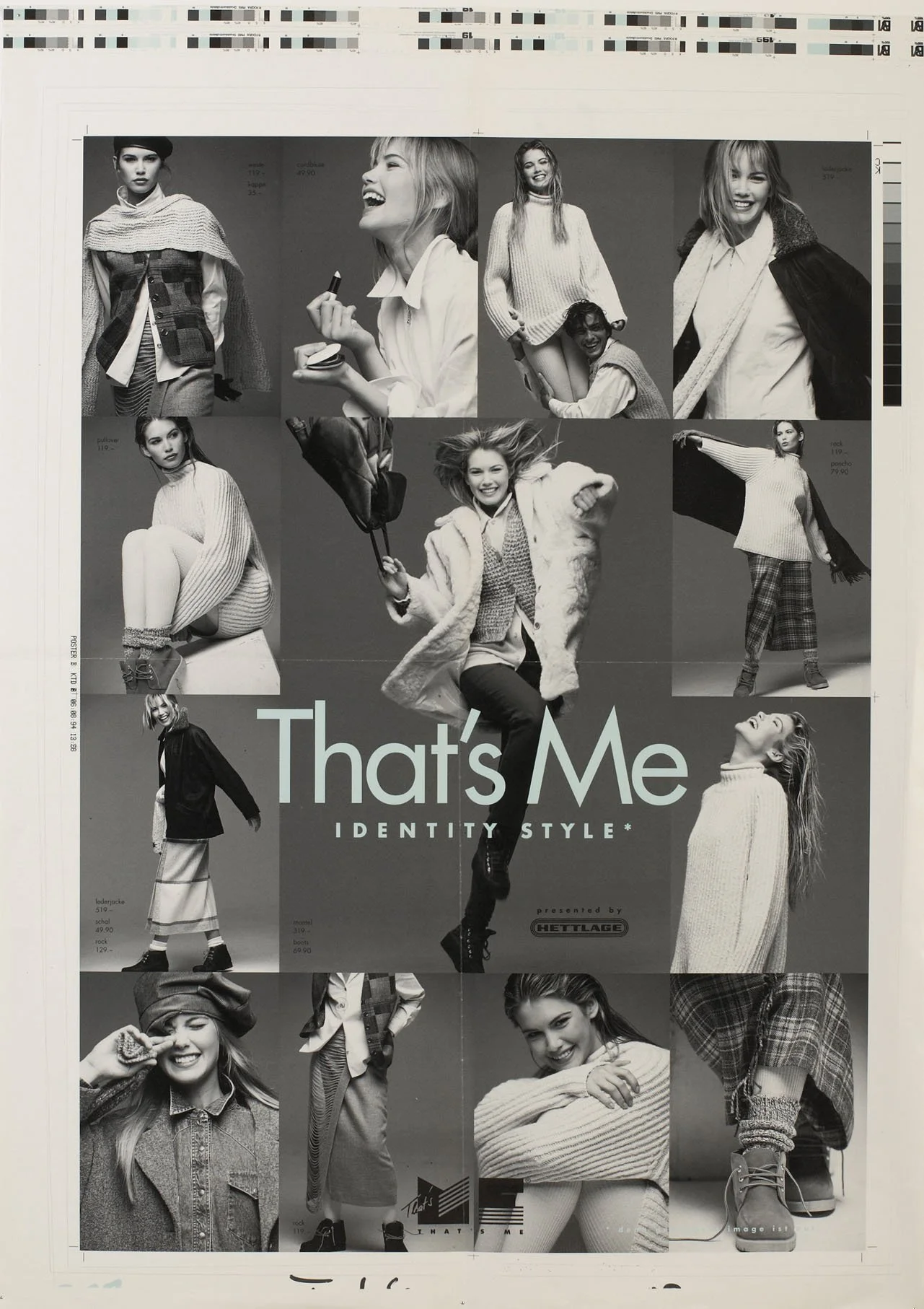
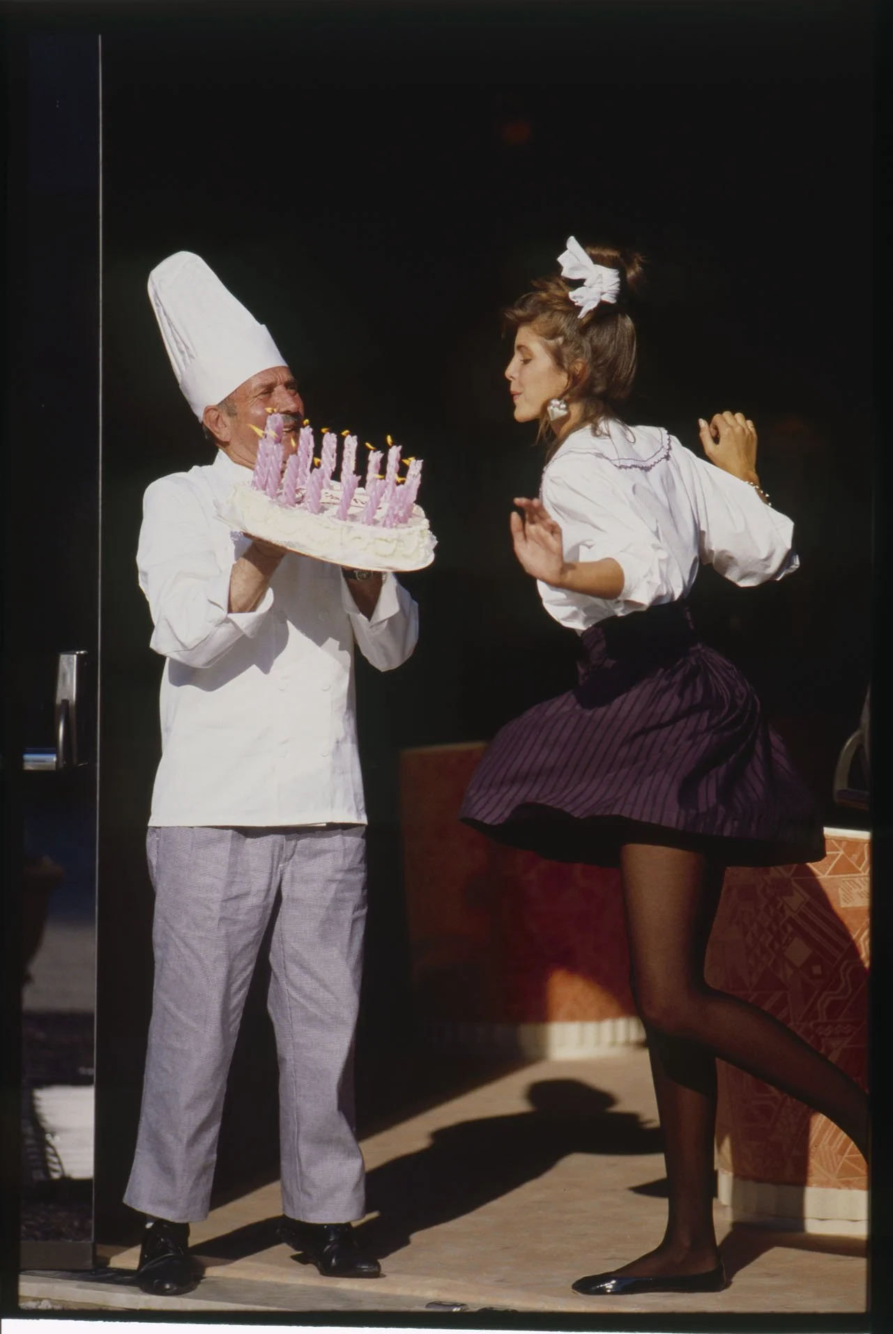
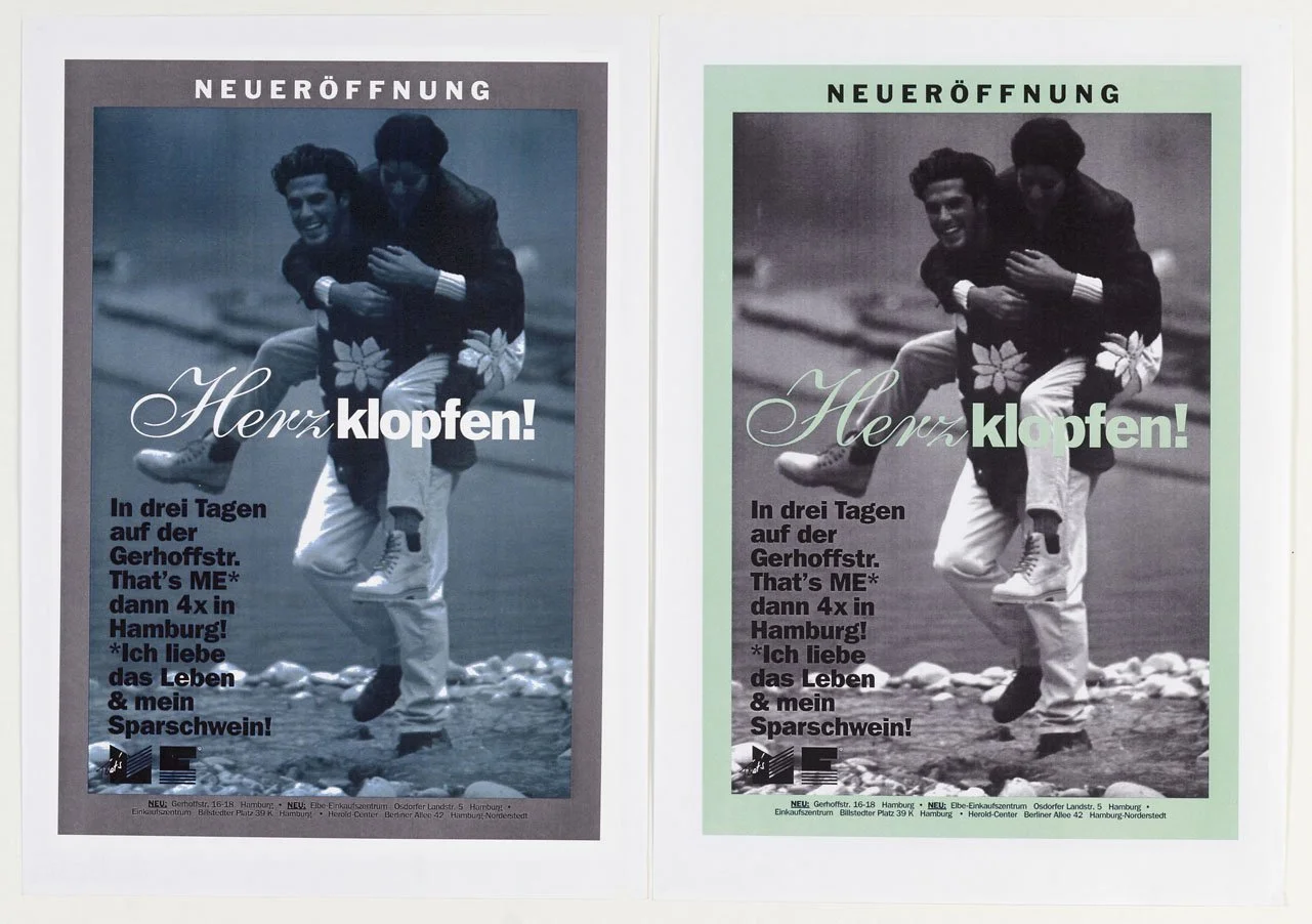
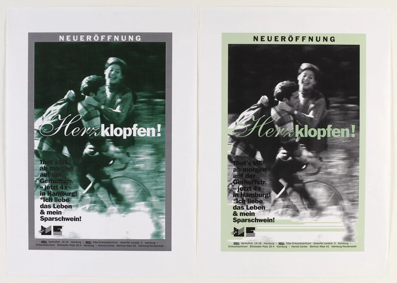
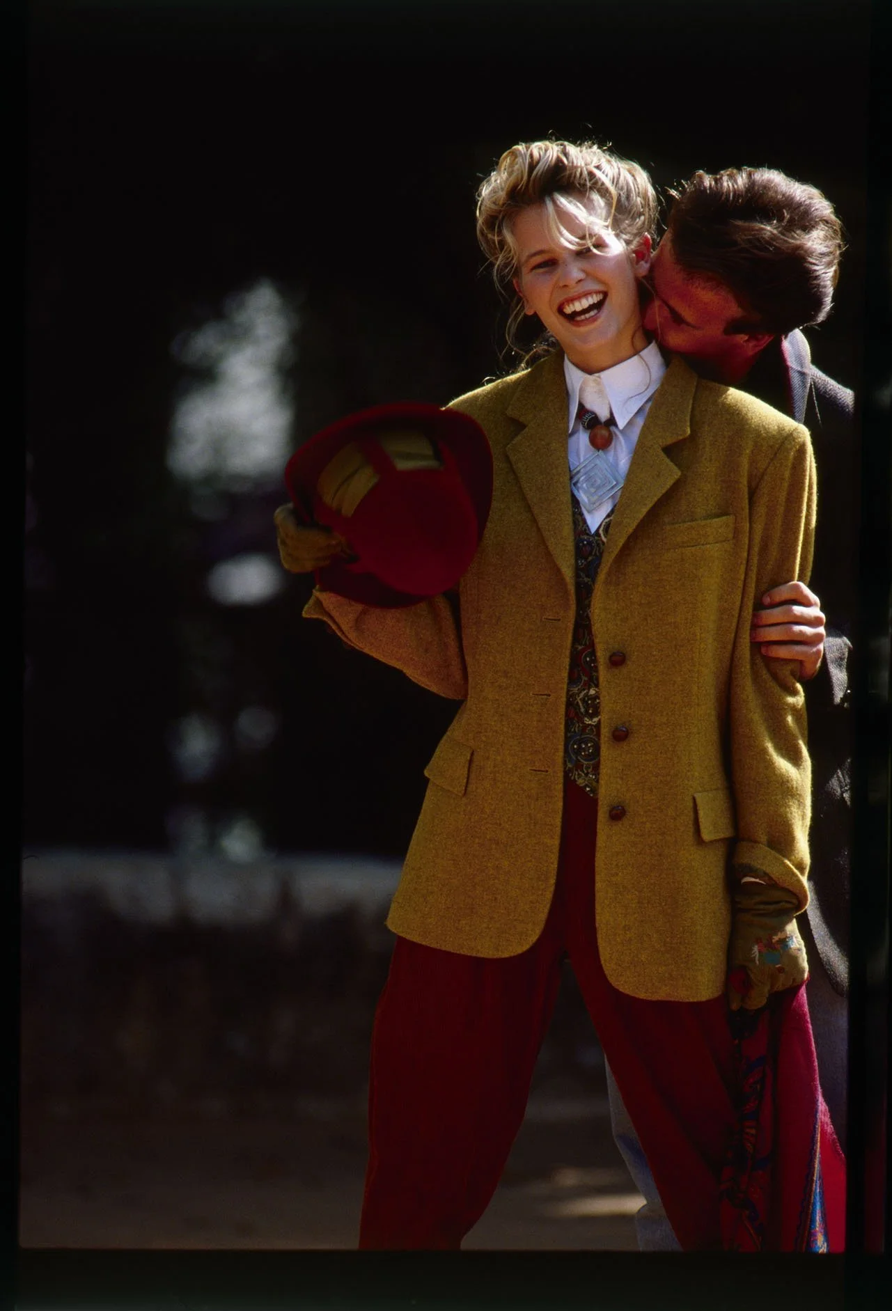
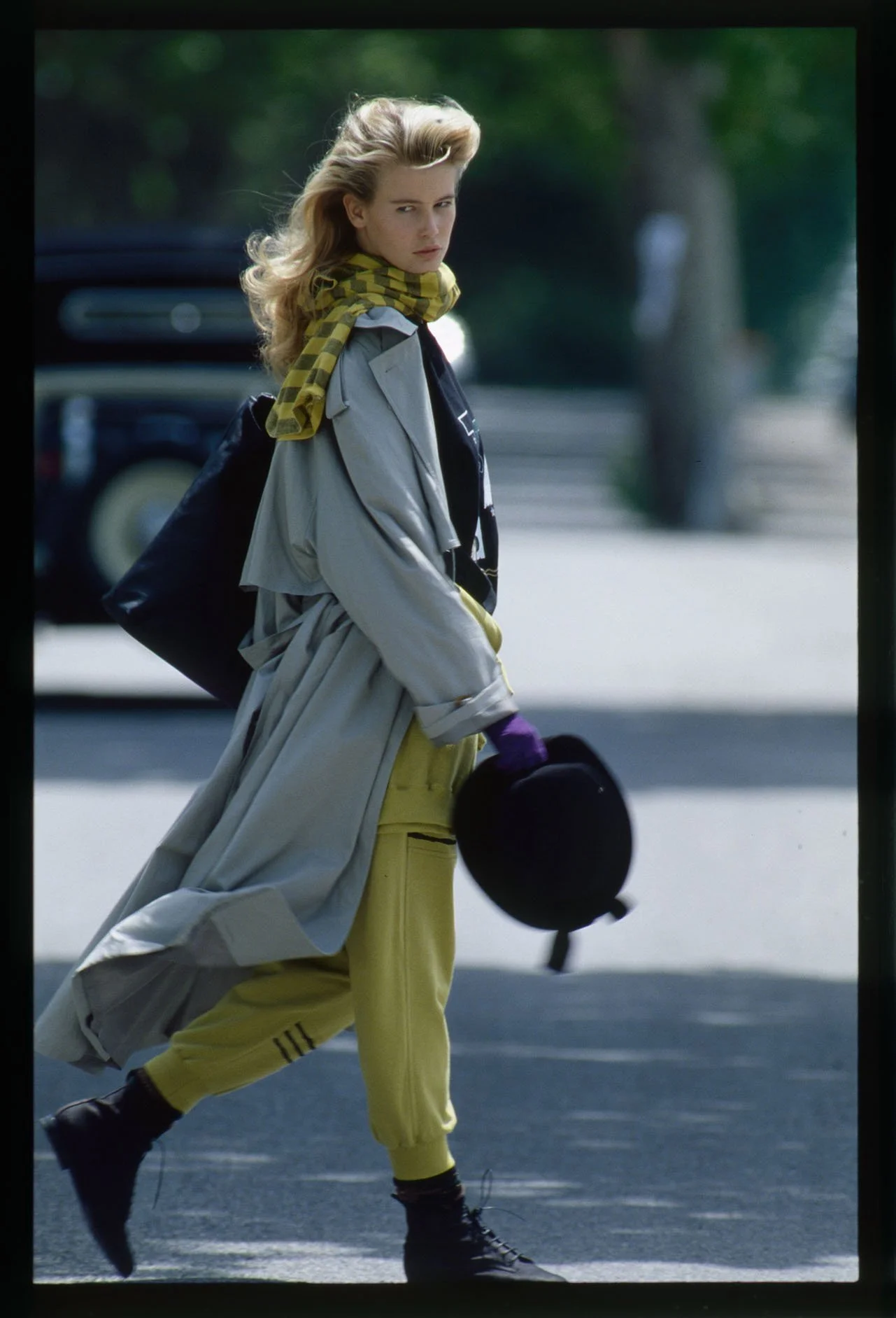
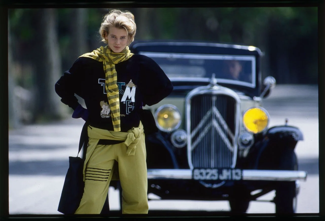
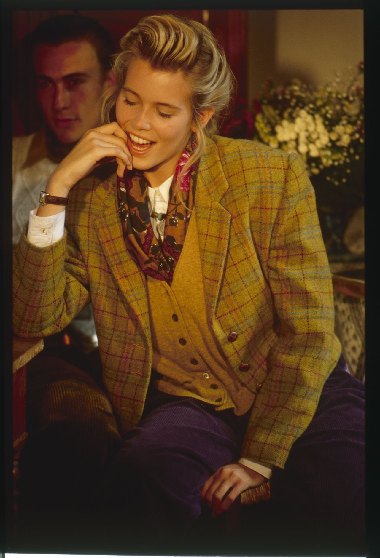
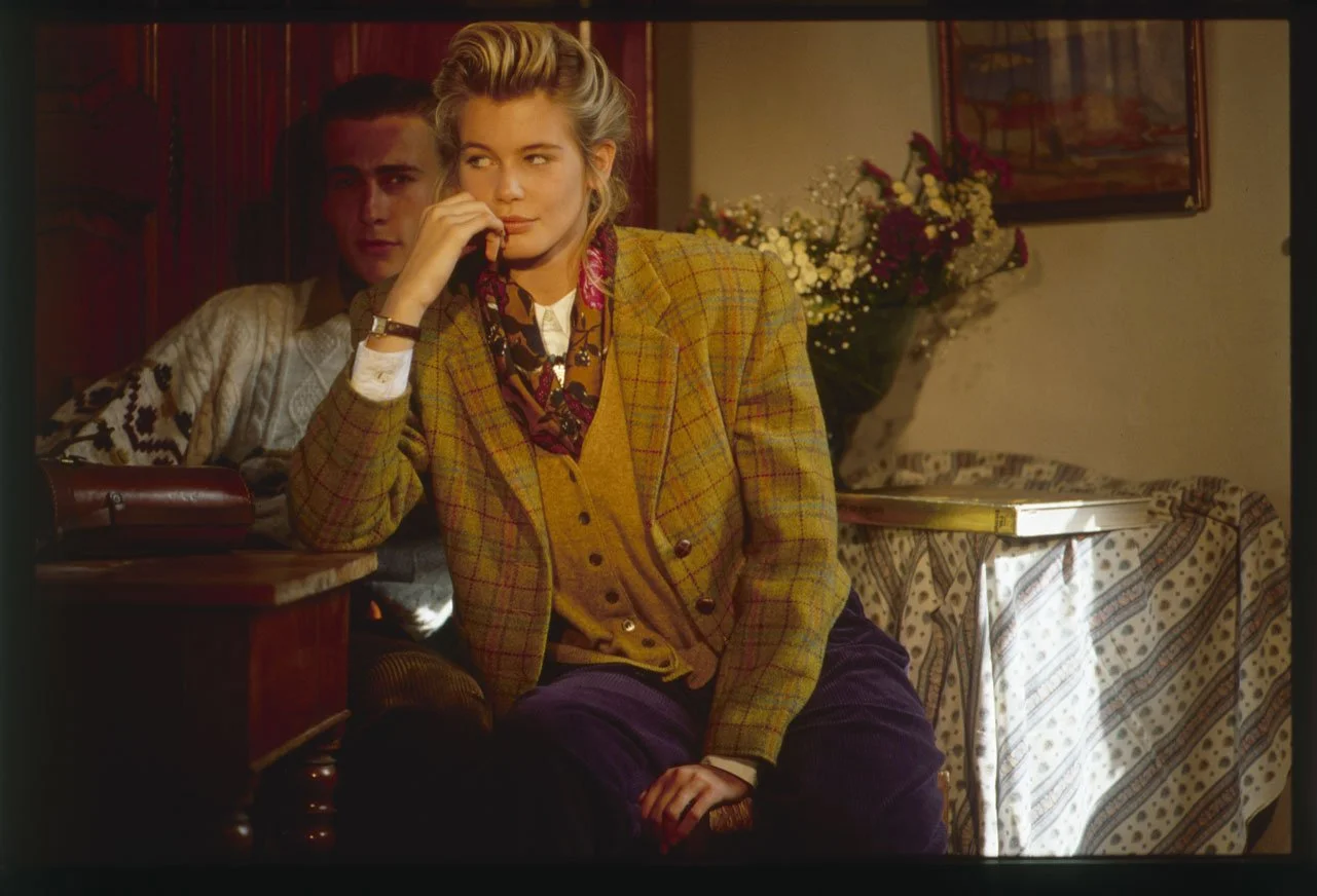
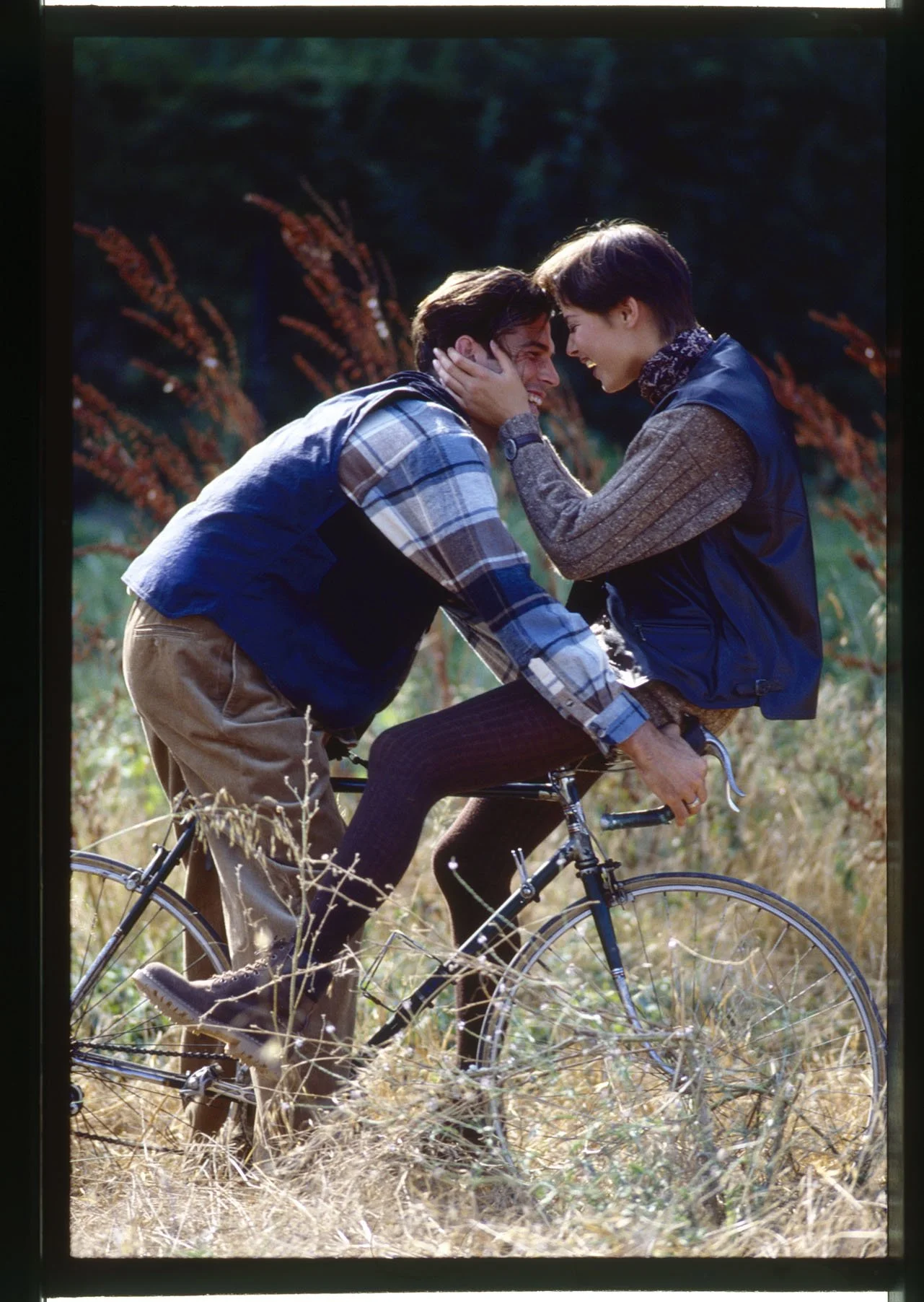
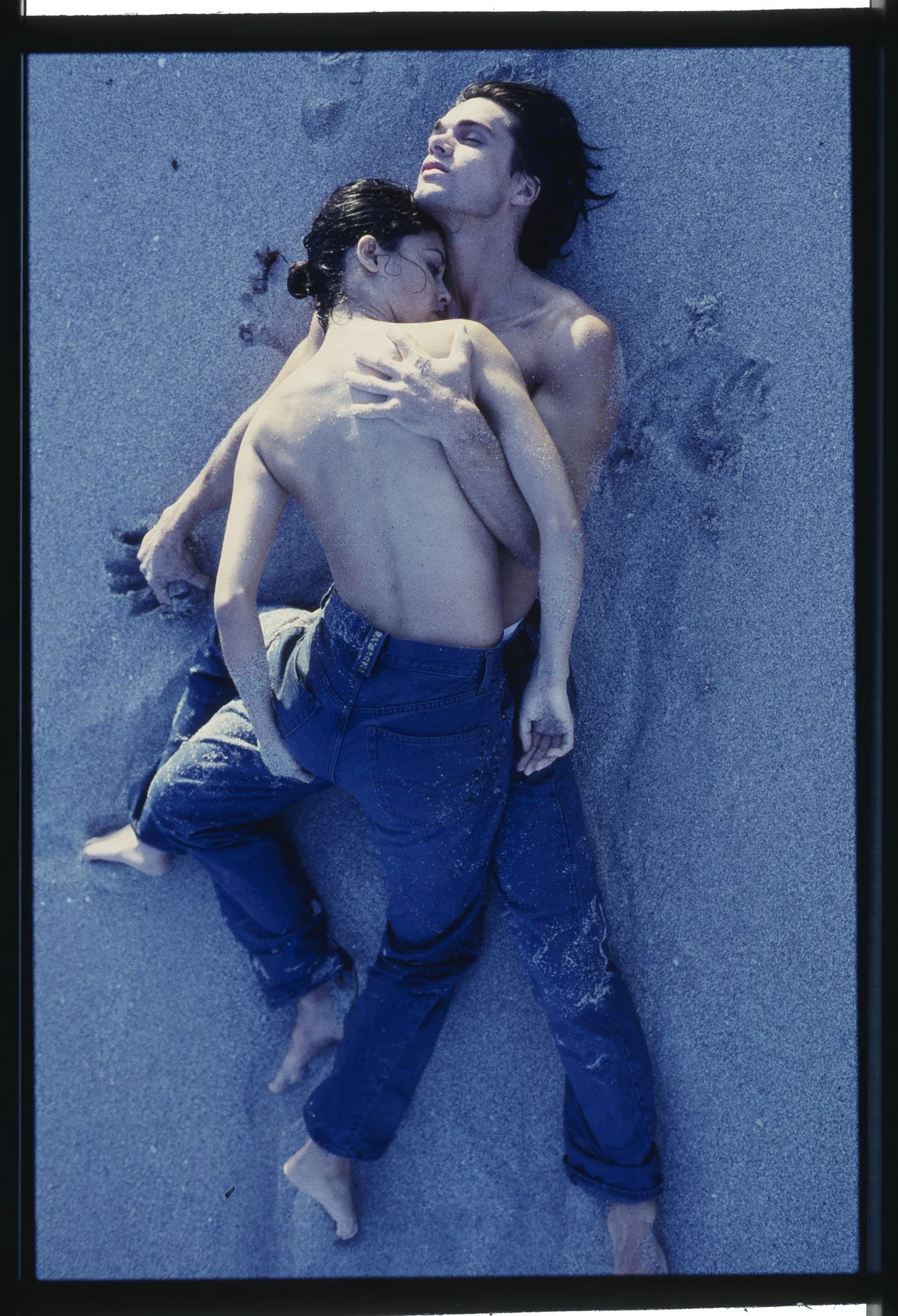
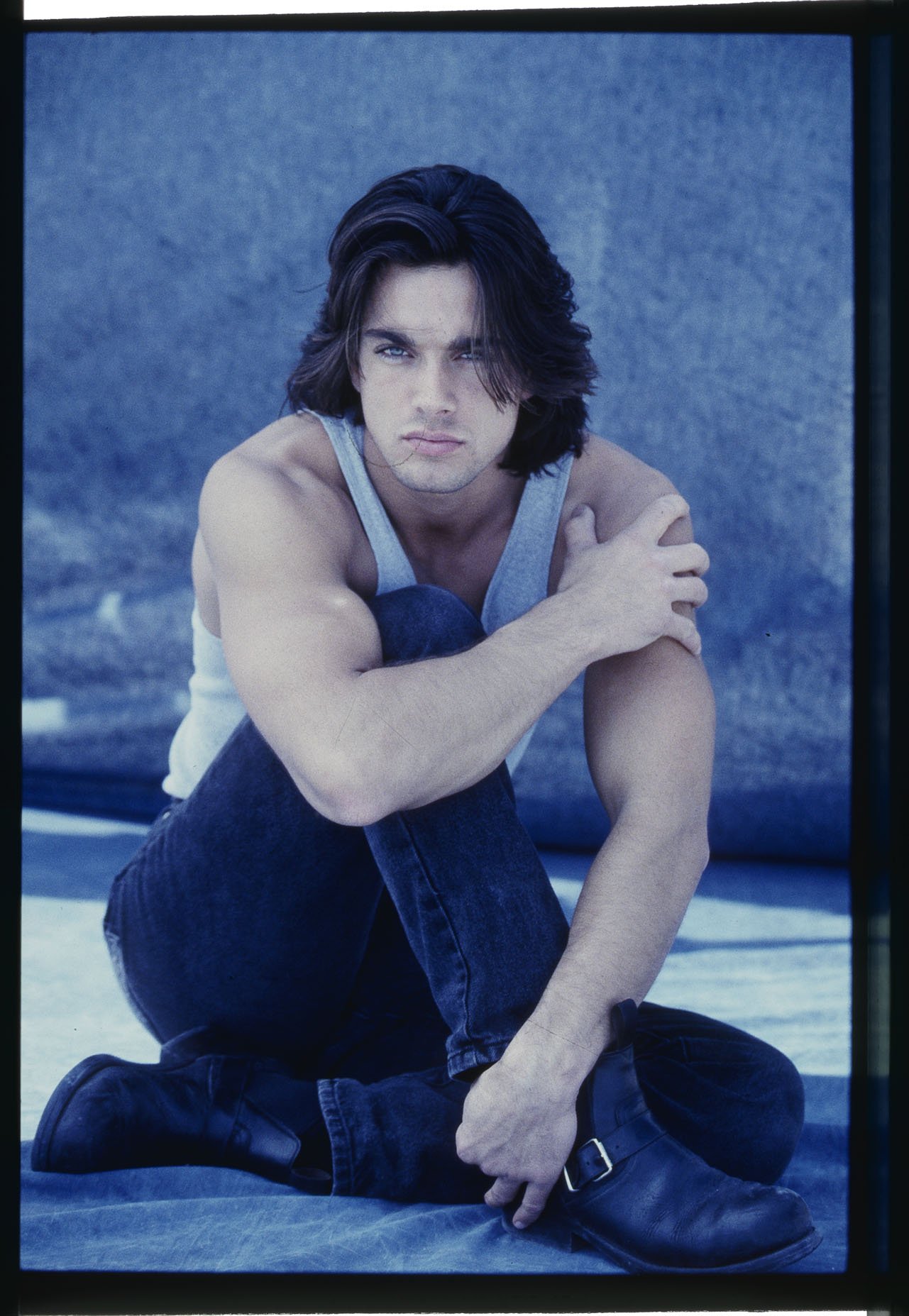
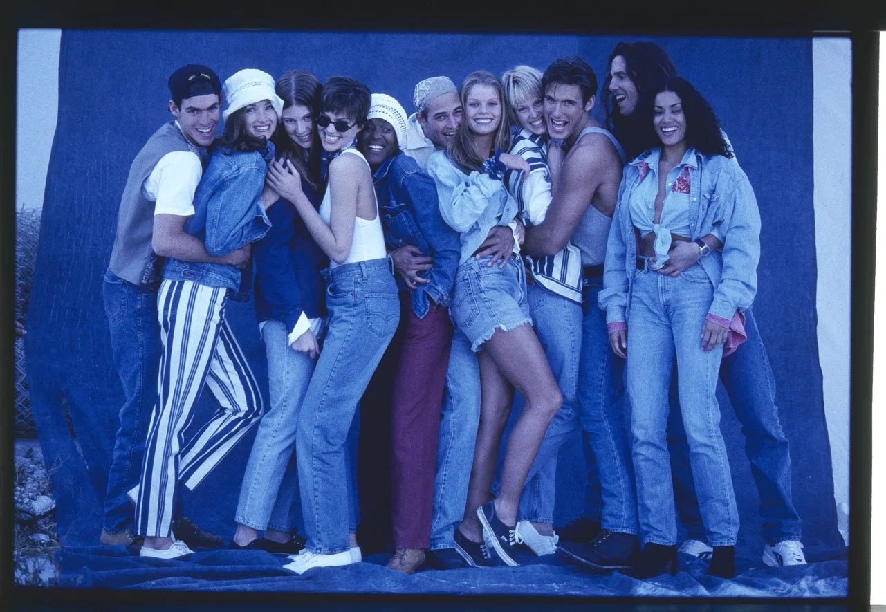
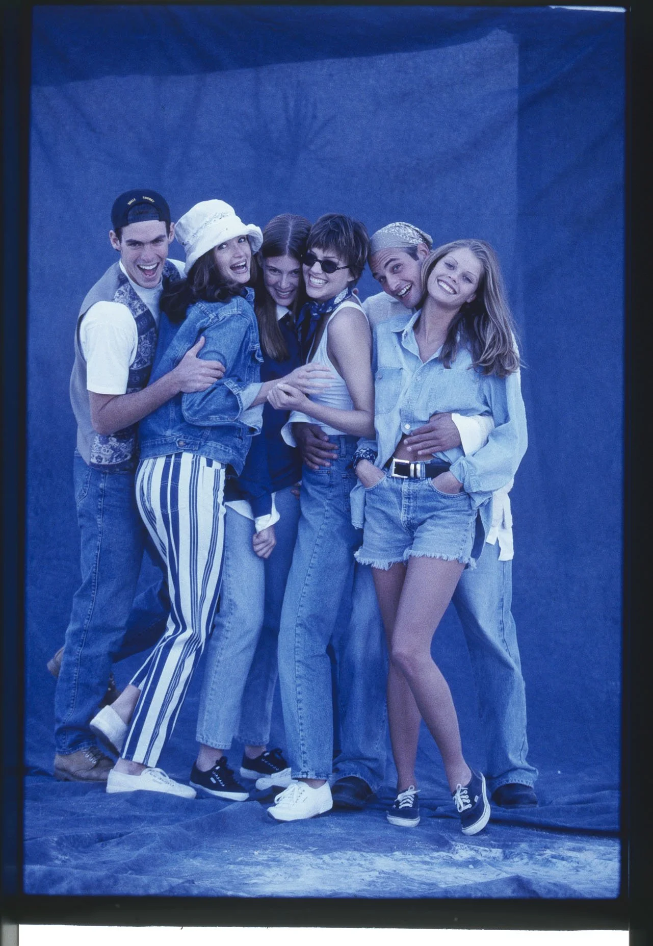
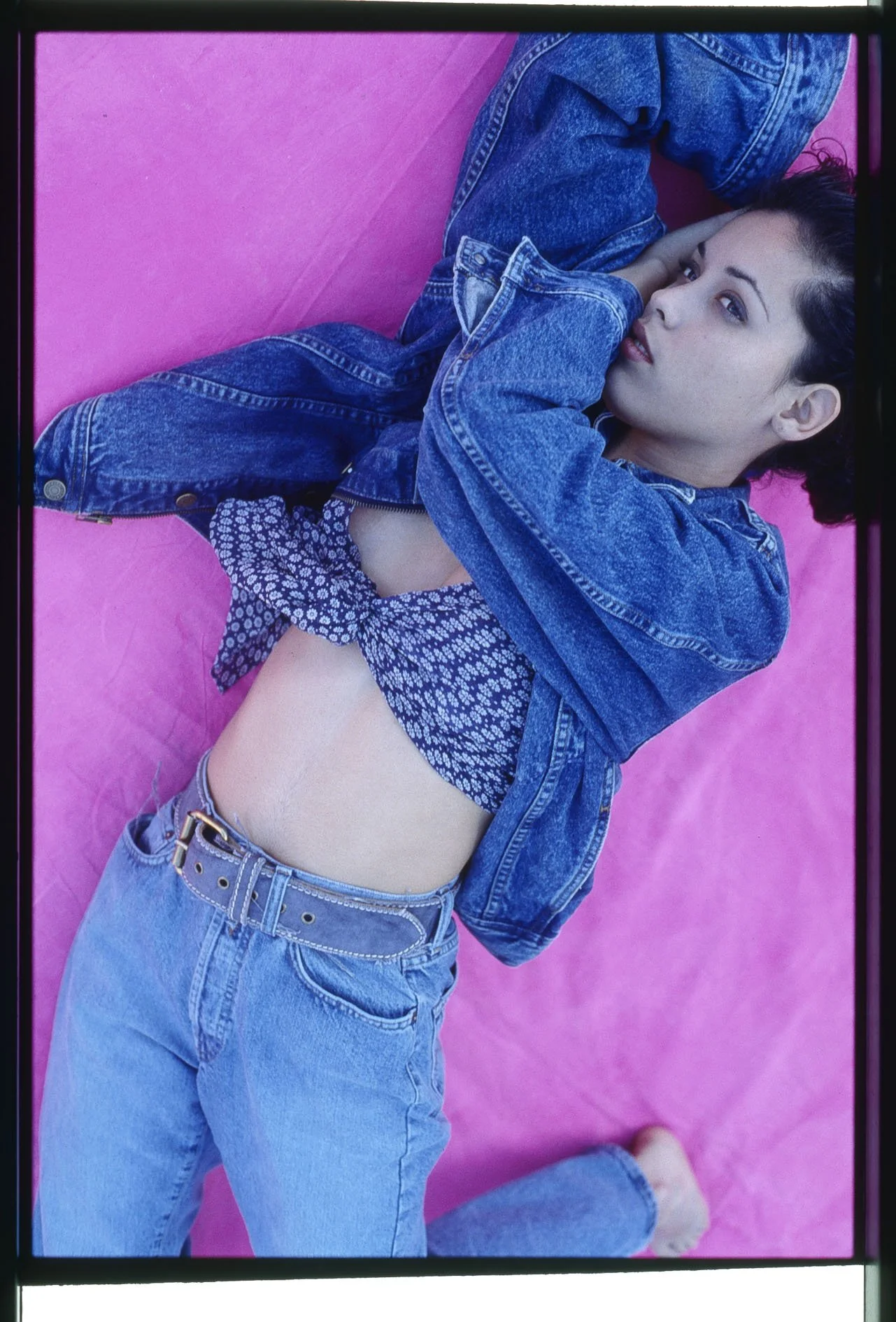
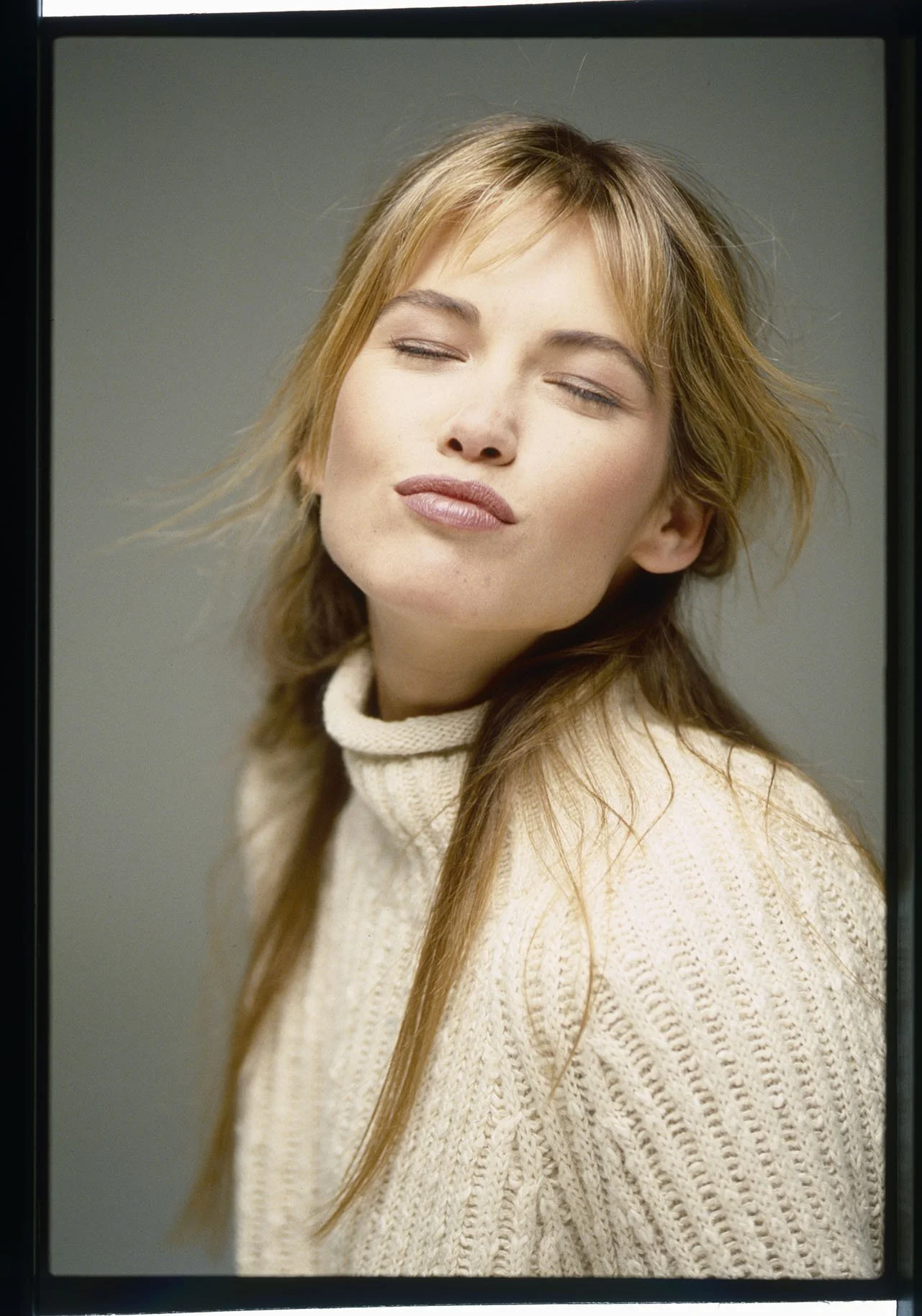
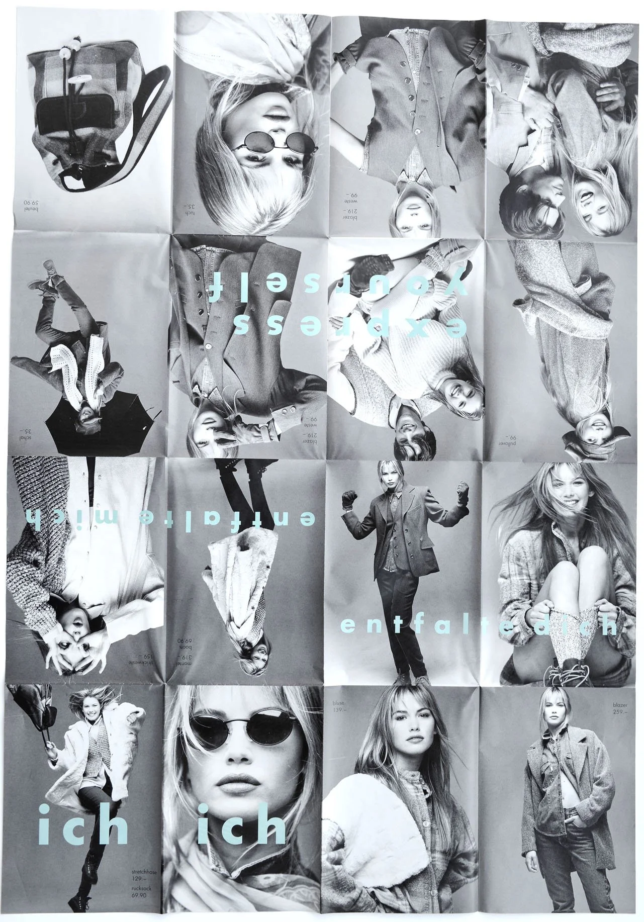
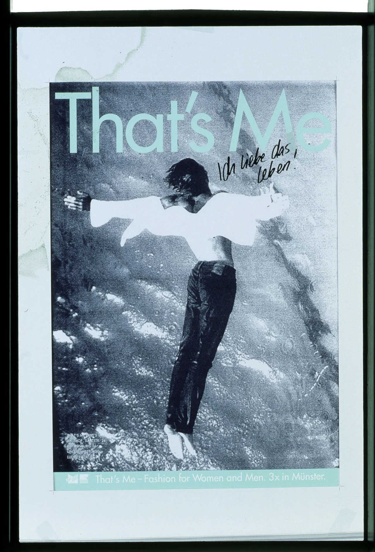
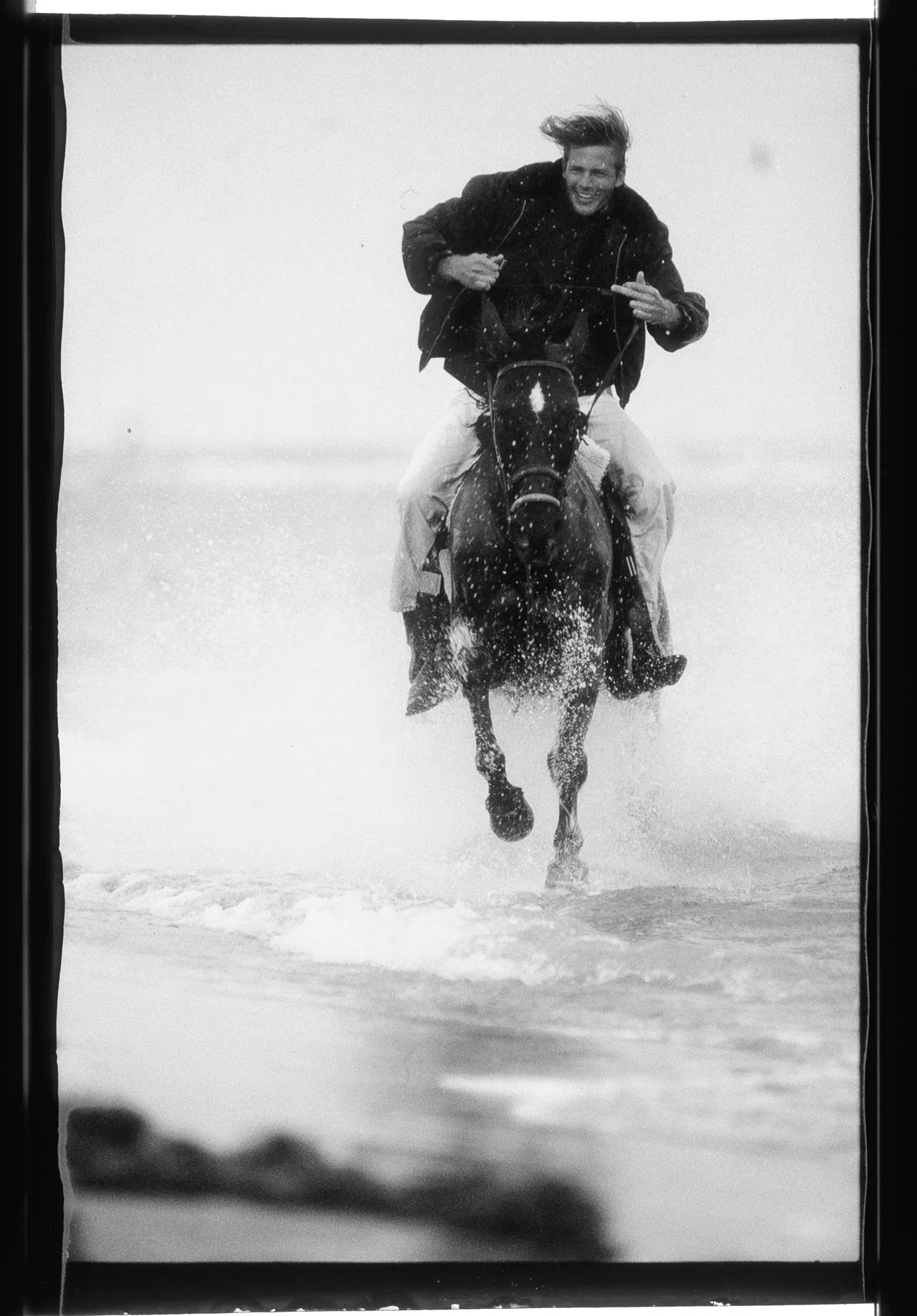
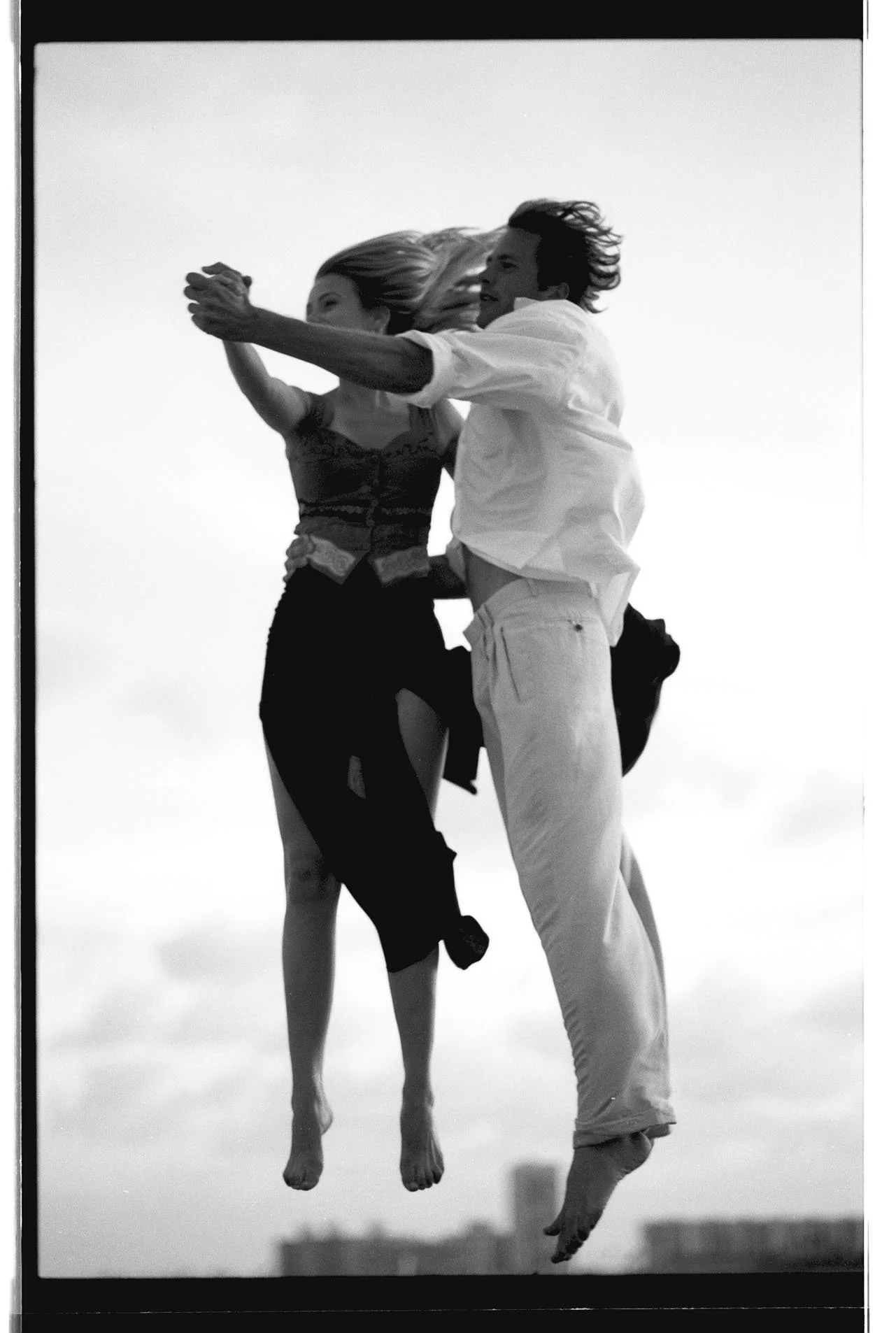
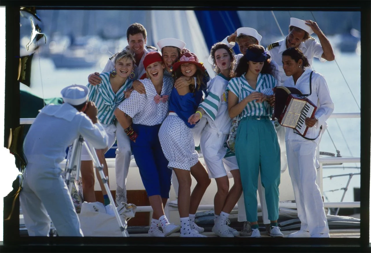
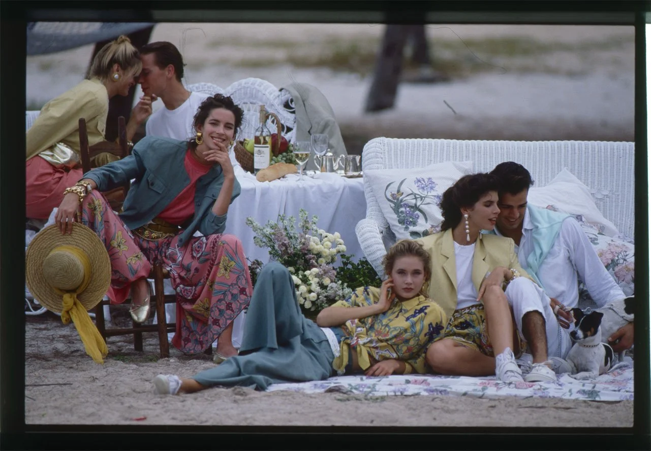
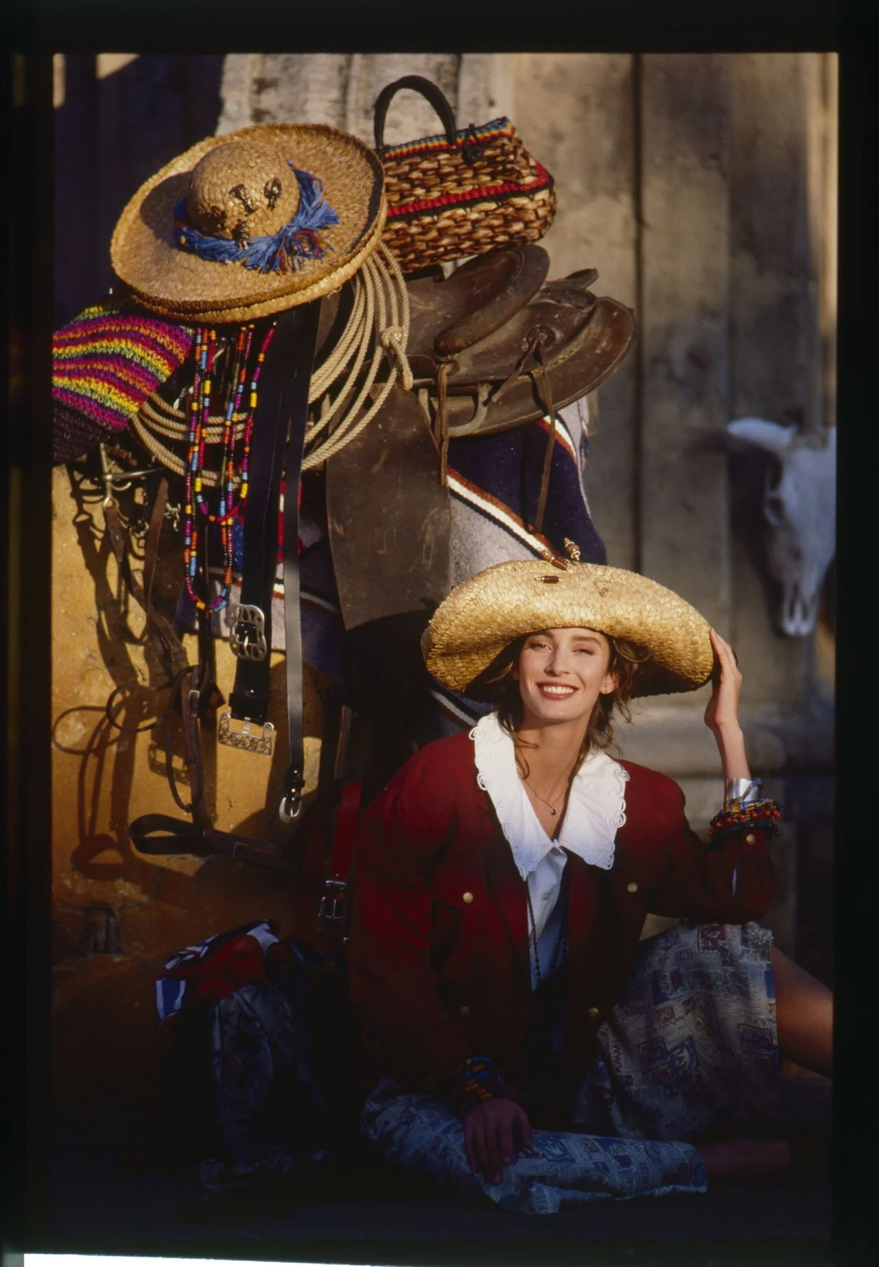
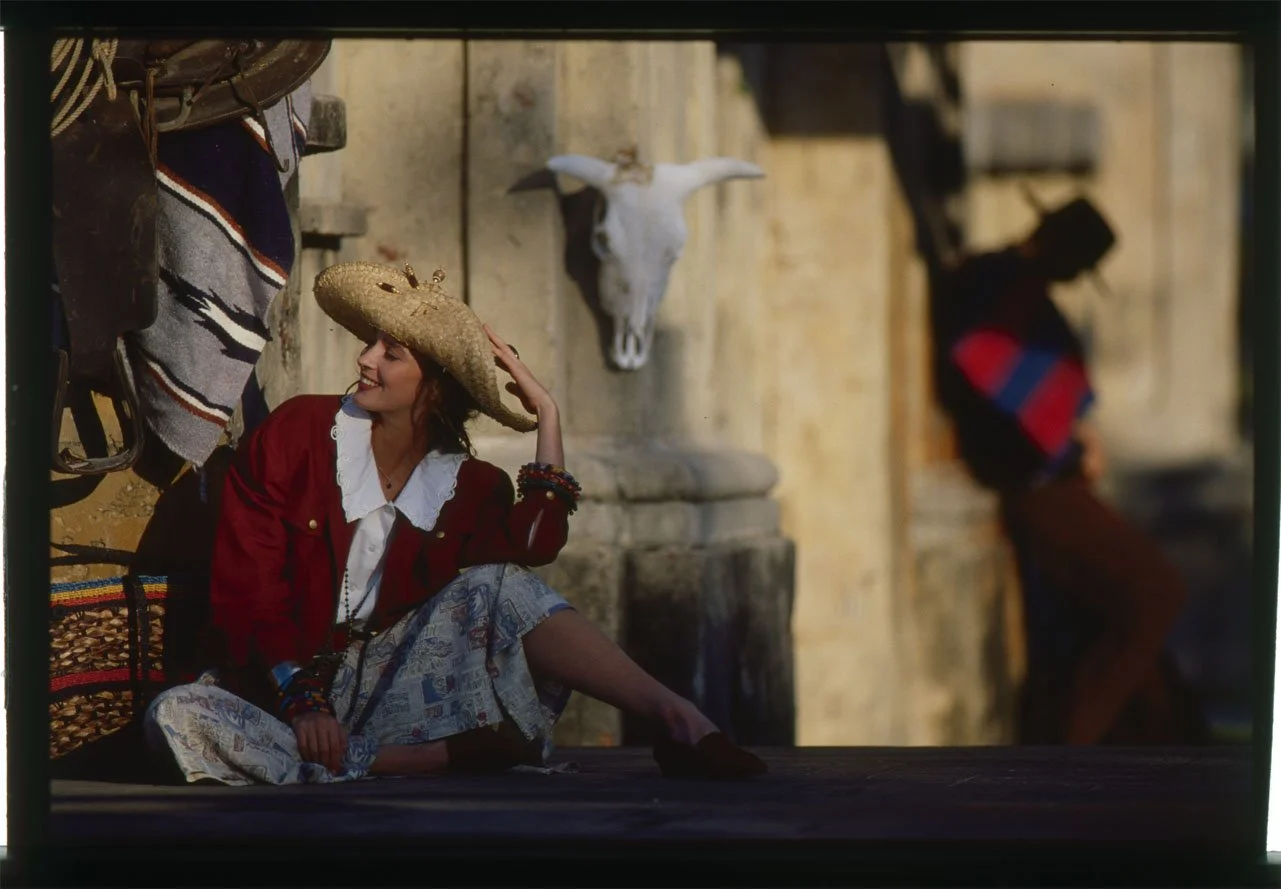
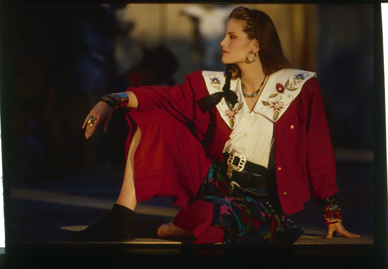
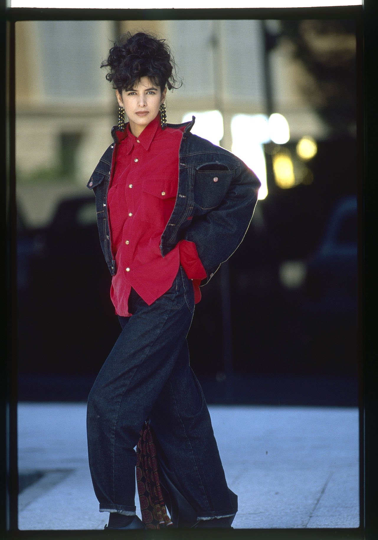
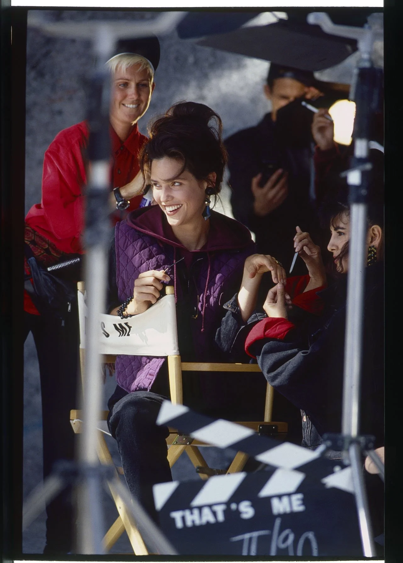
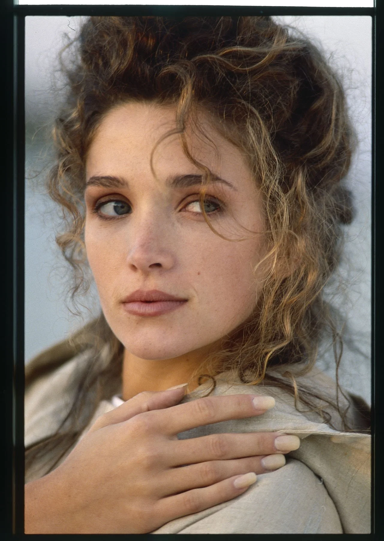
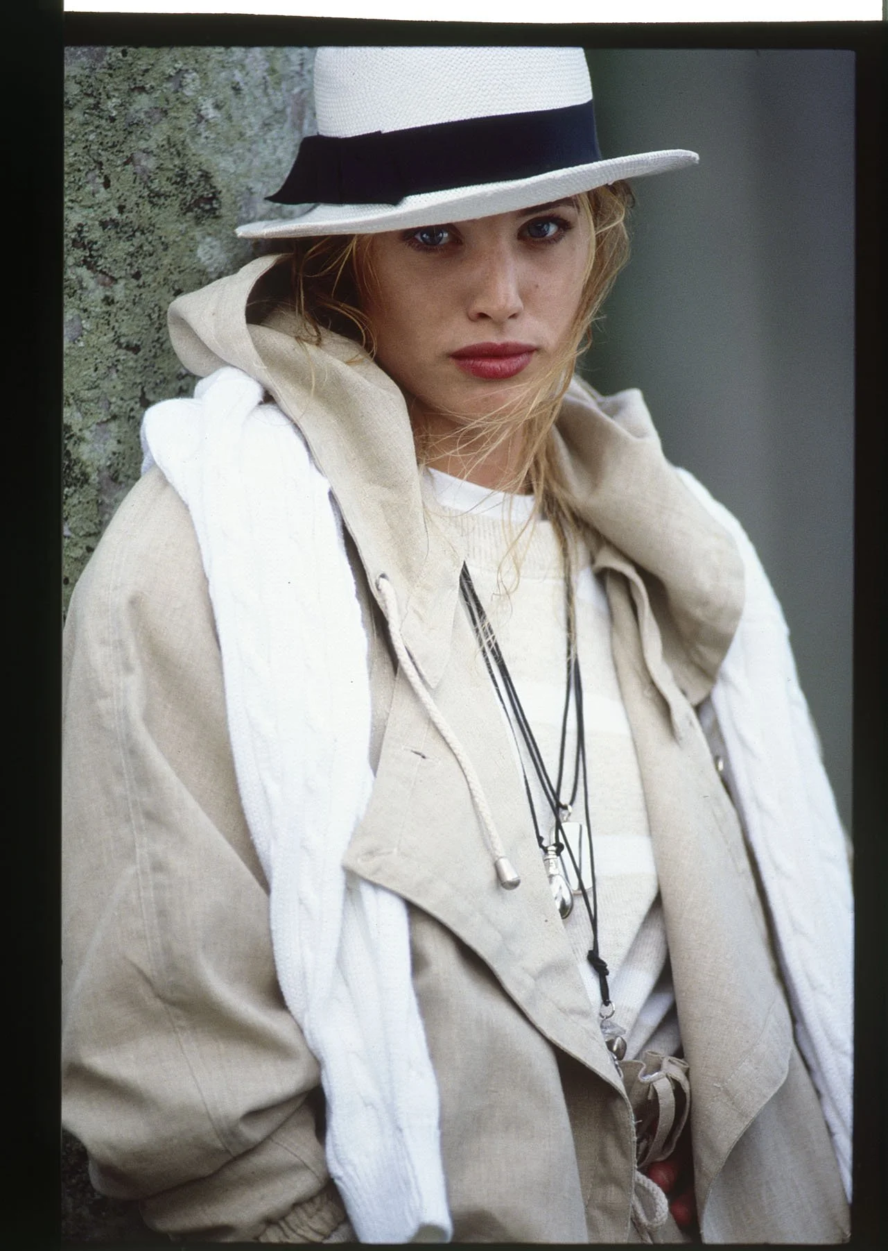
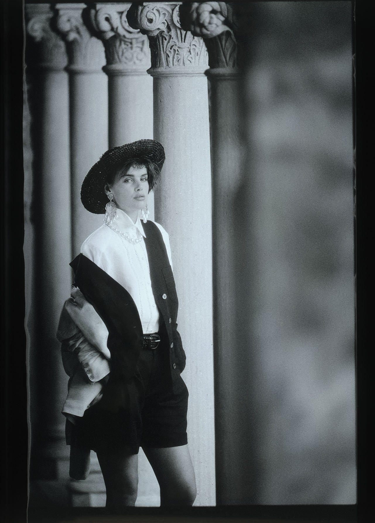
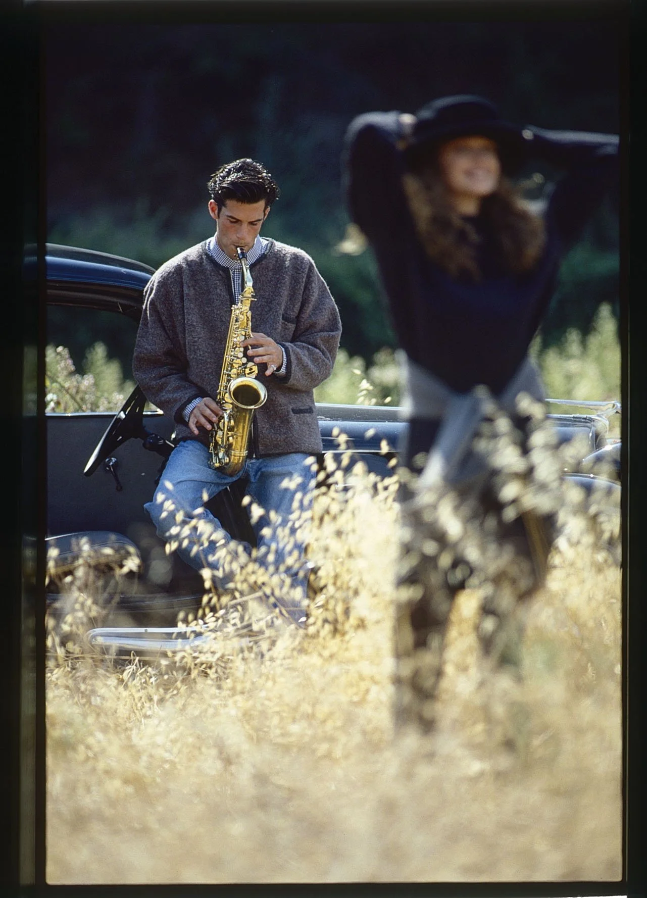
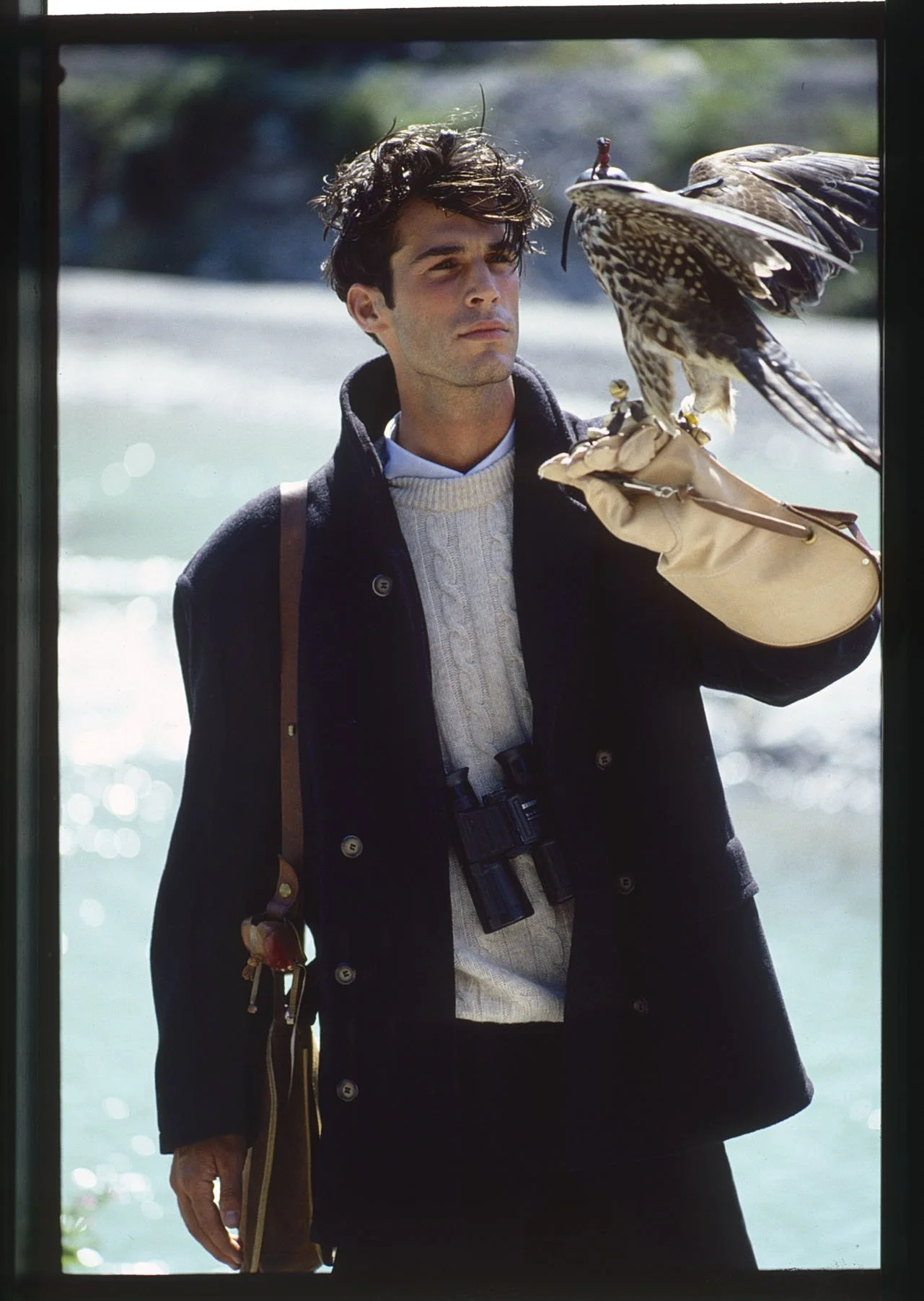
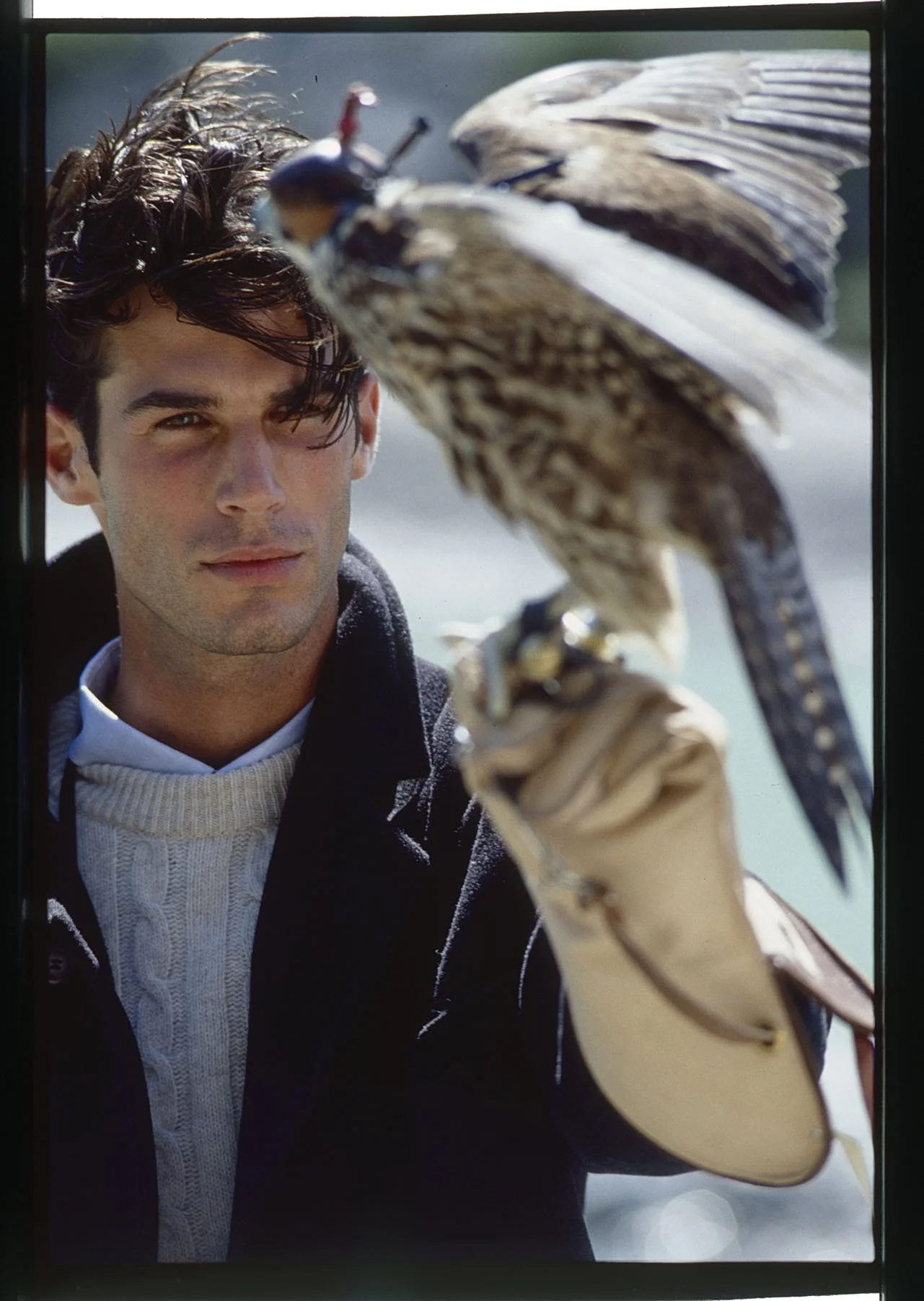
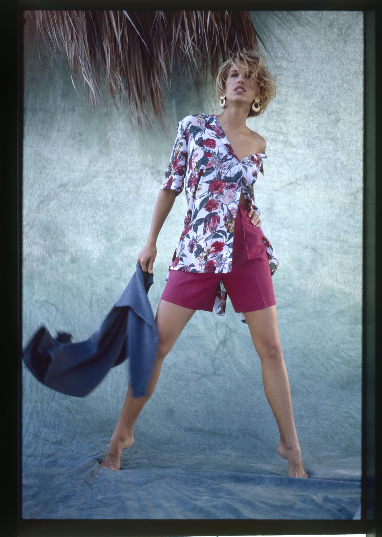
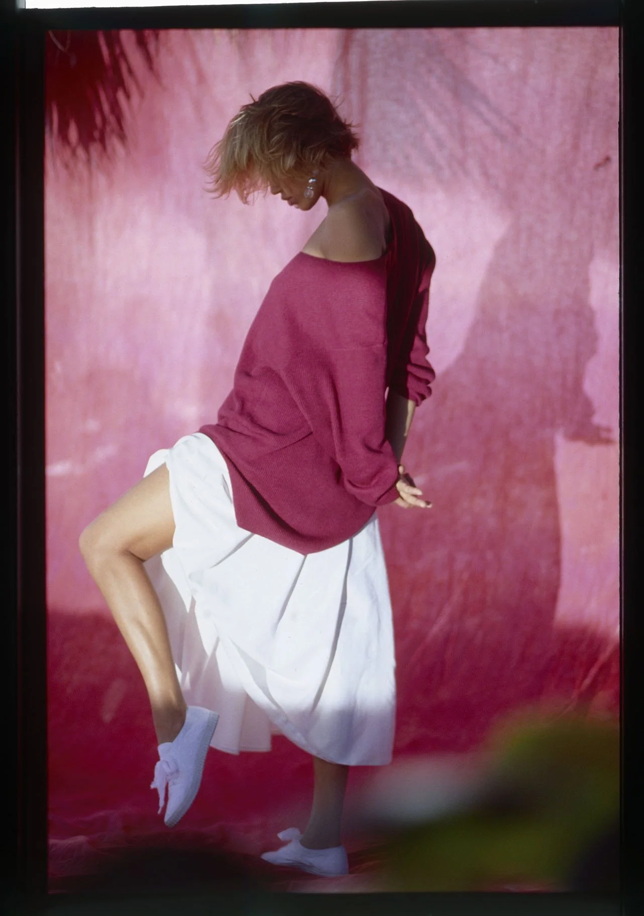
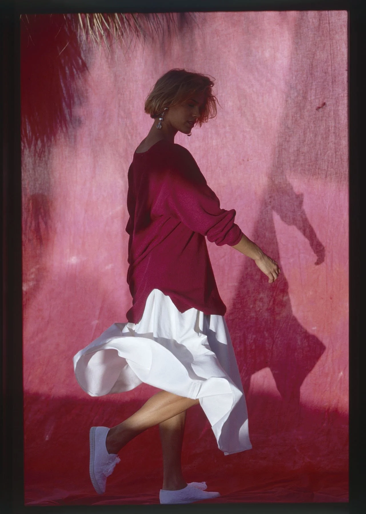
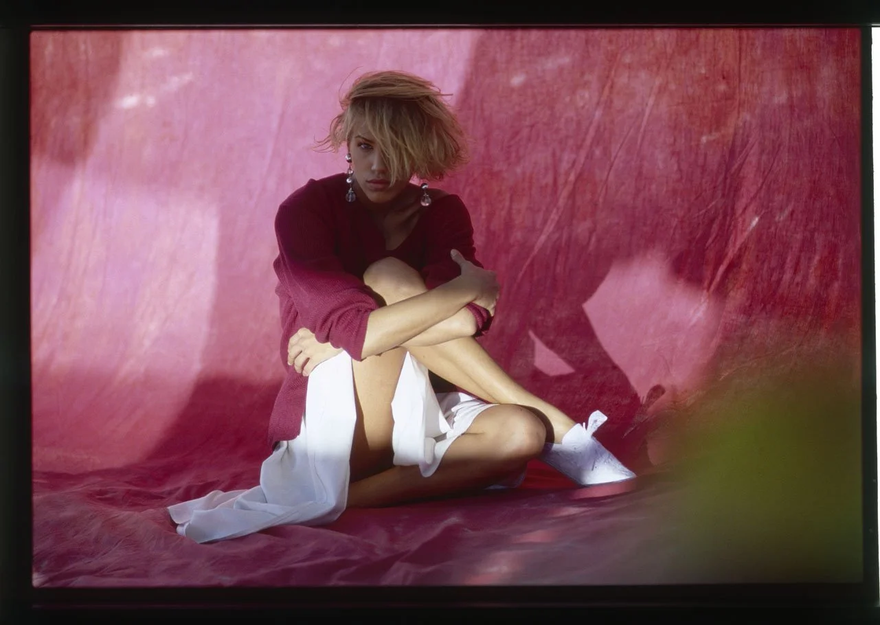
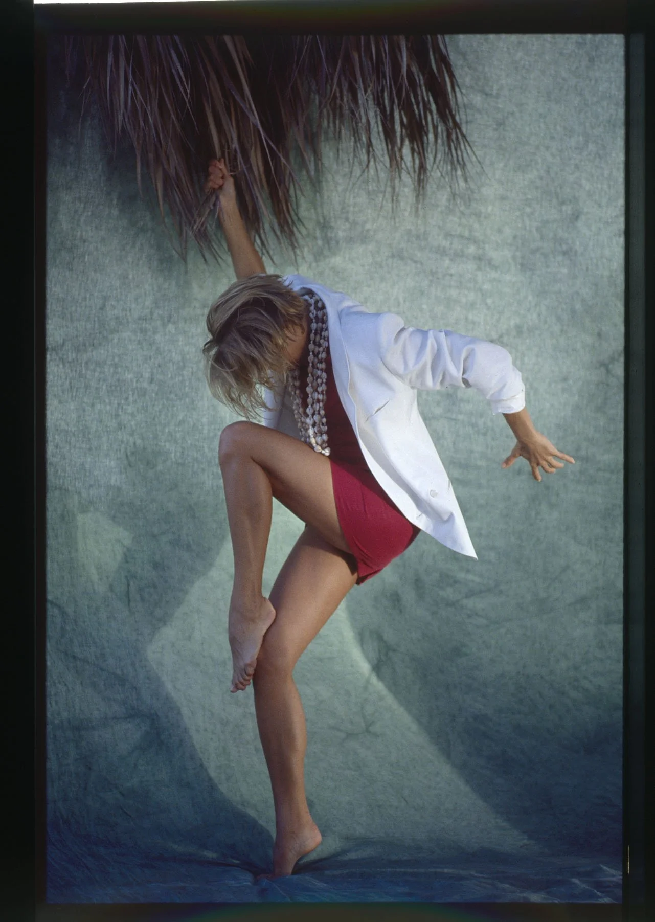
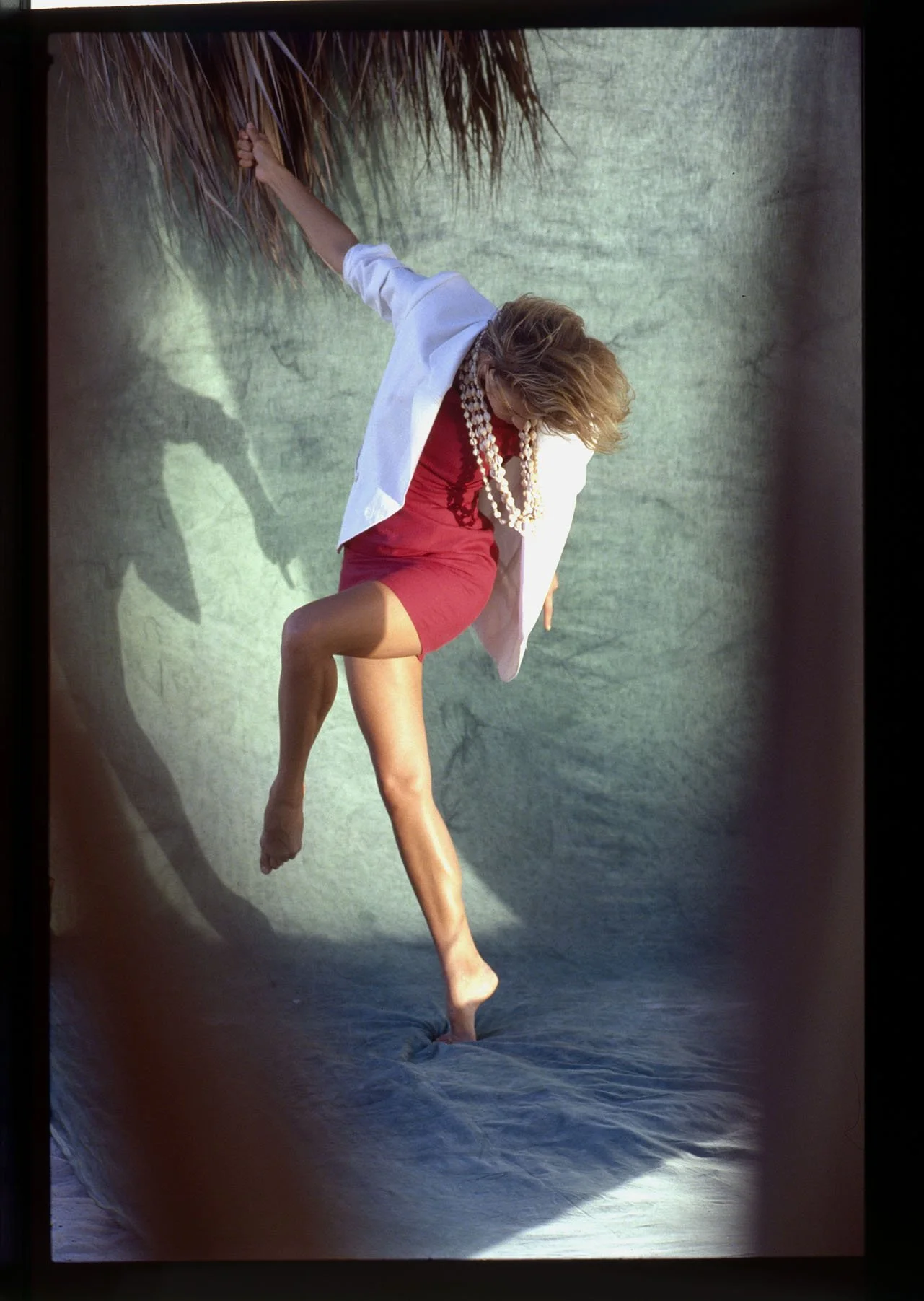
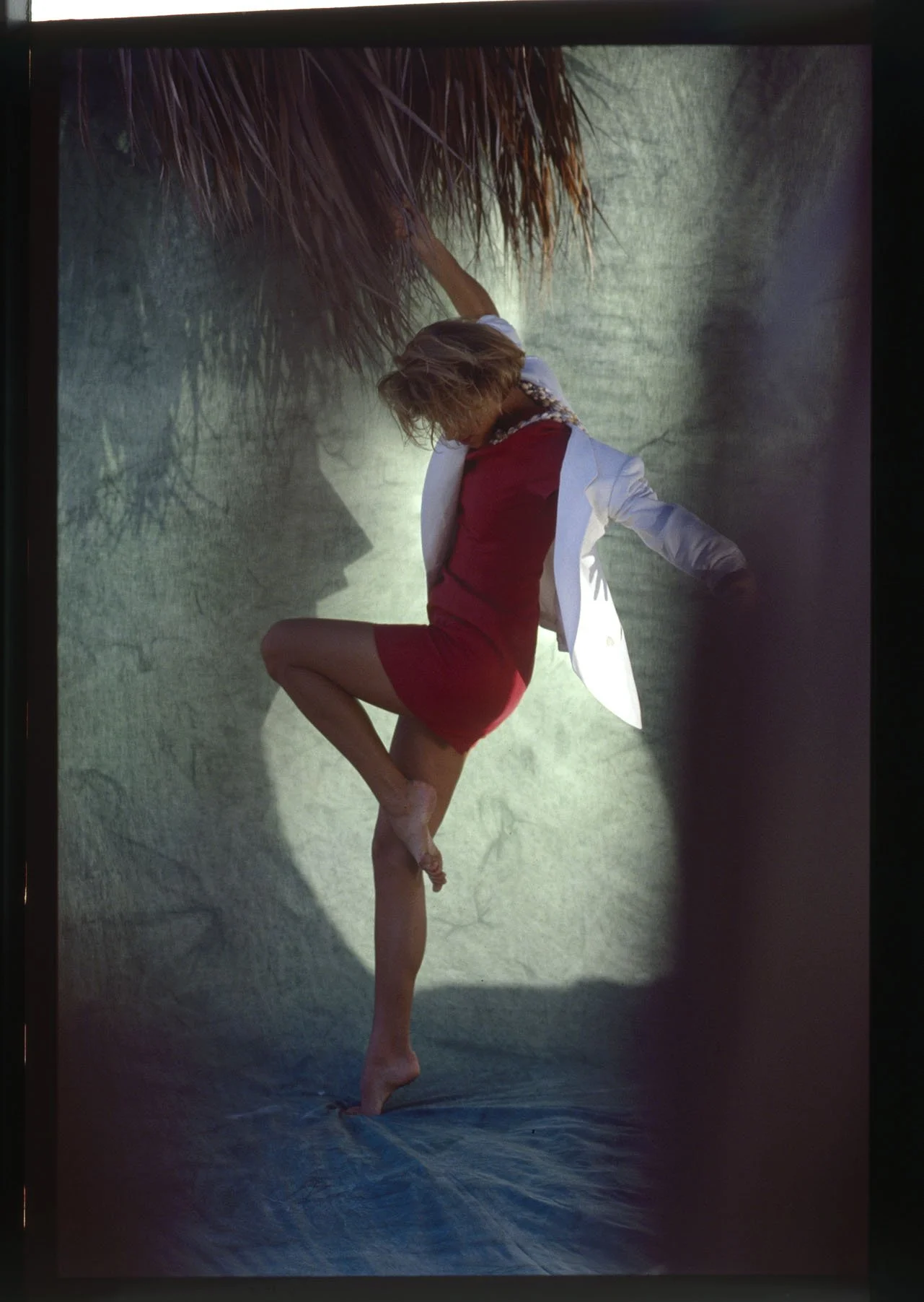
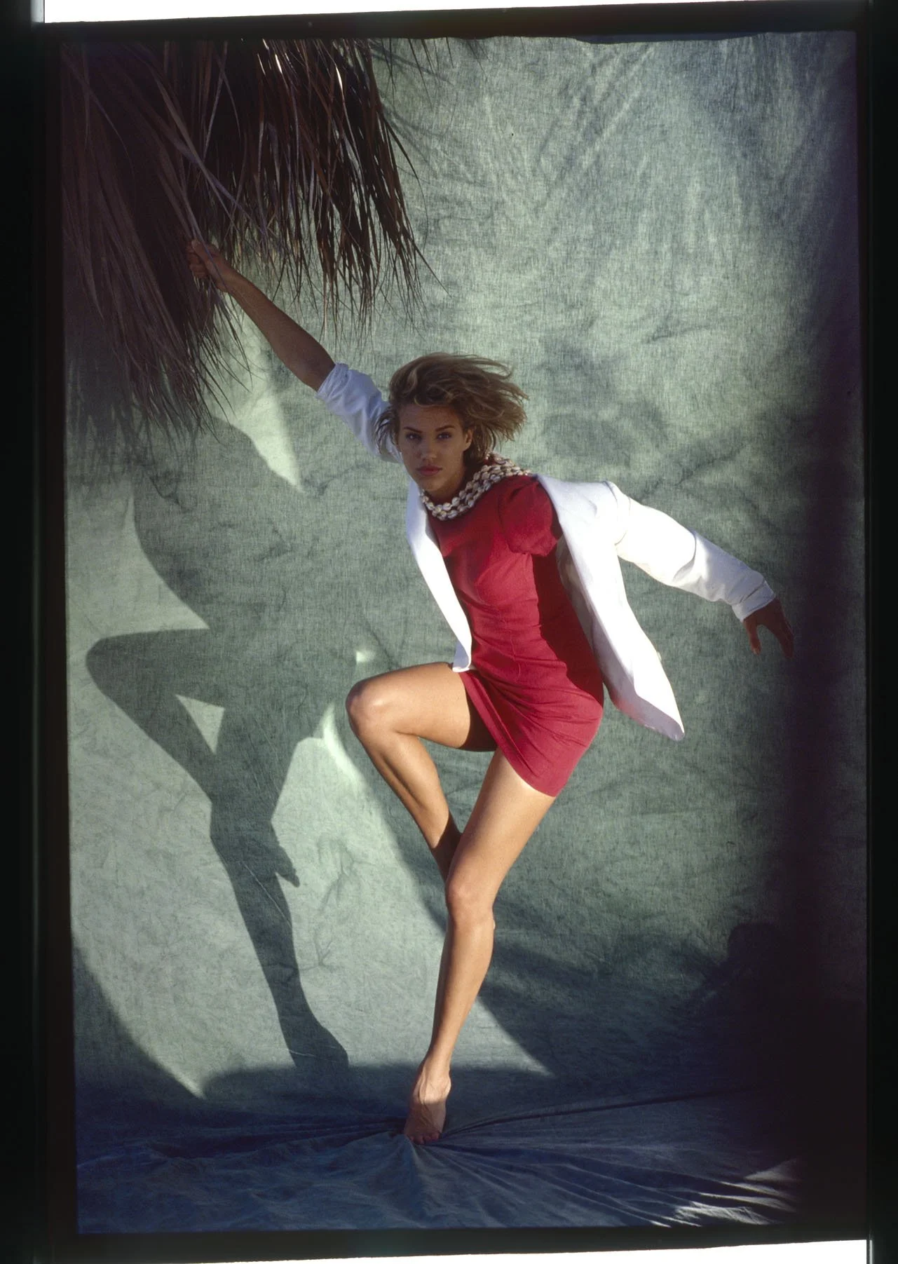
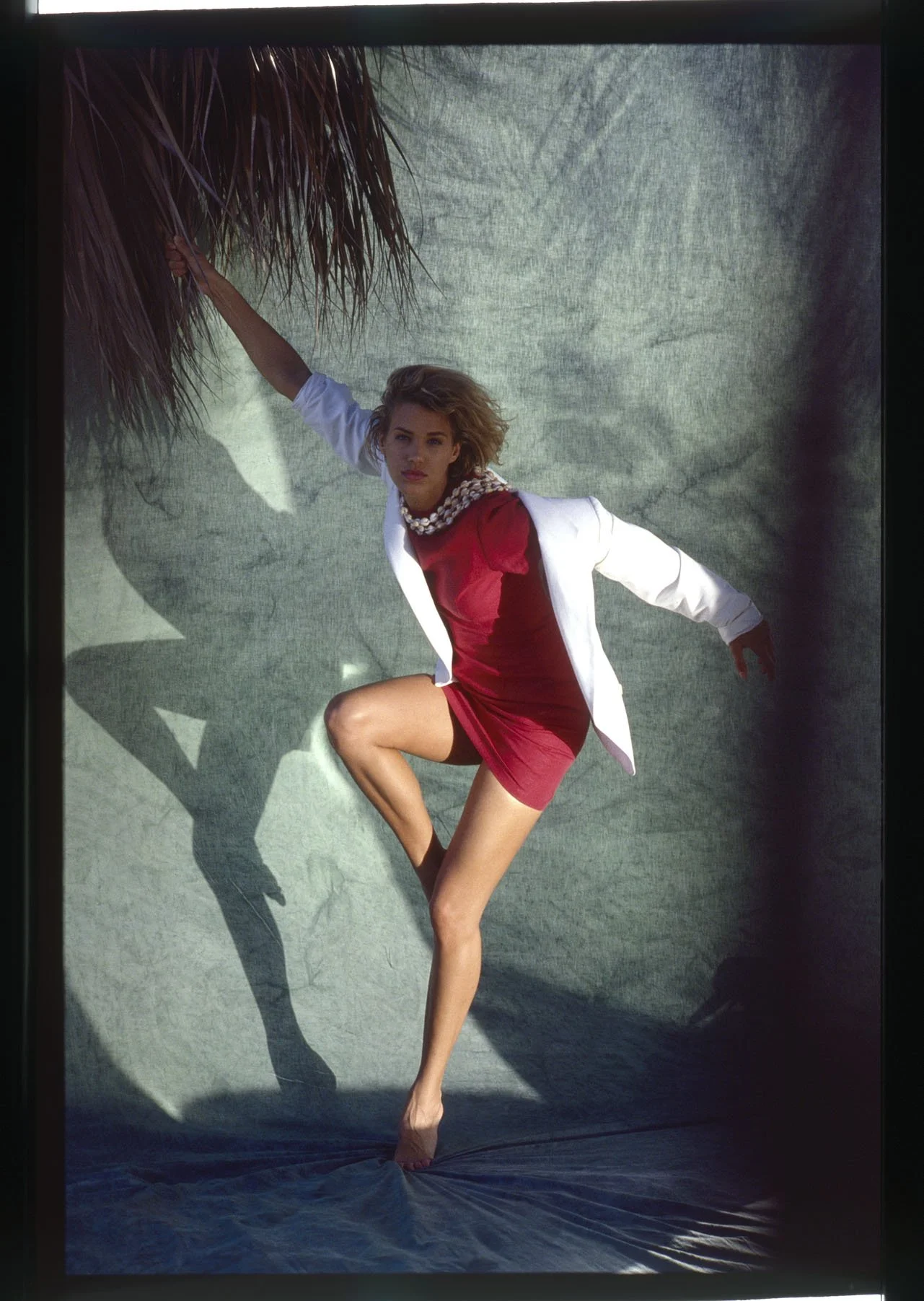
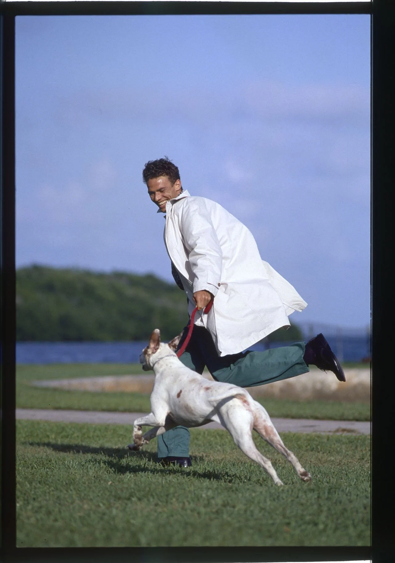
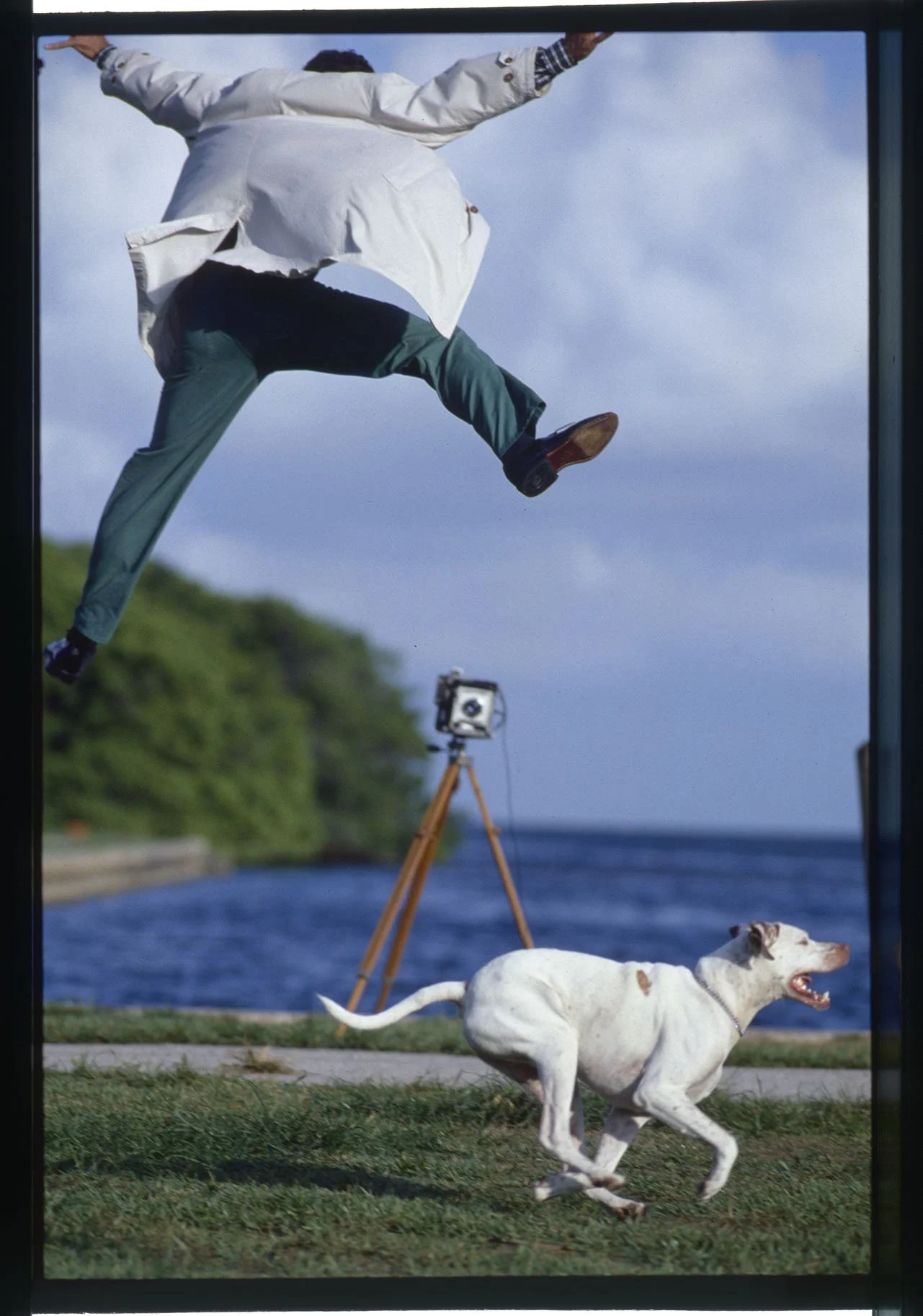
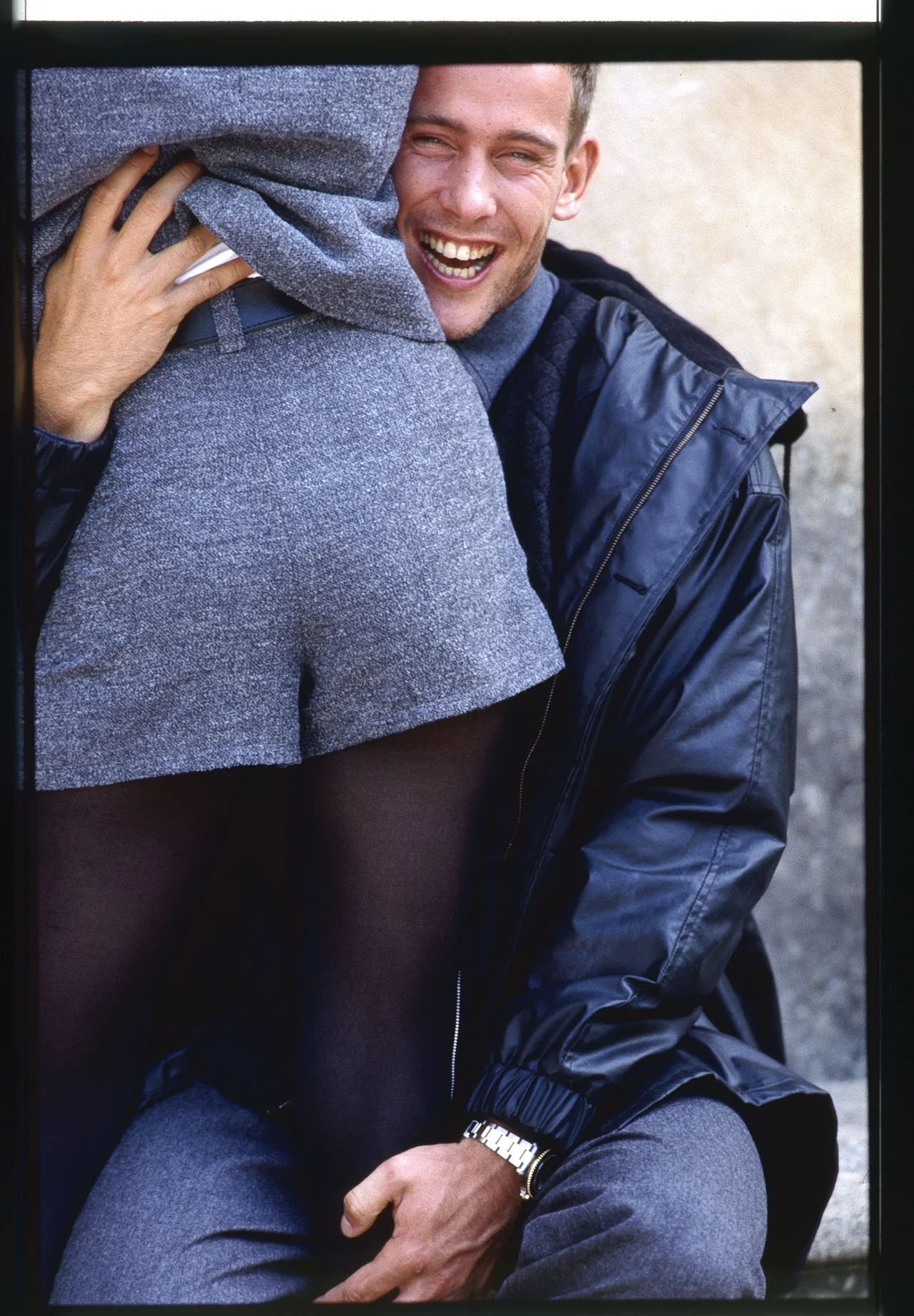
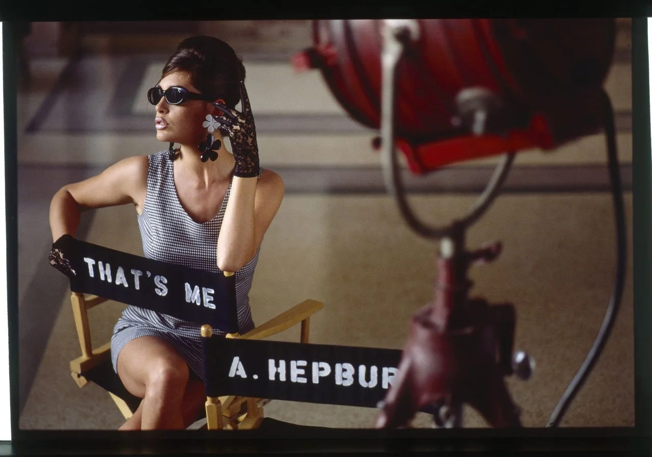
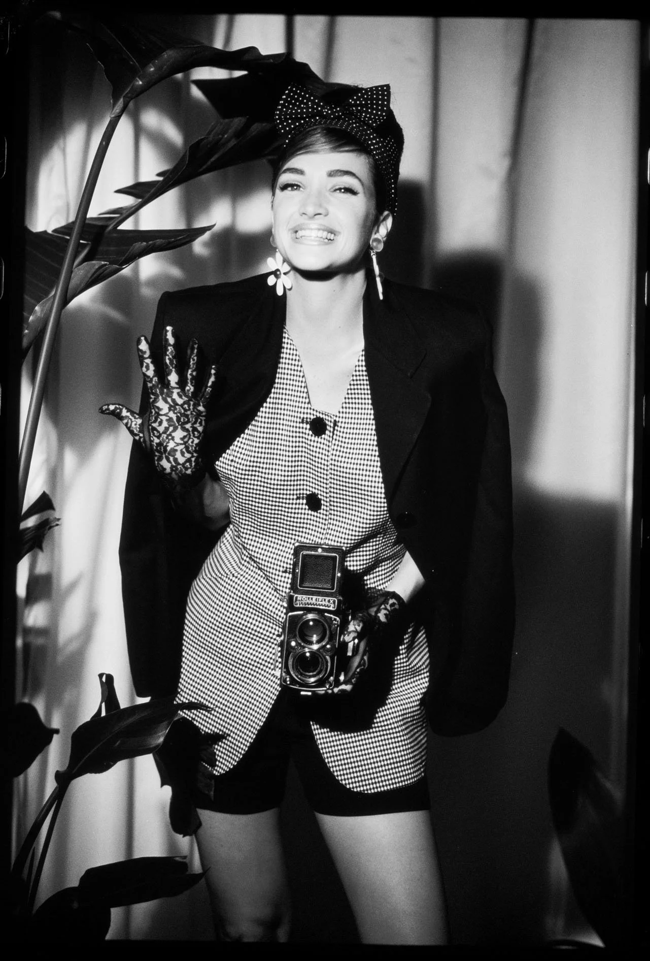
In the 1980s, a general shift in values within German society led the average citizen to spend increasingly less money on clothing. Naturally, this trend did not leave the textile retail sector unscathed. Faced with this crisis, Hettlage—a Münster-based company with a network of 40 department stores—sought to respond by establishing new fashion labels and retail outlets. Ulrich Pracht was invited to participate in a pitch for a new subsidiary dedicated to youth fashion—comparable to contemporary brands like Zara and H&M—competing alongside major advertising agencies such as BBDO and Eggert with his own comparatively small creative team. During a photo shoot in Miami, conducted under the motto "Take the situation!", a series of spectacular images emerged—shots brimming with verve and dynamism, in which the models were already sporting pieces from the new collection. As Ulrich Pracht and his Art Director reviewed the results, the sheer joie de vivre and self-confidence exuded by the models sparked a brilliant idea: the branding concept "That’s Me," followed shortly thereafter by the slogan "I love life!" In their presentation, they articulated that young women of this generation embodied a positive outlook on life—an attitude that was also reflected in their fashion choices: "What I like is fashion. My fashion. That’s me!" Applied to the new enterprise, this translated to: "We turn fashion into an experience. For ourselves and for our customers. Because they are just like us—just like me. That’s me!" As the audience erupted in applause, Ulrich Pracht knew: once again, driven by his powerfully pulsating creative streak and an artistic concept that clearly demonstrated his keen instinct for commercial viability, he had swept the industry’s major players off the field. Firmly rooted in the long tradition of artists whose affluent clientele secures their livelihood, he skillfully leverages his personal talents—qualities that set him apart from the "bureaucrats of the creative industry"—to "paint" his beautiful images with a camera and, in doing so, earn a living. In stark contrast to the shock advertising published by companies like Benetton during that era, the refined spirit Ulrich Pracht seeks out the aesthetic moment, aiming to cast the world in a better light—if only for that fleeting instant. This approach appeals not only to his corporate clients but also to the customers of "That’s Me." Whether capturing staged moments or situations that unfold by chance, the photographer immortalizes themes of freedom and independence, youth and femininity. One of the models featured in this campaign is the Argentine Valeria Mazza, who embodies a type similar to that of Claudia Schiffer. Through their sheer variety, these moments convey images of the lifestyle and glamour of a positive society—one with which young people can identify and which they can actively help to shape. This sense of independent, liberated living serves as the bridge to the core message: "With Young Fashion from That’s Me, you belong."






















04.3
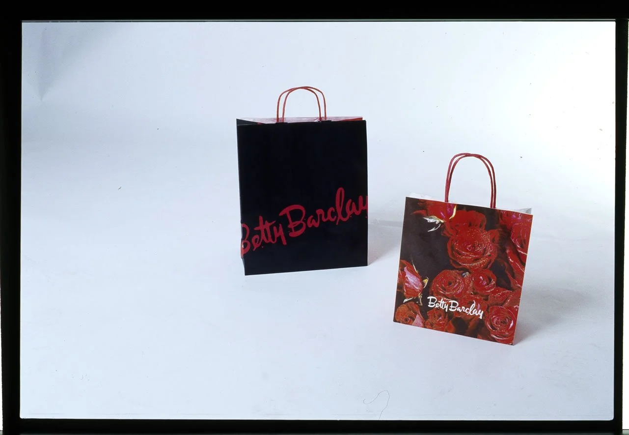
BETTY BARCLAY
INTIMATE MOMENTS of HAPPINESS
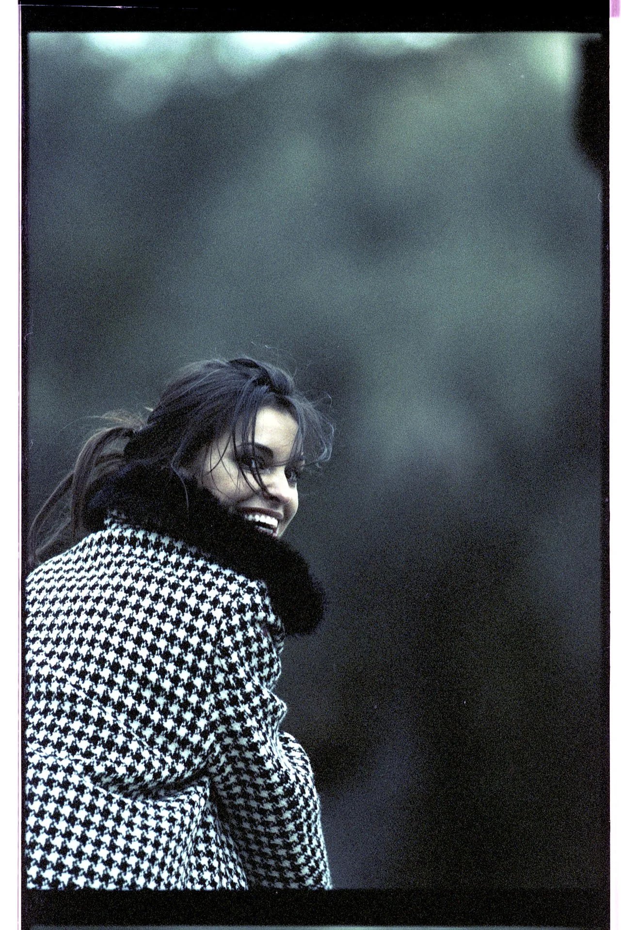
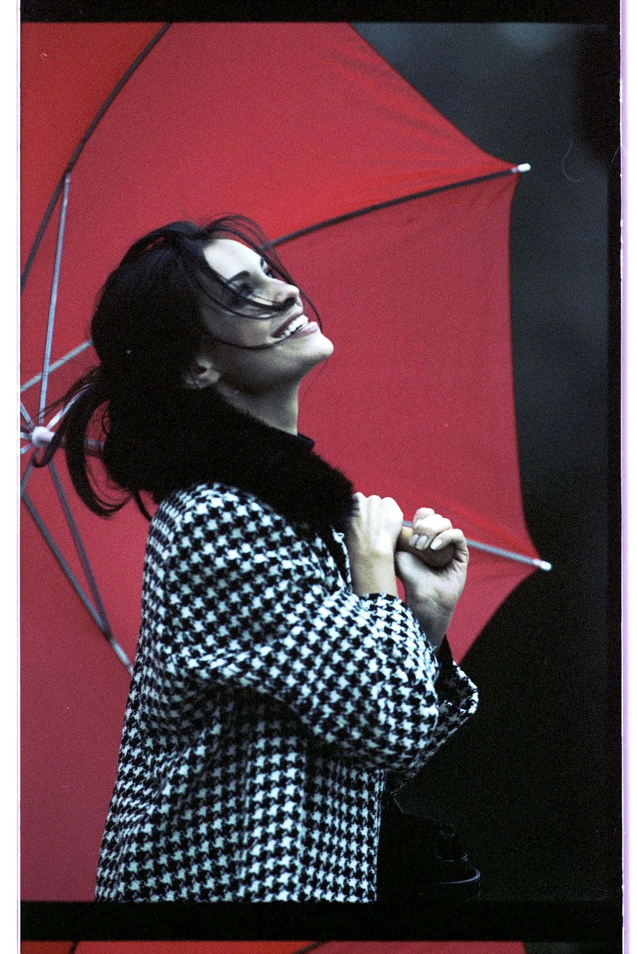
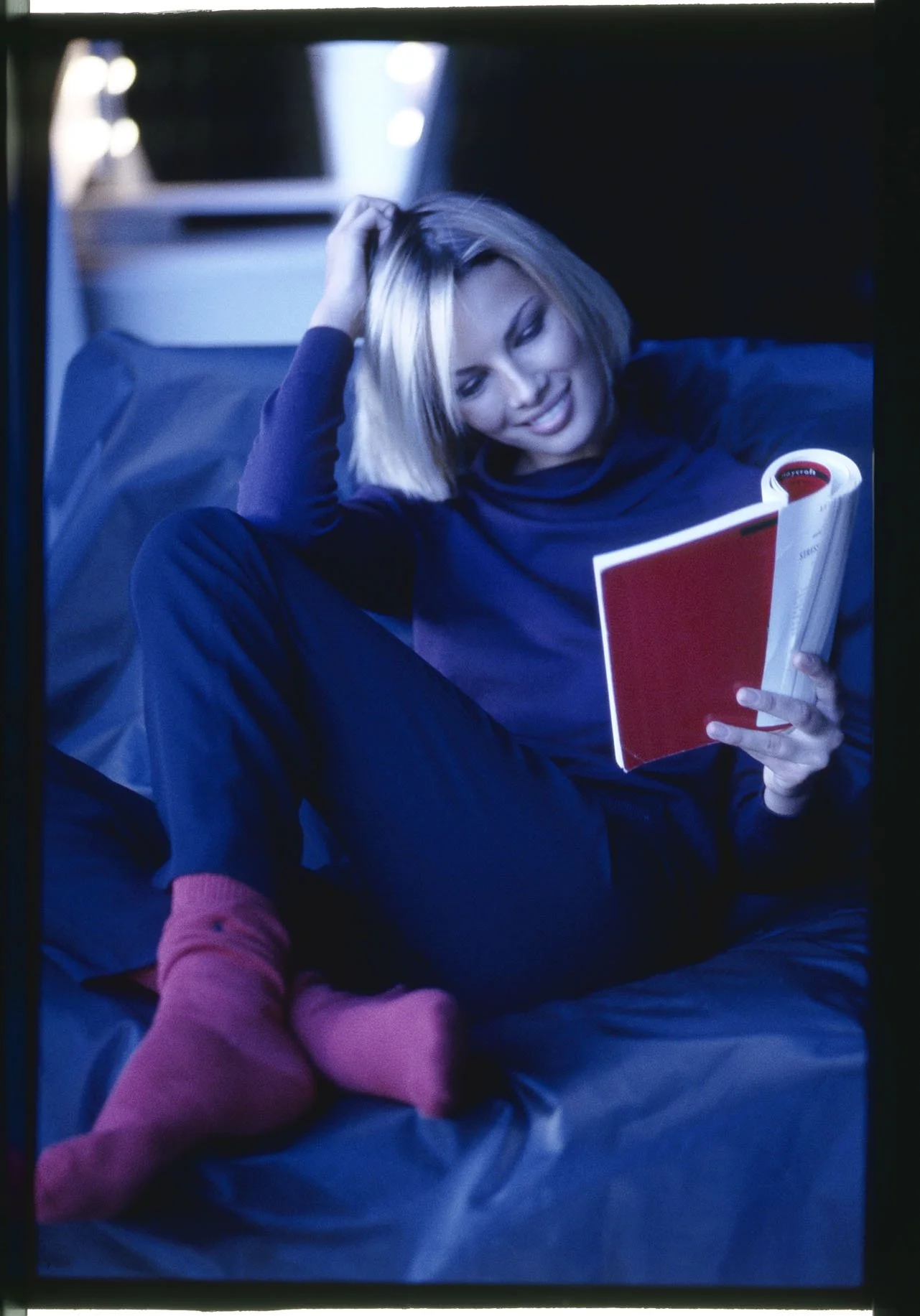
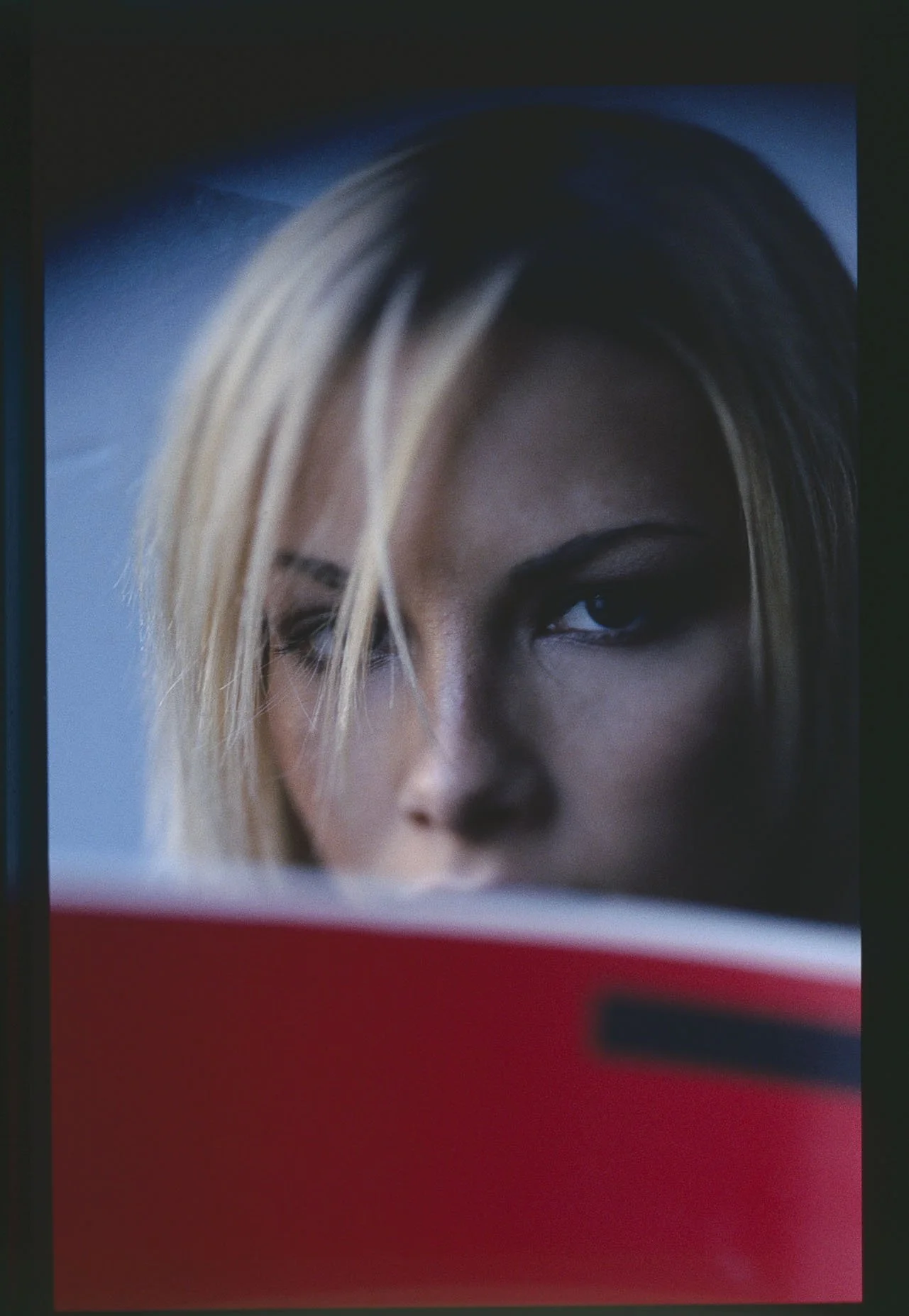
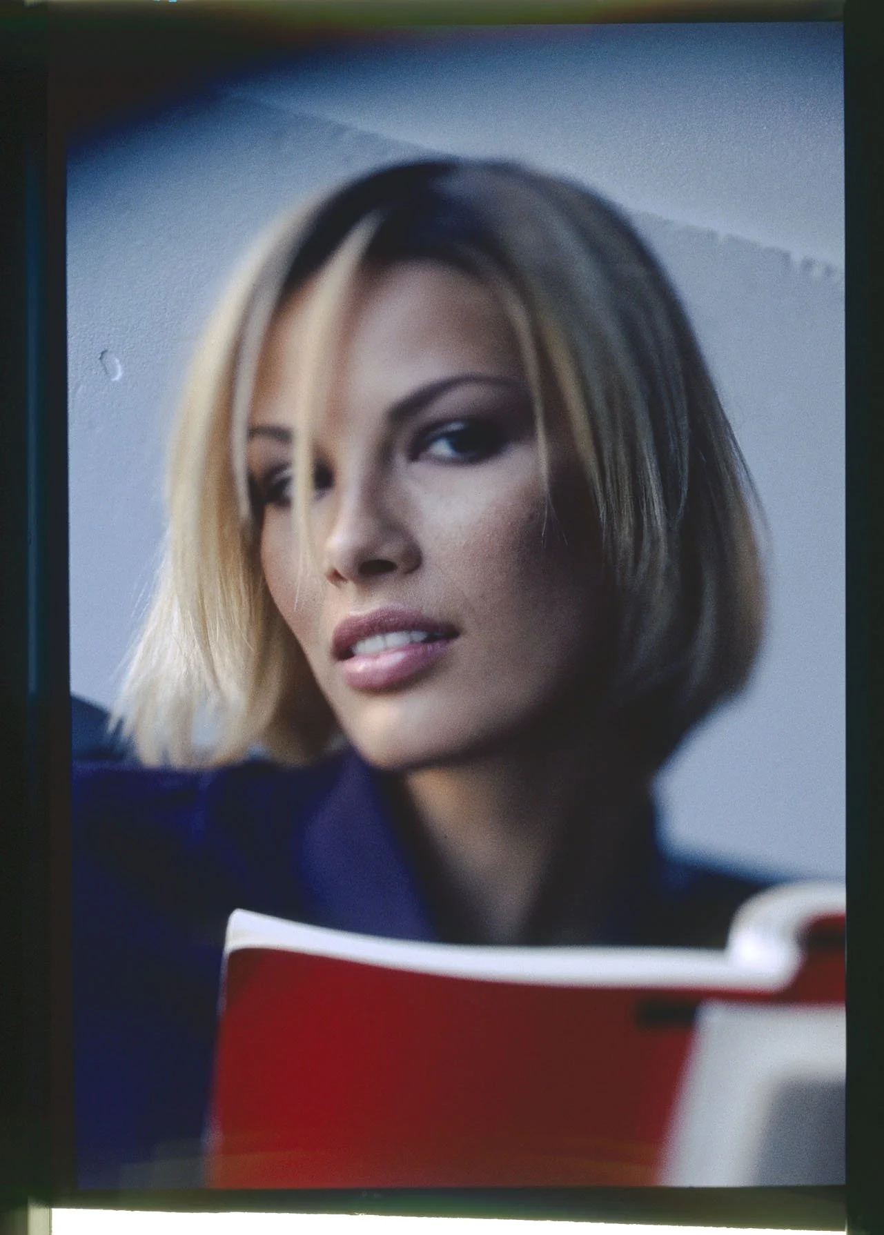
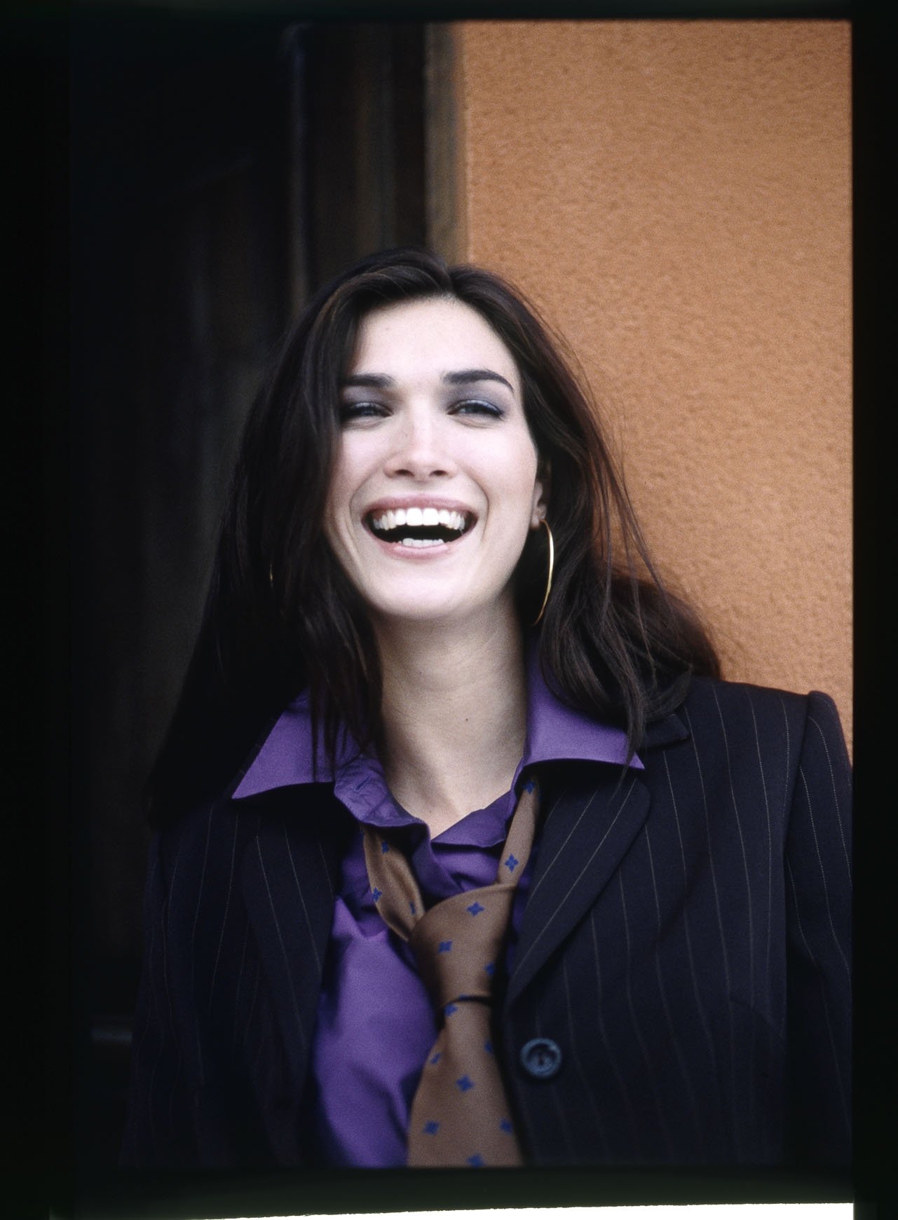
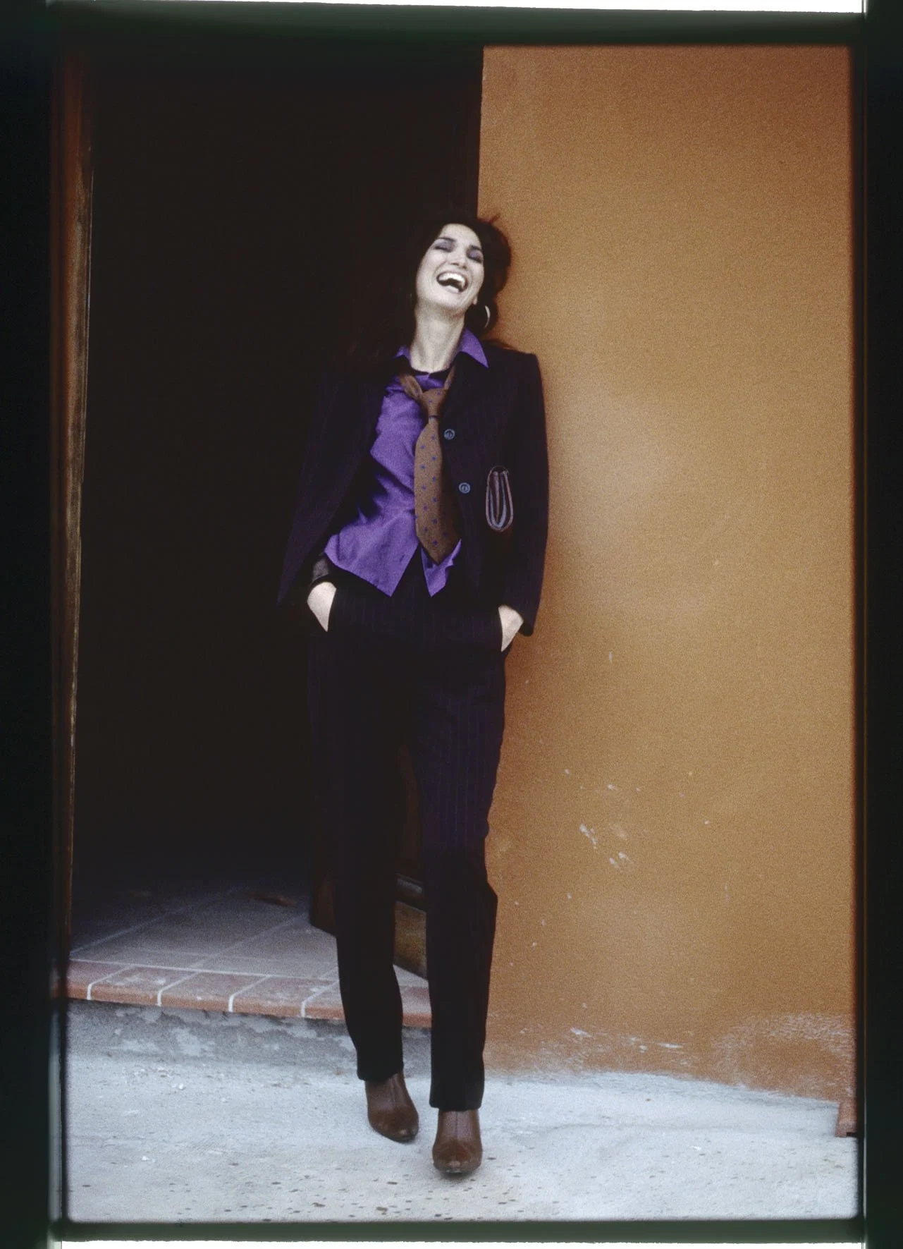
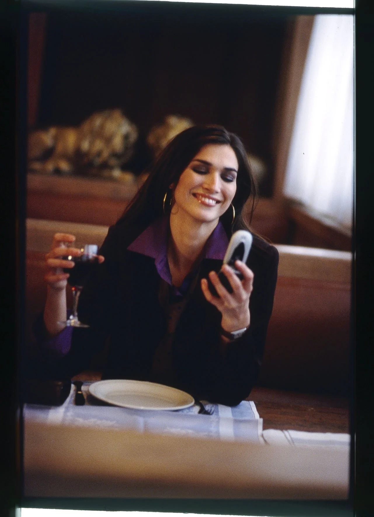
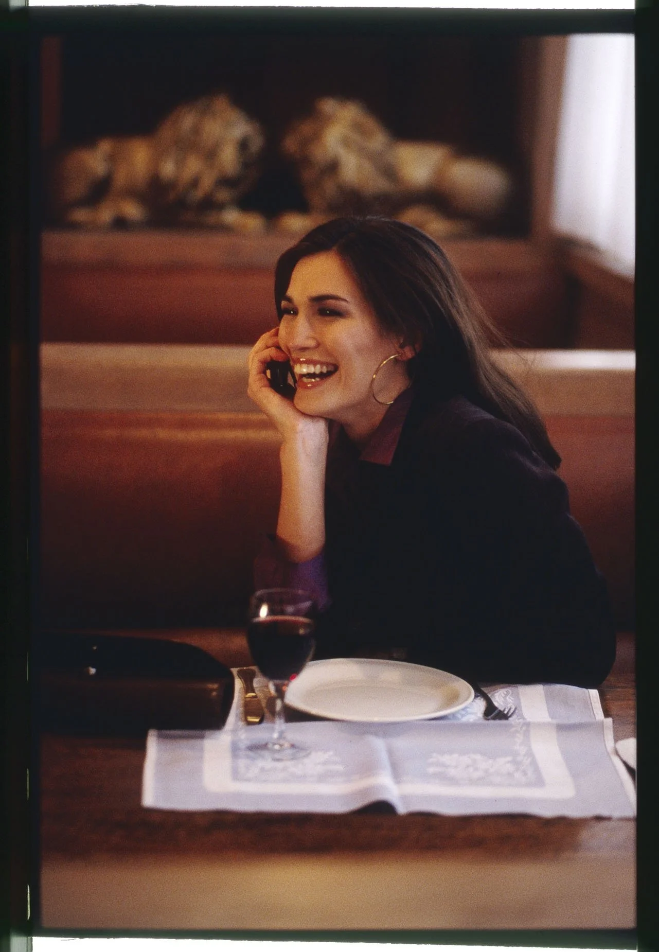
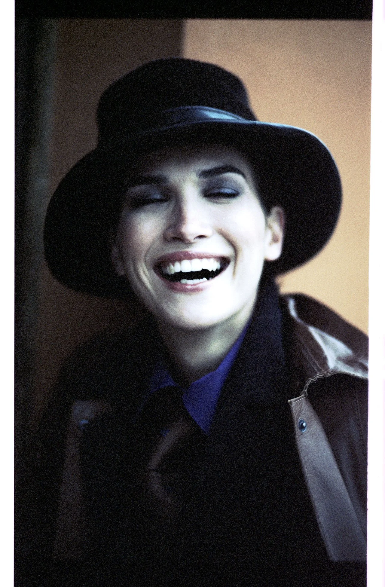
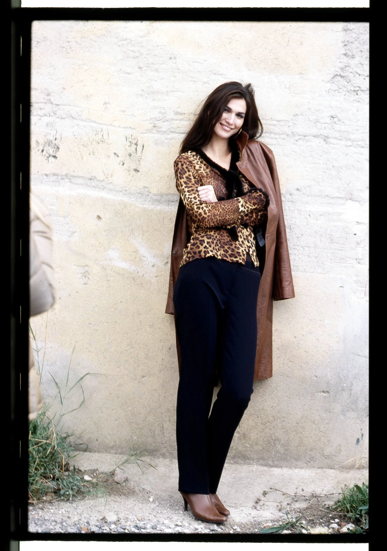
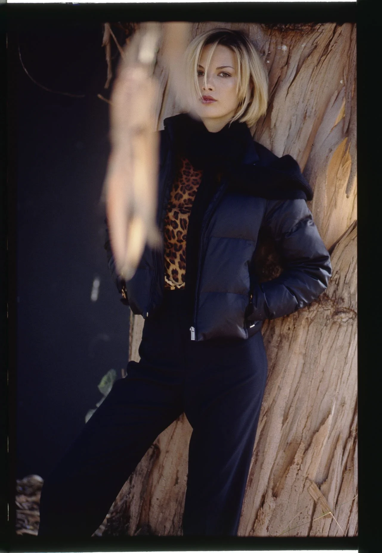
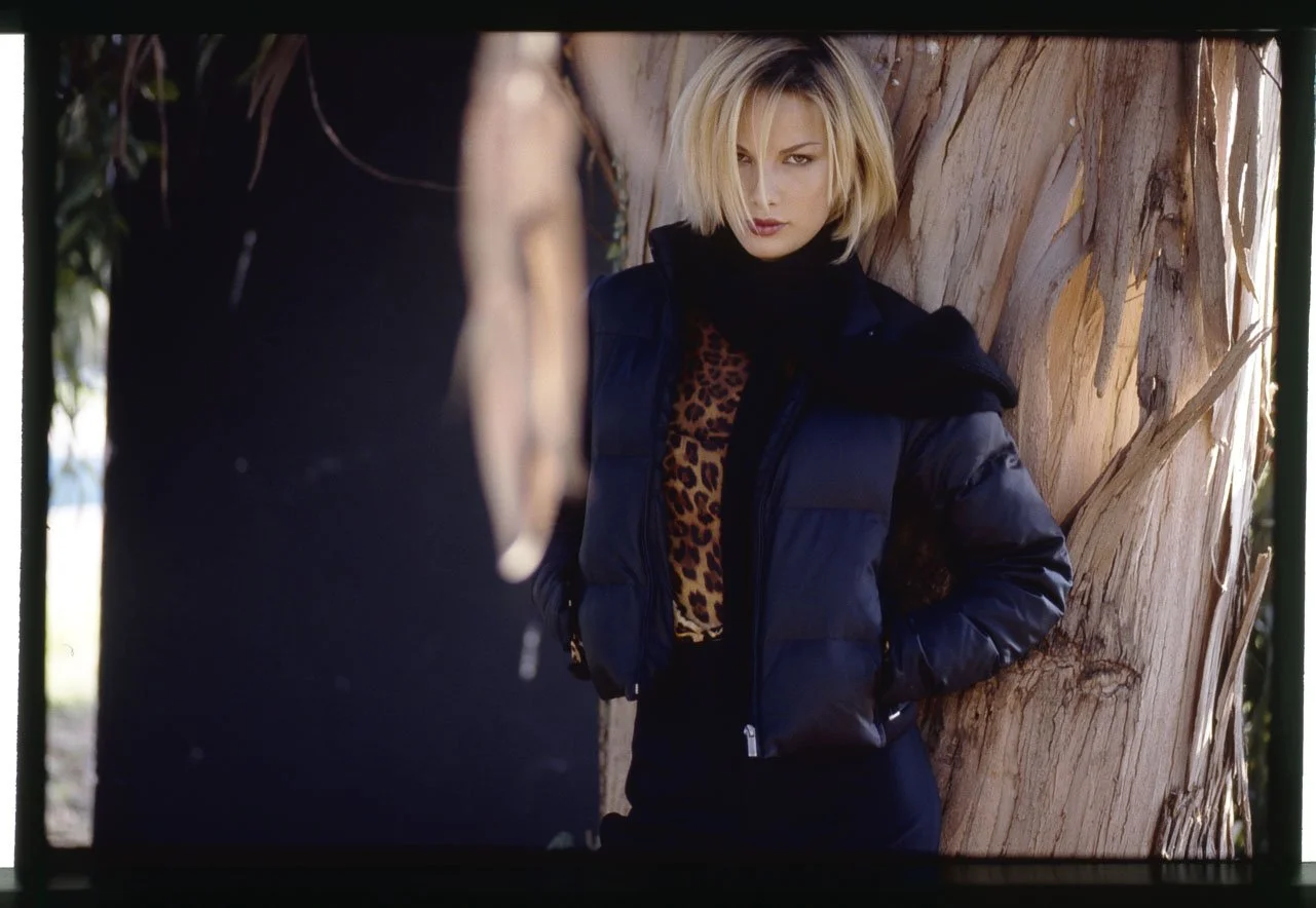
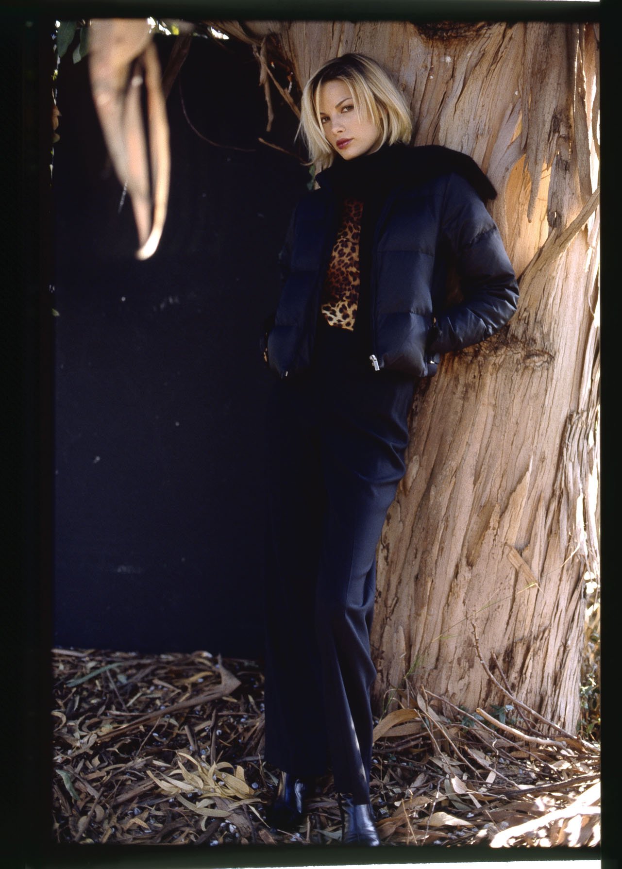
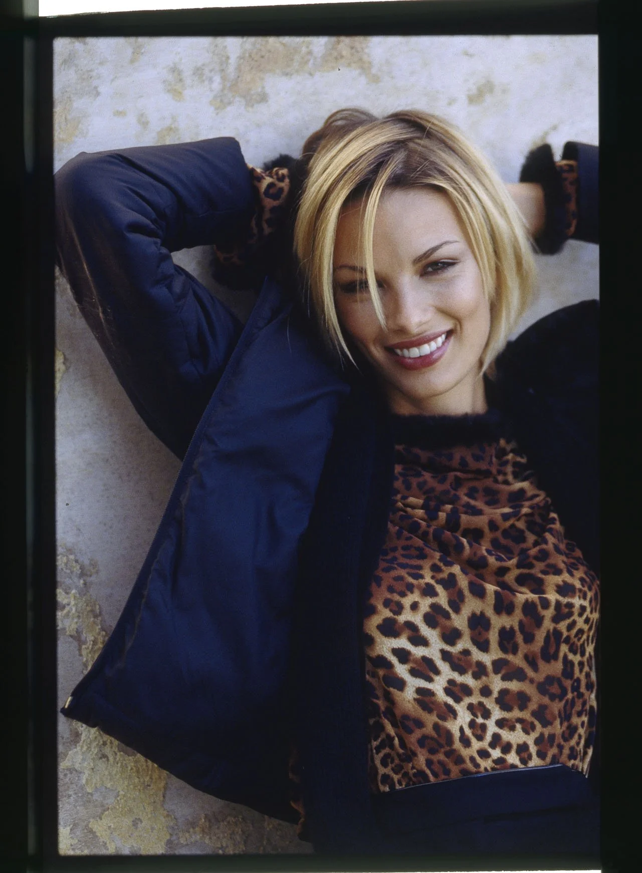
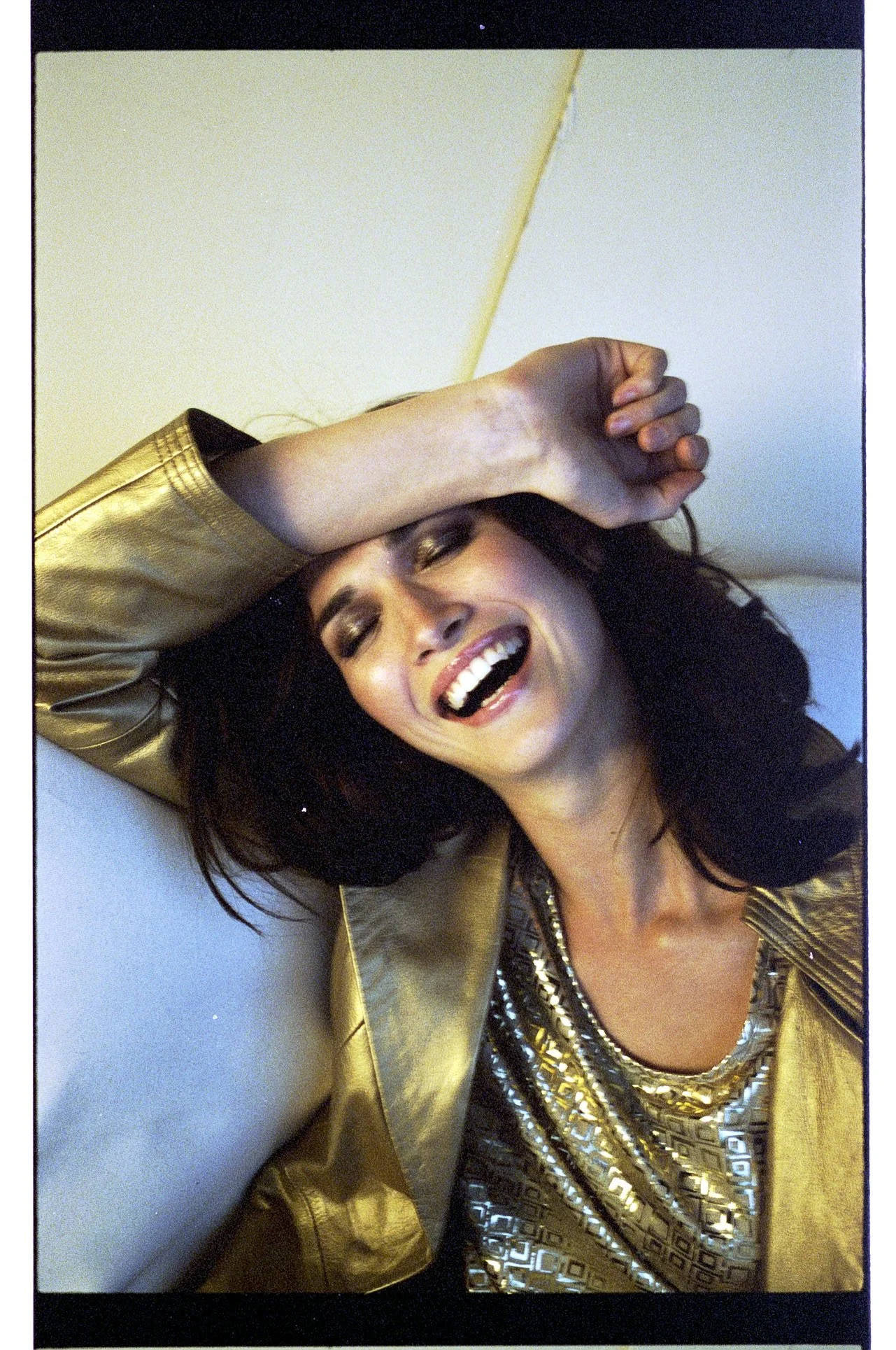
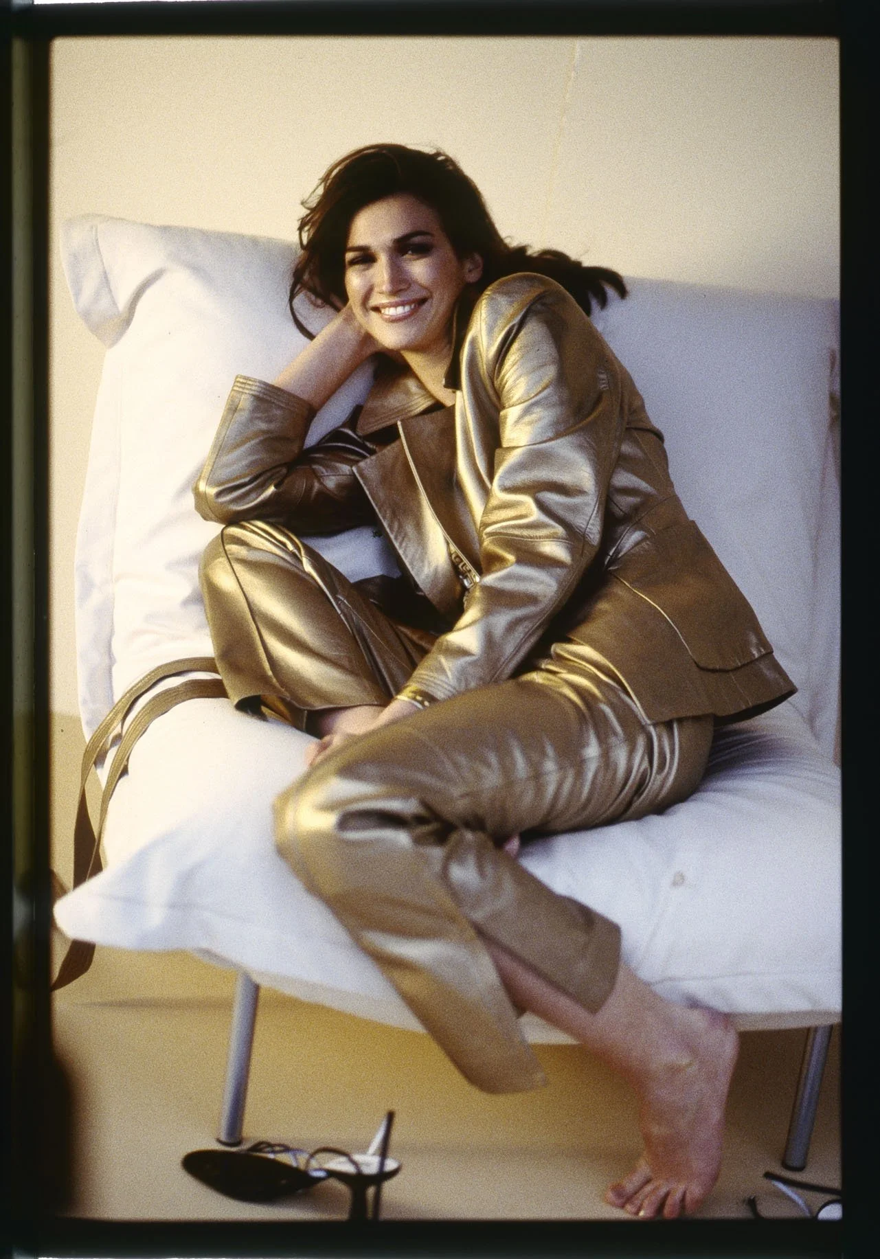
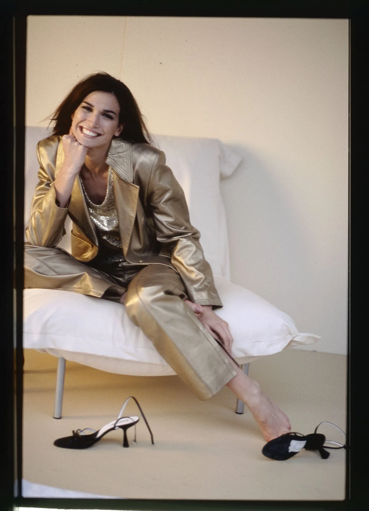
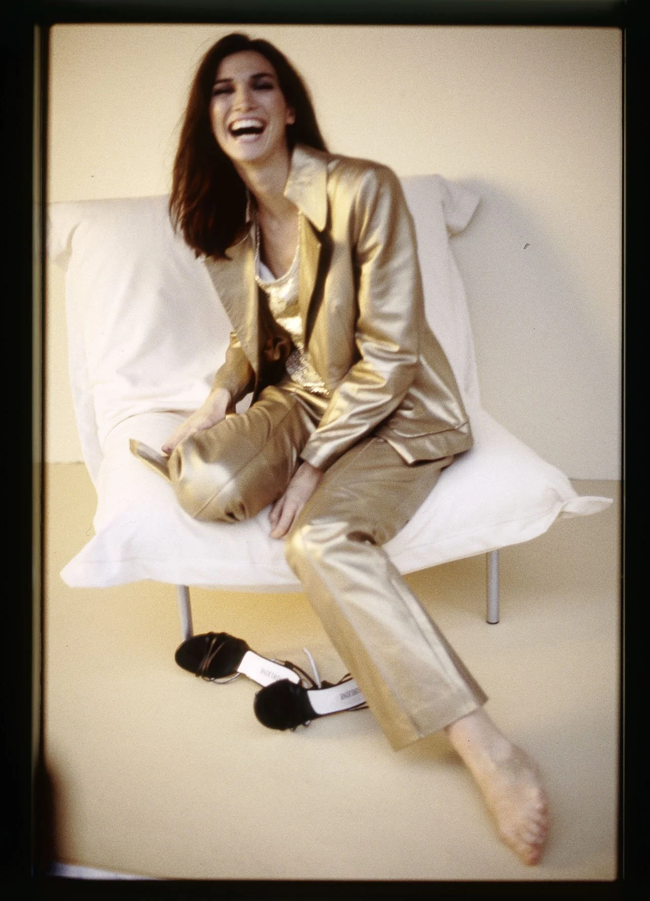
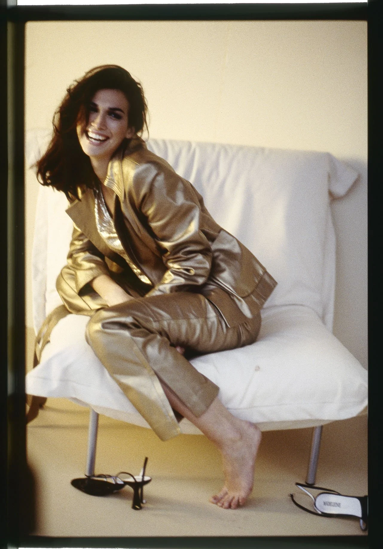
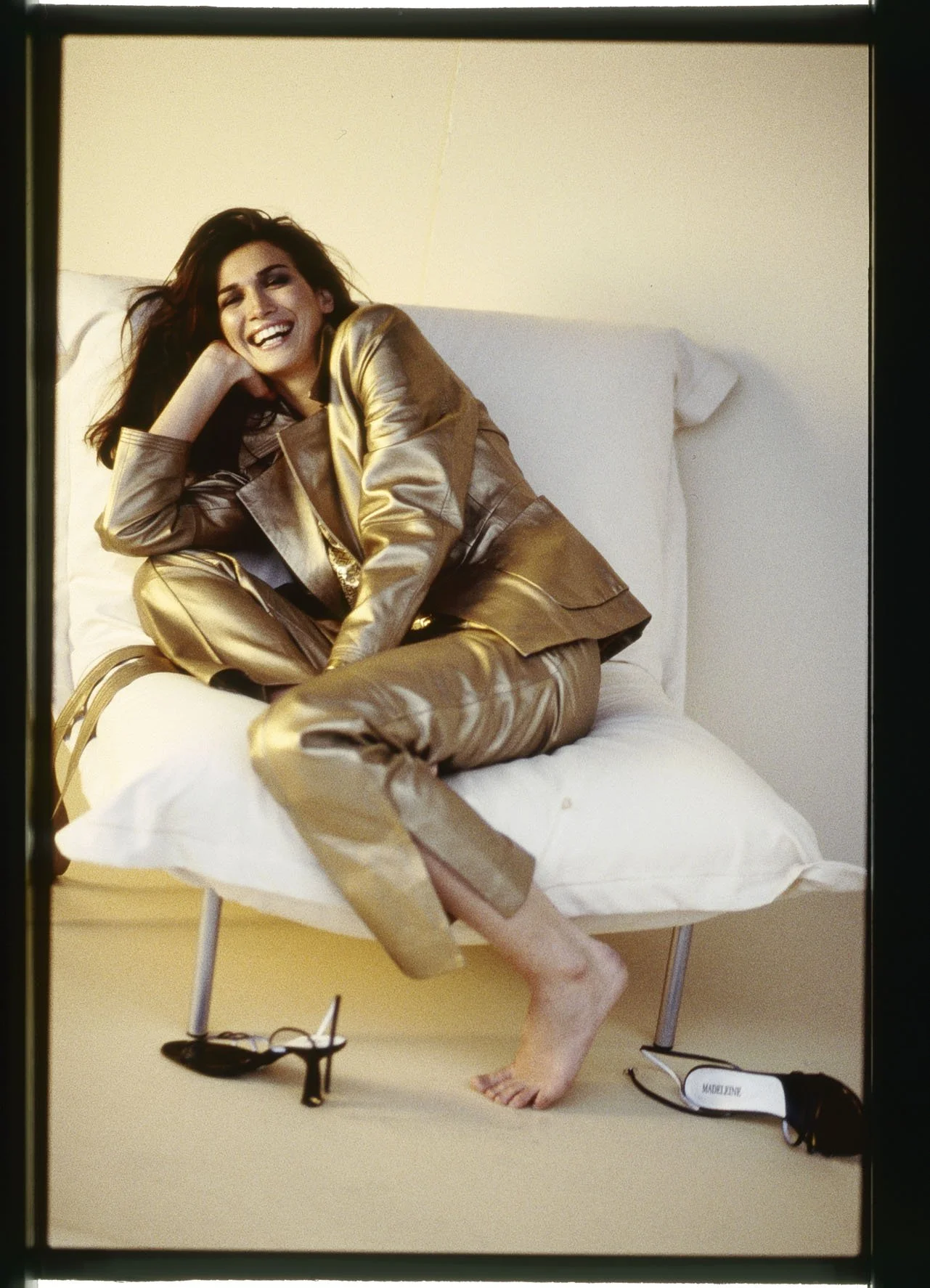
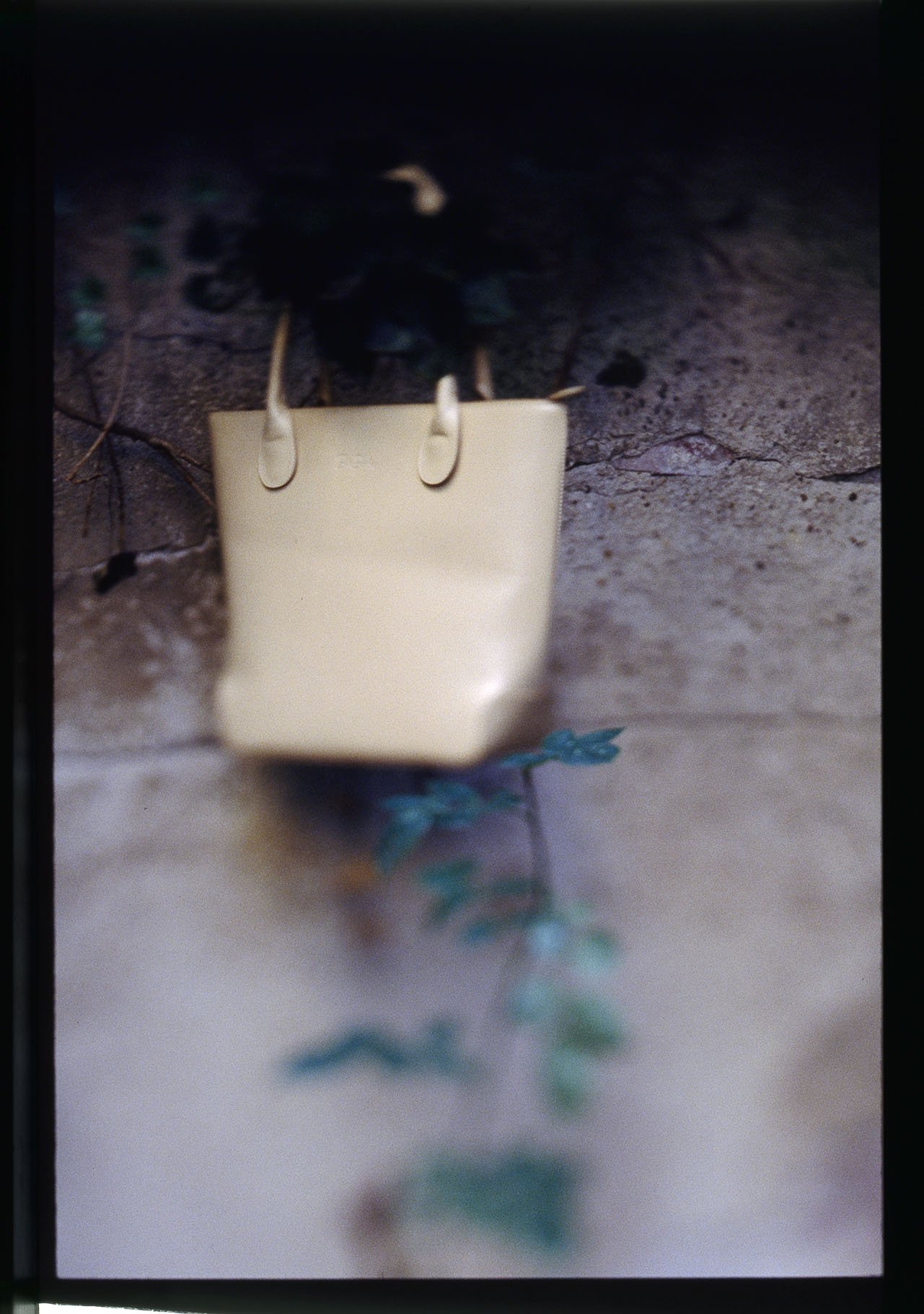
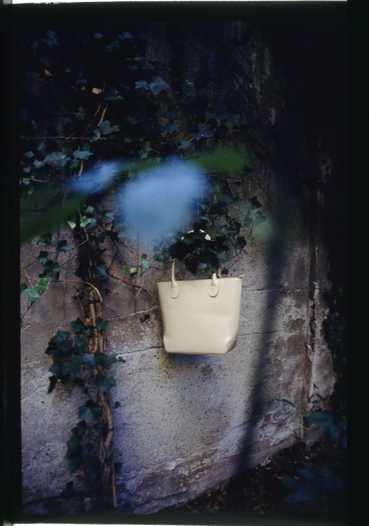
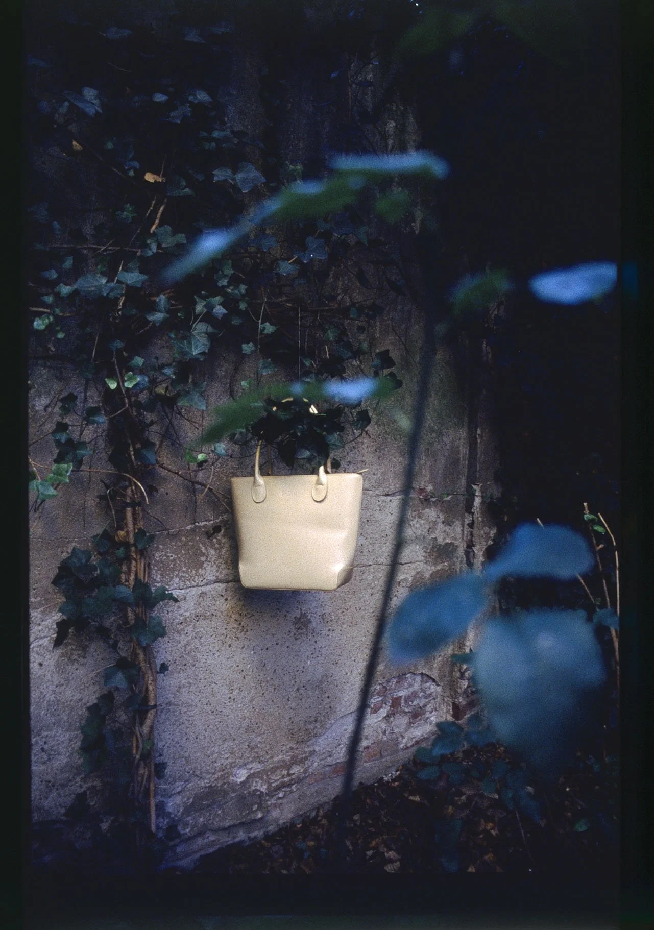
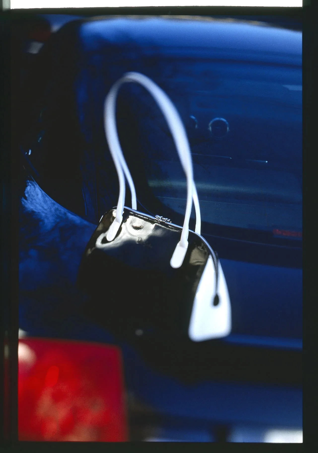
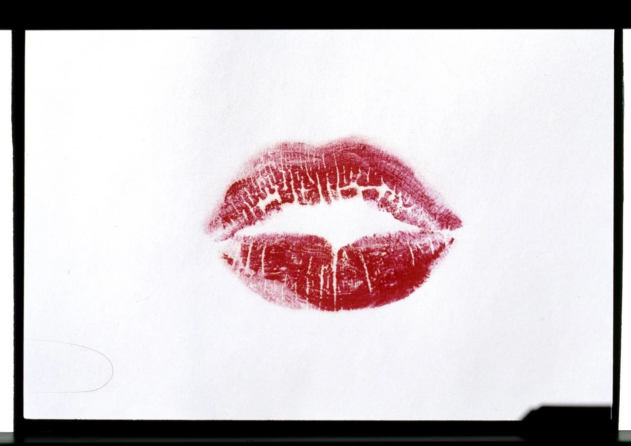
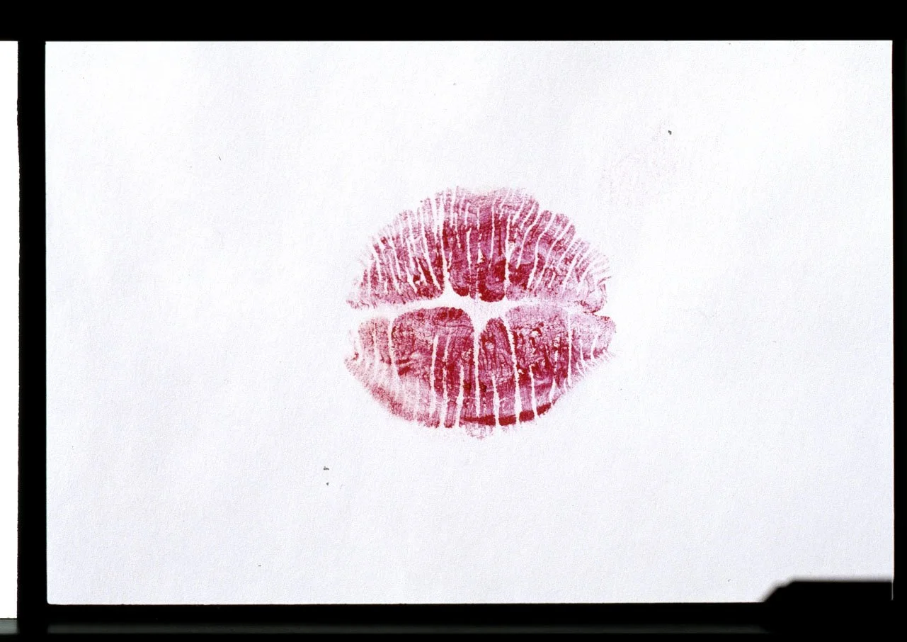
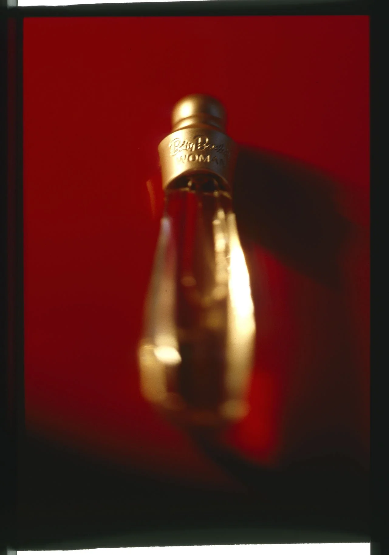
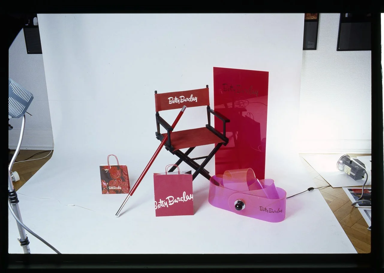
Since its "invention" in the 1910s by Condé Montrose Nast—the Vogue publisher who paved the way for his lifestyle magazine’s triumph through staged images by Baron Adolphe de Meyer—fashion photography, as an artistic genre, has continually discovered new creative avenues. It has found ways to stage just three elements—fashion, model, and location—within the context of the prevailing Zeitgeist, thereby becoming a defining stylistic force for each successive generation. Photographers such as Edward Steichen, Man Ray, and Richard Avedon were among the most significant protagonists of their respective eras. Ulrich Pracht’s evocative compositions can be encountered wherever fashion intersects with everyday life: at the point of sale in the department stores and boutiques of Germany, as well as in fashion journals, catalogs, and calendars for all the renowned labels. Here, the artistic photographs of this Düsseldorf-based star photographer boost sales by opening a door to another world for potential customers—women who yearn for beauty and dream of embodying current ideals. Pracht skillfully enables them to identify with the attractive models in his images—women whose feminine individuality embodies a highly aspirational lifestyle. In his timelessly beautiful images for the renowned German fashion label Betty Barclay, he portrays them as emancipated, elegant women, capturing them in intimate moments of happiness—painting their toenails, delighting in an amusing book, taking a spirited ride on a bicycle, or meeting for a date over a glass of wine. Who wouldn't want to be like that?
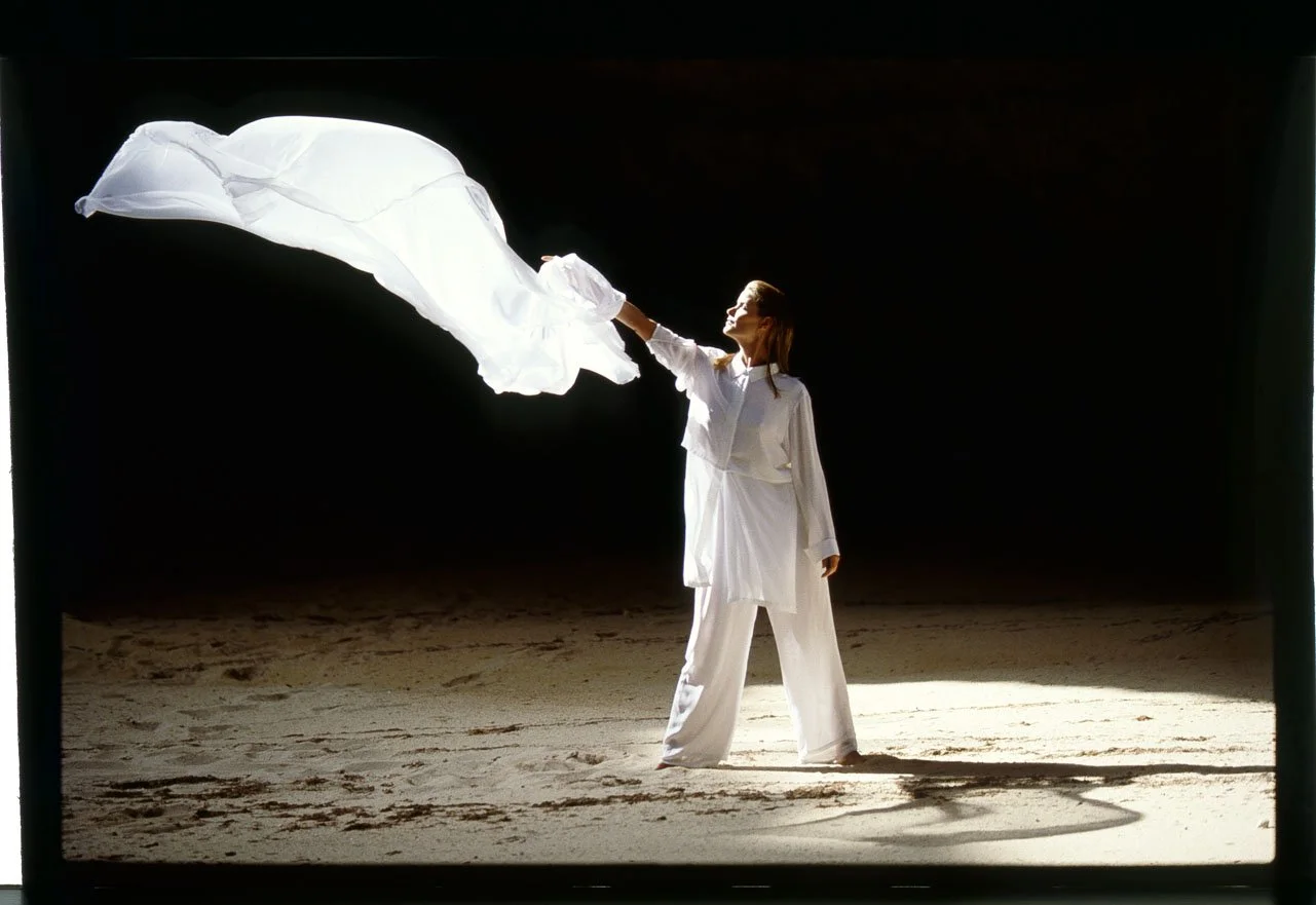
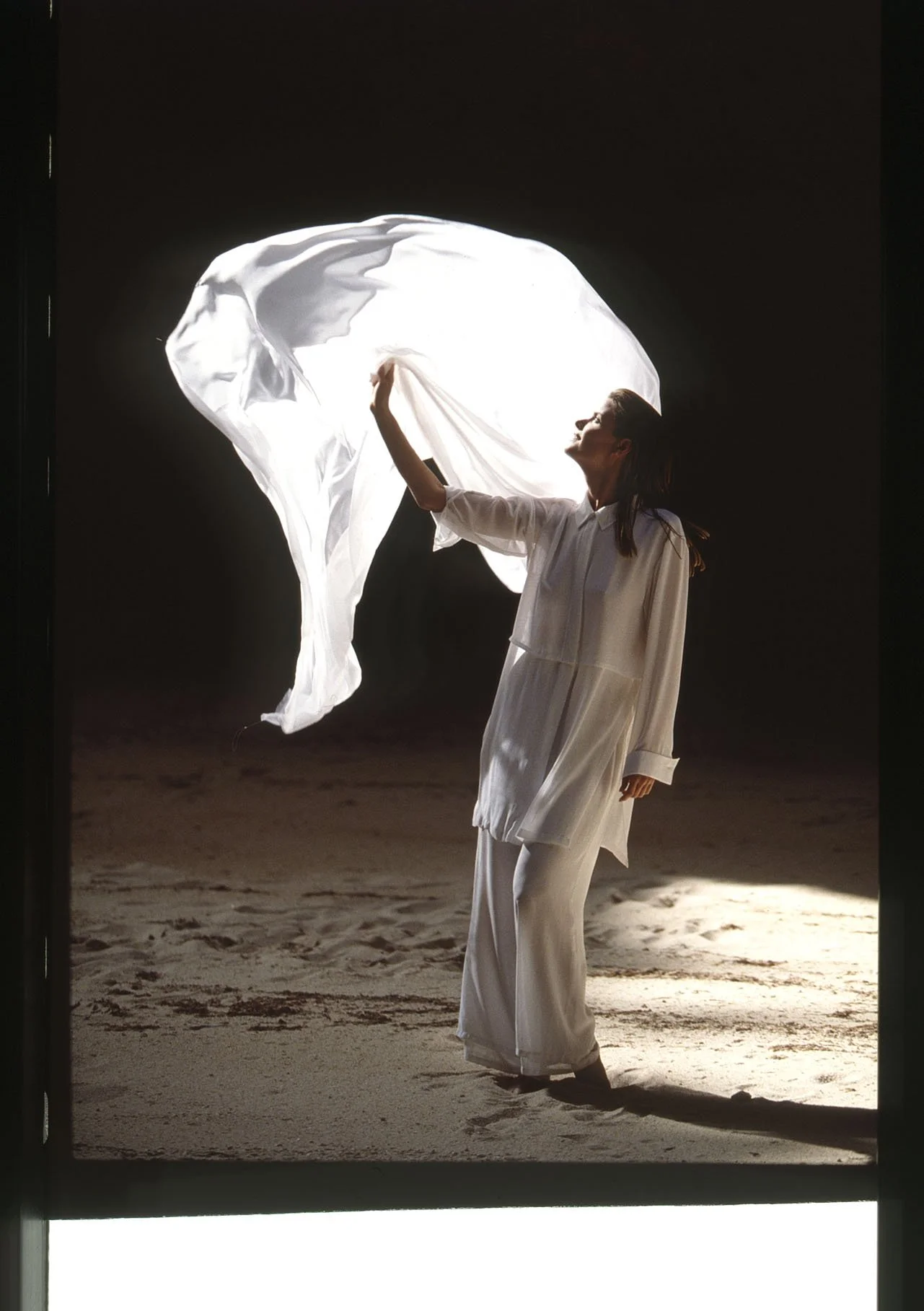
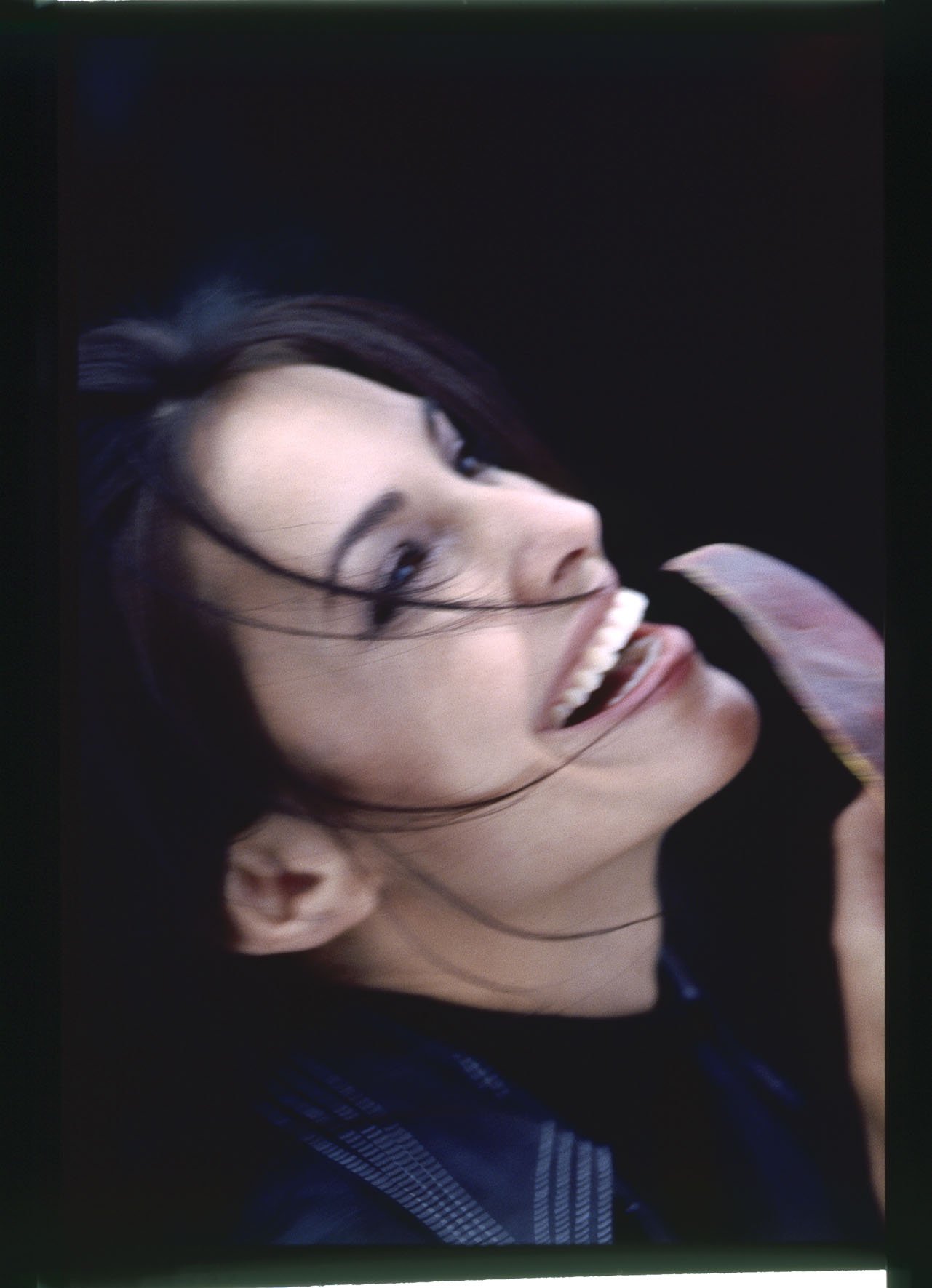
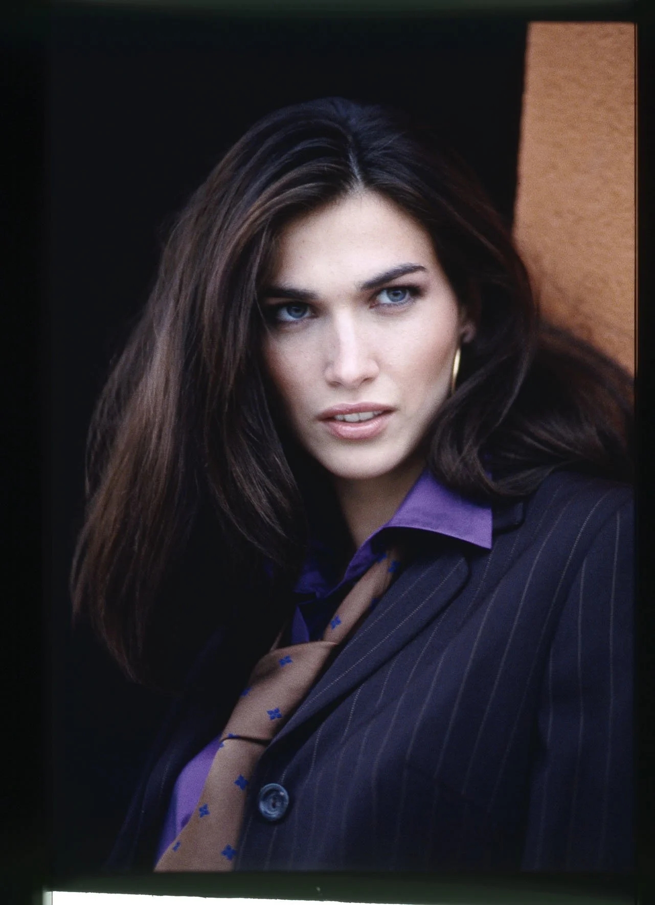
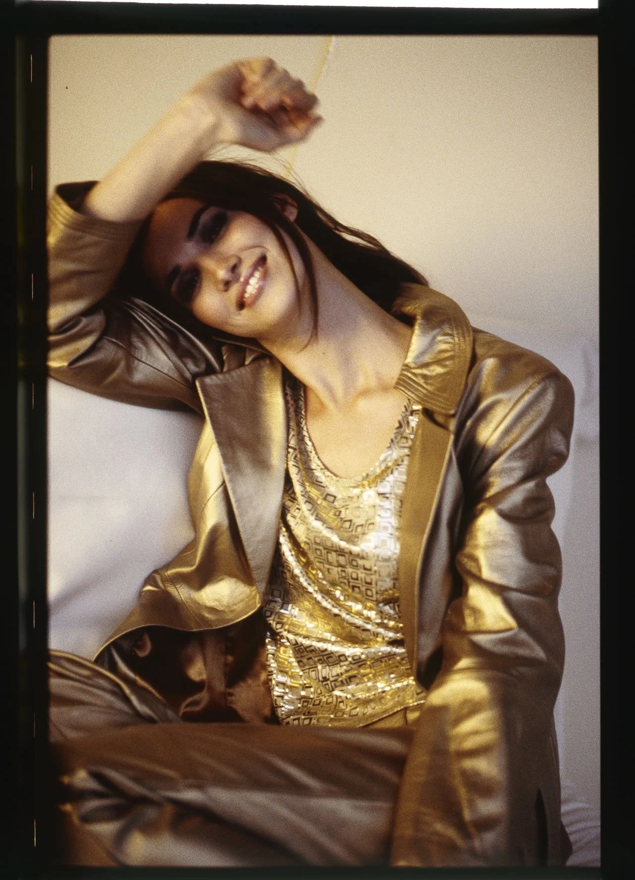
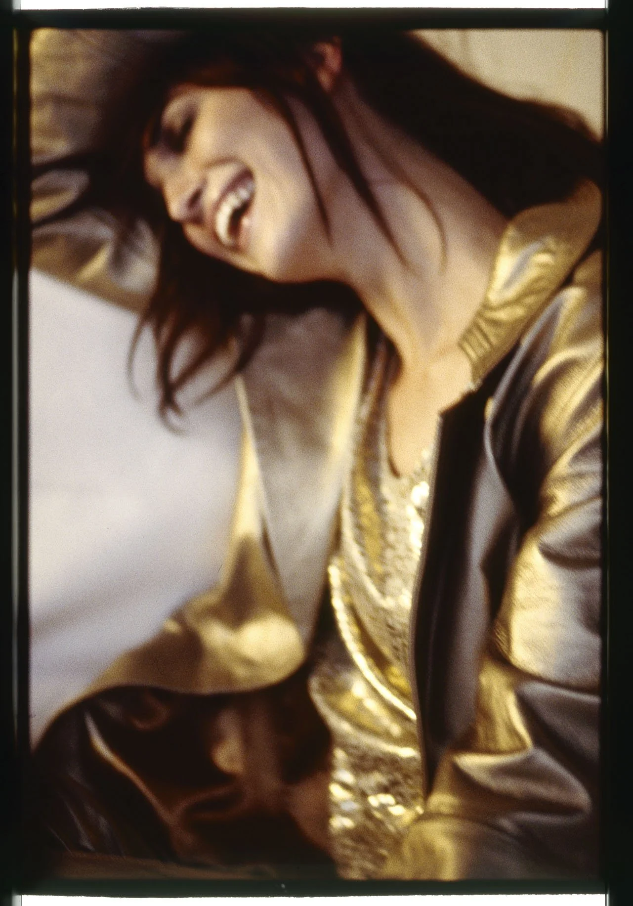
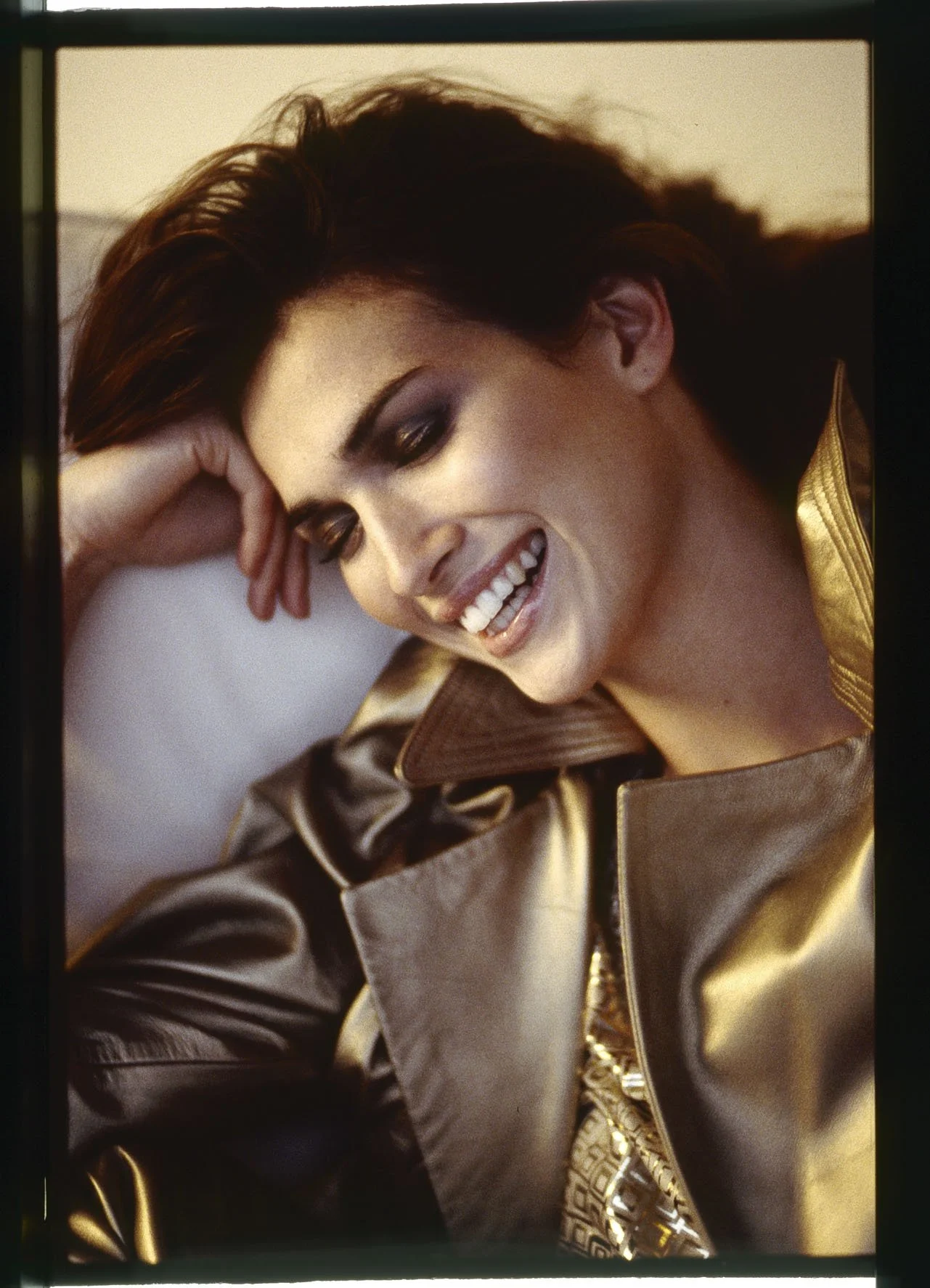
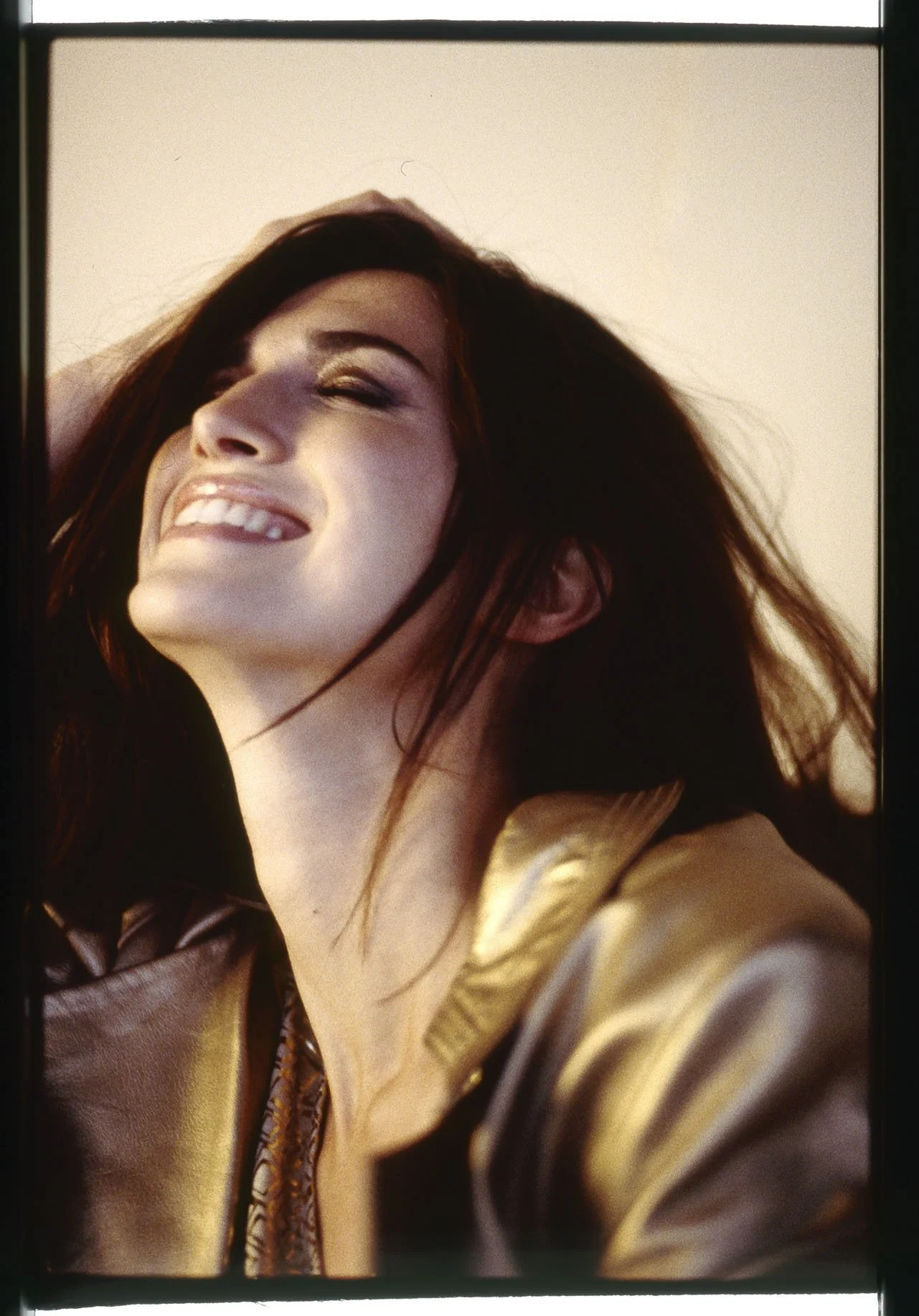
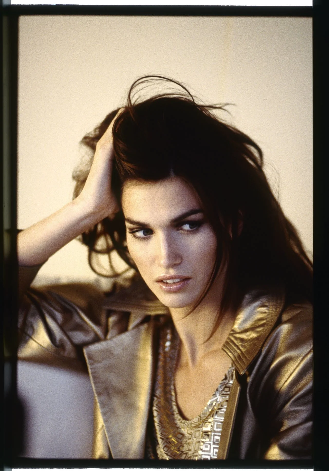
In his expressive series featuring a dark-haired woman in a glossy, dark ensemble, the creative photographer distills this message to its very essence. Set against a starkly minimalist—and at times softly focused—background, Ulrich Pracht directs his lens toward "private" facial expressions and bold gestures; in their sheer naturalness, these moments appear so authentic that they might well be the result of a spontaneous snapshot. Against a black backdrop, the young woman—much like the heroine in the fairy tale—gives herself over with complete abandon to the playful dance of golden petals swirling above her head. As we gaze upon her, we discover a pure zest for life—one that finds its expression in the conviction that, in this very moment, there is nothing more beautiful than catching one of those dancing leaves, right here and now. There is no doubt that, at the instant the shutter clicked, she was truly blessed with this fleeting moment of bliss. With this, everything has been achieved: Ulrich Pracht has not only perfectly arranged a charming little success story—crafted from just three simple elements—and masterfully staged its spontaneity, but he has also stirred up desire; in doing so, he has forged a profound connection between a positive outlook on life and the brand, between art and commerce. It is an exceptional talent—one that this self-taught polymath continues to master to perfection to this very day.












04.4
ALBA MODA
Aiming High
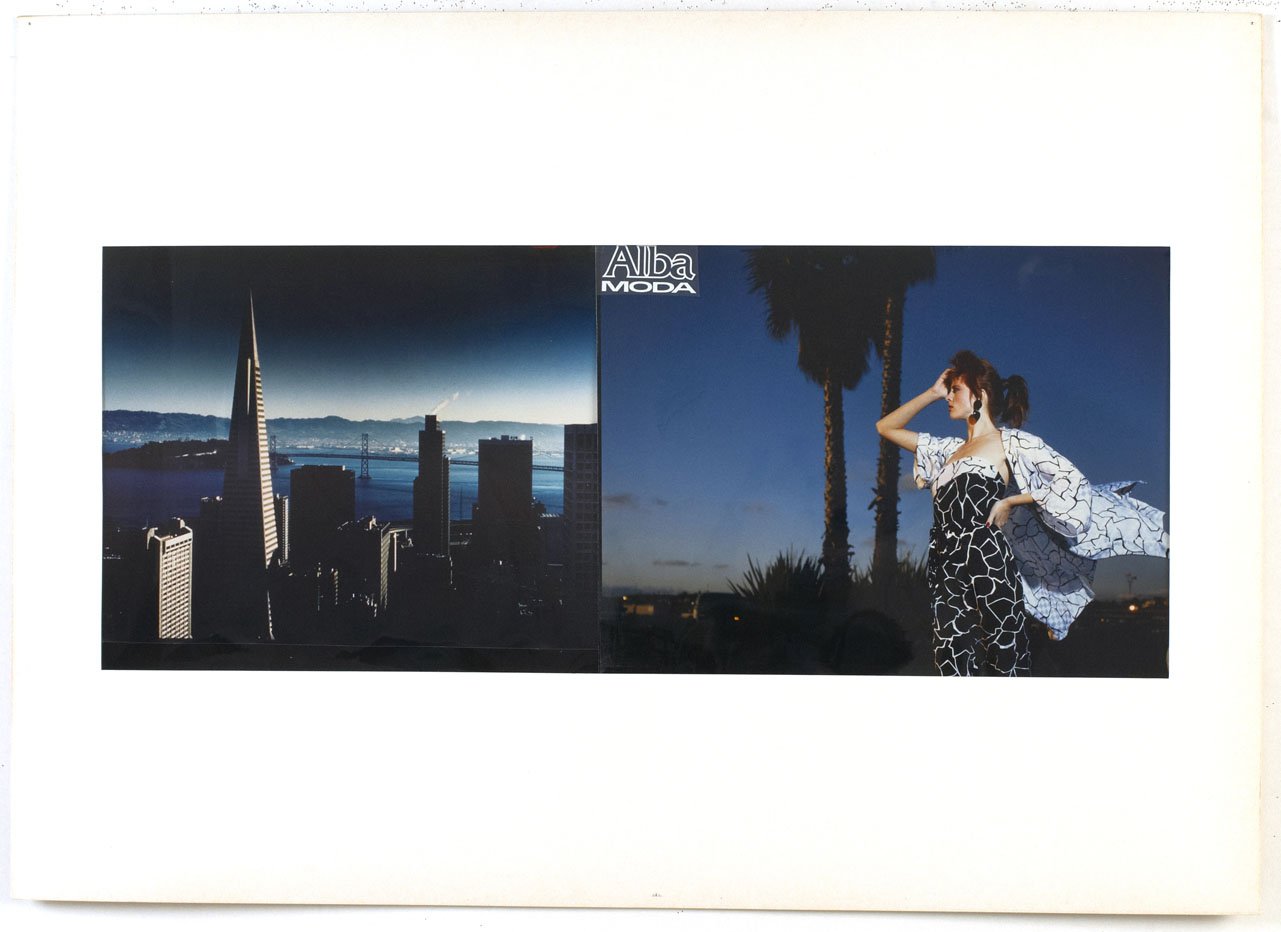
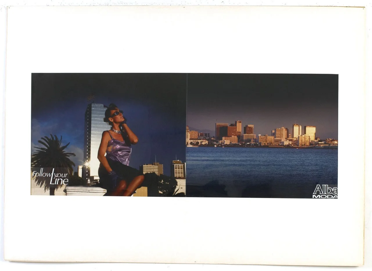
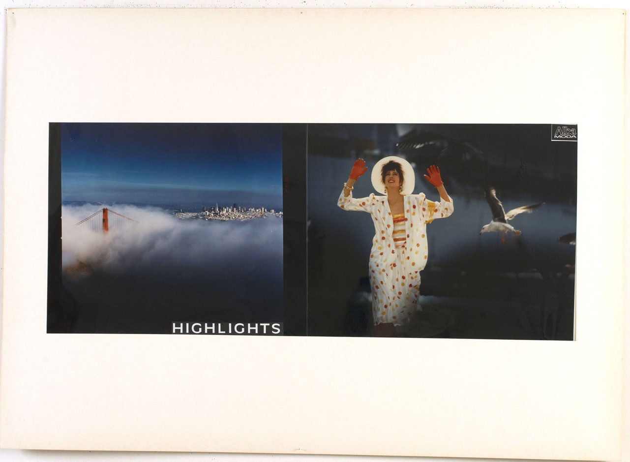
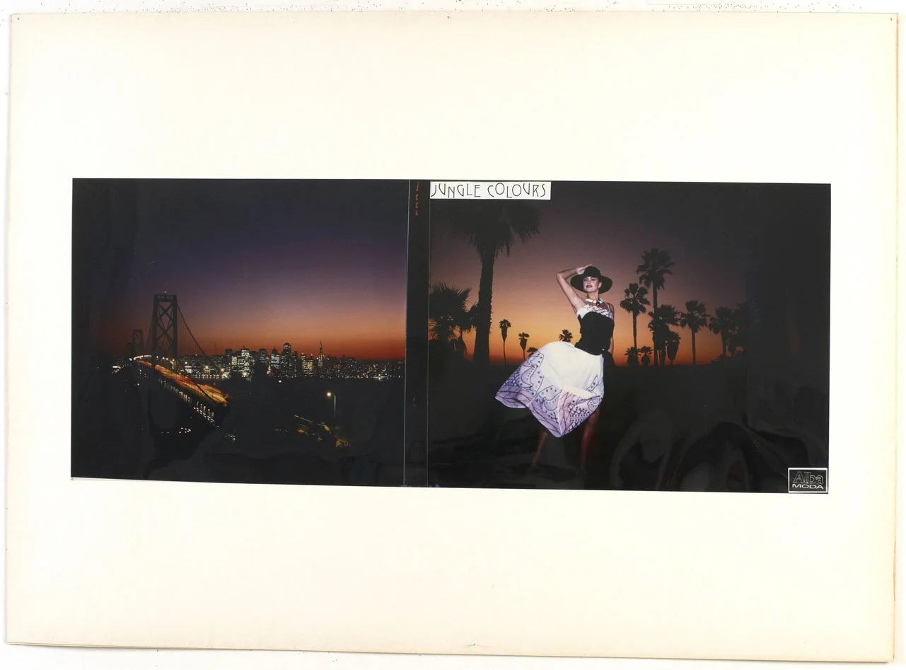
"Bruce Weber inspired me because he was the first photographer whose visual style helped commercialize fine art photography for advertising purposes. This influence shaped my work for Alba Moda—images that bore no resemblance to the fashion photography typical of the era. For me, it was an opportunity to leverage this high-profile reference to build my own reputation."
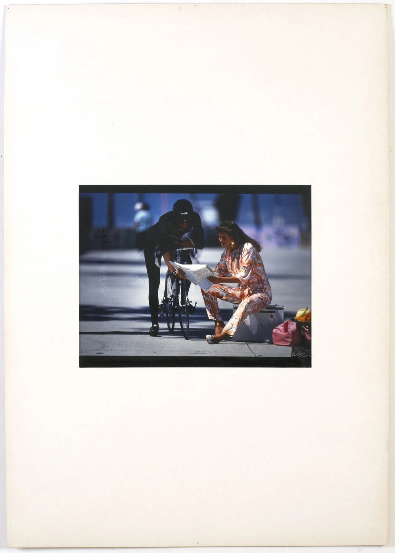
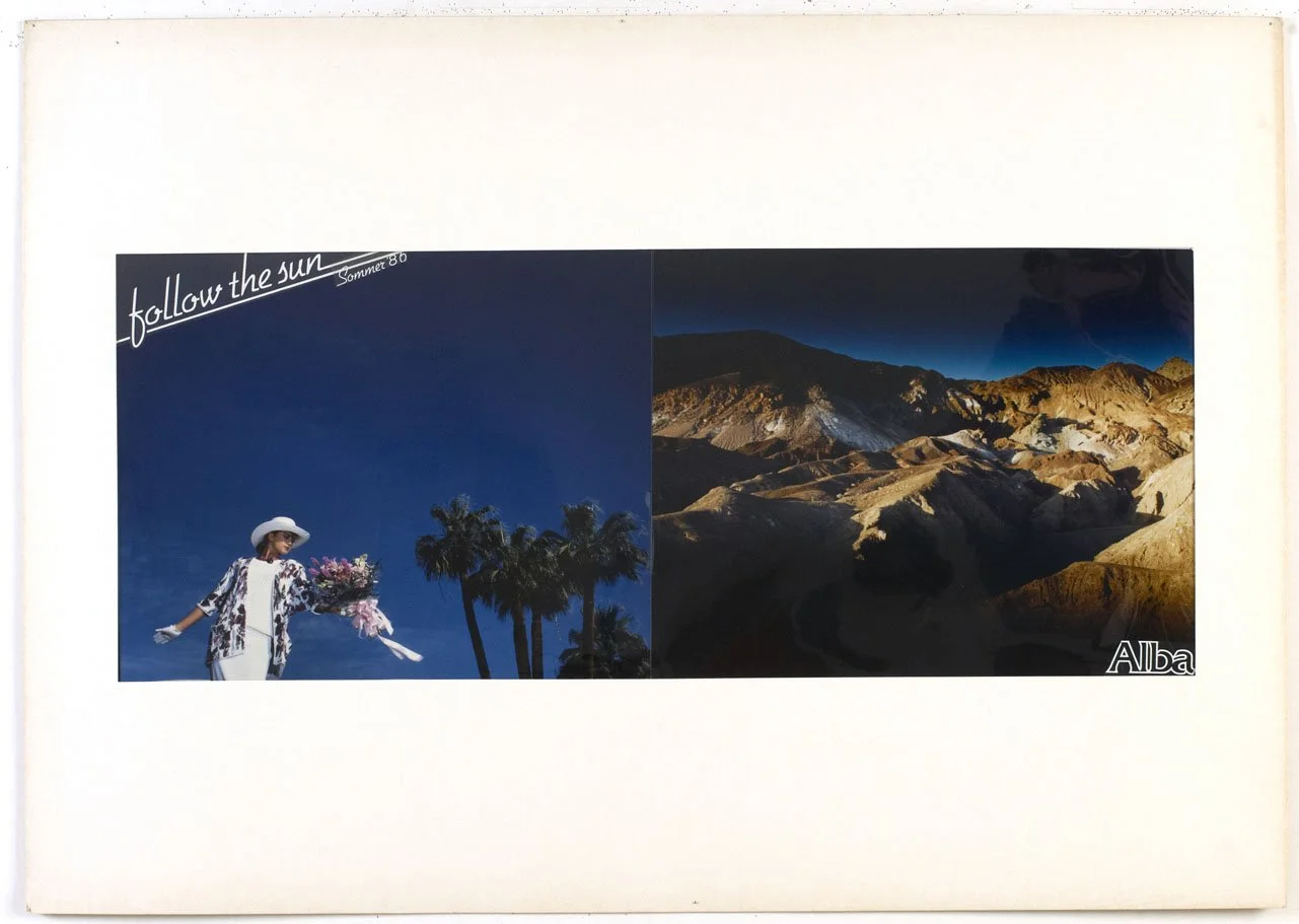
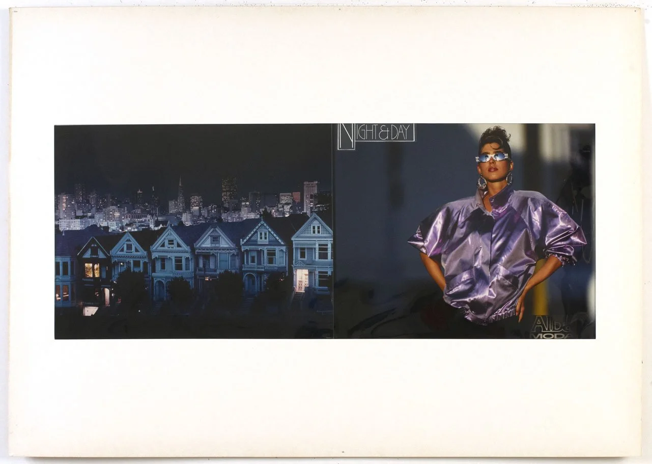
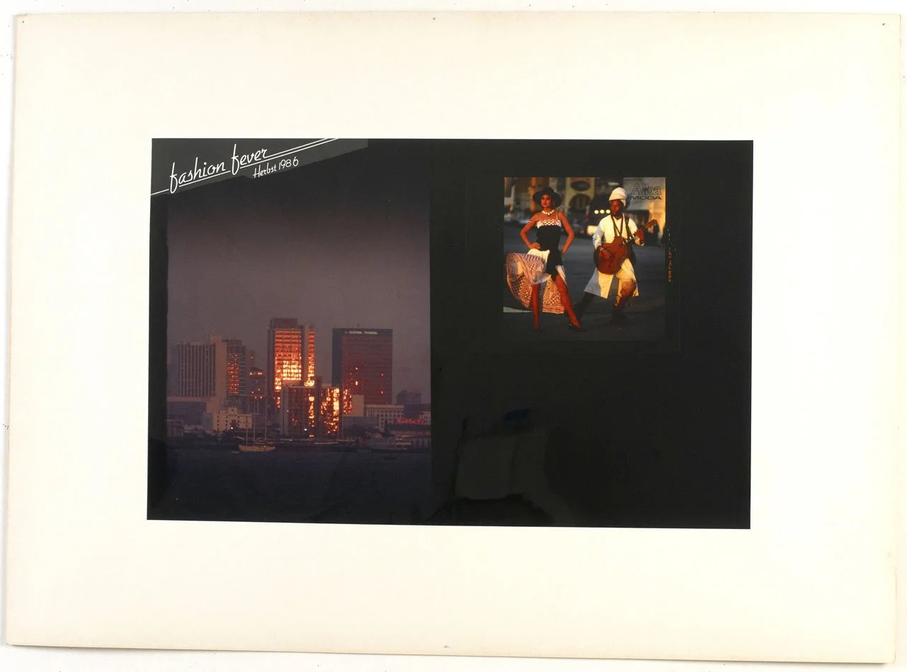
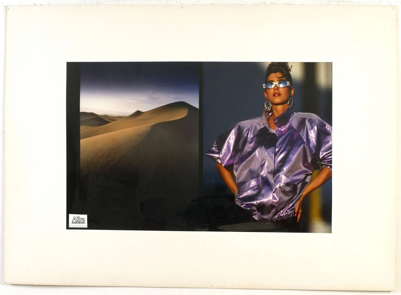
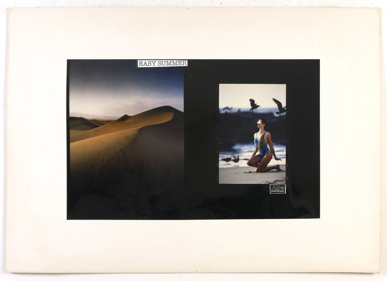
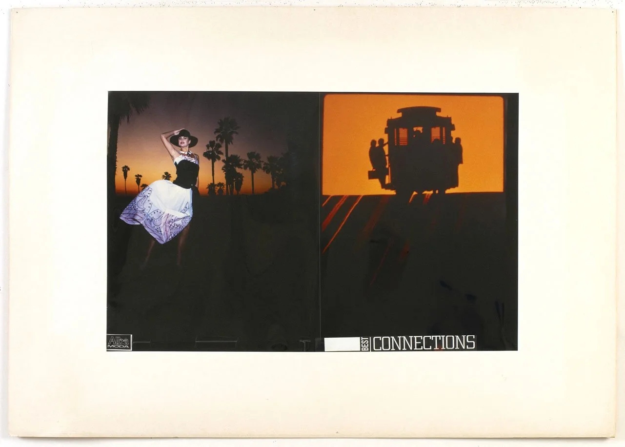
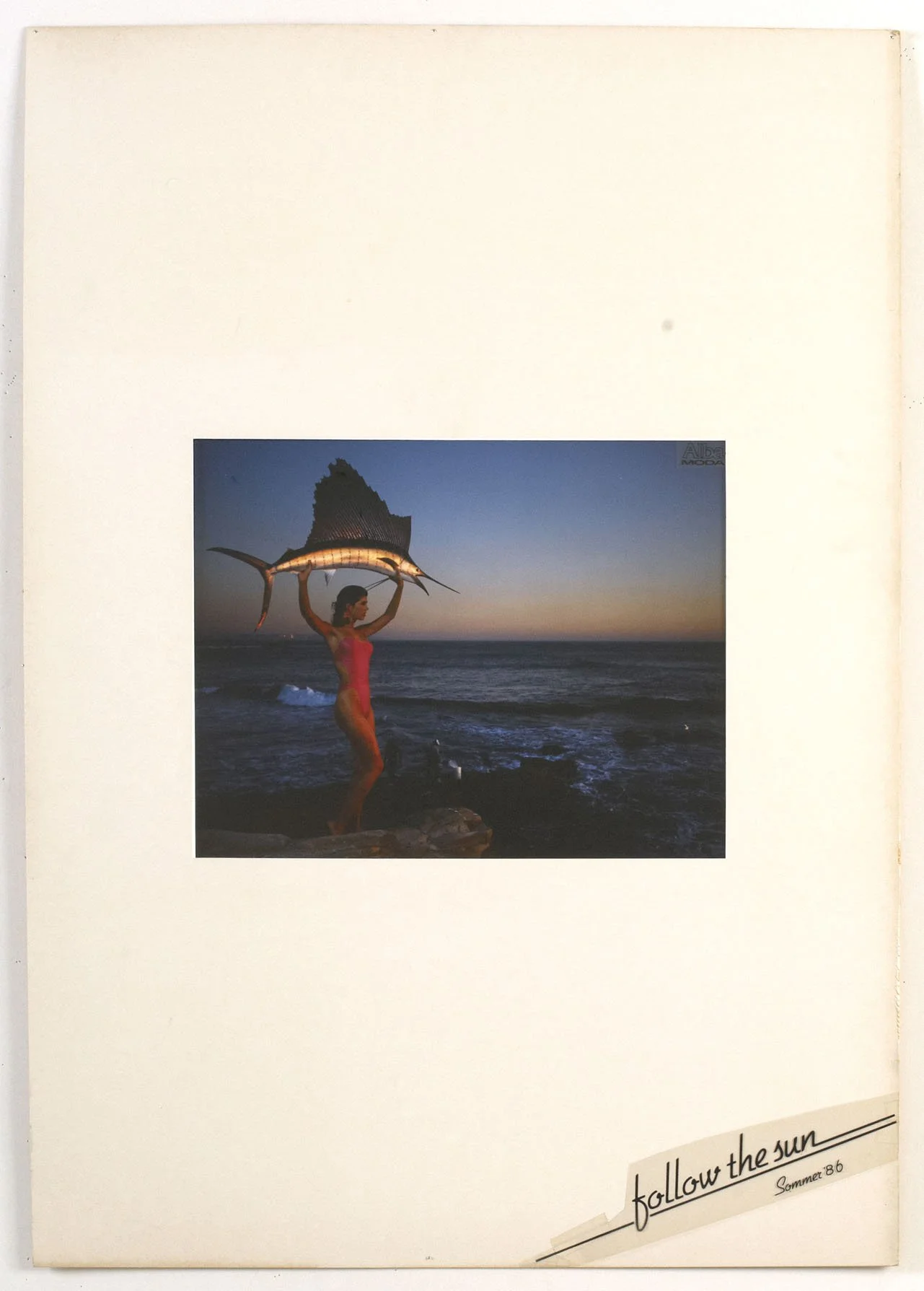
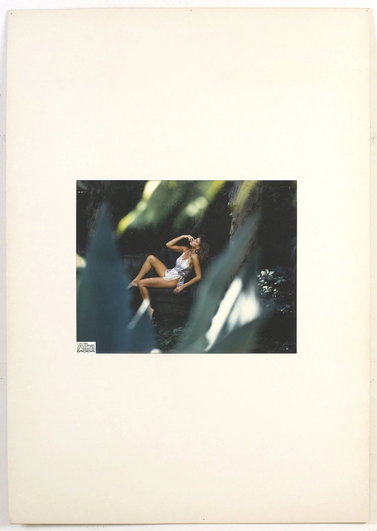
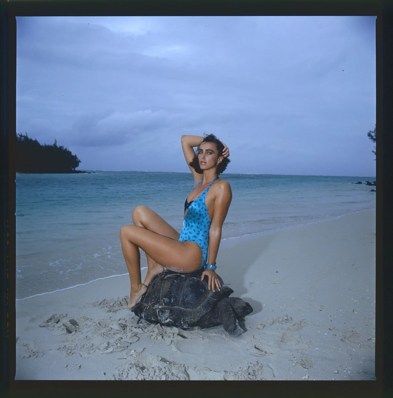
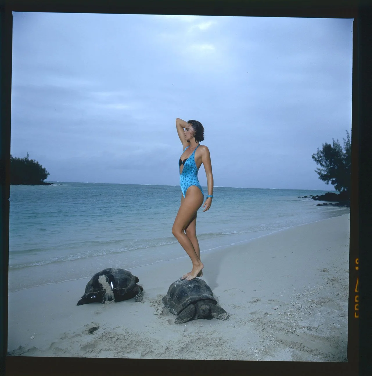
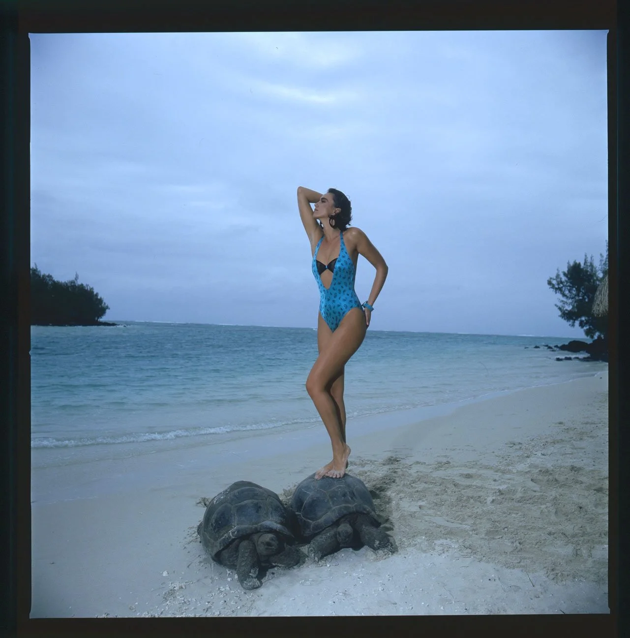
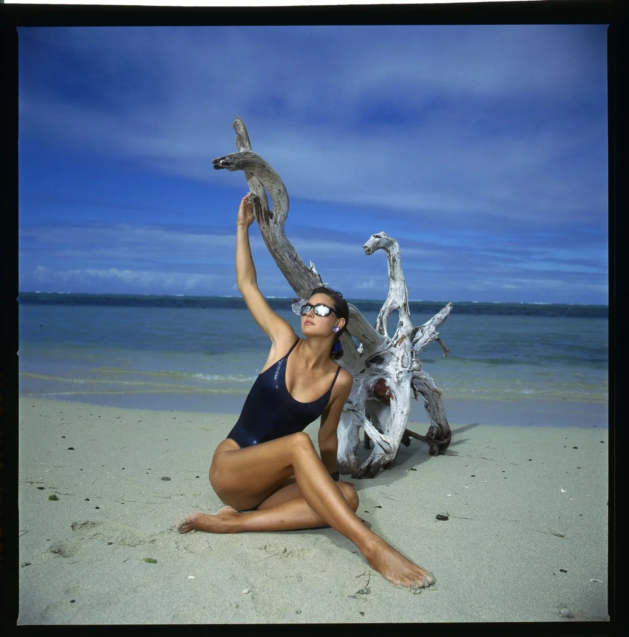
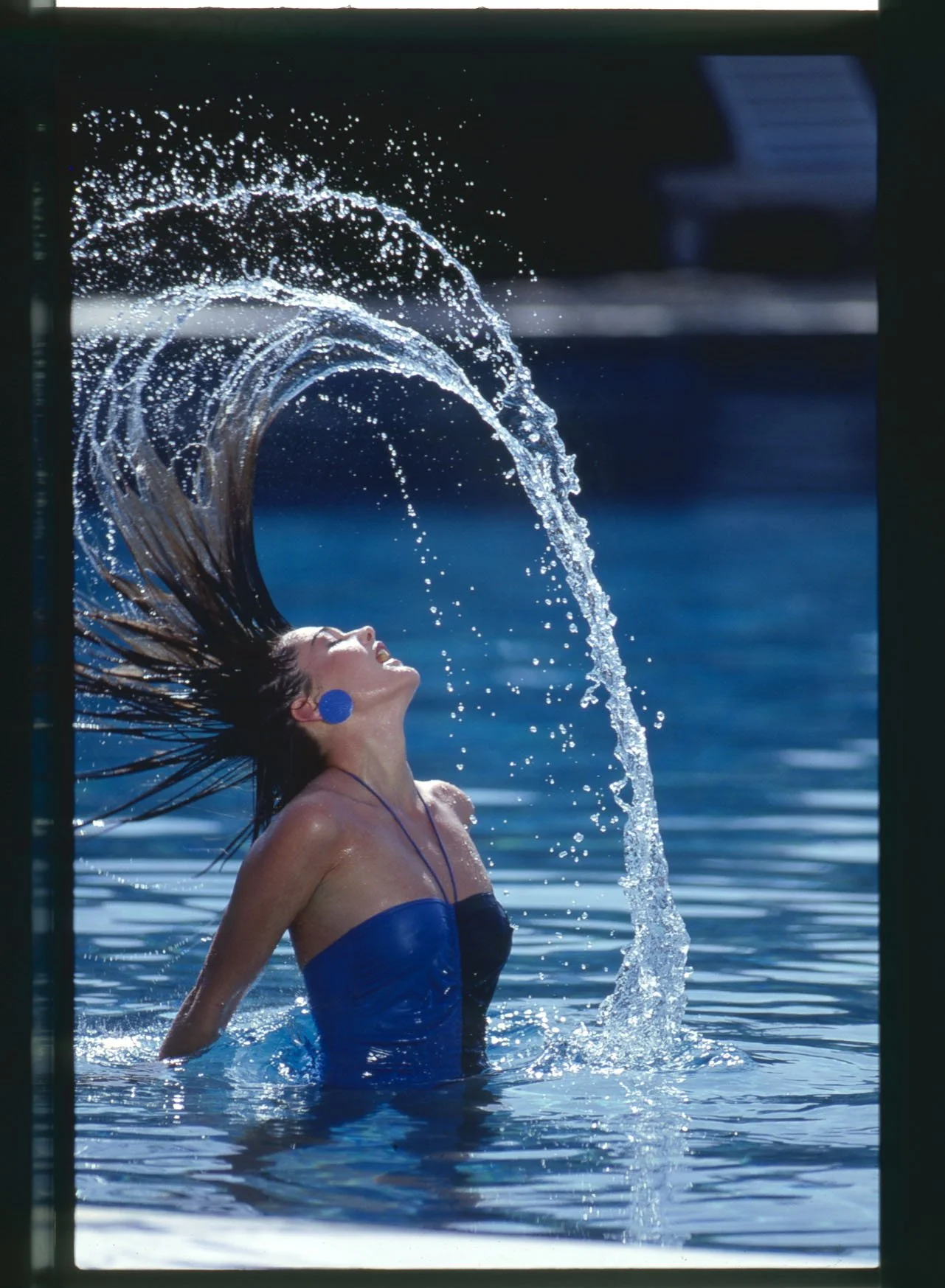
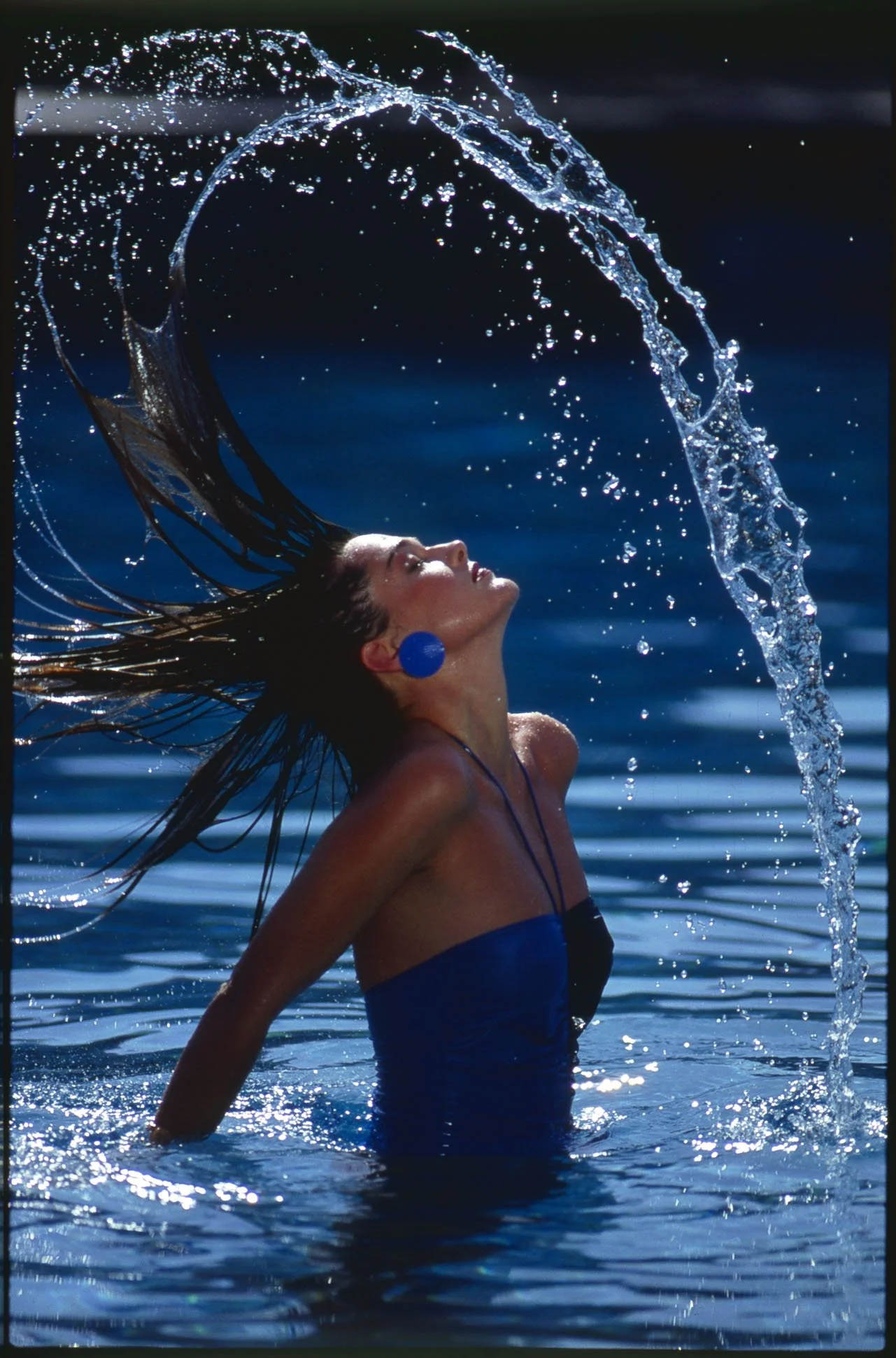
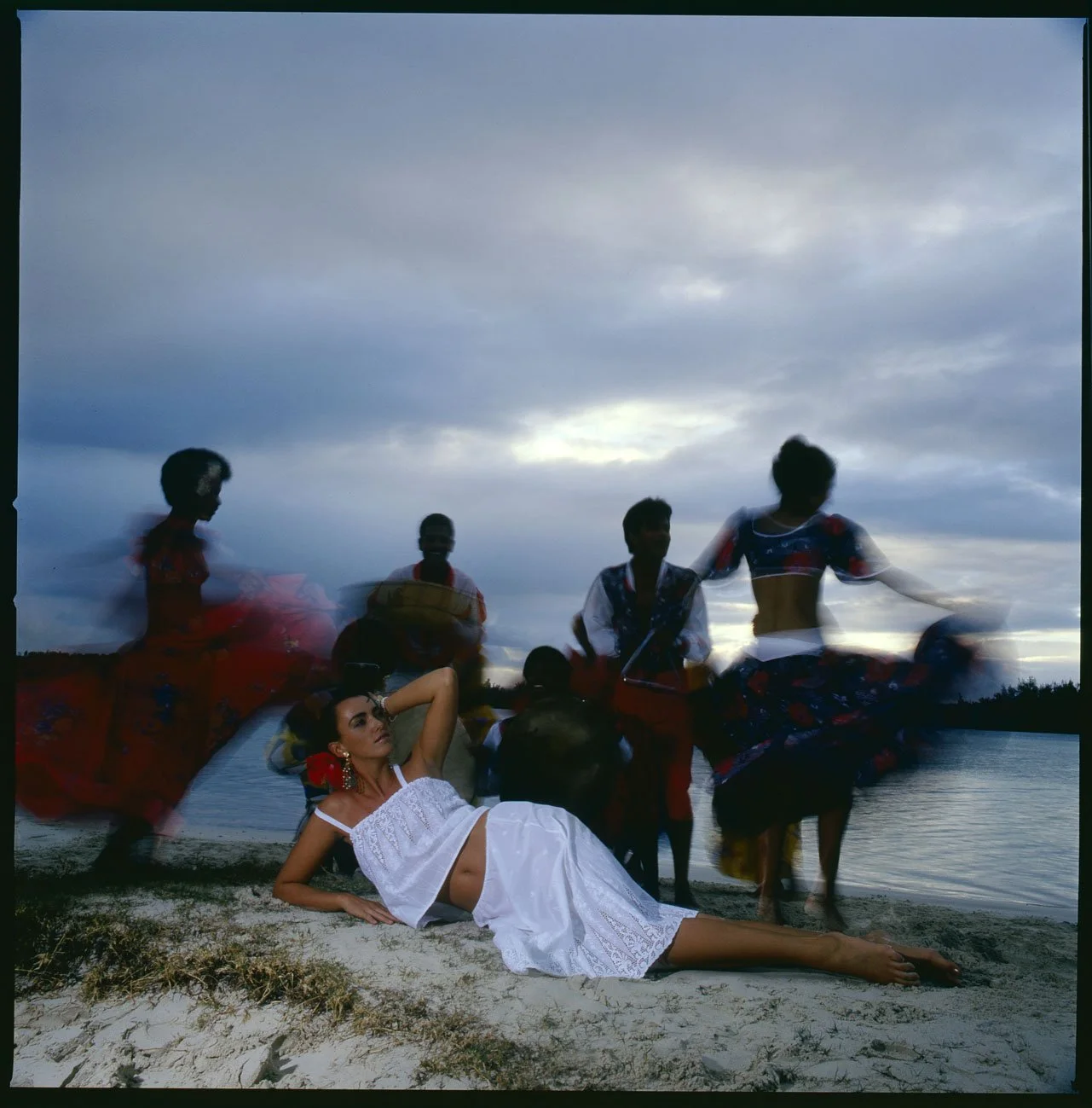
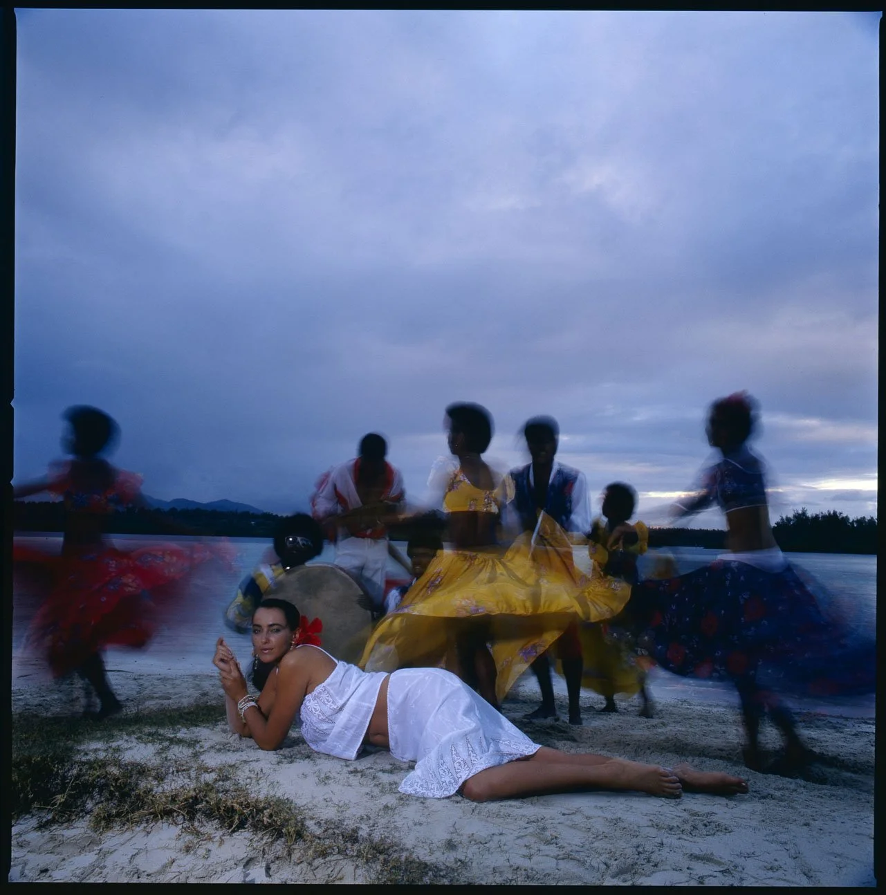
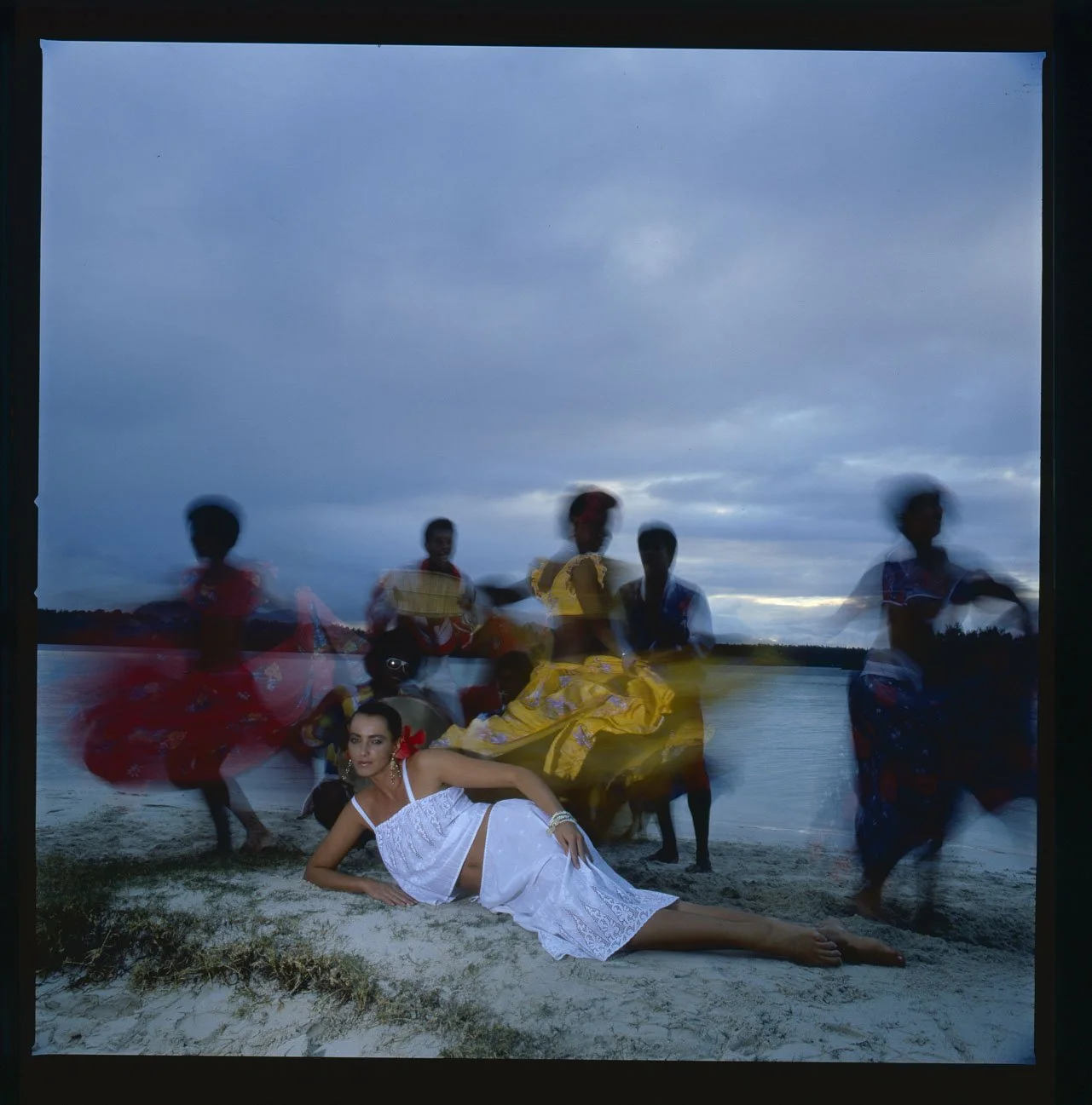
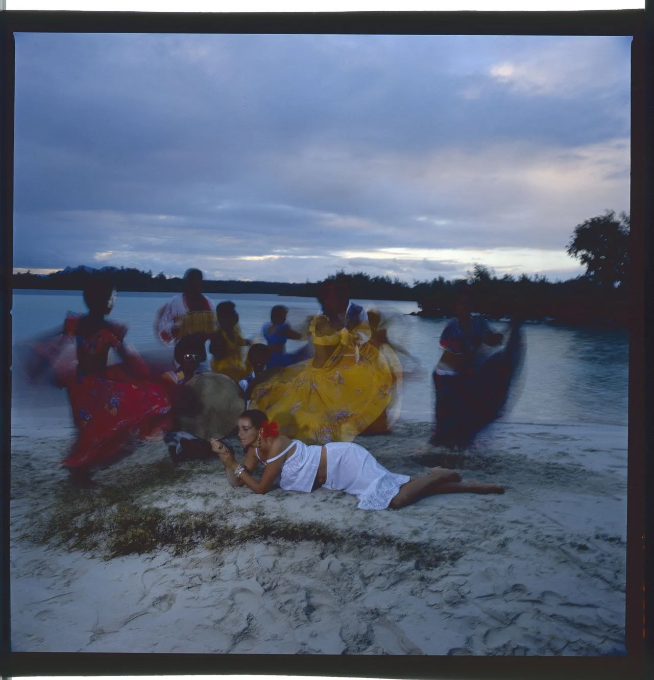
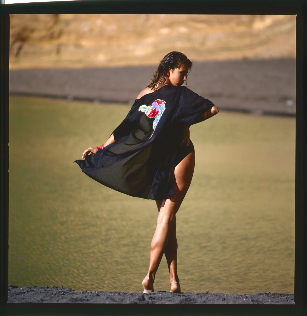
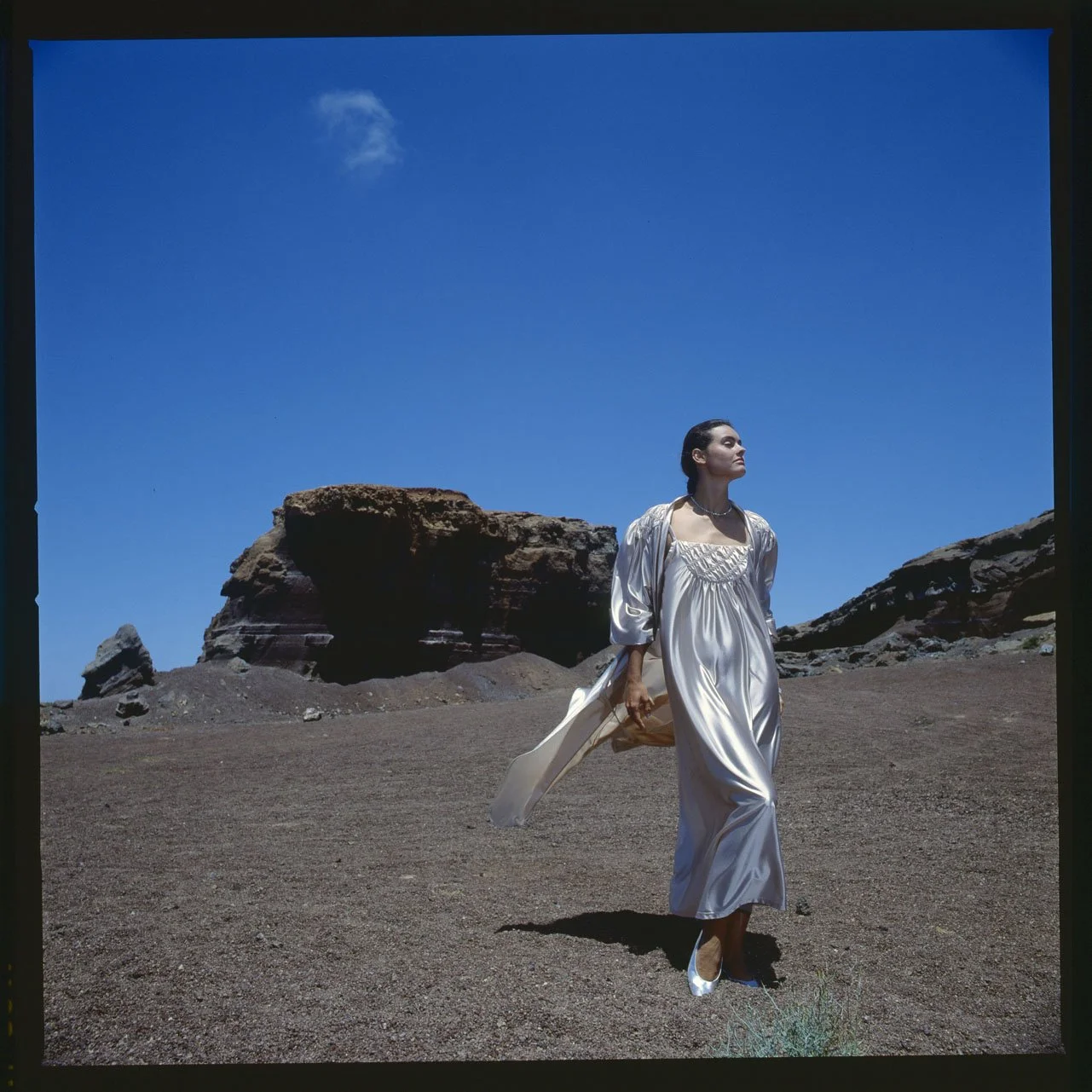
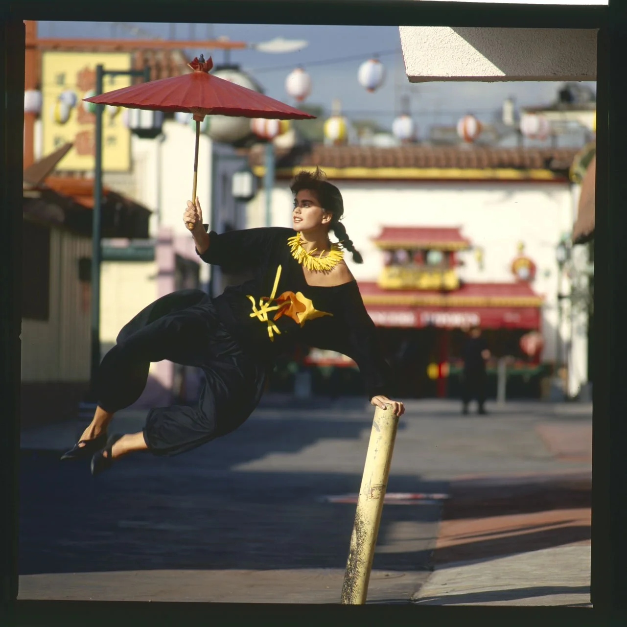
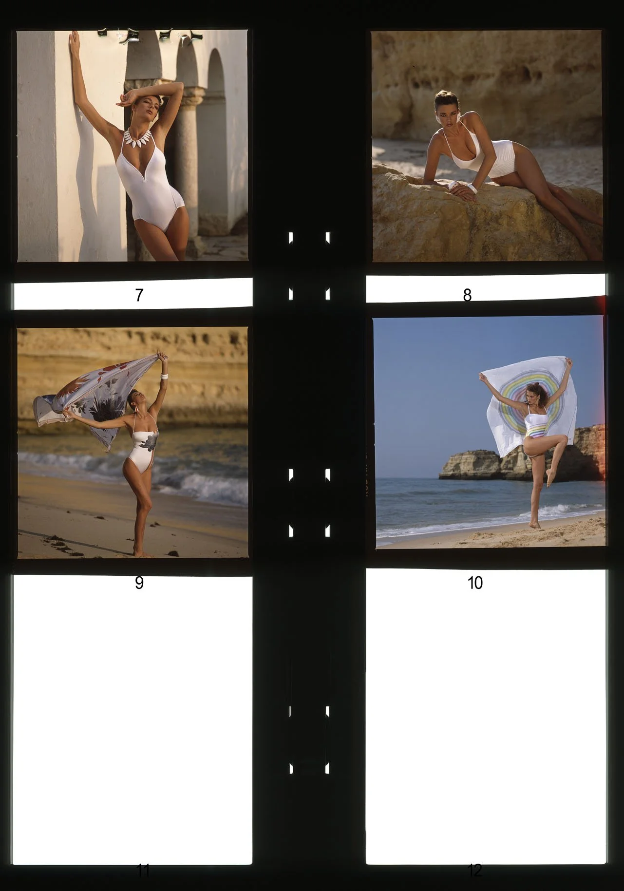
The word "alba" comes from Latin and means "white." White, too, are the products sold by Alba Moda—a company founded in 1981 by Manfred Goldkamp in Bad Salzuflen as a mail-order business specializing in professional attire for doctors and pharmacists. Photographing such garments in a way that imbues them with a strong brand image is no easy challenge. "Stan thought it wasn't for me," recalls Ulrich Pracht, referring to the initial phone call to his studio—a call answered by his assistant. "I thought: 'White professional wear? That actually sounds pretty cool.' In moments like that, my entrepreneurial mindset would kick in; I recognized the commercial potential inherent in working with this client!" Yet, upon returning to Düsseldorf after his first meeting with the company’s owner, he initially confessed to his assistant: "You were right." Eventually, however, the decisive idea struck him. Ulrich Pracht proposed to Goldkamp that they photograph the products high atop Mount Teide on Tenerife, where the stark backdrop of the dormant volcano promised a truly extraordinary setting—a landscape rendered in shades of brown, black, and white. The client initially accepted—albeit reluctantly—the fact that, in addition to the now highly sought-after photographer’s hefty daily rate, there would be further costs for styling, makeup, travel, and accommodation. Yet, when he finally held the catalog—filled with sensational images—in his hands and sensed the success it would bring, he immediately booked the creative talent from Düsseldorf for the very next shoot, which took place in the French Alps. When the phone rang again in Düsseldorf a few months later, the call concerned a new collection for Alba Moda—to be named Night & Day—in which "Night" stood for nightwear and lingerie, and "Day" for swimsuits, bikinis, and swimming trunks. Ulrich Pracht and his team now traveled to the world's most beautiful locations, accompanied by models who ranked among the most successful of the decade. From these shoots, he brought back images that once again demonstrated his exceptional ability to highlight the art of seduction in such a way that they inevitably captivated the viewer. Pracht further enriched the catalogs with international imagery from ZEFA—one of Europe’s largest photo agencies in the 1980s—utilizing this design element to add even greater depth to the layout.







04.5
MADELEINE
Pure Feelings.
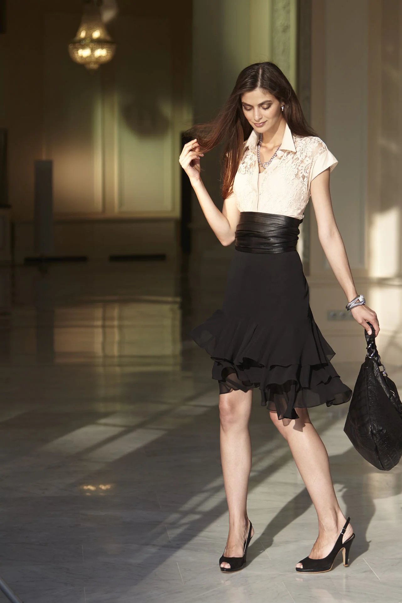
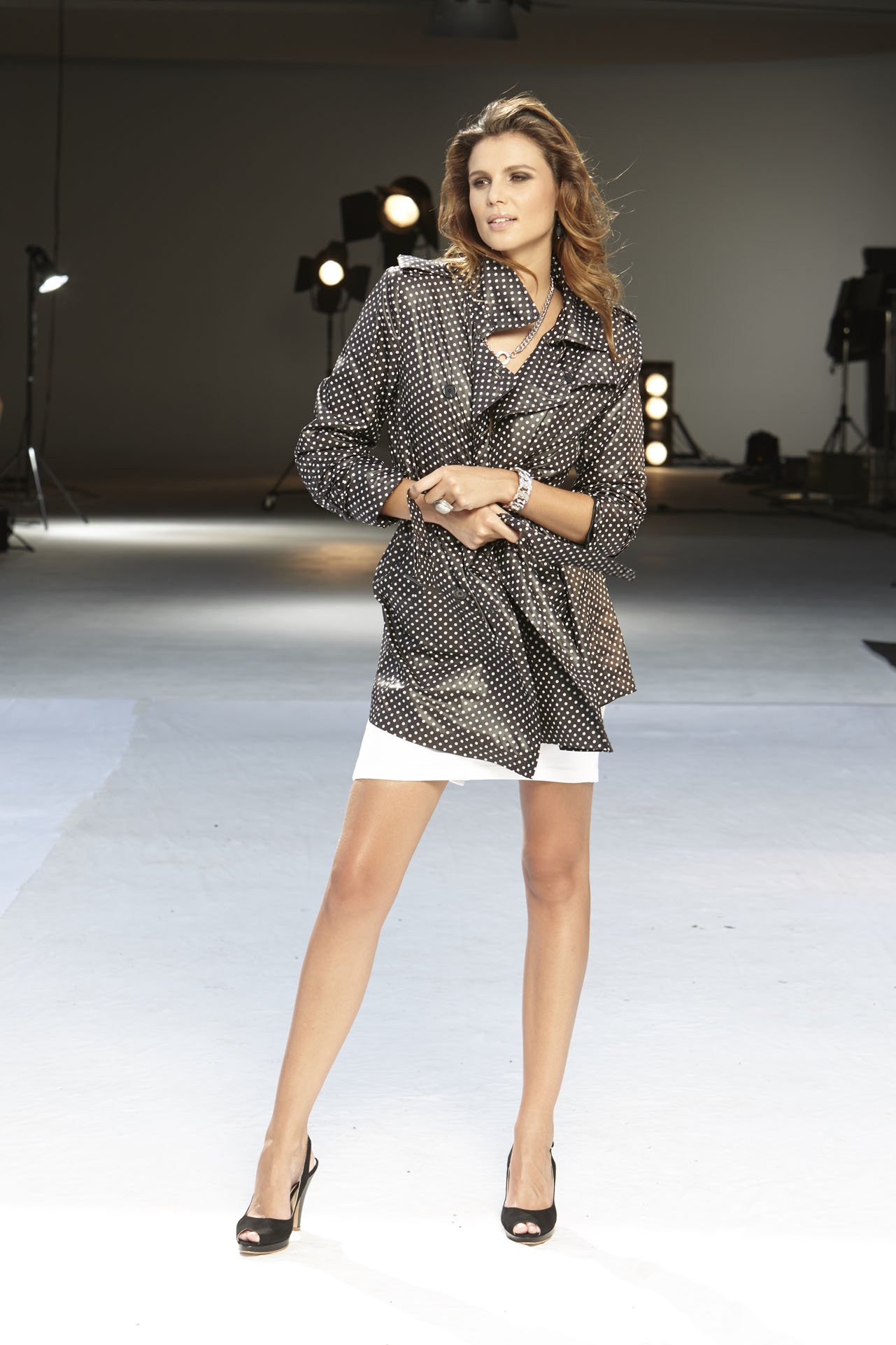
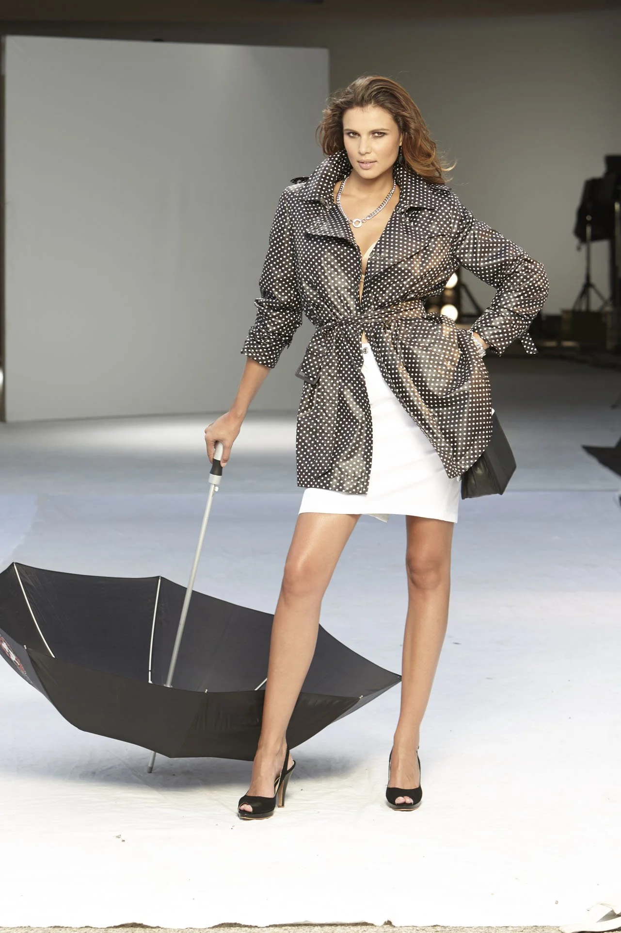
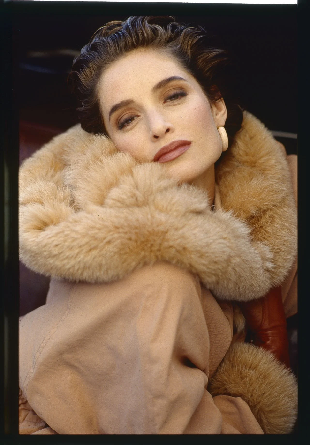
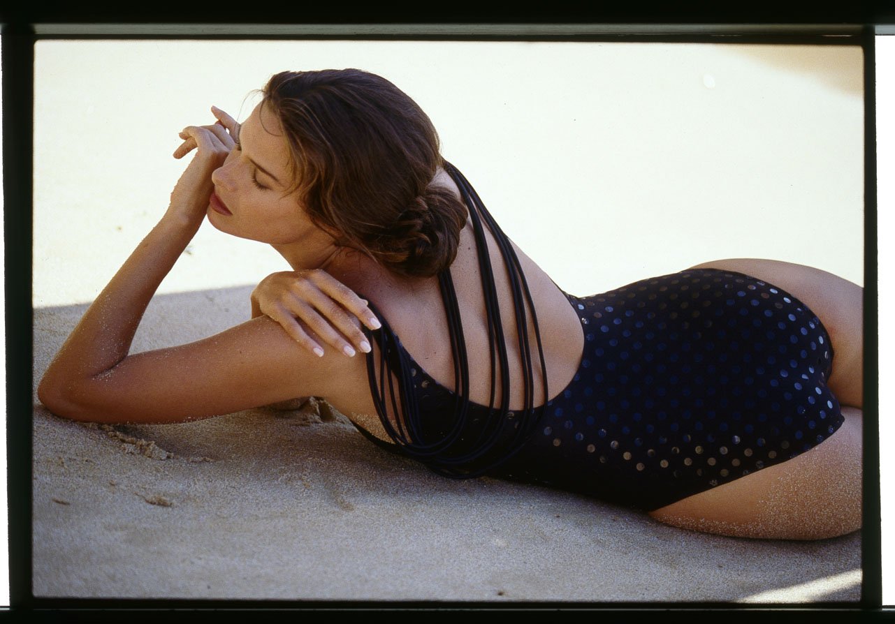
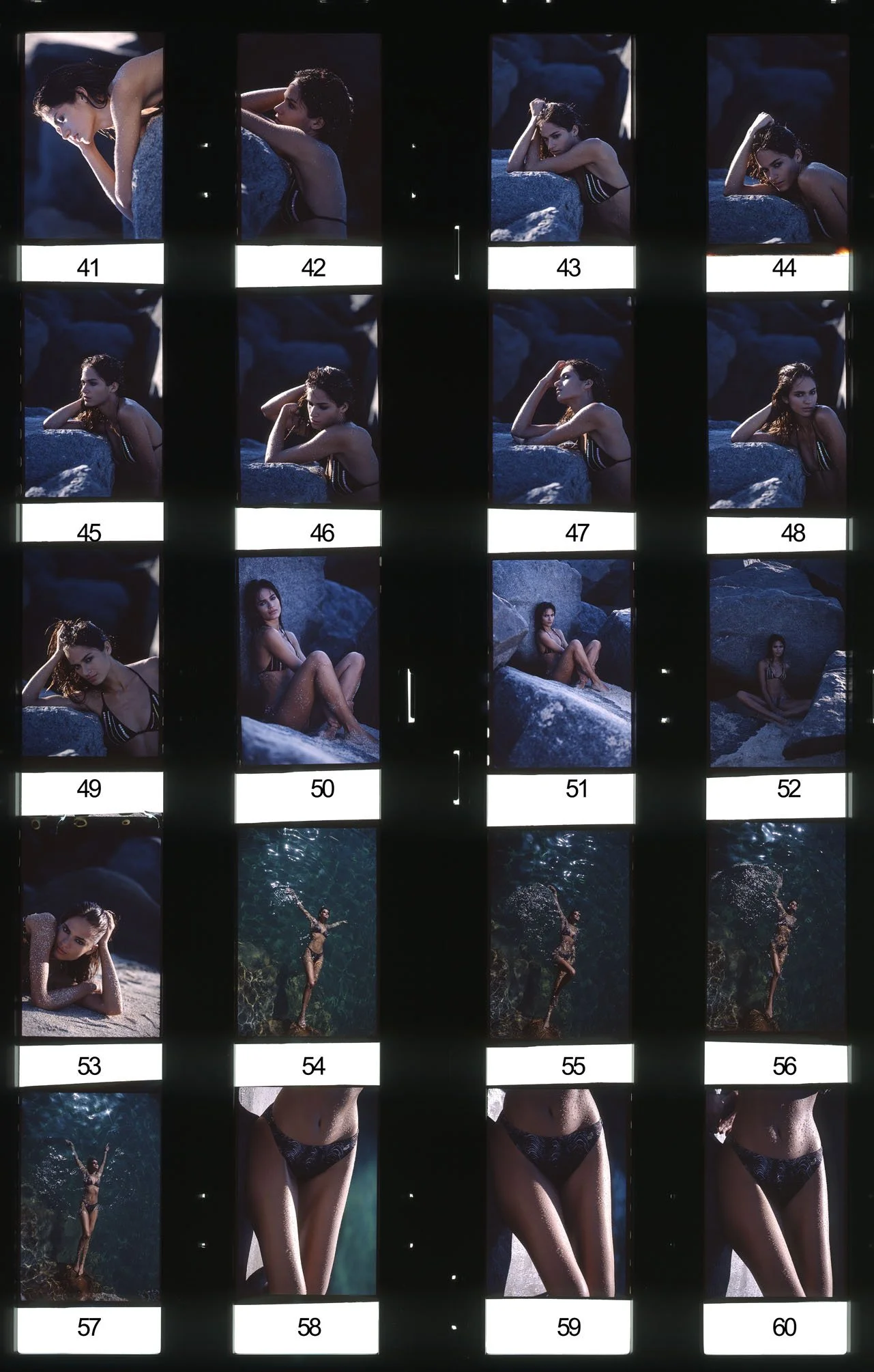
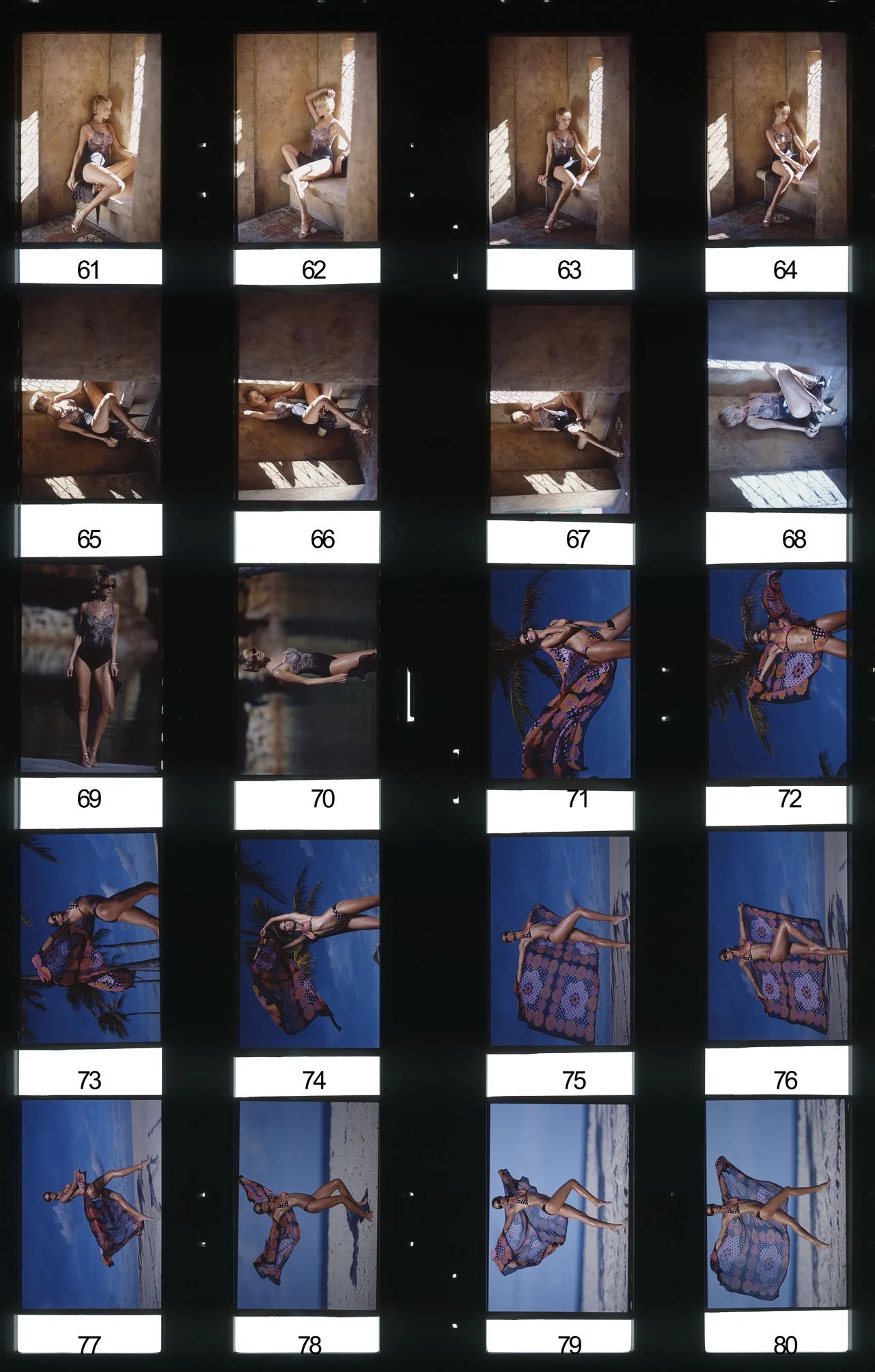
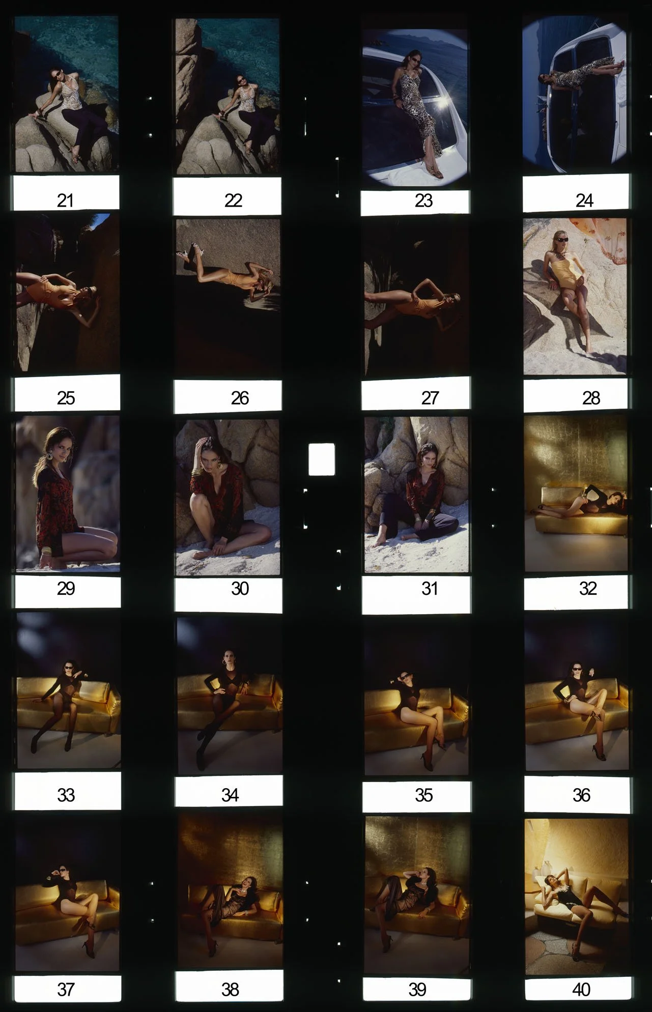
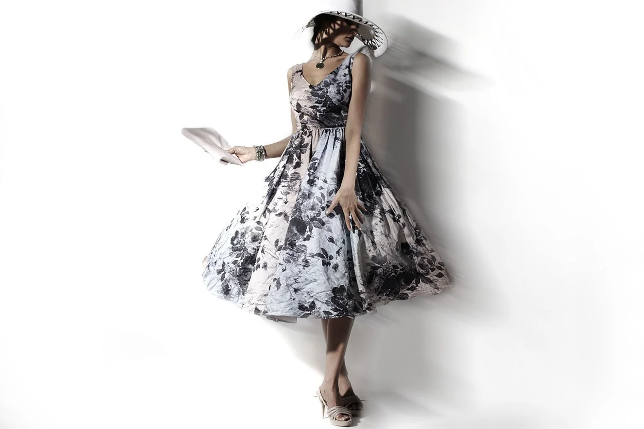
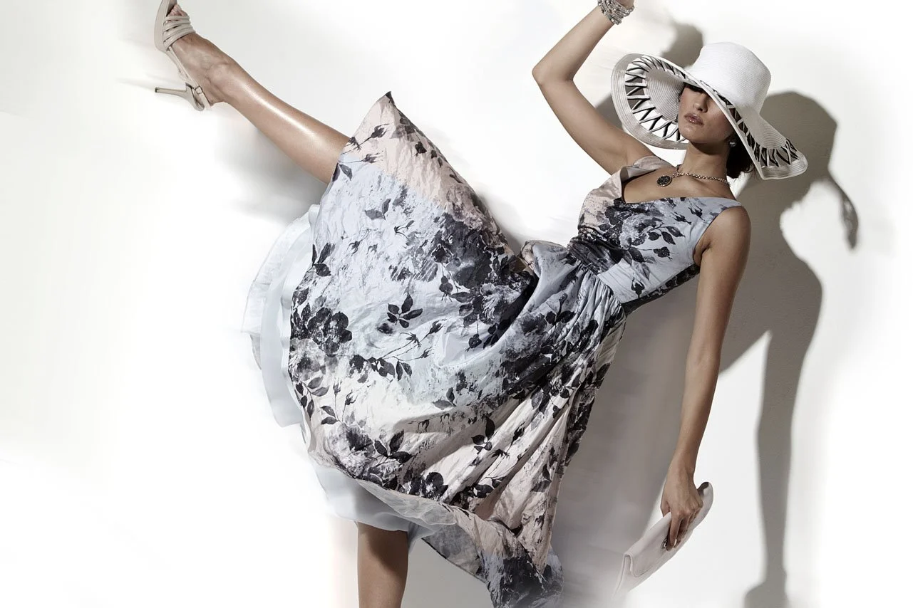
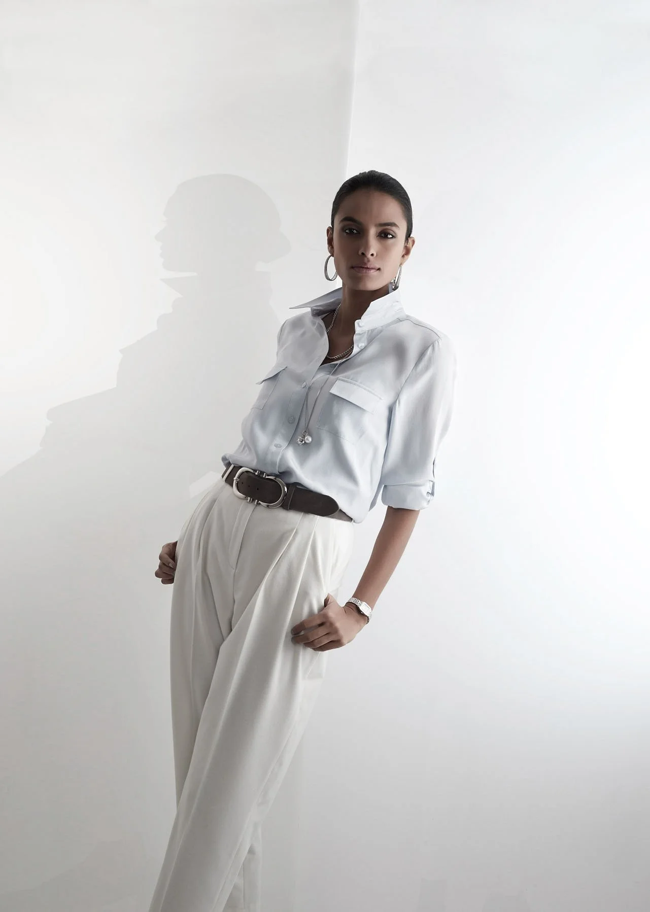
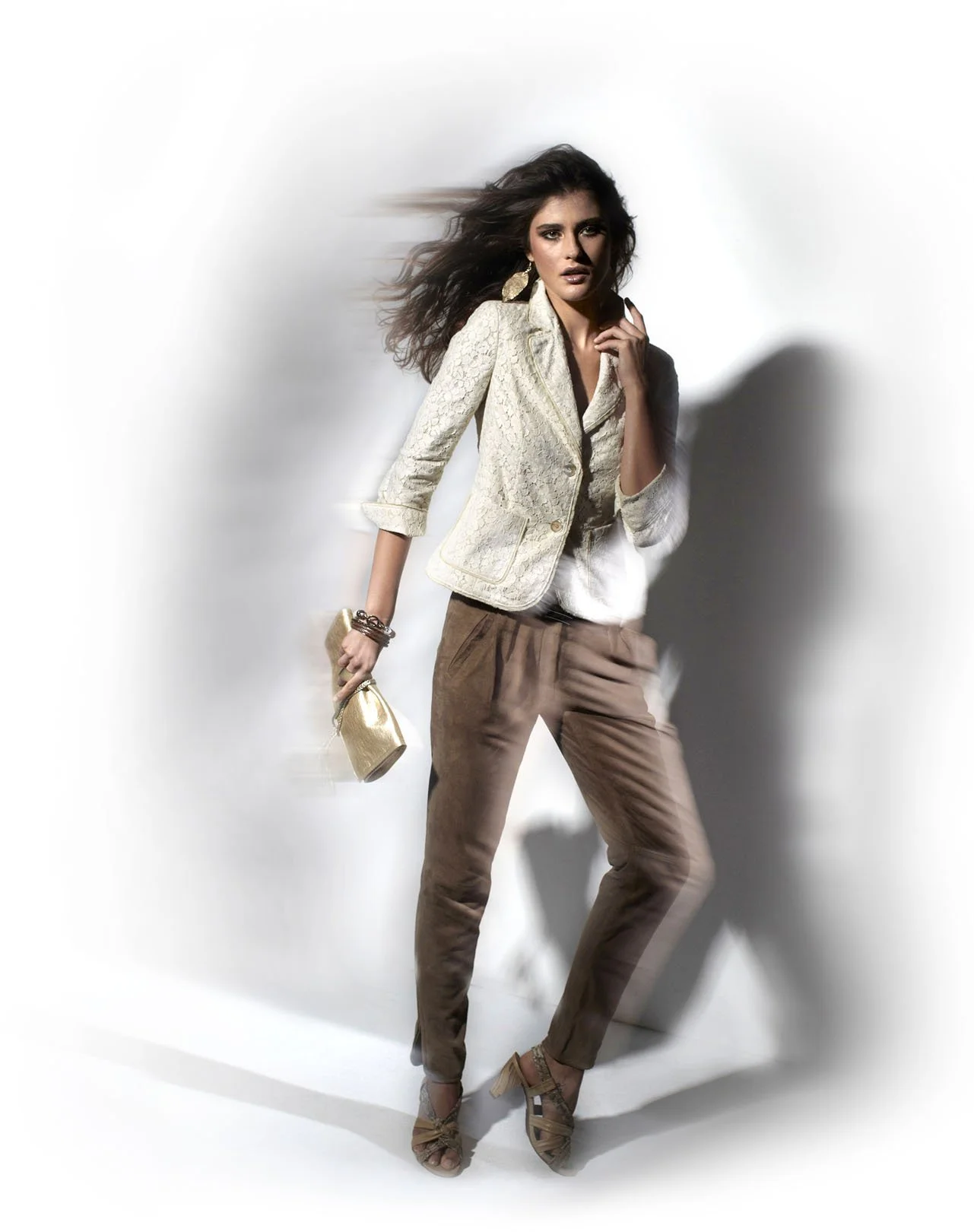
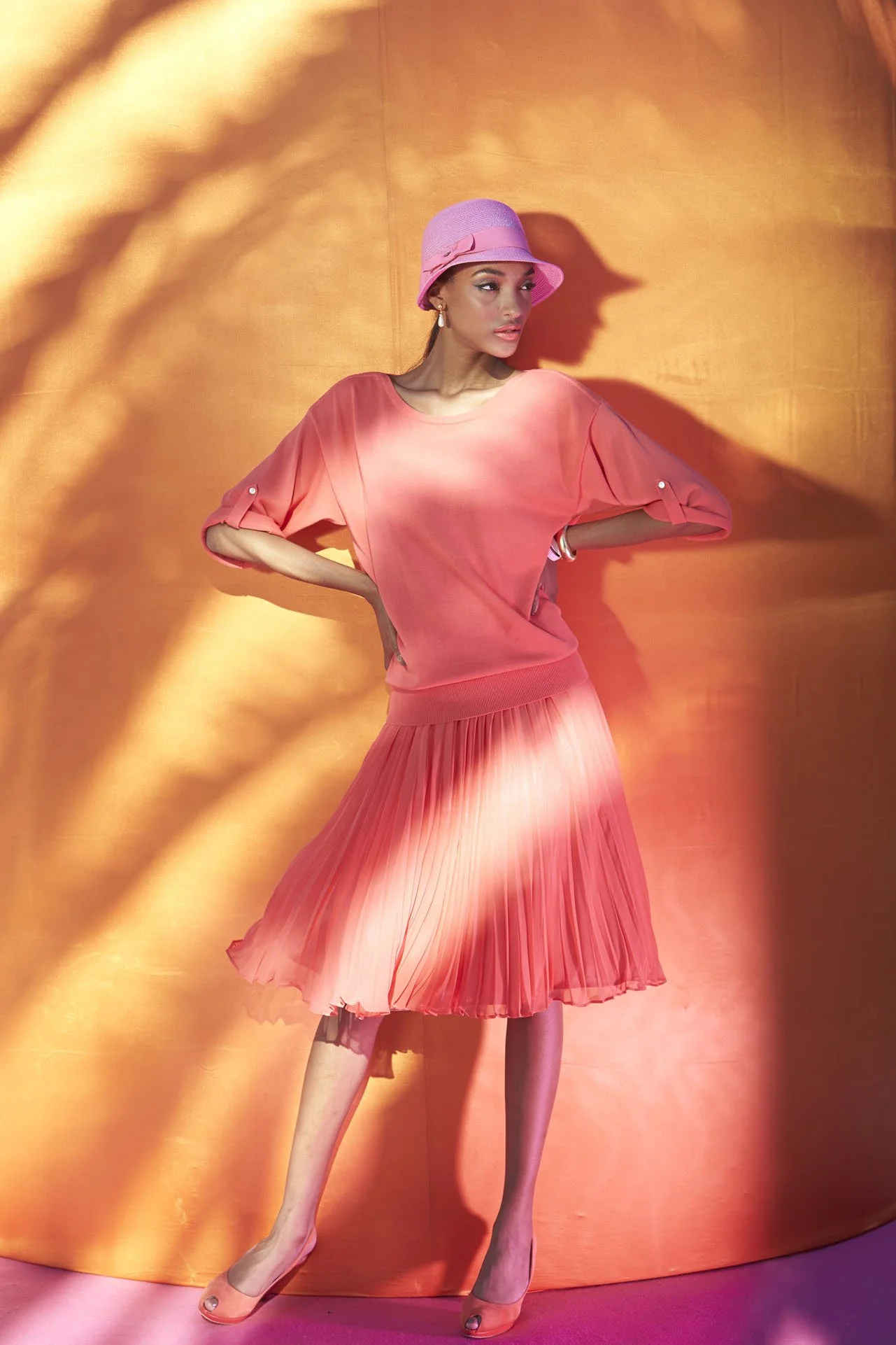
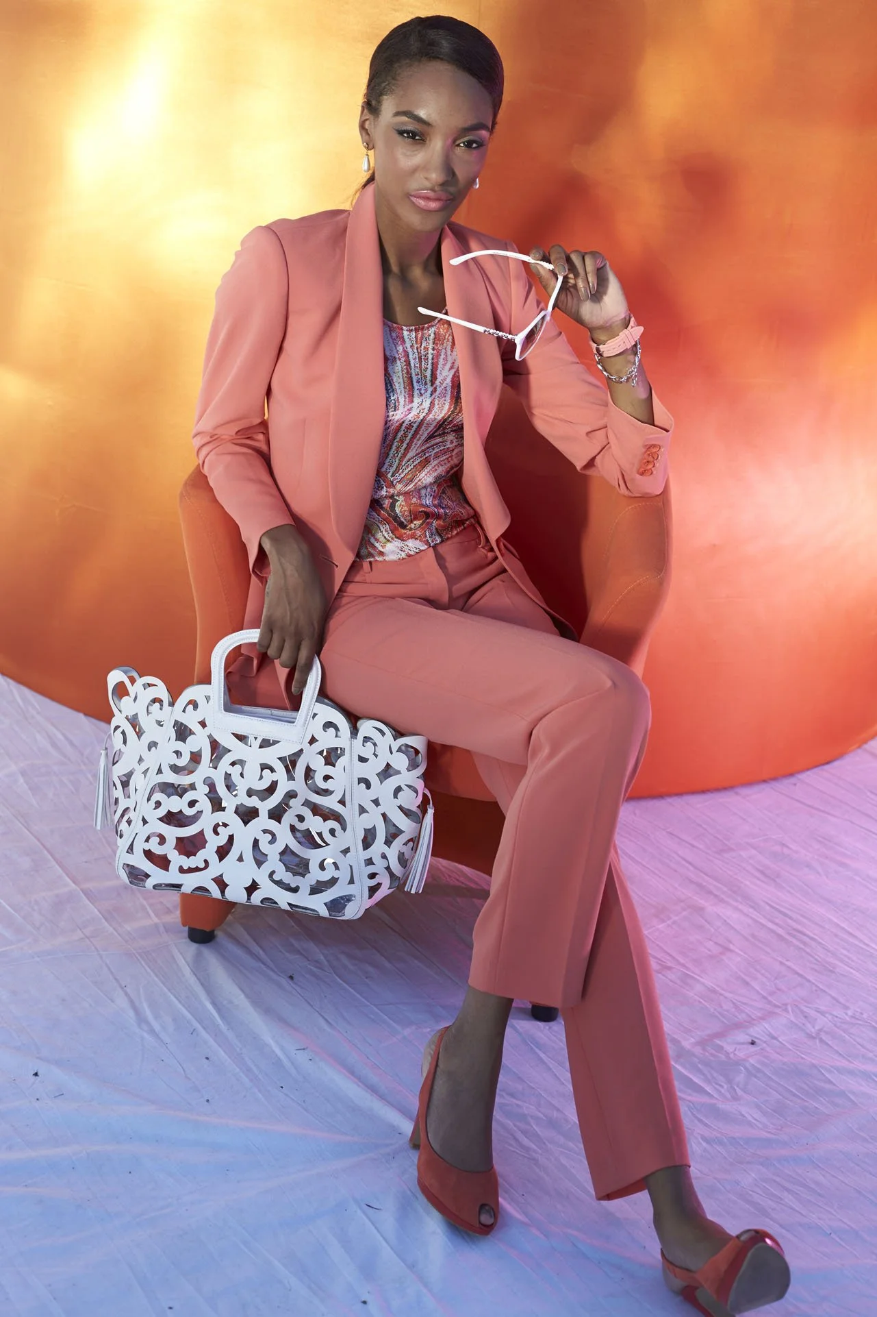
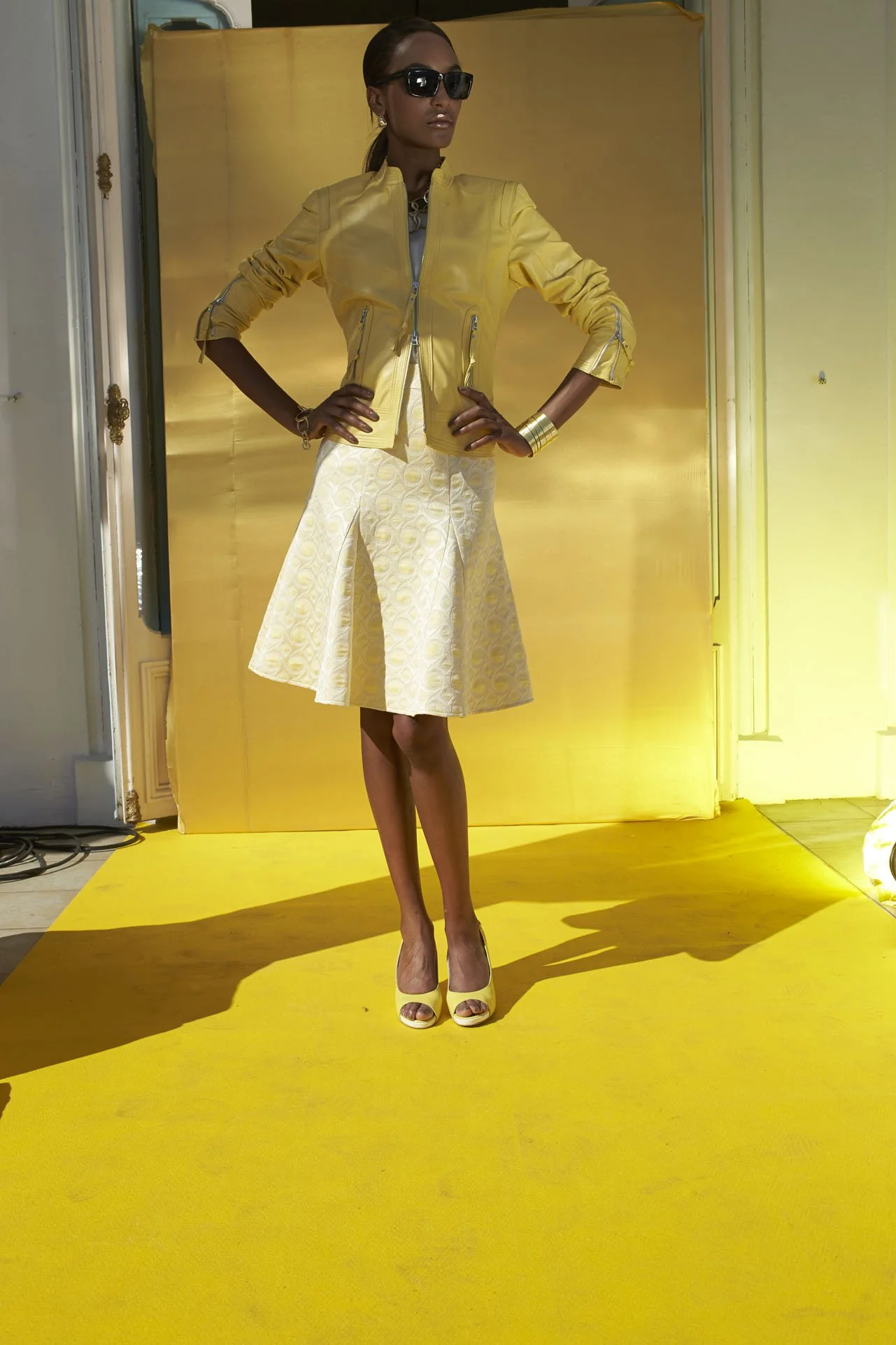
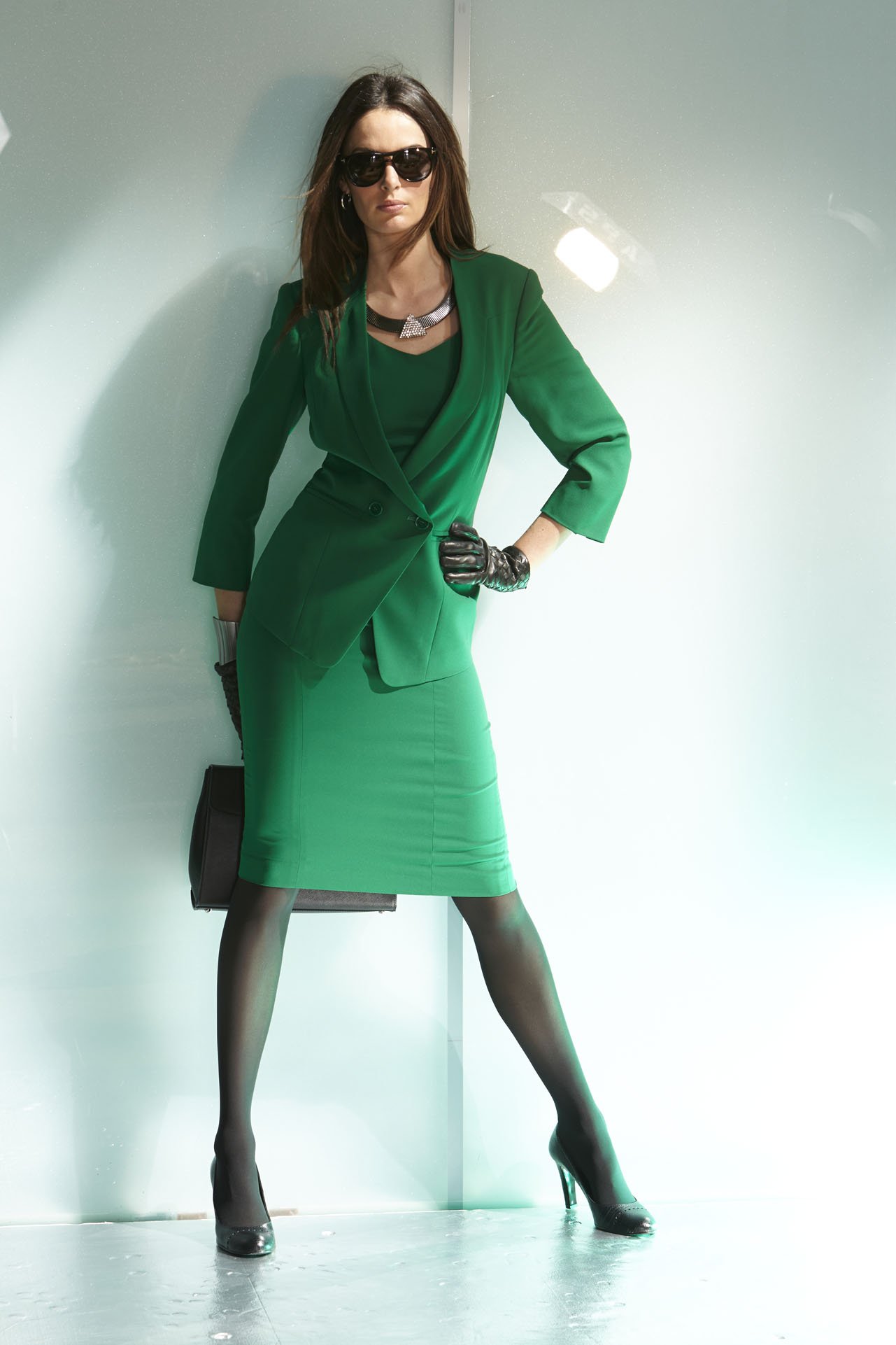
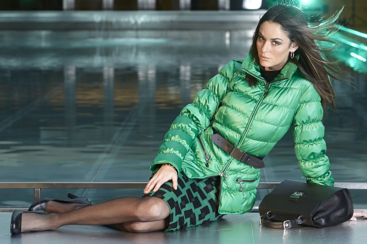
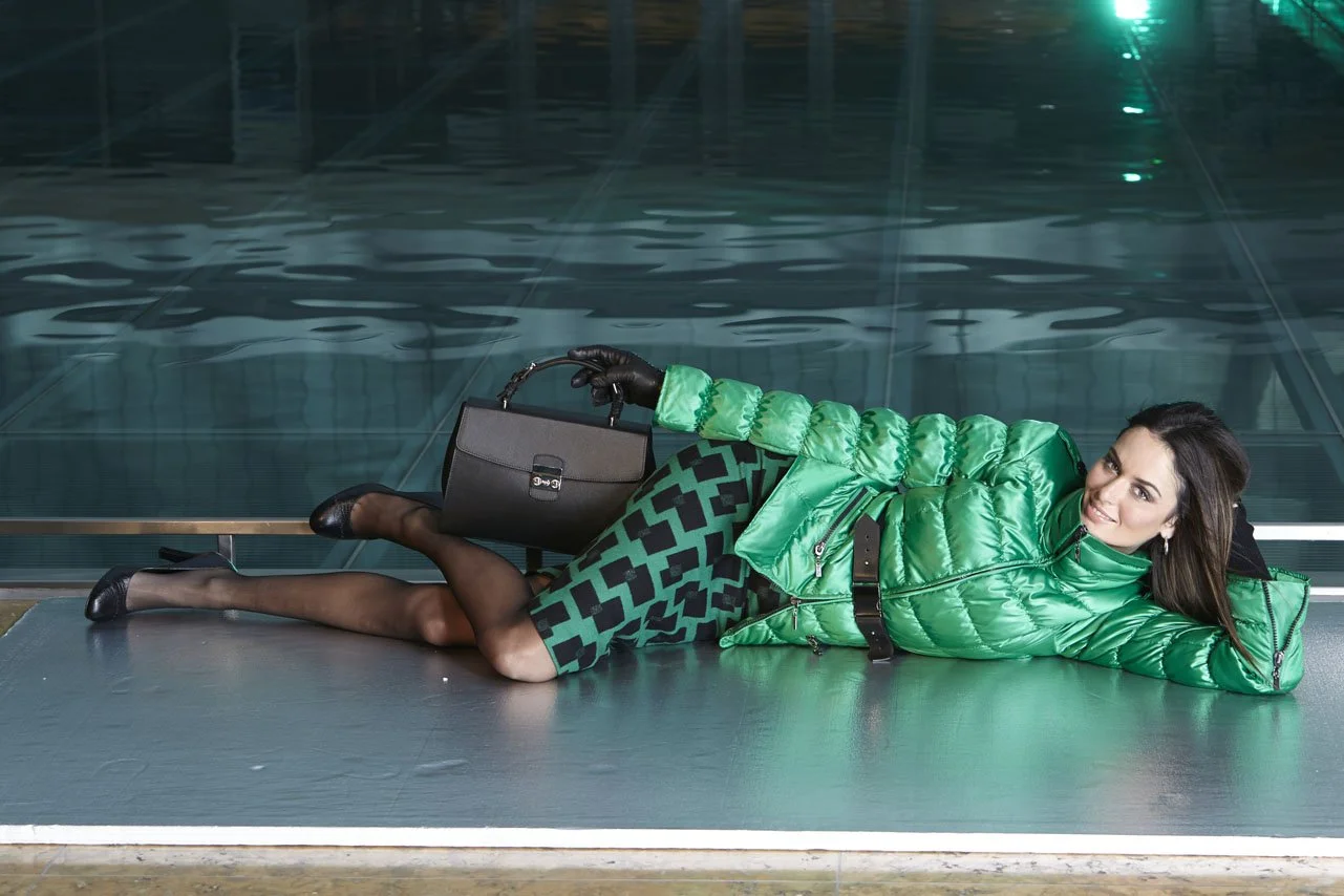
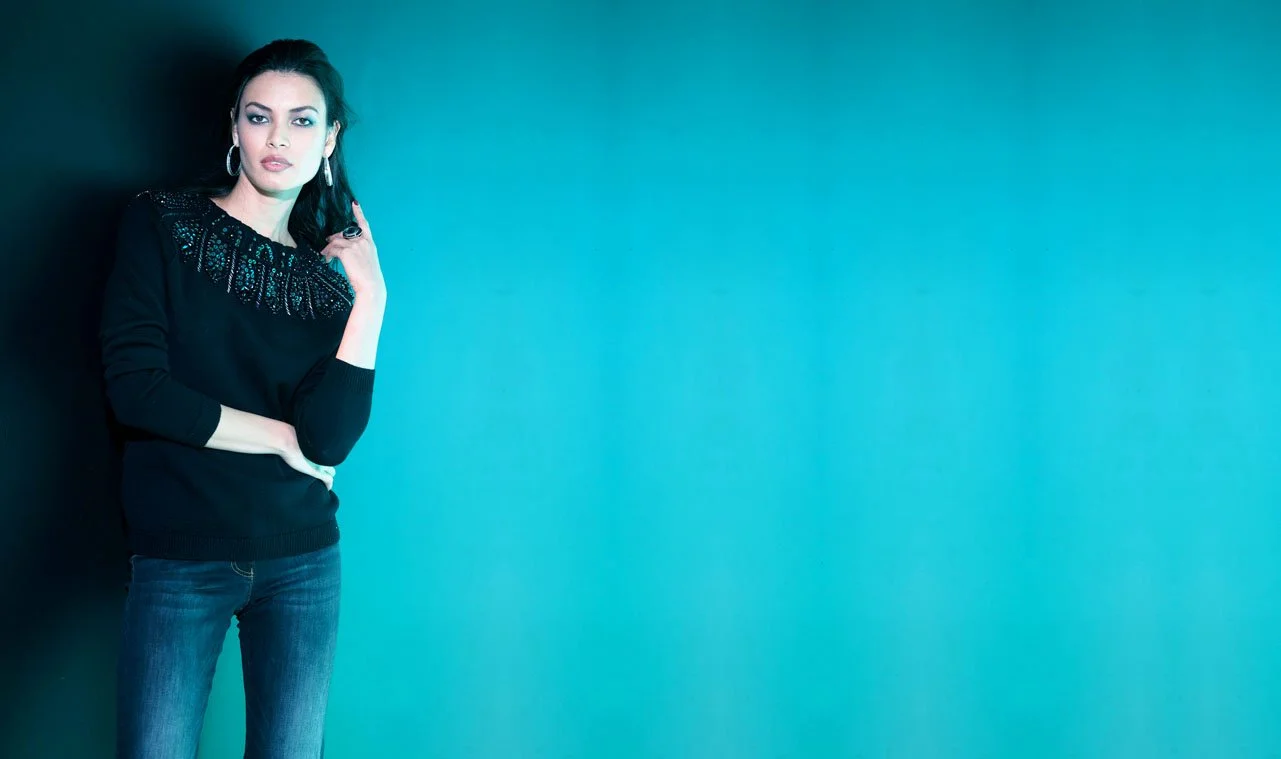
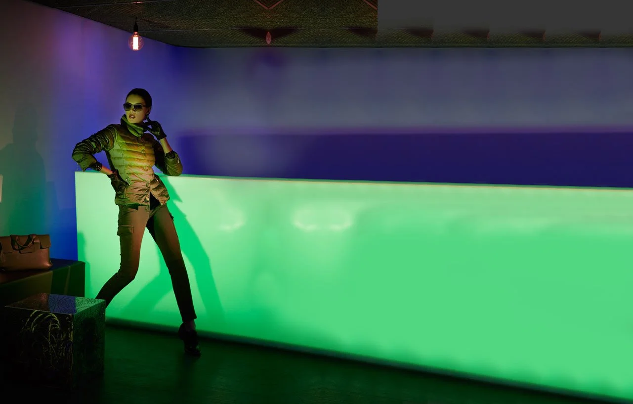
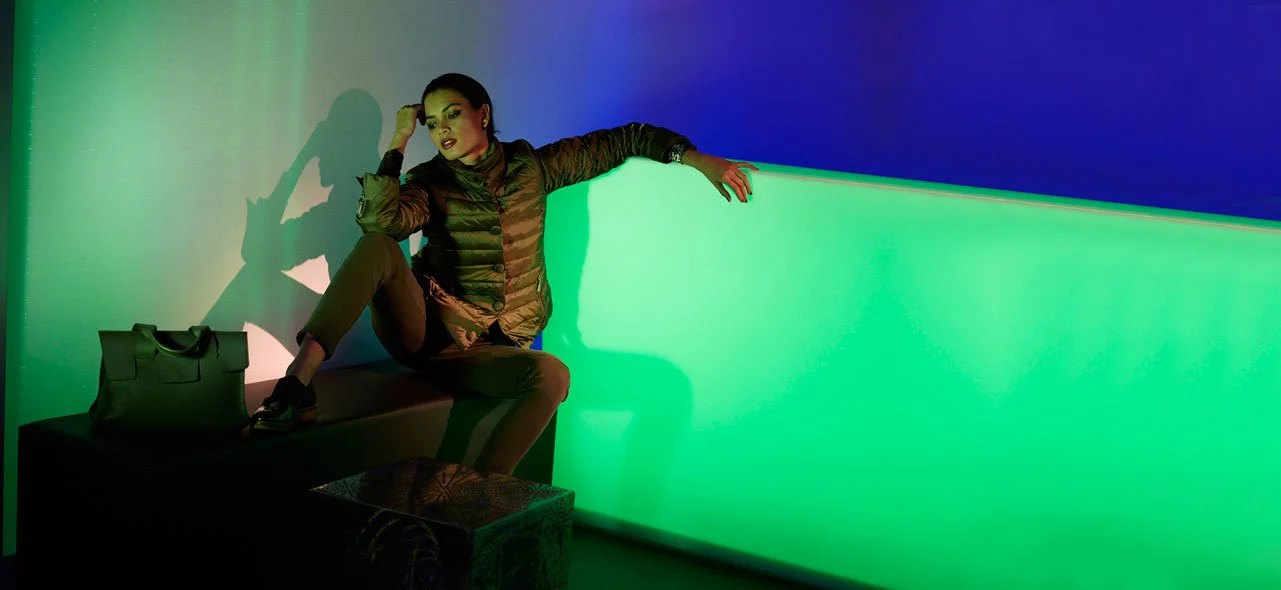
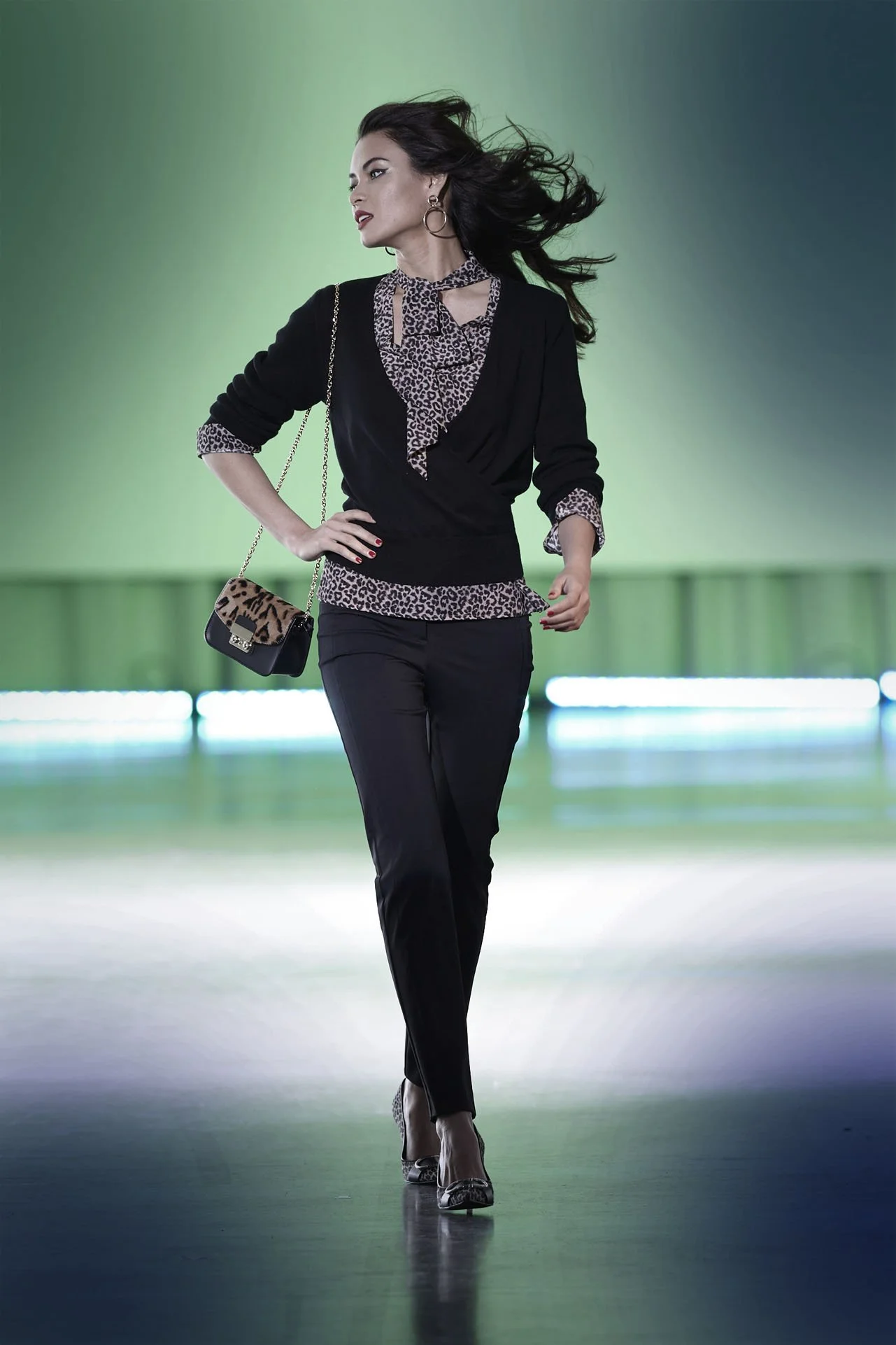
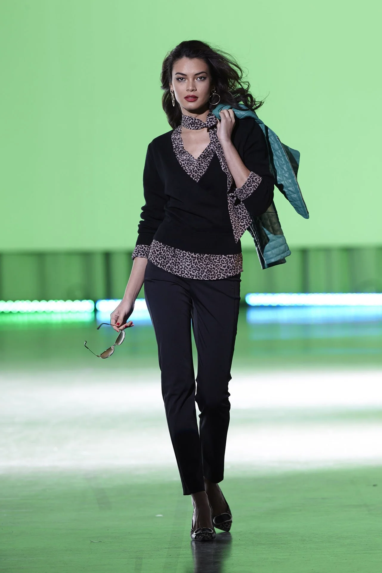
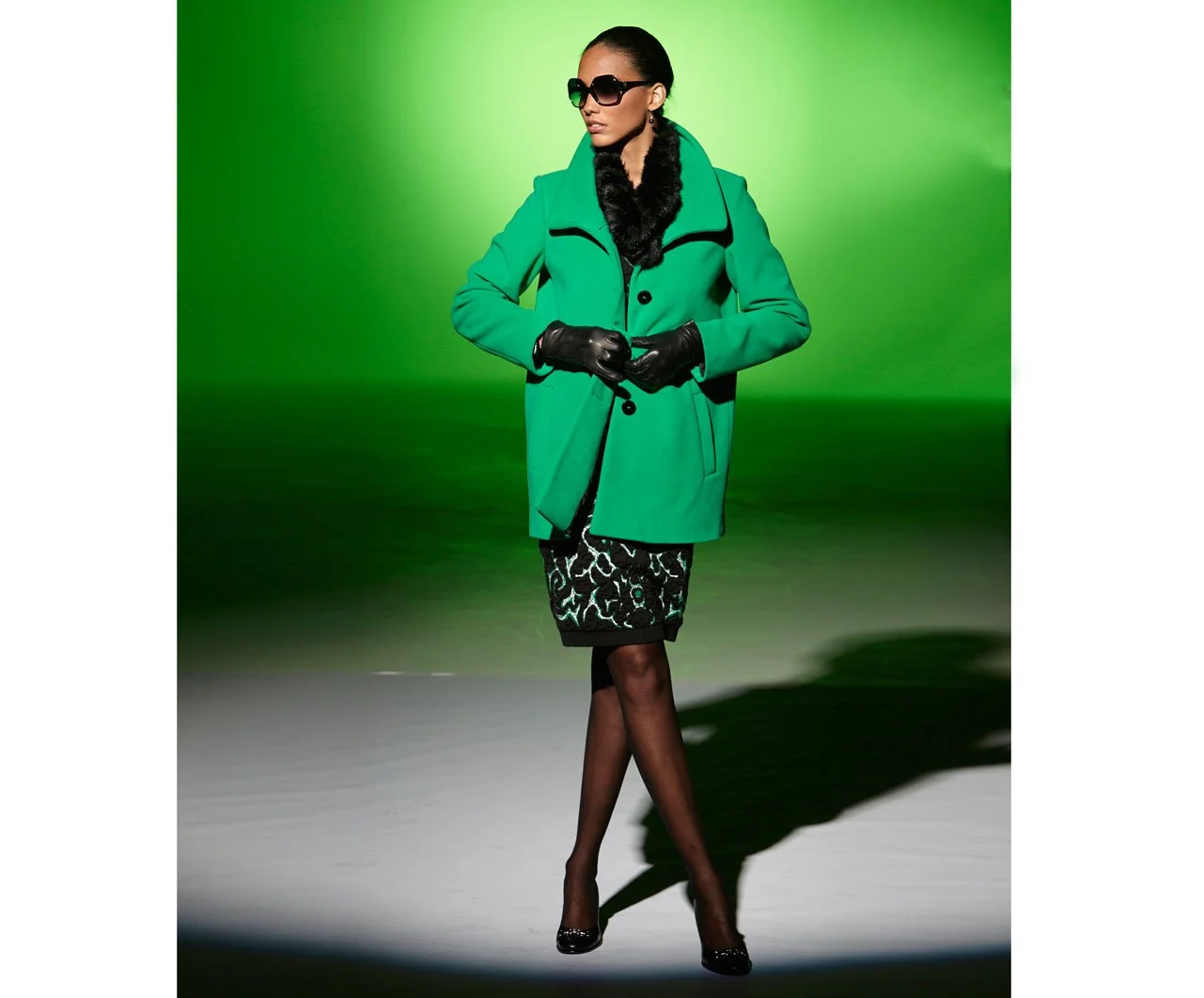
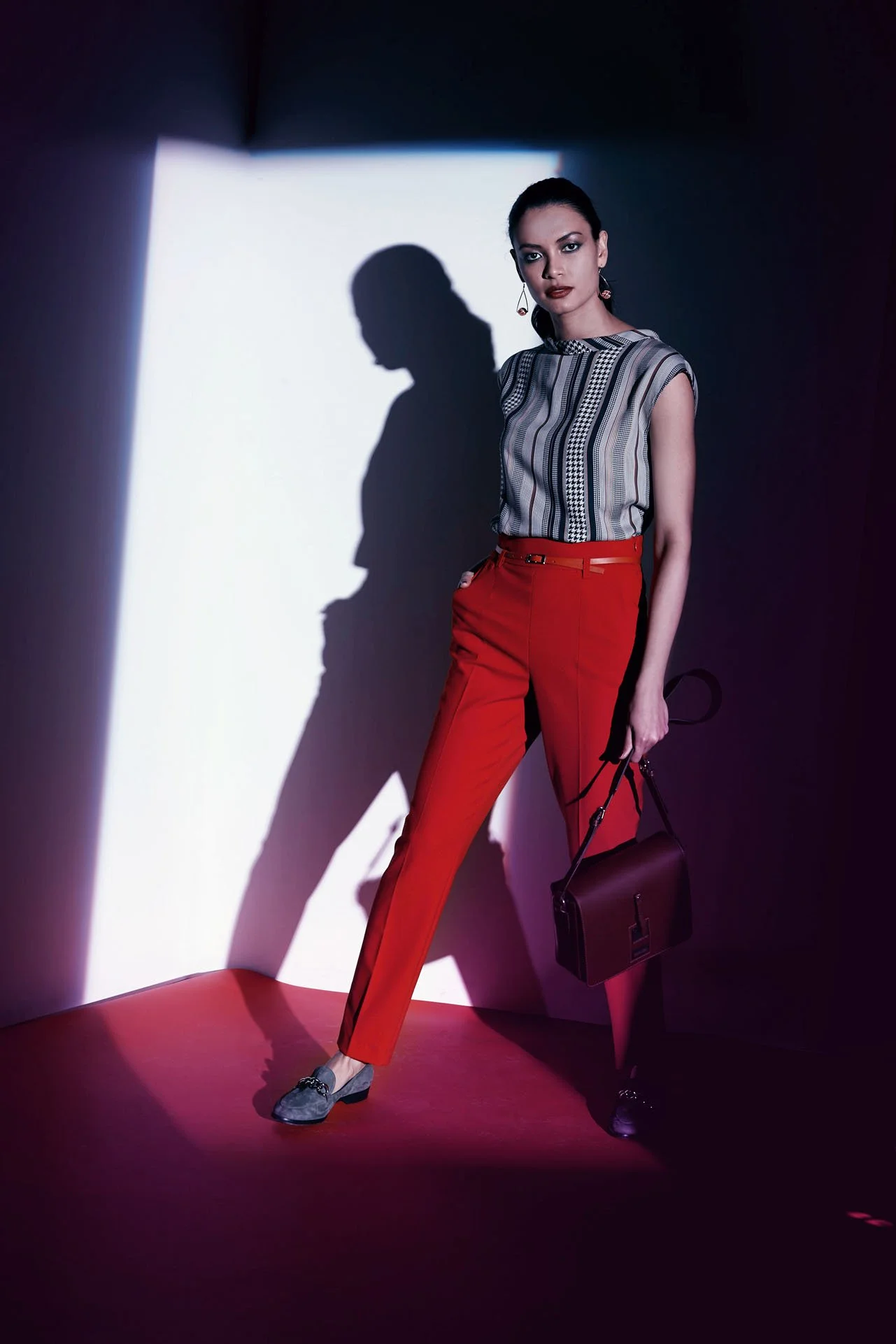
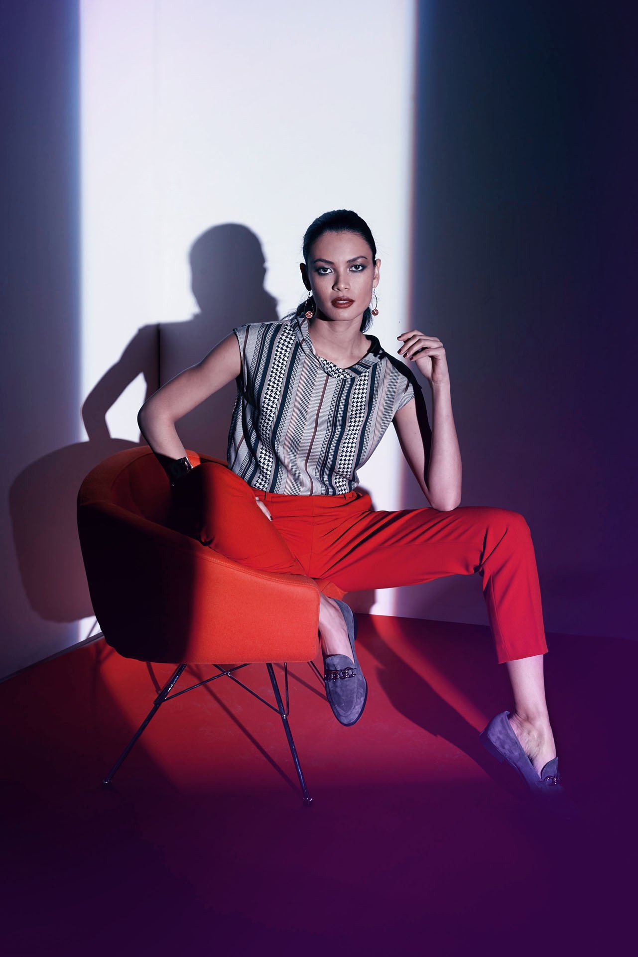
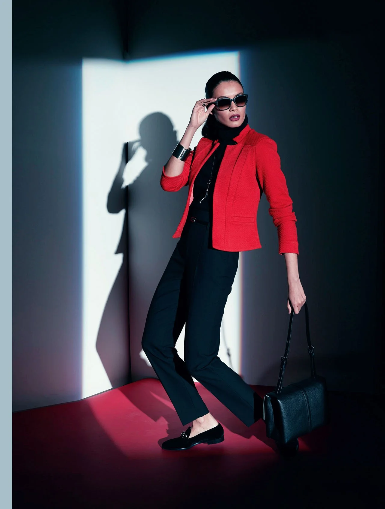
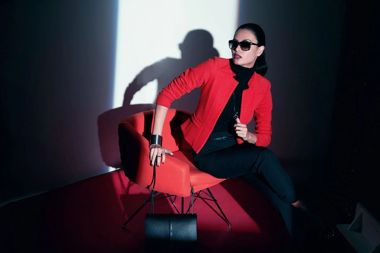
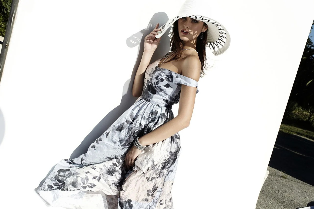
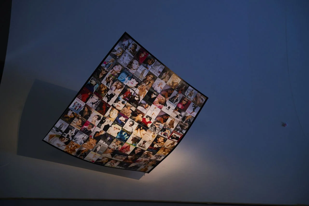
One of the defining phenomena of the German "Economic Miracle" was the massive, multi-hundred-page catalogs produced by the mail-order house Quelle—volumes in which German citizens could browse and order fashion and other goods to their heart's content. To reach specific target groups within the fashion sector even more effectively, Madeleine Mode GmbH was founded in 1977. Initiated by the successful entrepreneurial couple Grete and Gustav Schickedanz—and named after their own daughter—the company was established to market elegant, glamorous, and trend-setting fashion. A team of just three employees assembled the initial collection; however, its presentation proved rather modest, as the early catalogs failed to live up to the sophisticated standards the fashion itself was intended to embody. Consequently, in the early 1980s, the search began for a photographer capable of translating Madeleine’s elevated brand aspirations into visual form. The name Ulrich Pracht quickly rose to the top of the list, as his work for Blacky Dress—a supplier to Quelle—had already earned him high praise from one of the company’s key partners. "One day, the phone rang in my studio, and a Ms. Hoffmann was on the line. At that moment, the name 'Madeleine' meant nothing to me, though 'Quelle' was, of course, a household name. I replied: 'The best thing would be for you to come meet me in person.'"
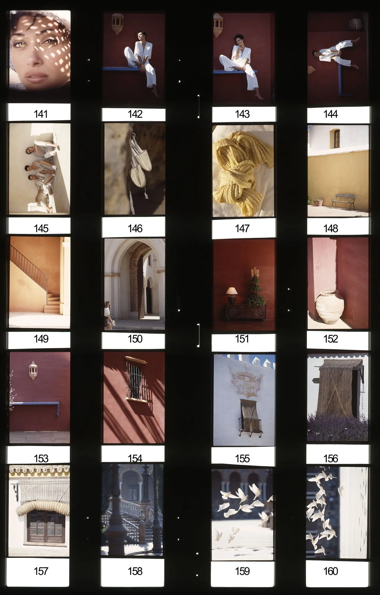
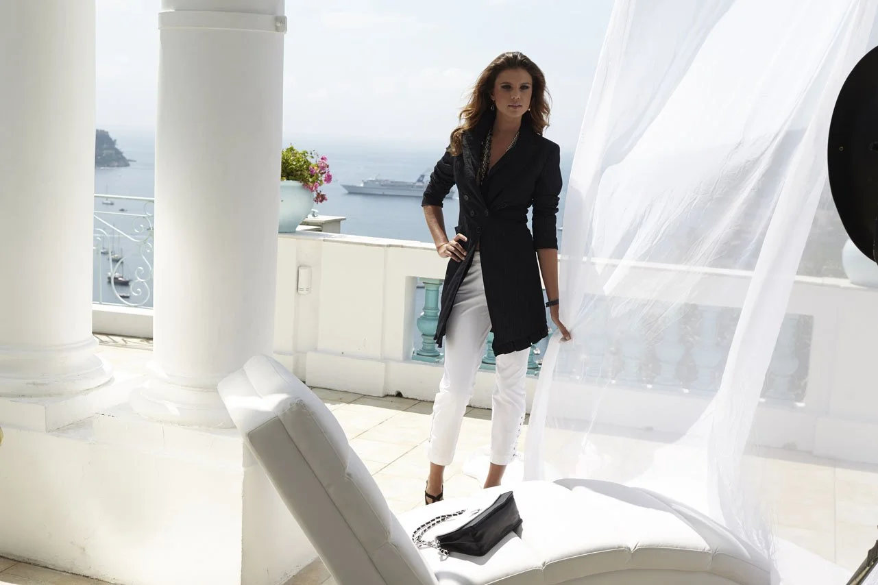
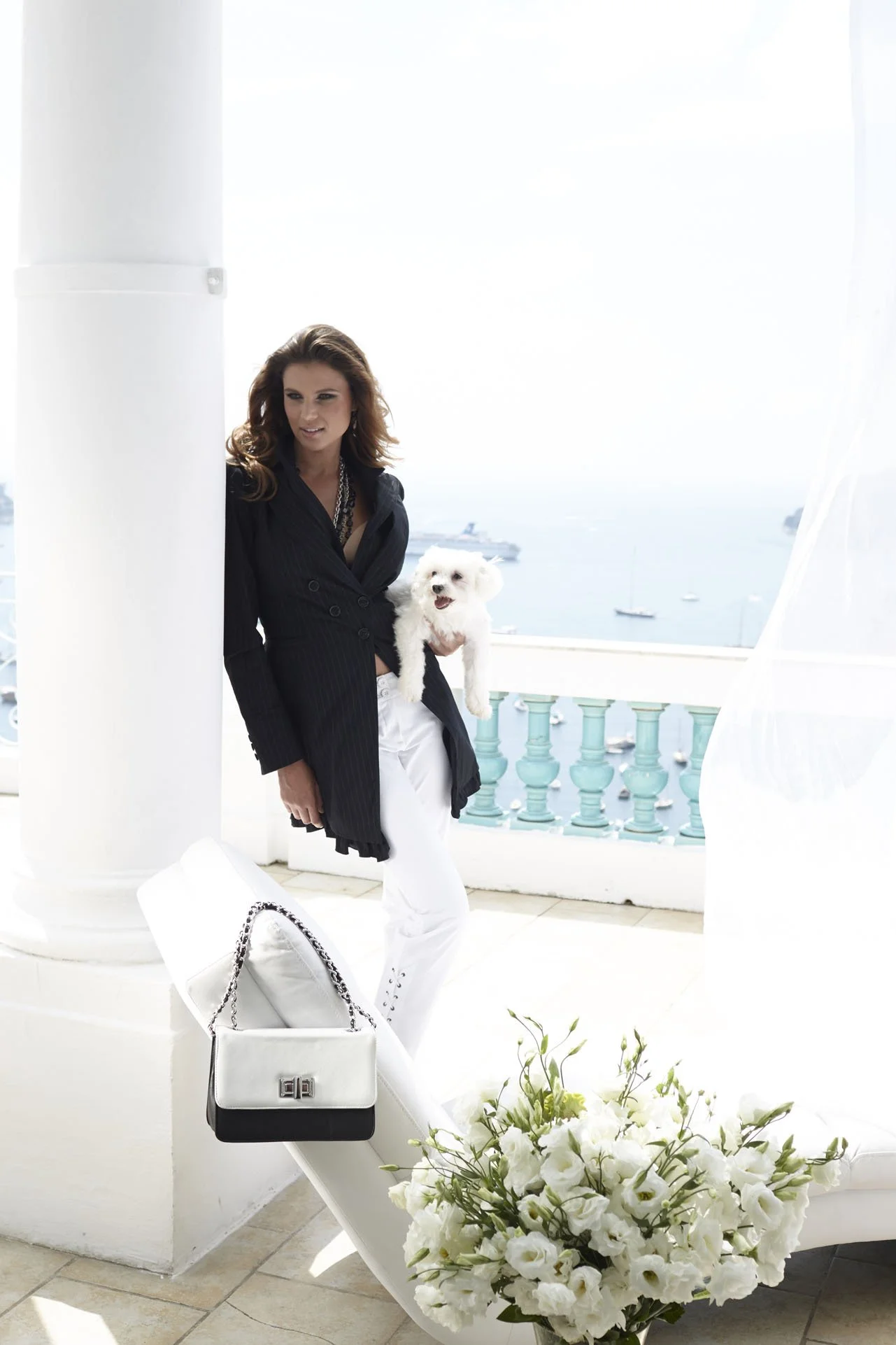
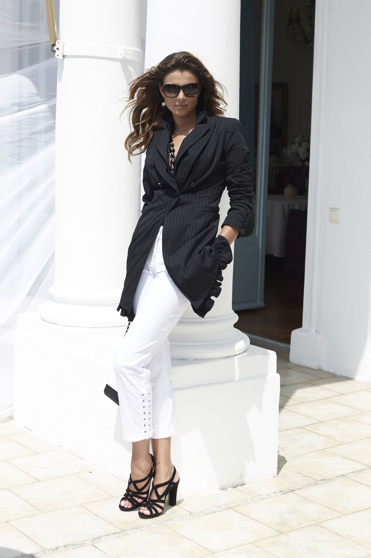
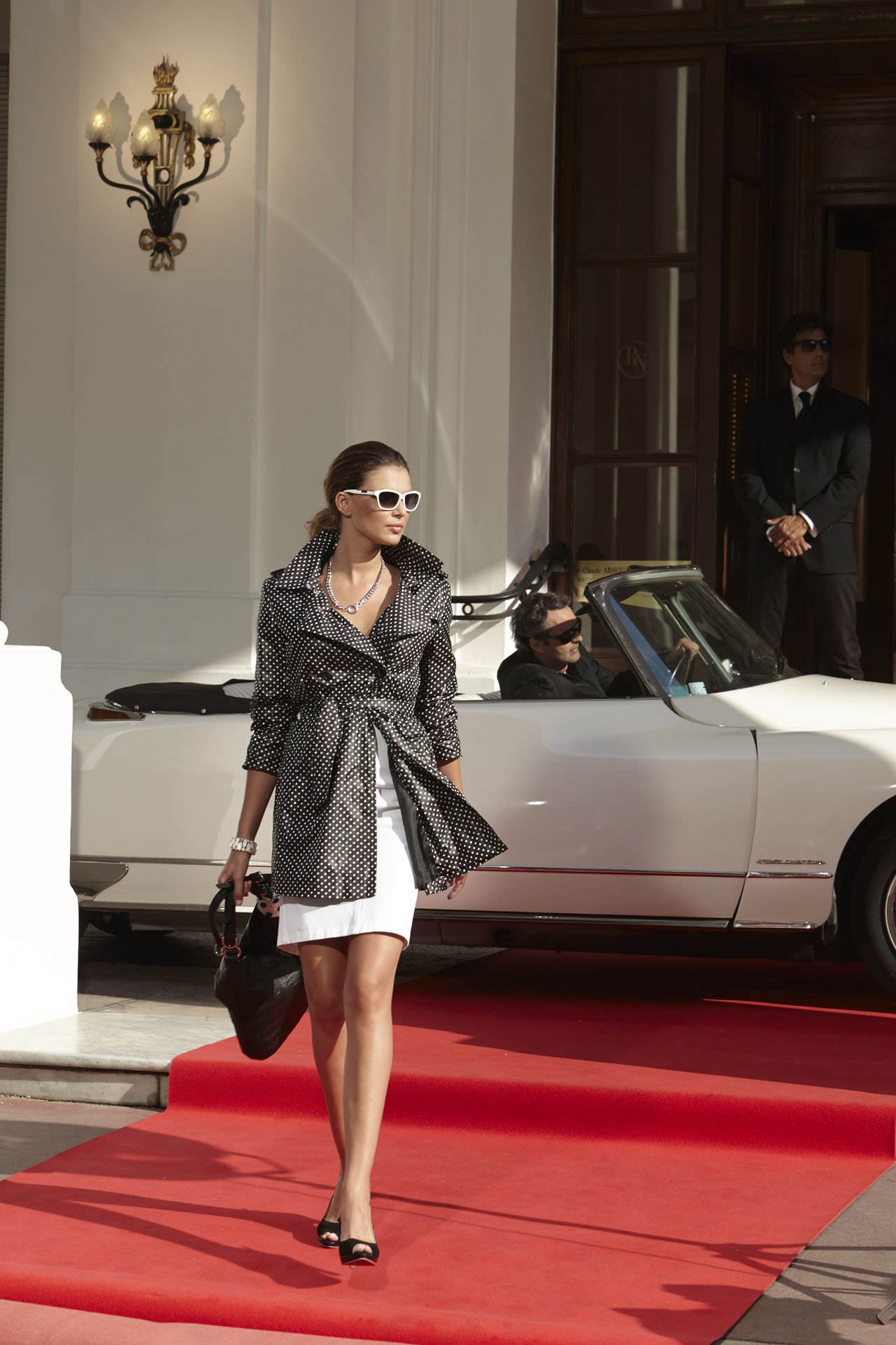
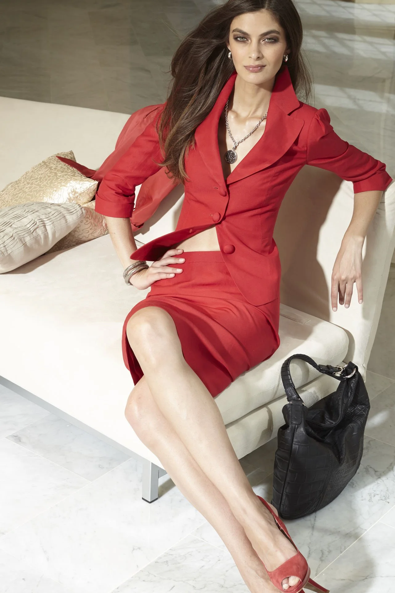
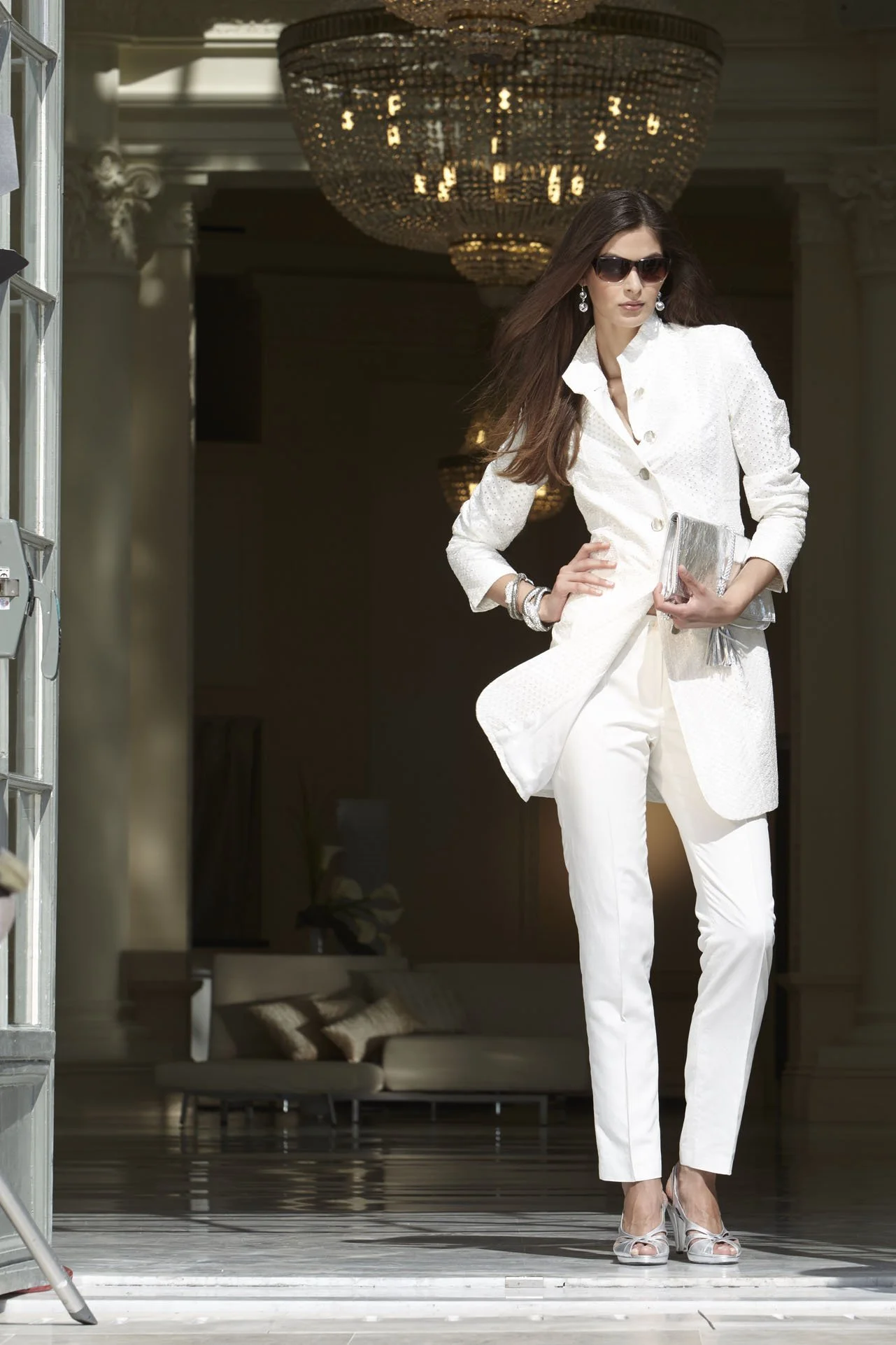
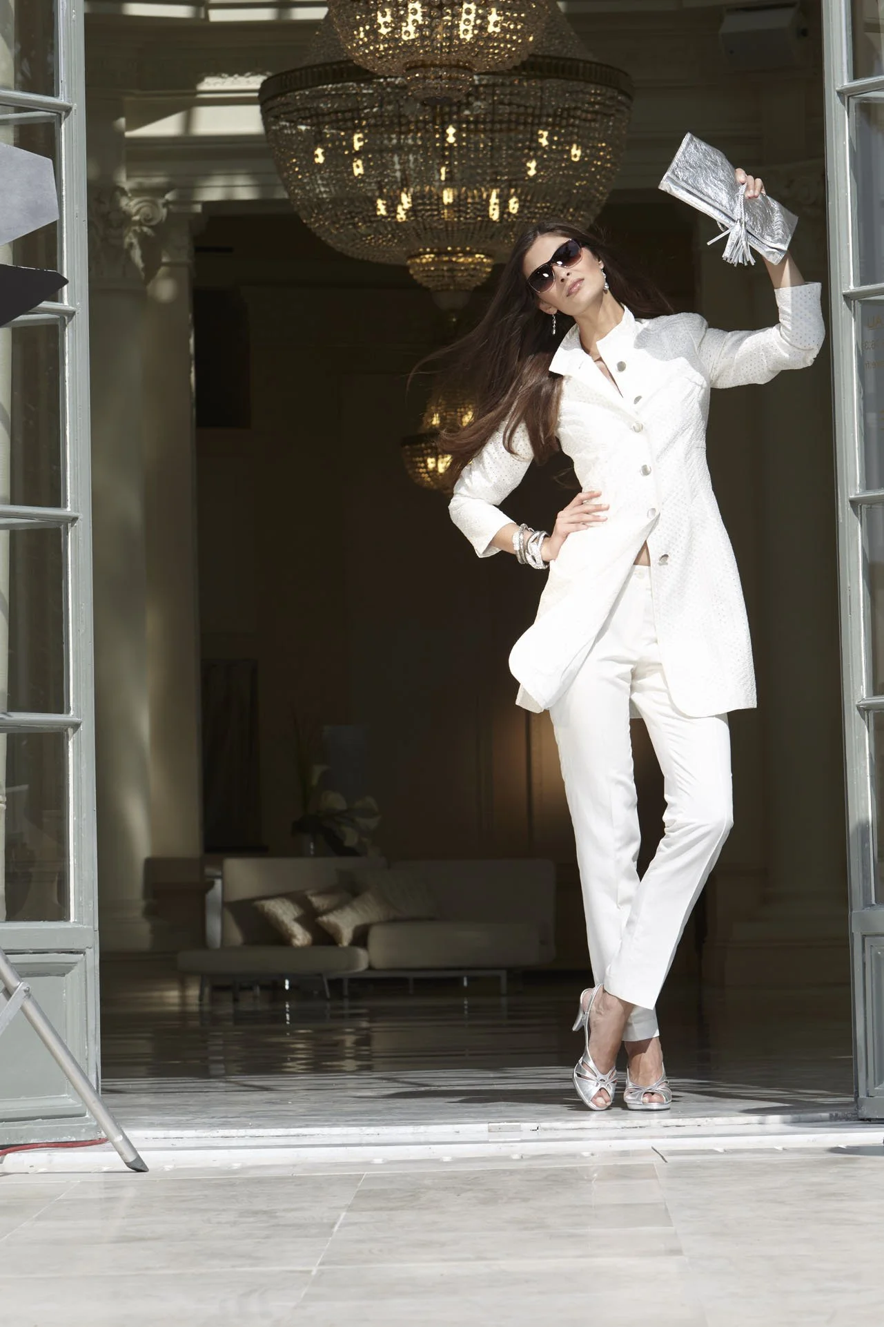
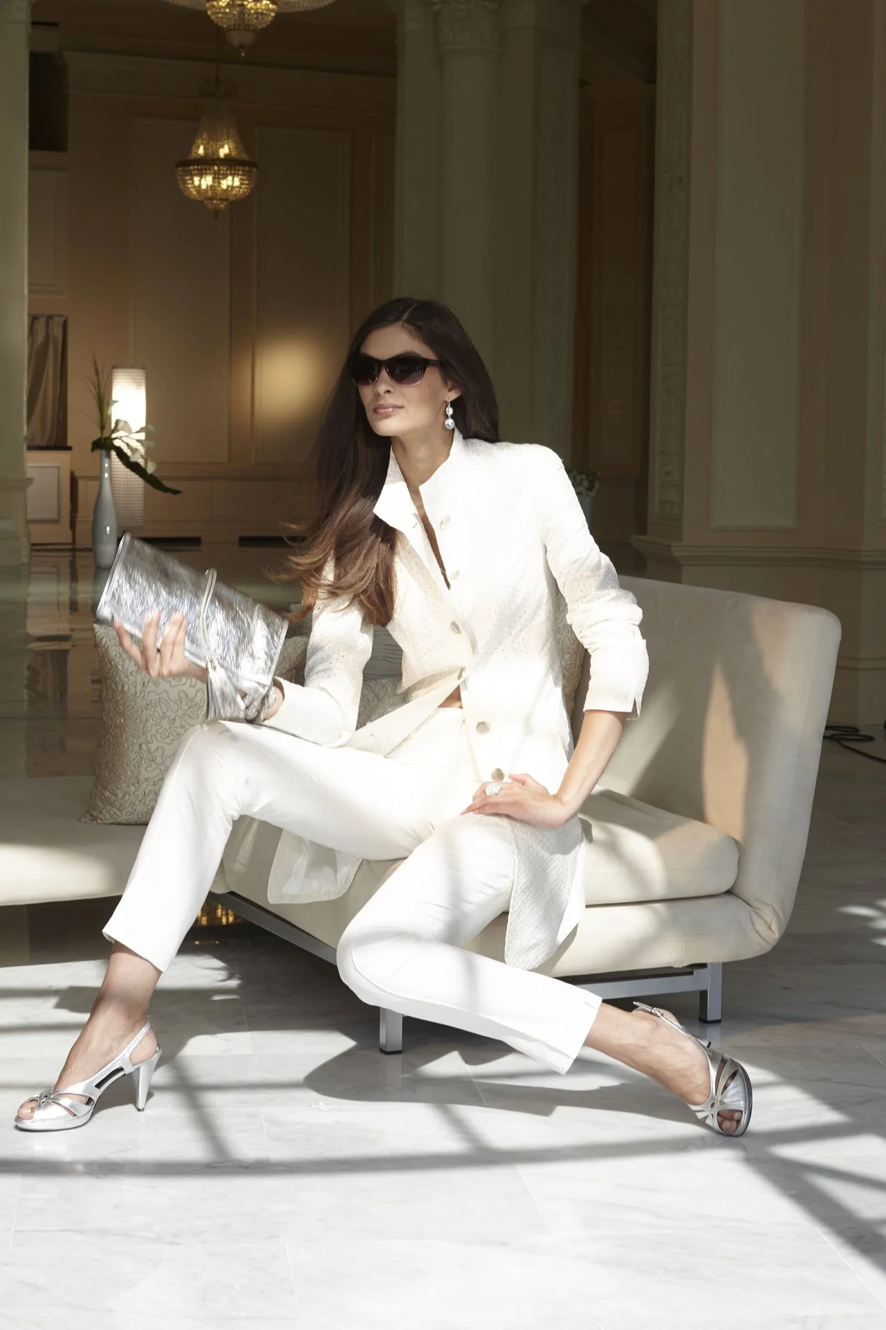
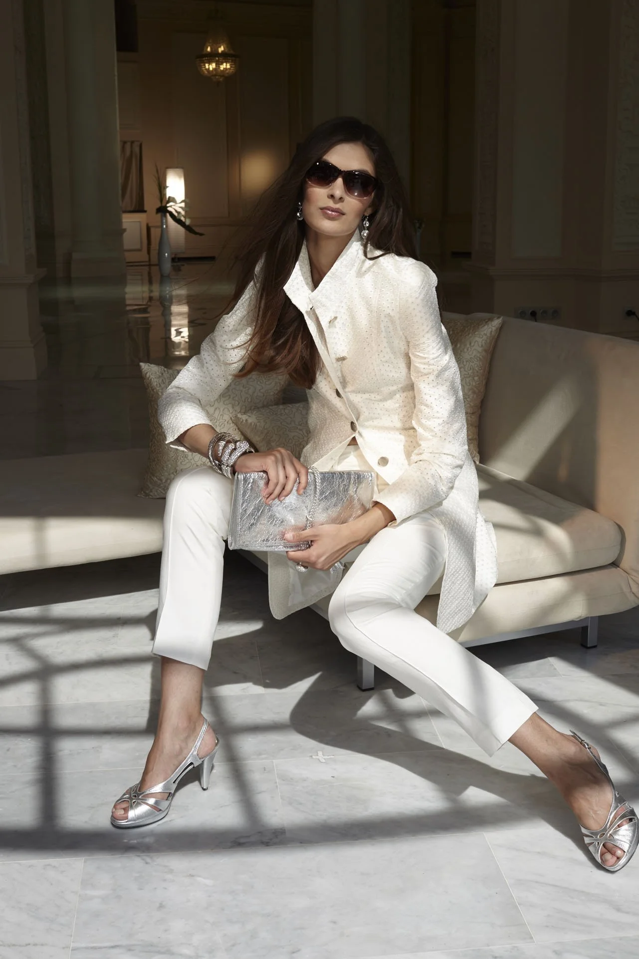
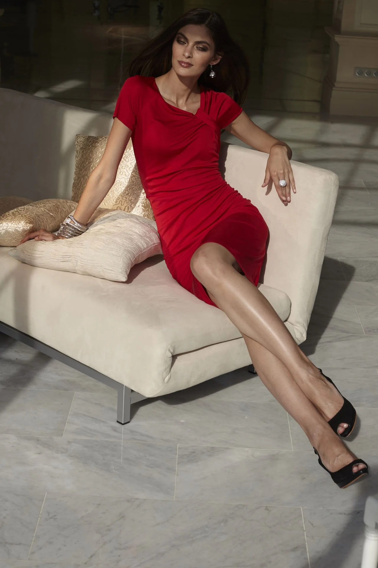
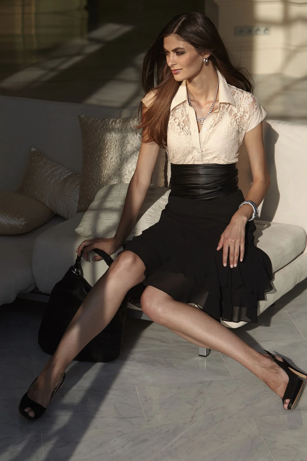
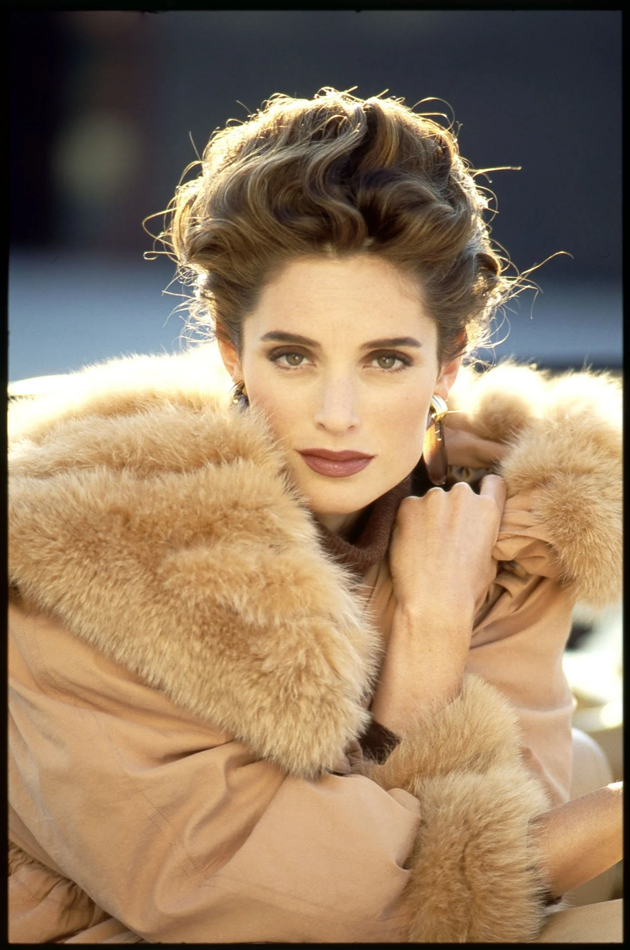
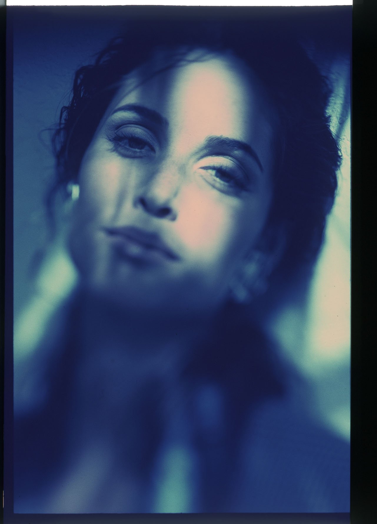
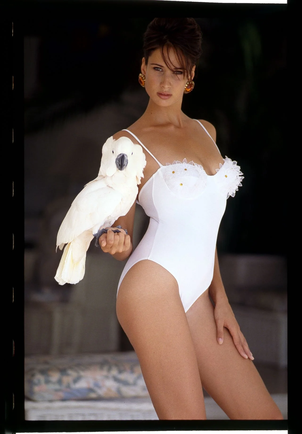
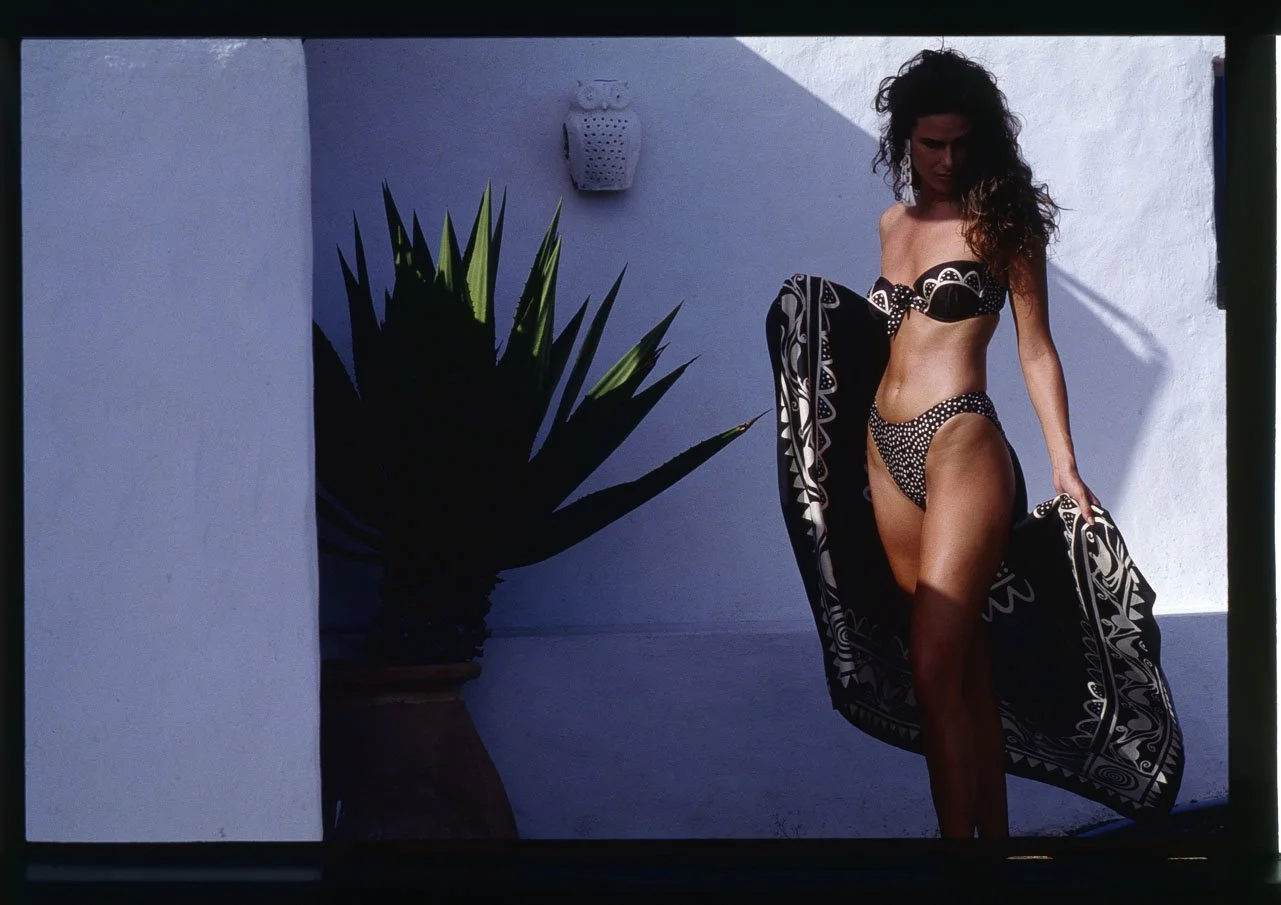
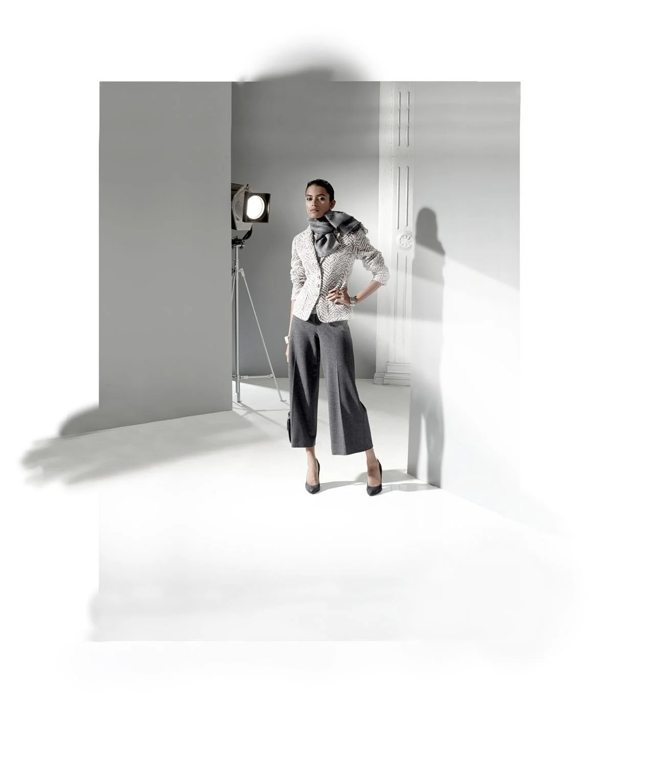
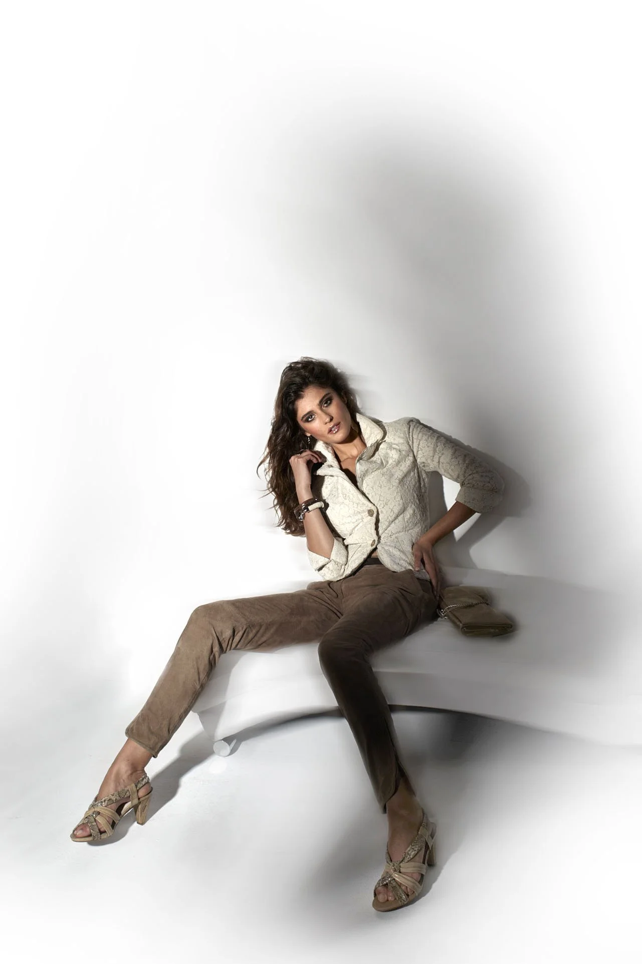
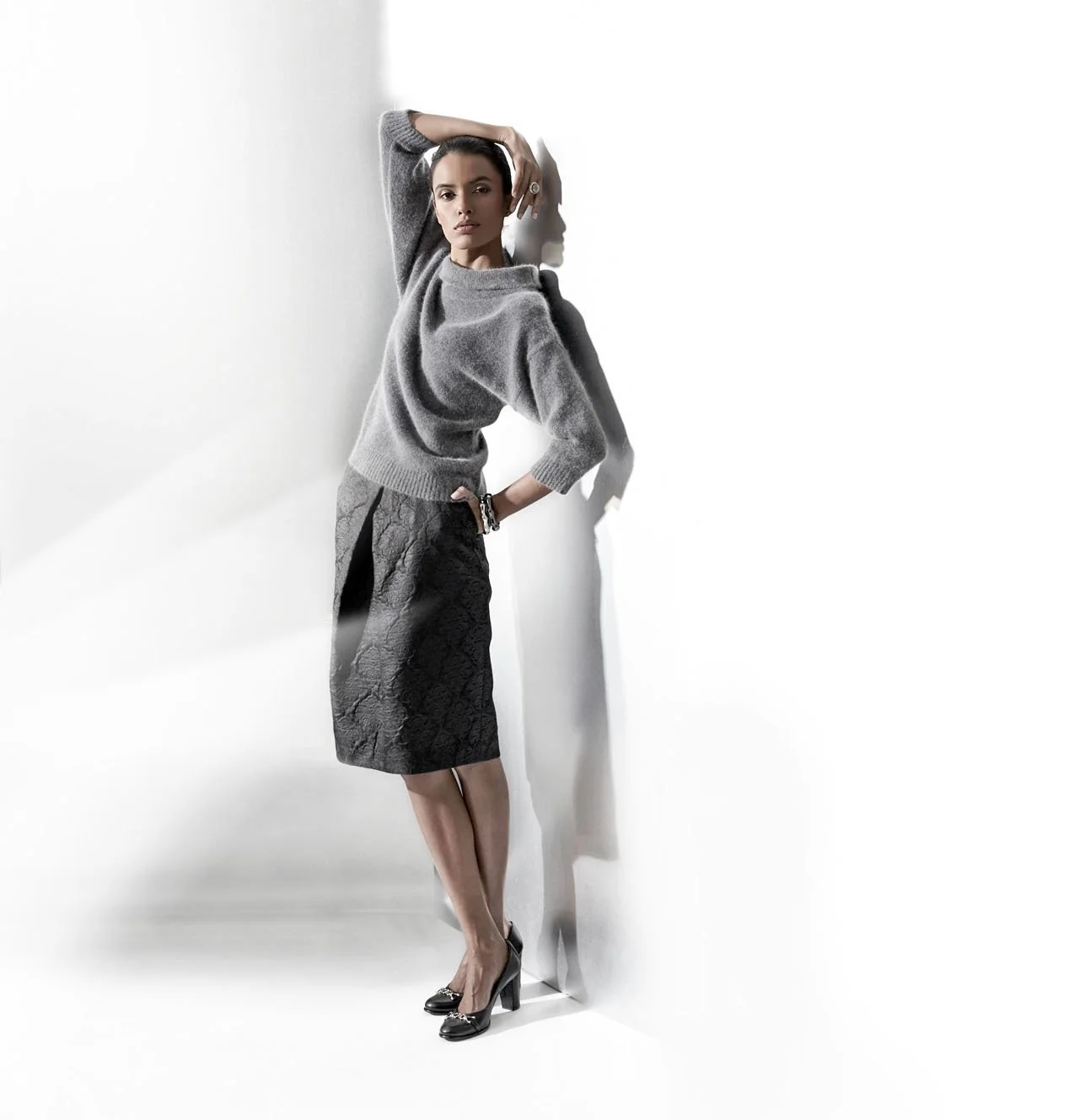
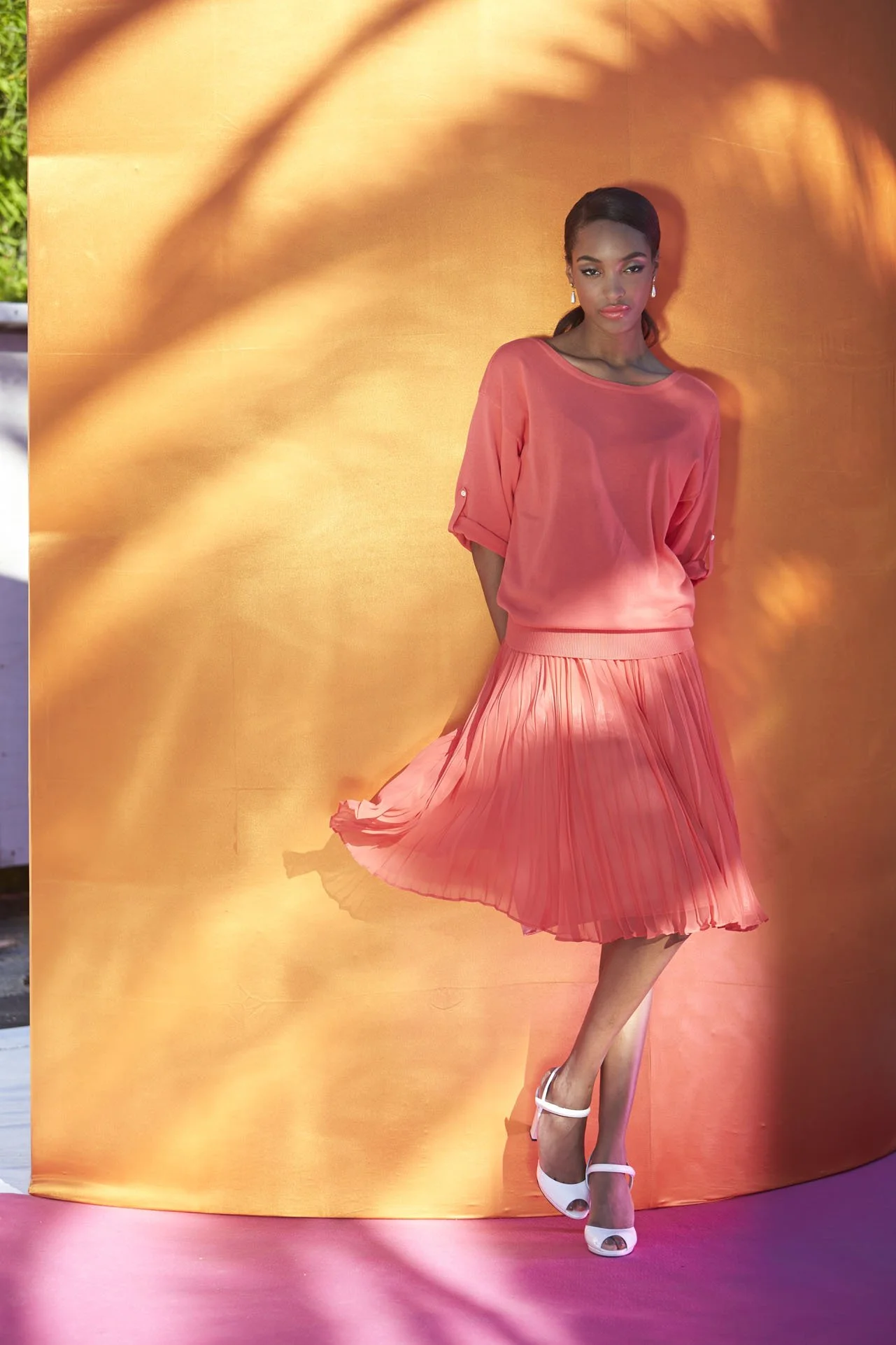
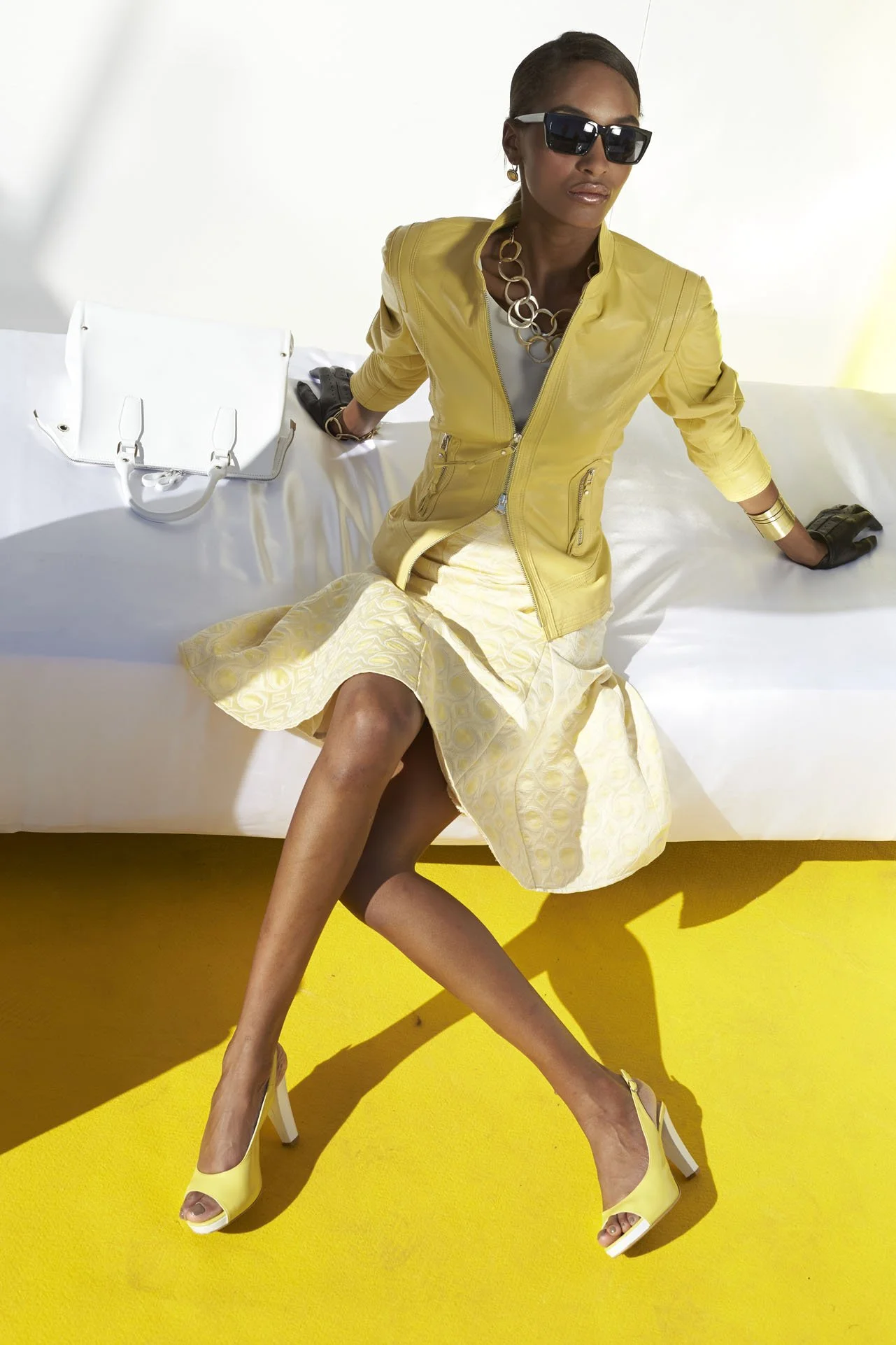
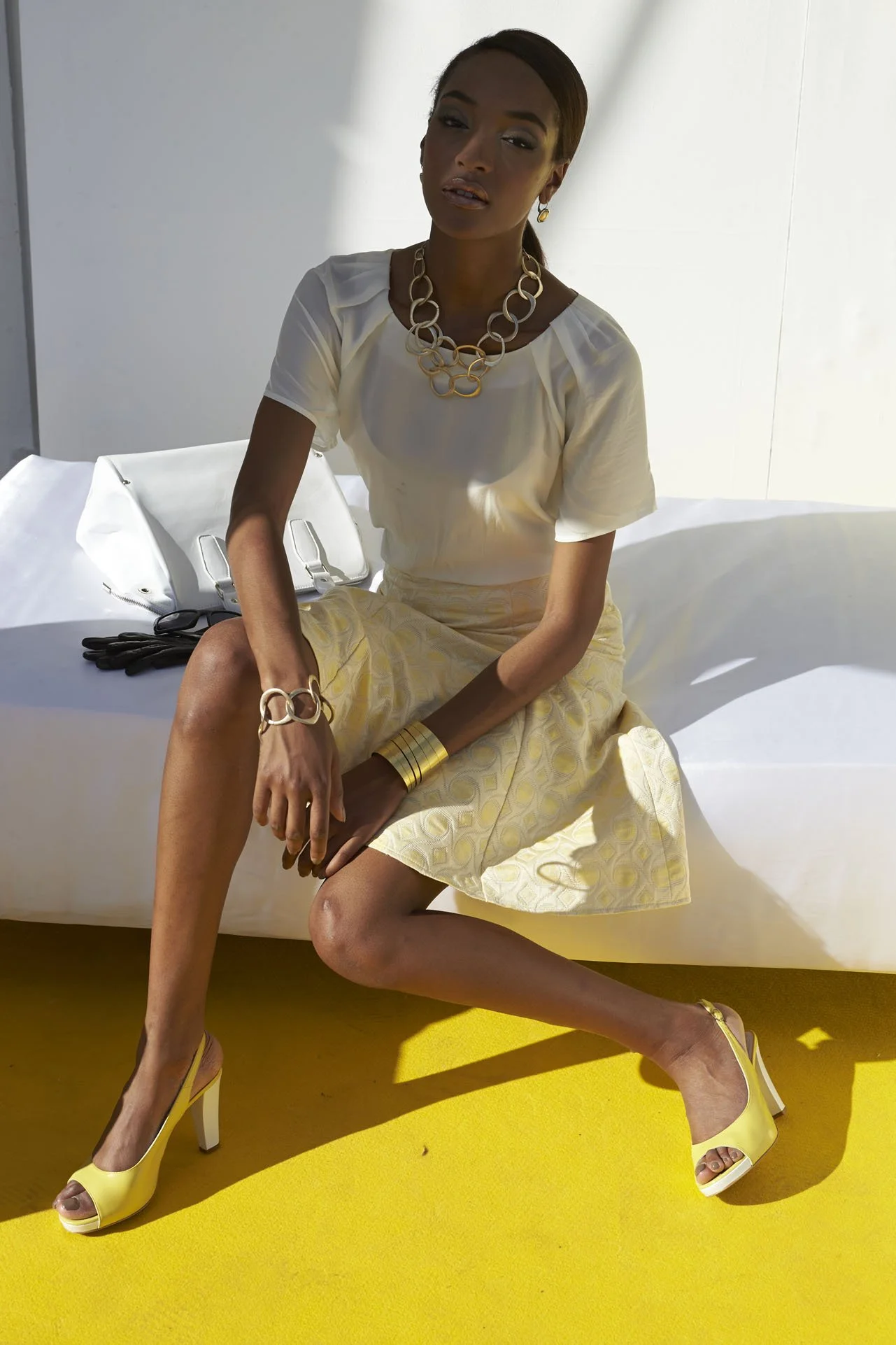
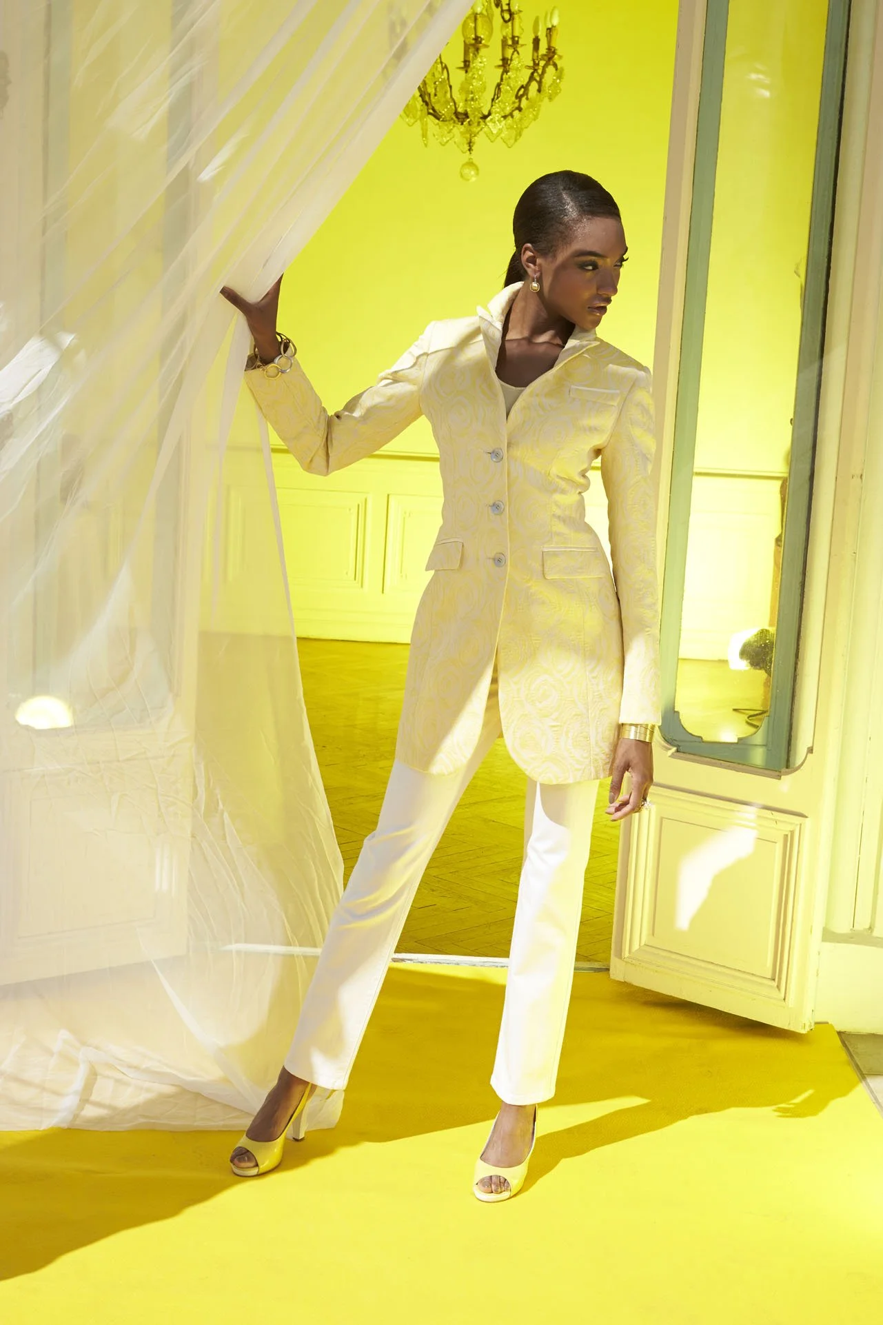
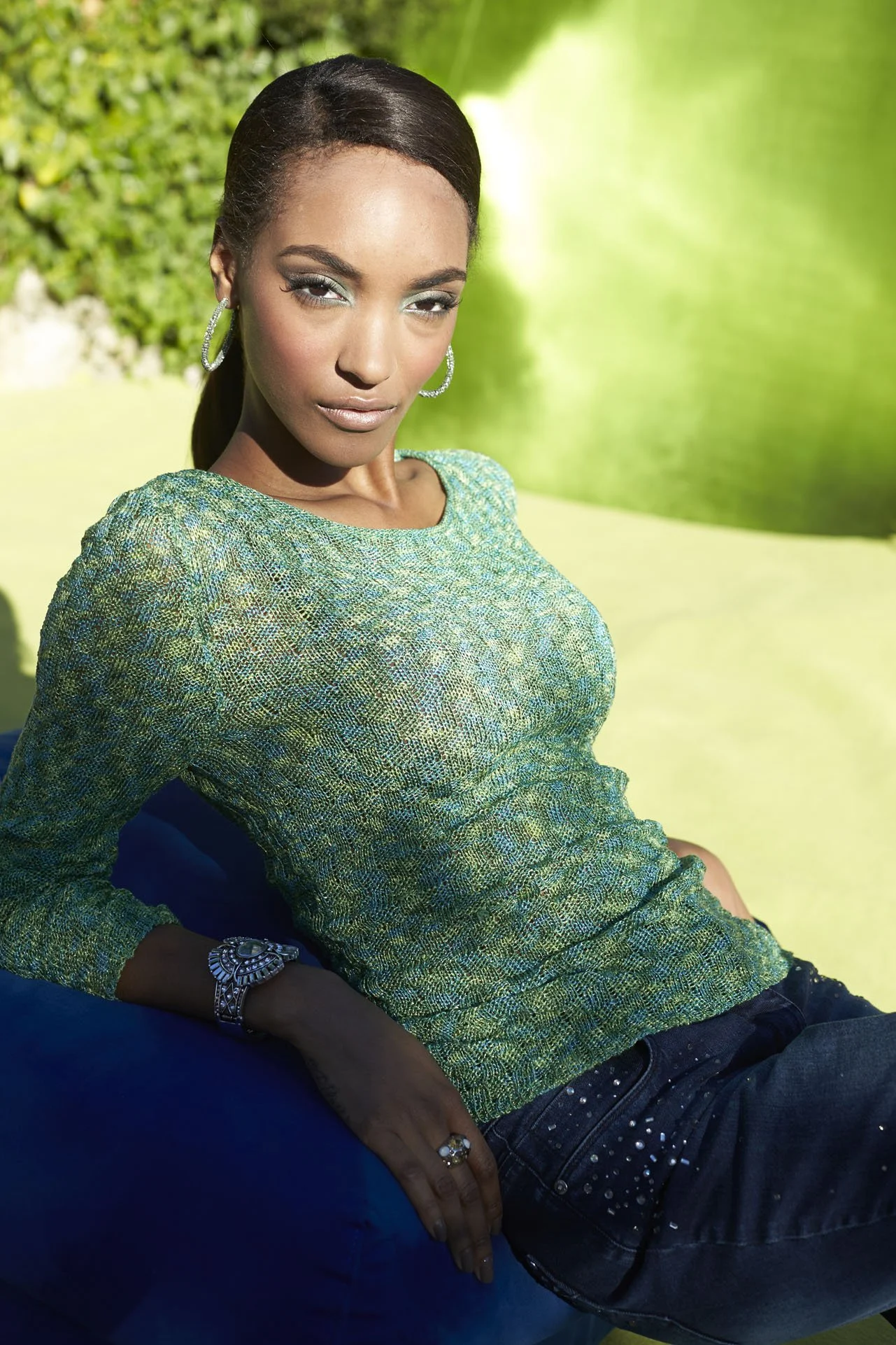
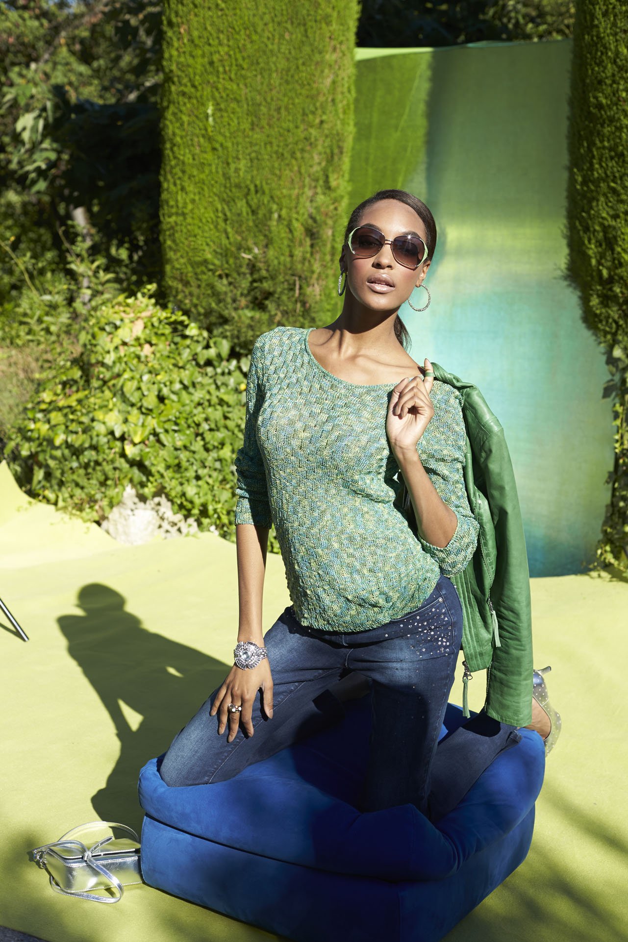
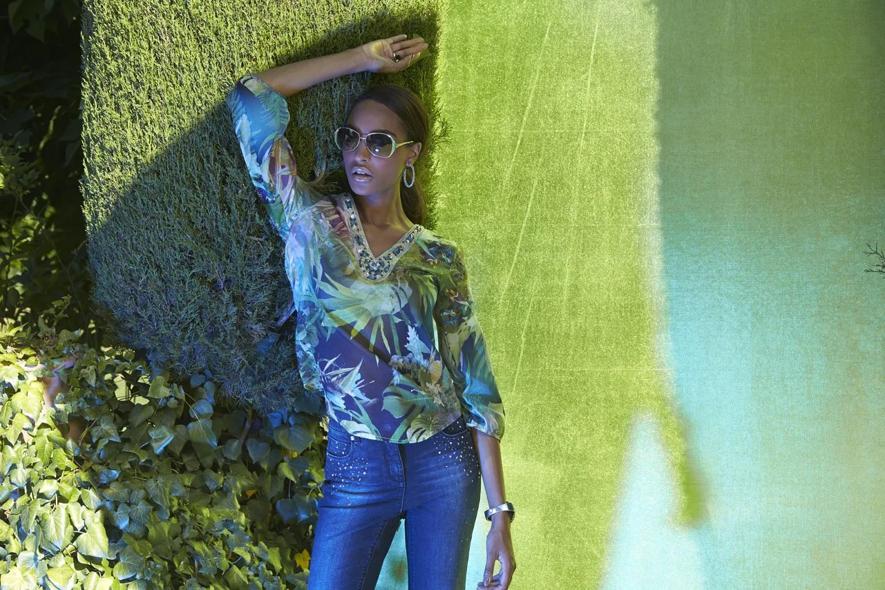
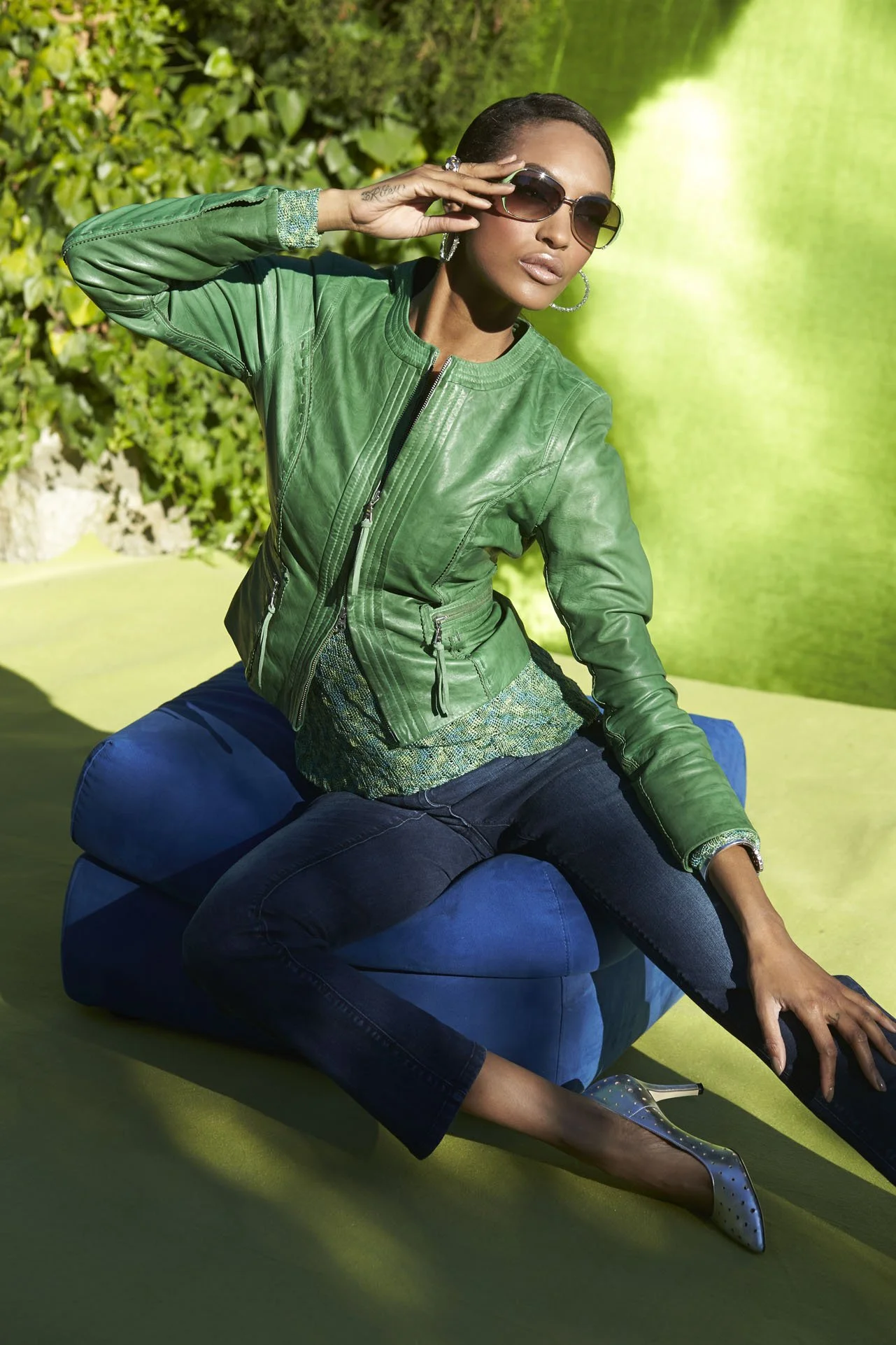
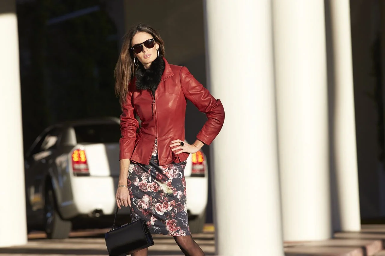
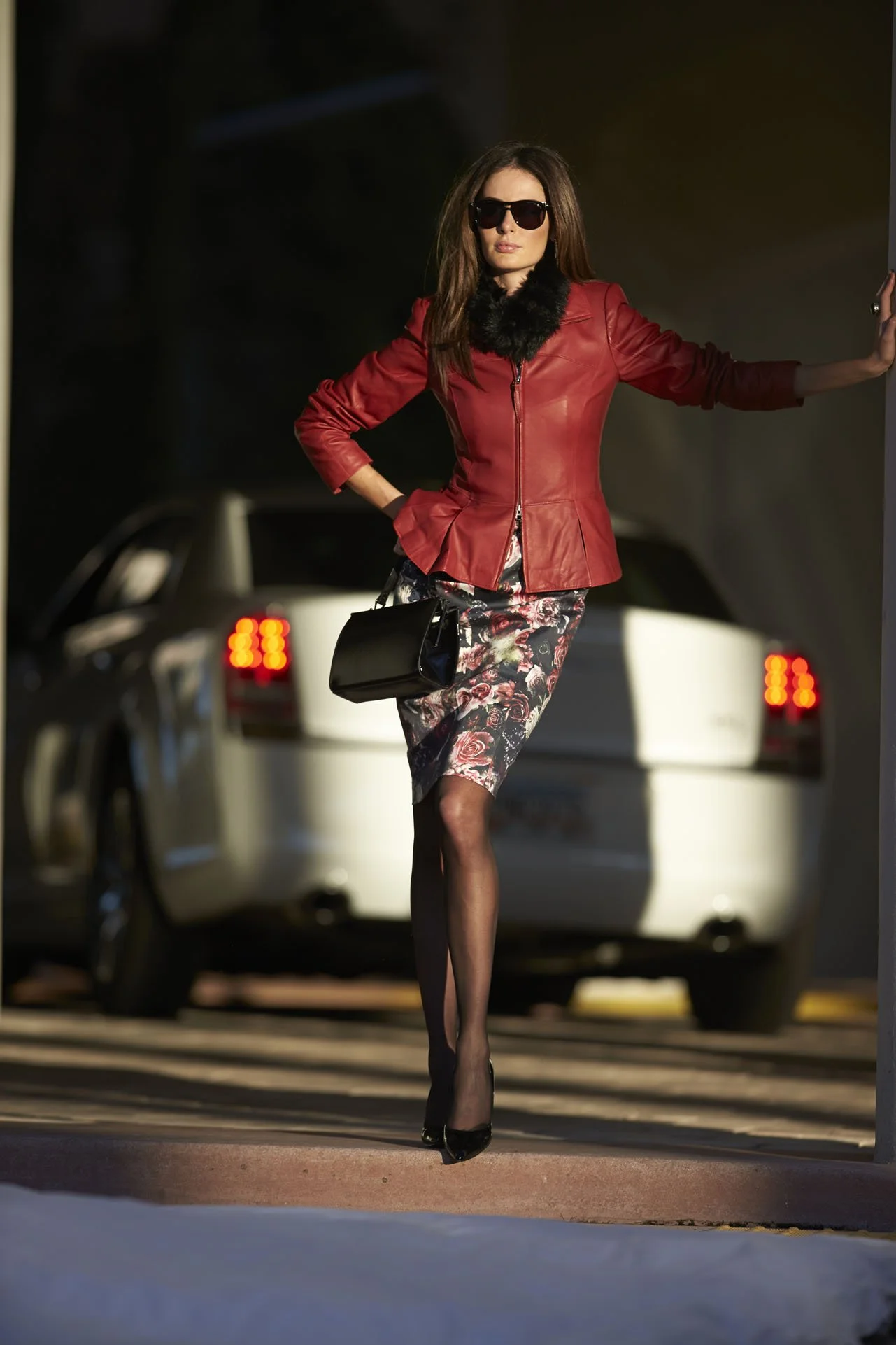
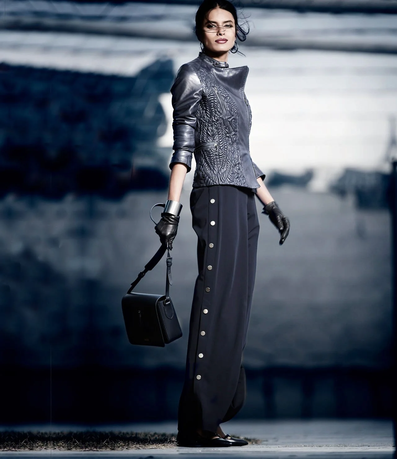
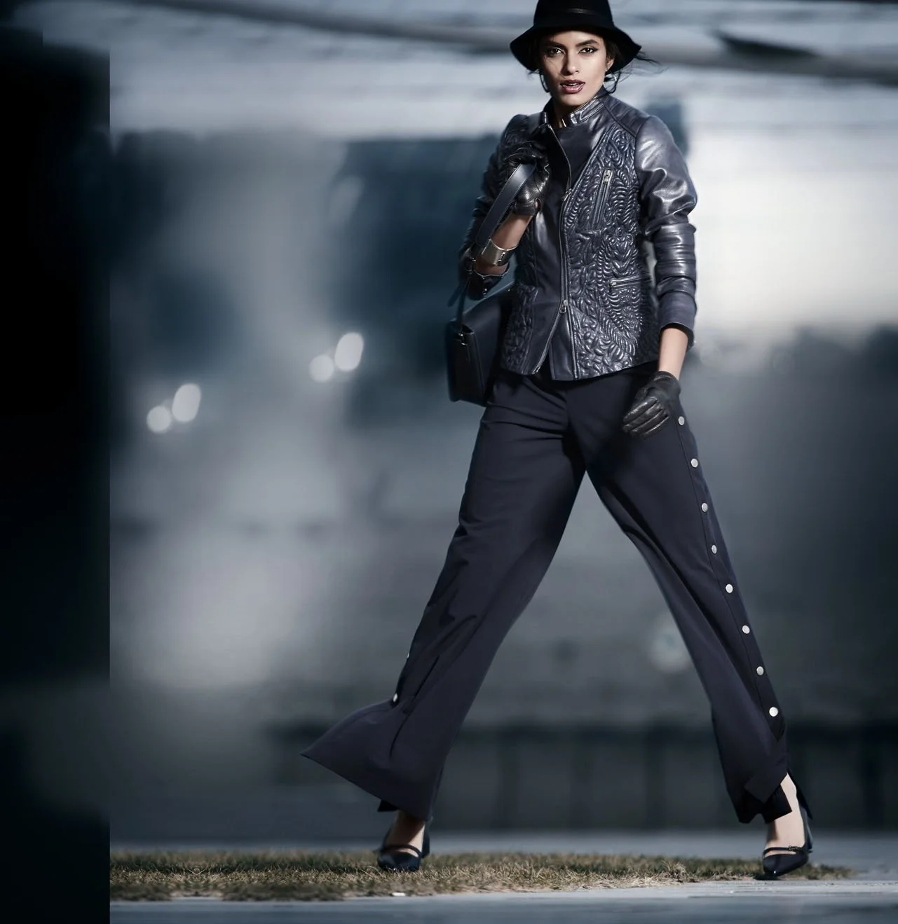
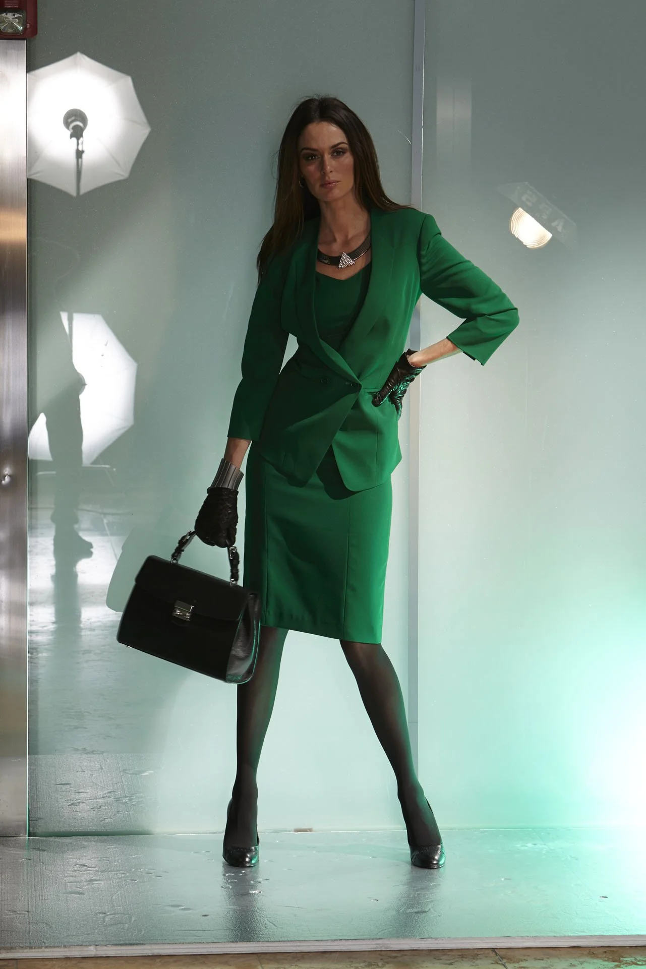
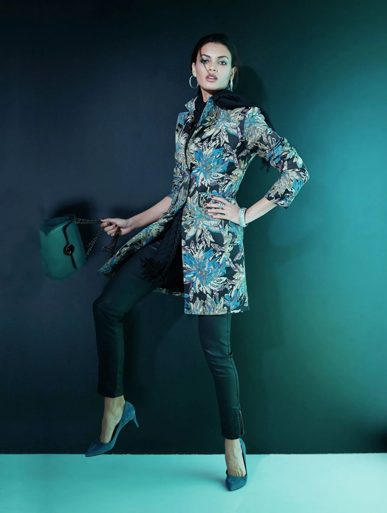
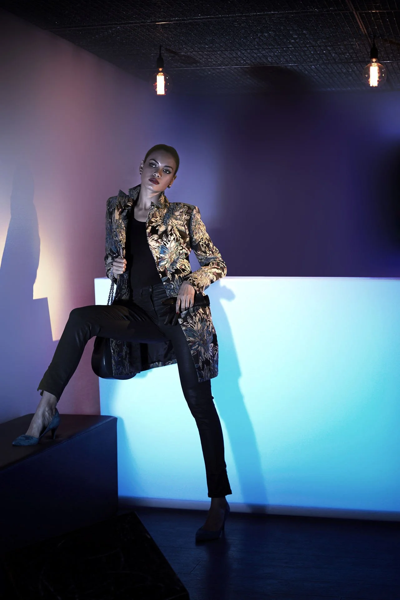
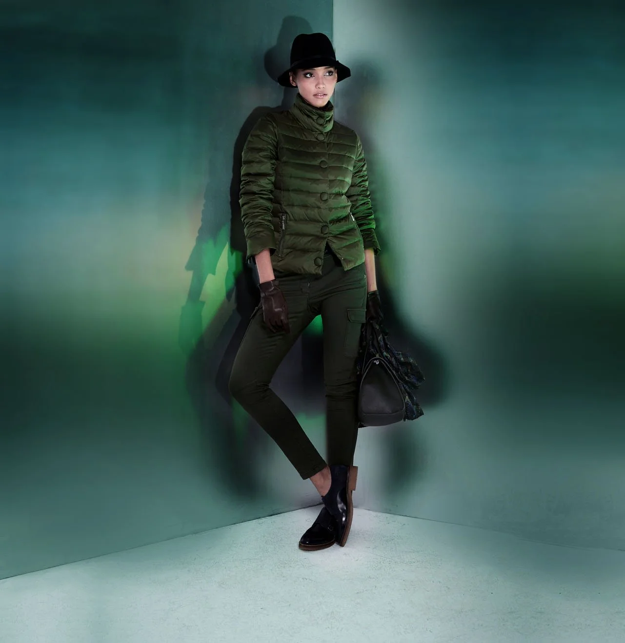
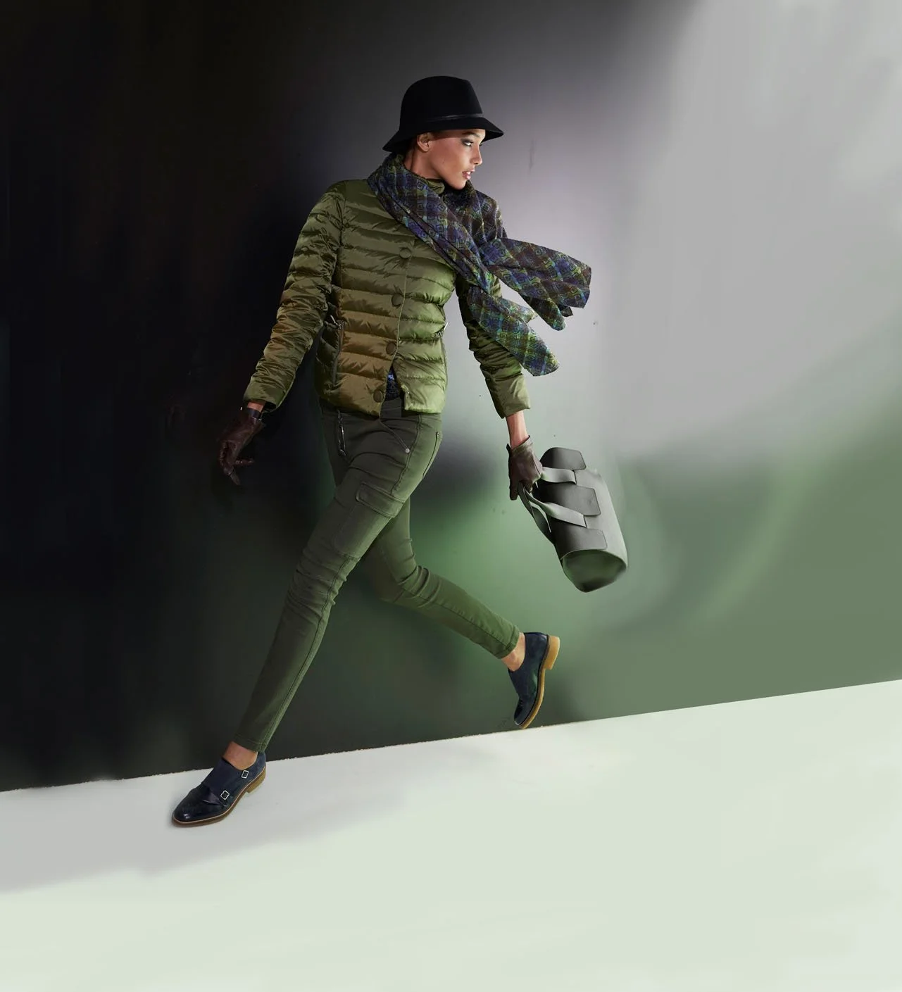
At the company’s headquarters in Fürth—a place where time seemed to have stood still—Ulrich Pracht met the amiable, yet cautious, Ms. Hoffmann. Upon his arrival, the gatekeeper—in keeping with the social conventions of the era—had announced her to him simply as "Fräulein Hoffmann." Step by step, a working relationship began to evolve between the dynamic photographer—who carried a vision of contemporary imagery in his mind—and the Madeleine executive, who hailed from a world that still breathed the spirit of bygone days. Following an initial series of test shots at his studio on Lindemannstraße—which were received with enthusiasm—Ulrich Pracht proposed a photo shoot in Marbella. This venture, too, yielded results that met with great approval. "At that stage, the Madeleine executive remained somewhat cautious; she suggested that I photograph only a portion of the collection. I, however, wanted to shoot the entire collection." With Pracht’s new visual language—a graphic concept that evokes Vogue far more than a Quelle catalog—and the slogan "Madeleine: The Feeling of Experiencing Fashion," the brand finally gained the momentum needed to achieve success. "By naming it the 'Madeleine Feeling,' I gave a specific name to the philosophy behind my photography for the brand."
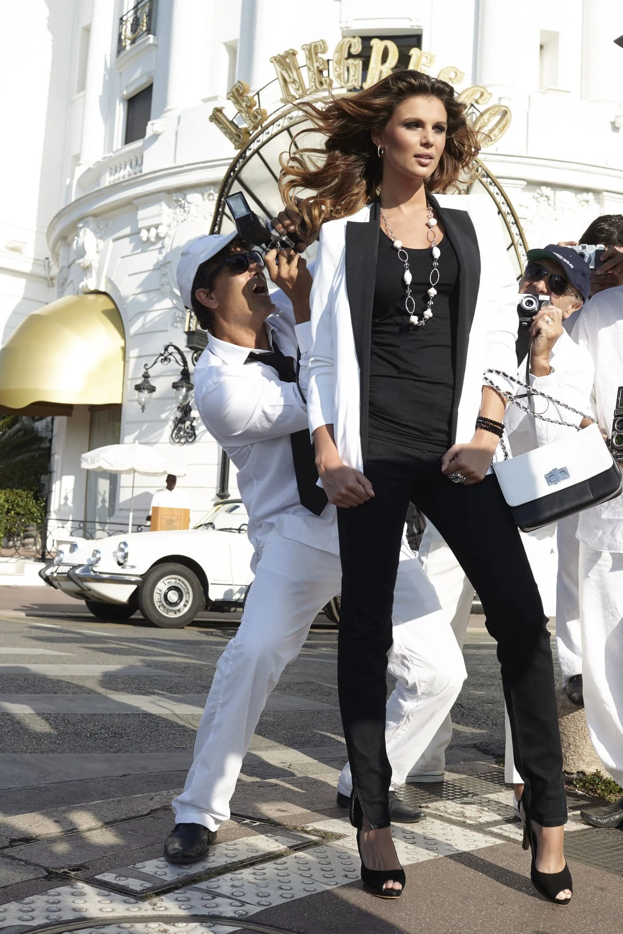
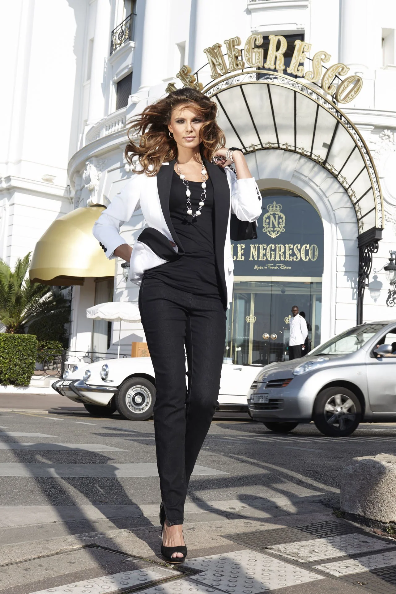
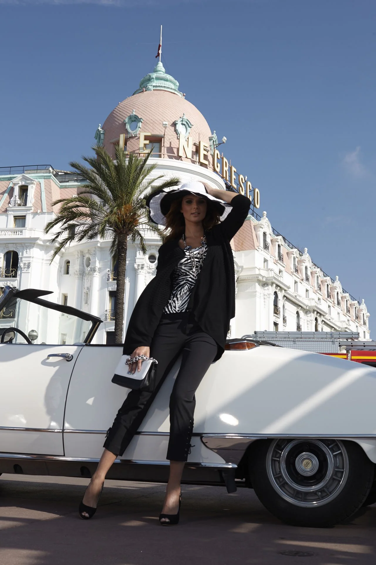
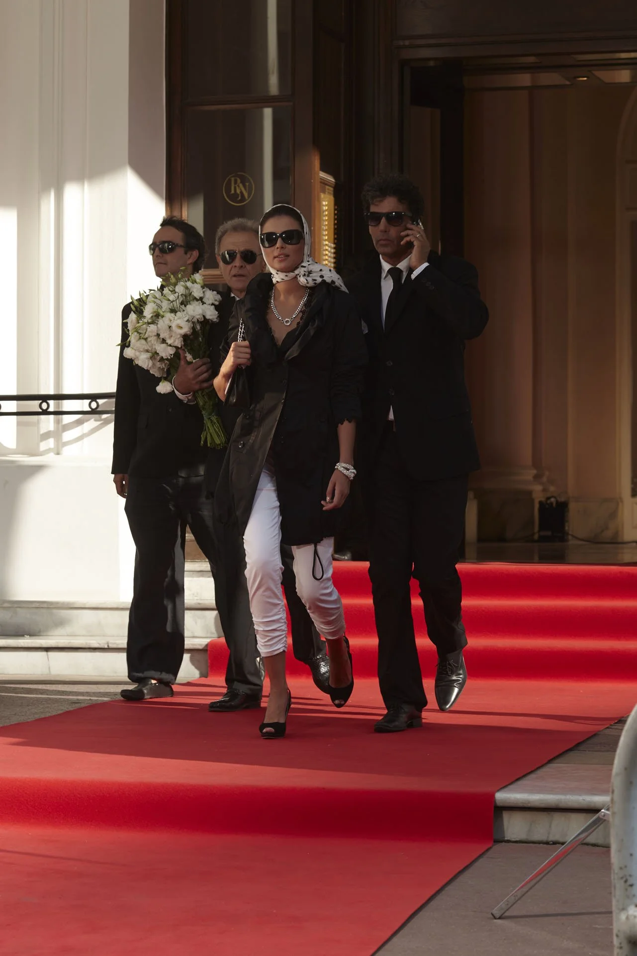
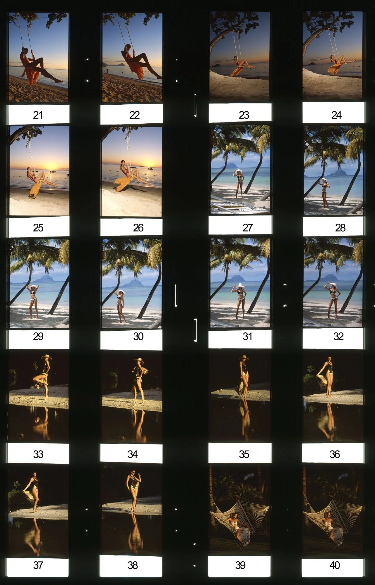
"I photographed a summer collection in the South of France. Miss Hoffmann had asked beforehand, 'Is that really necessary?' but I simply replied, 'Yes, it is.' Upon hearing this, she informed me that she intended to join us. I was well-acquainted with the South of France, so I hired a local producer named Brigitte Roßband. She secured every location I requested. In Nice, we discovered a large square paved in white marble, and I declared, 'Brigitte, this is it.' As it turned out, however, the site was a well-known war memorial. Brigitte somehow managed to obtain permission for us to shoot there, but then Miss Hoffmann arrived and raised objections. Although I convinced her that the specific backdrop wouldn't be recognizable in the final images, the situation later escalated. She became anxious that the garments weren't fitting correctly because she felt my photographic style was too casual. Eventually, I said, 'We can't go on like this. Either you fly home, or I do.' Miss Hoffmann withdrew, and I didn't see her again until that evening. She informed me that she had booked a flight, to which I replied, 'I take full responsibility for this shoot.' Following this clarifying exchange, a successful professional partnership spanning three decades began."






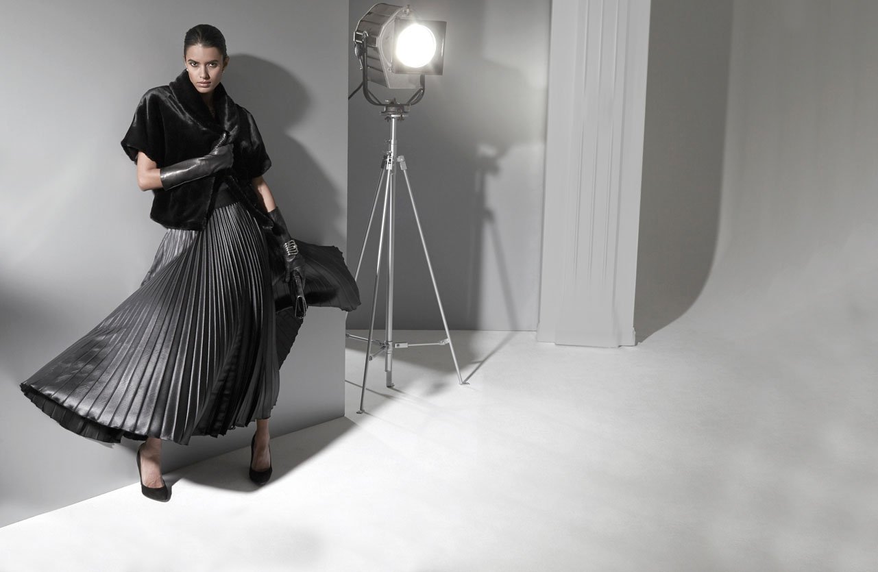
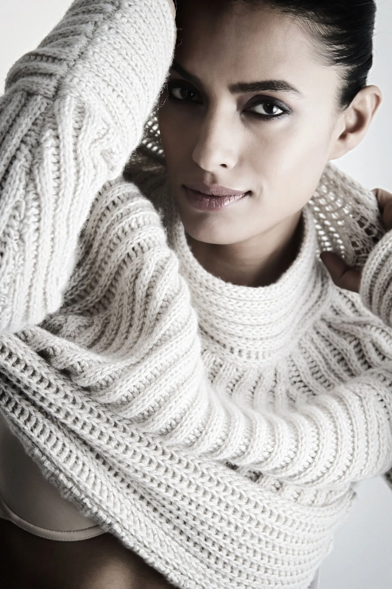
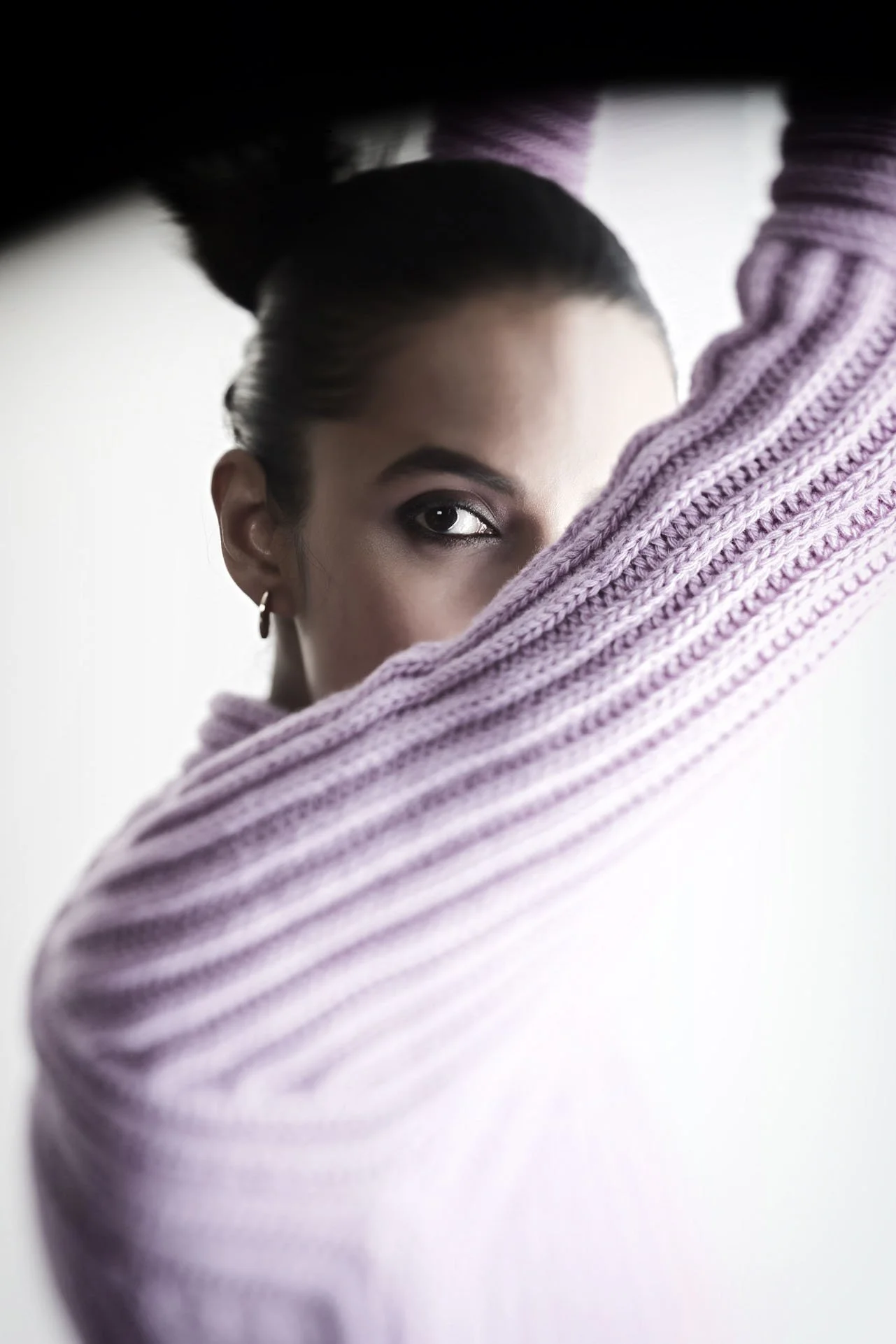
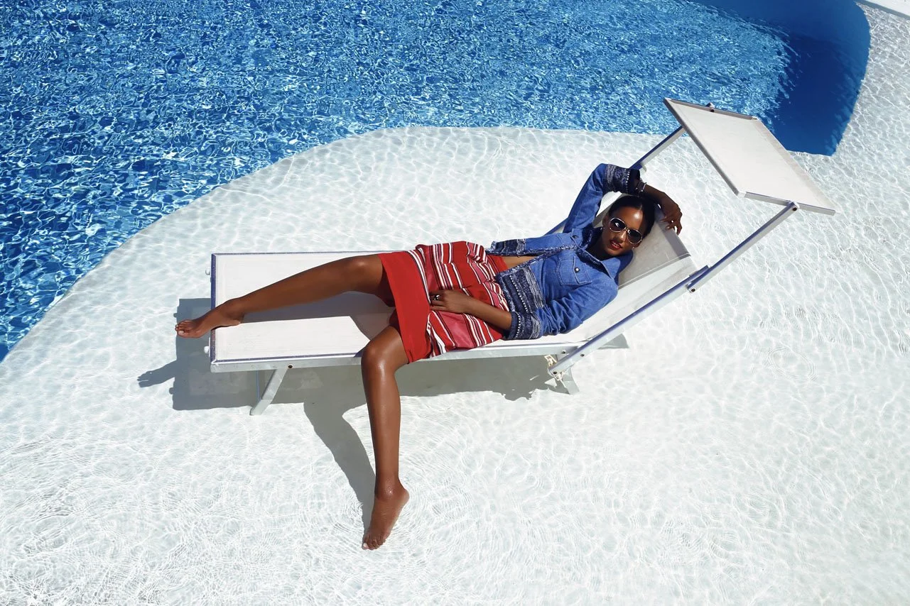


04.6
9 SUPERMODELS
Sets with a playfully luxurious look.
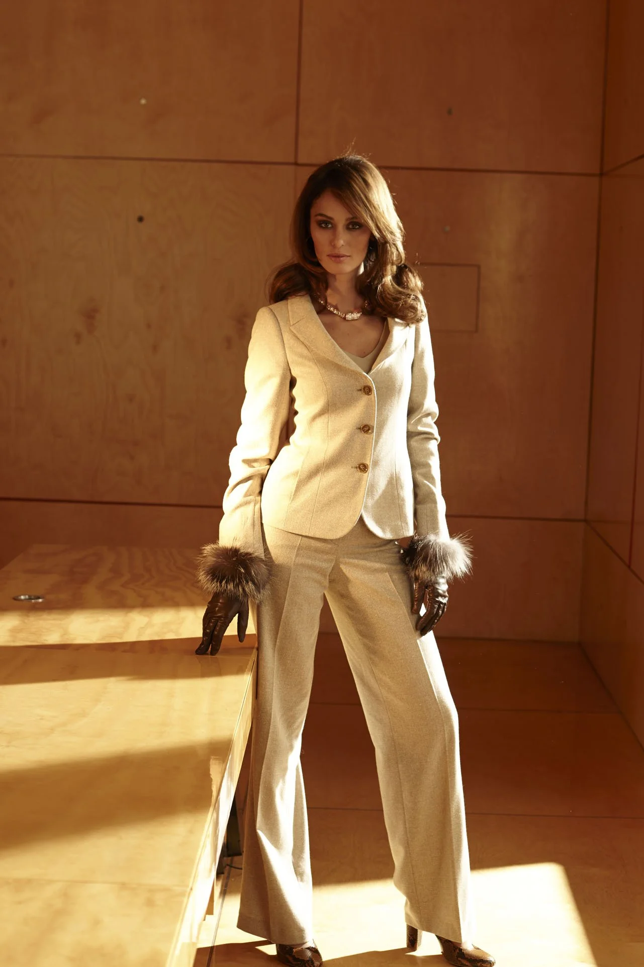
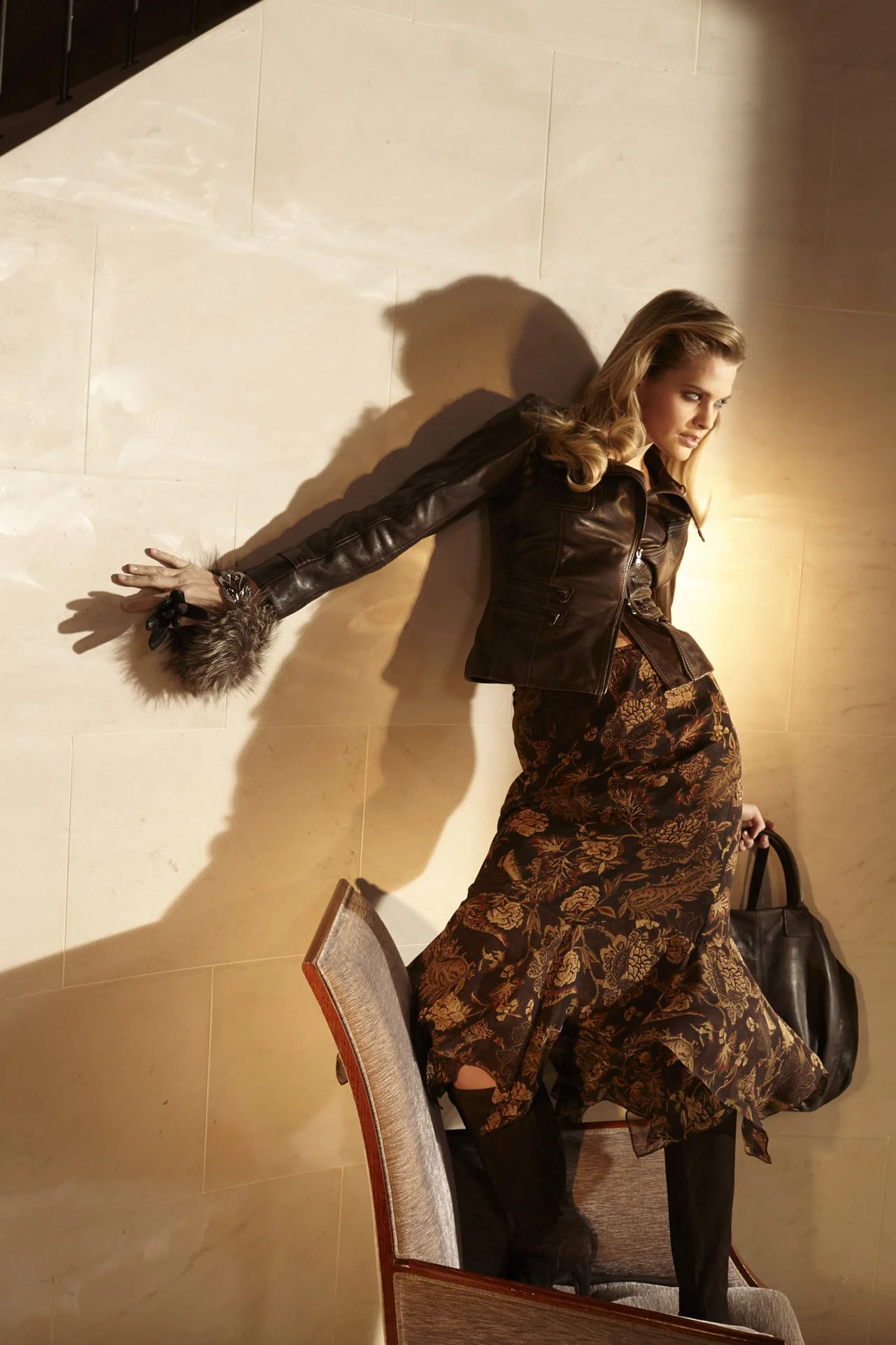
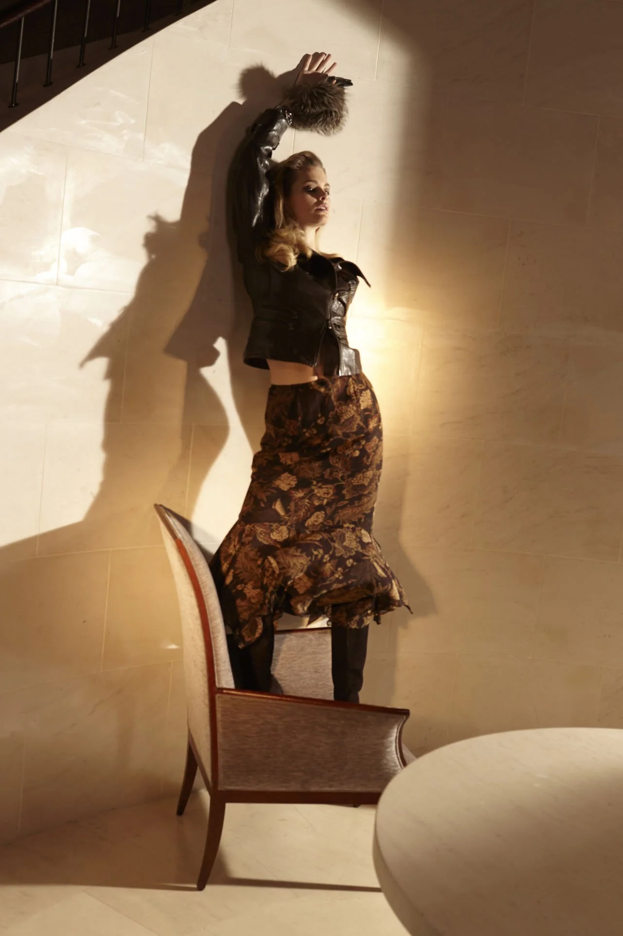
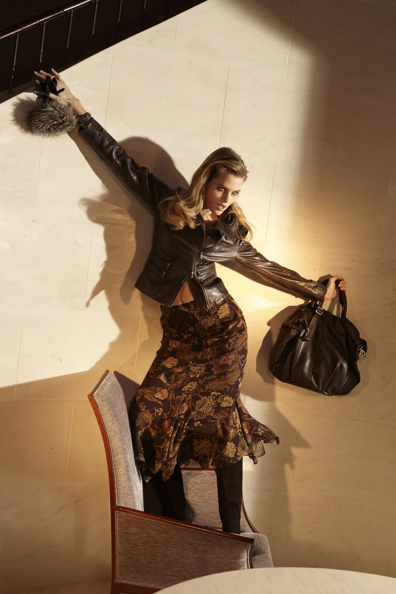
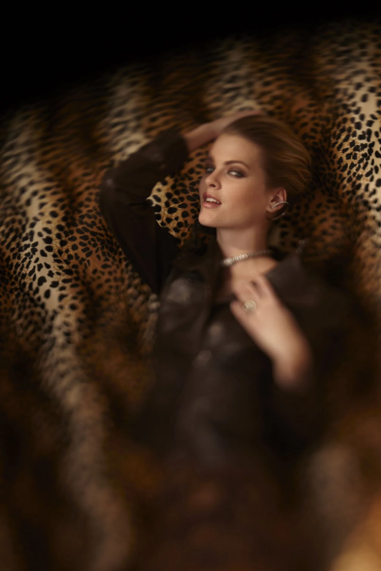
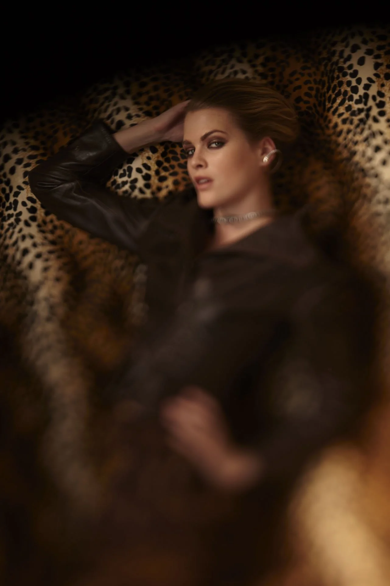
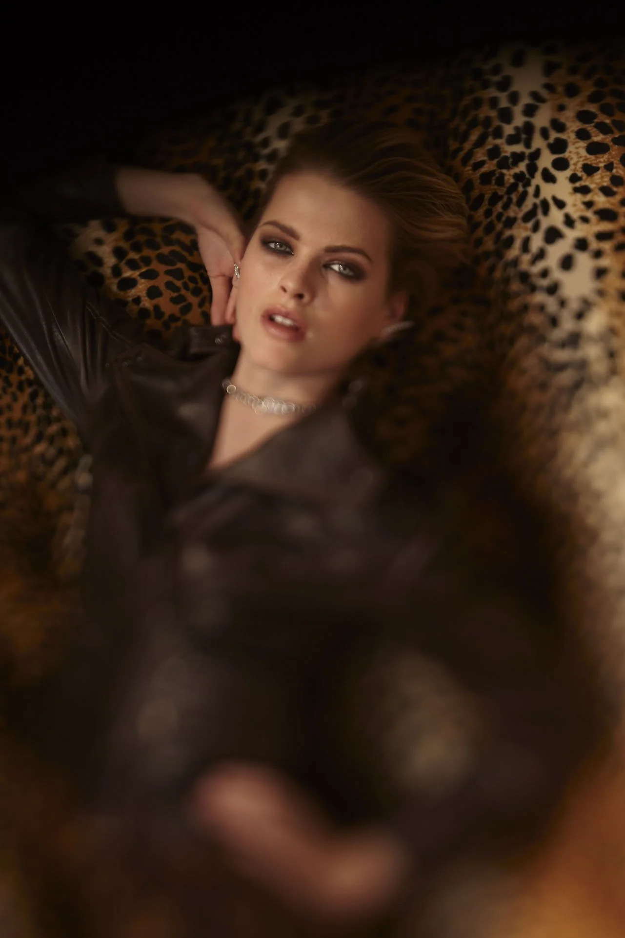
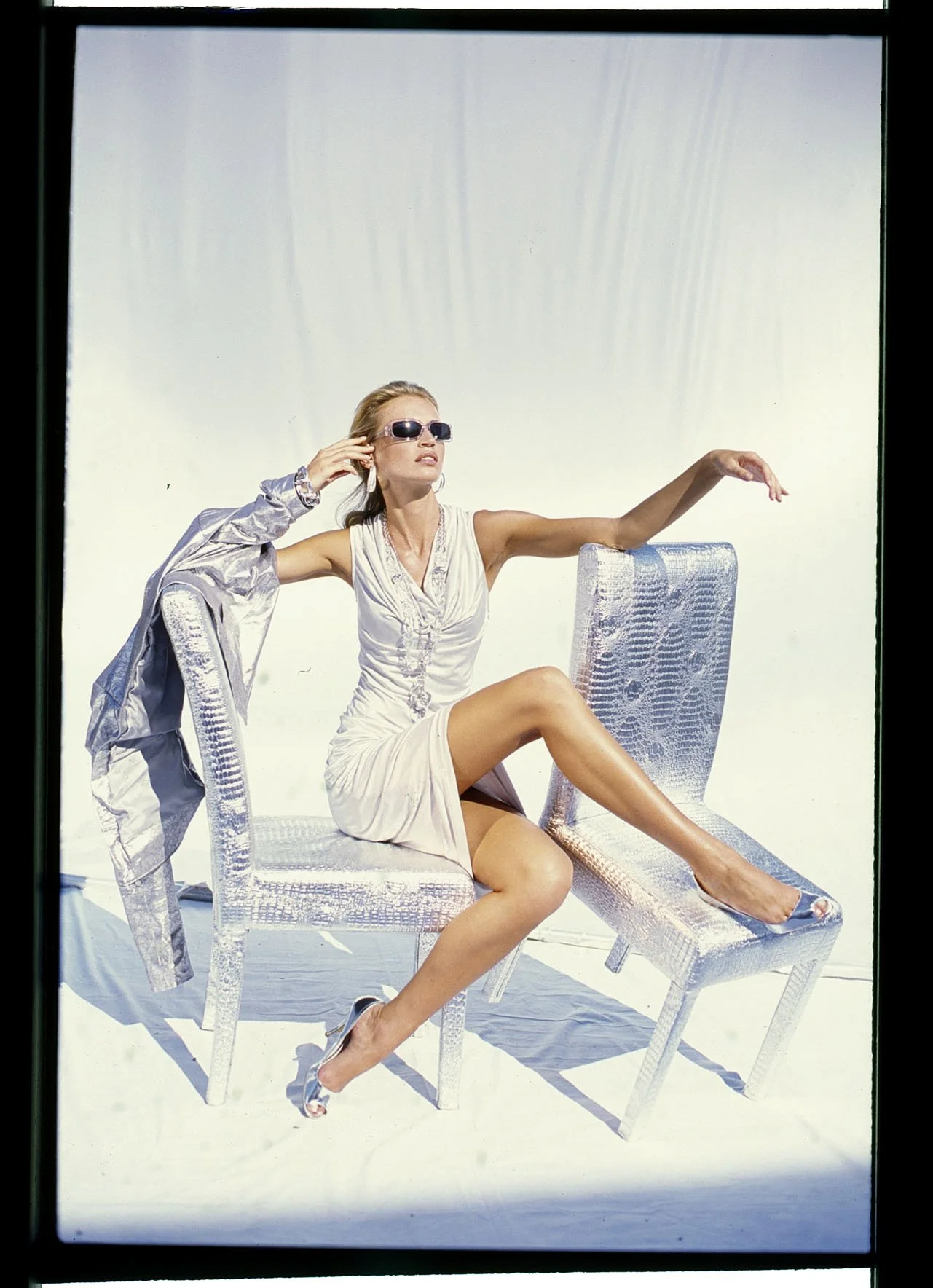
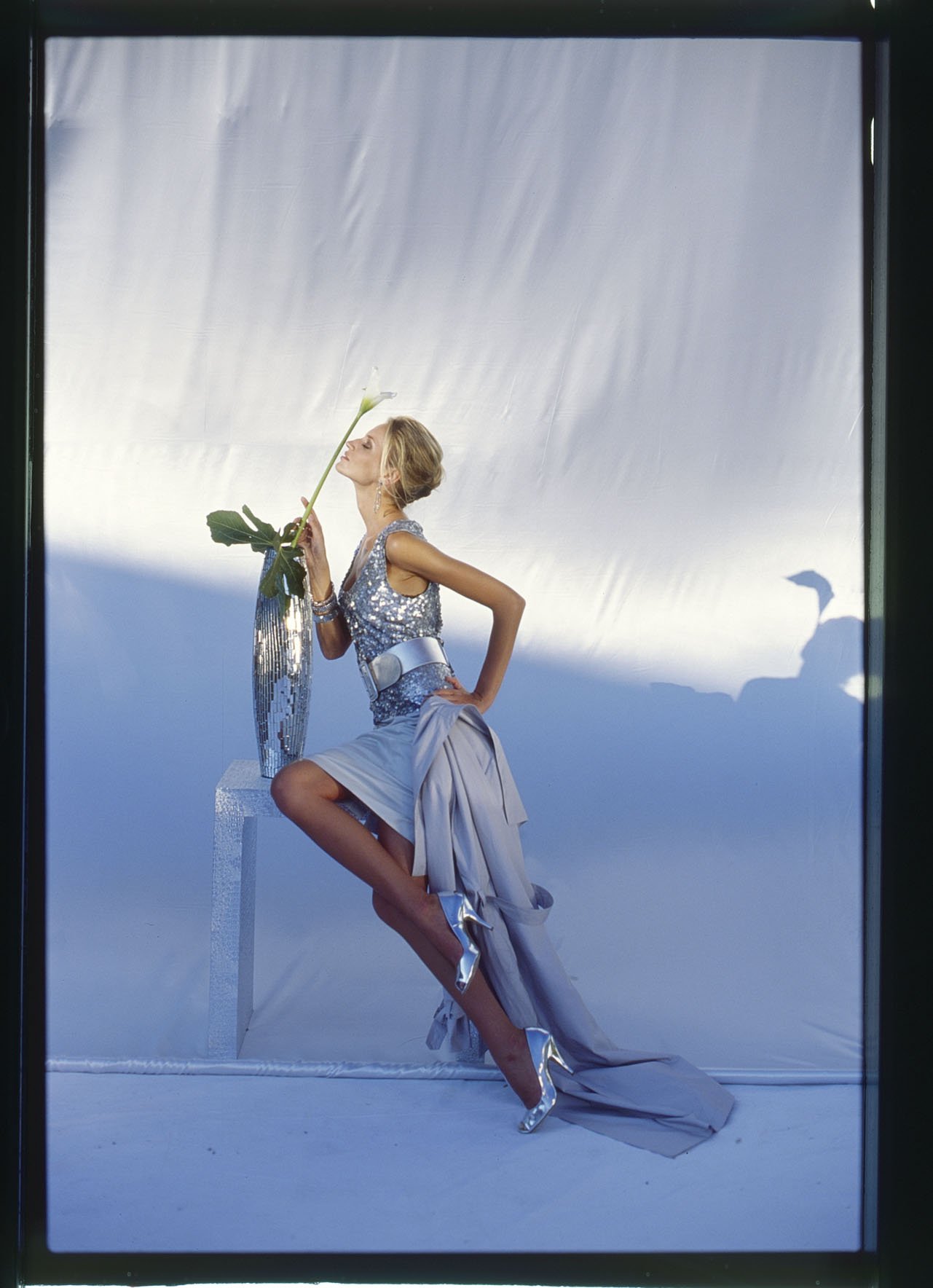
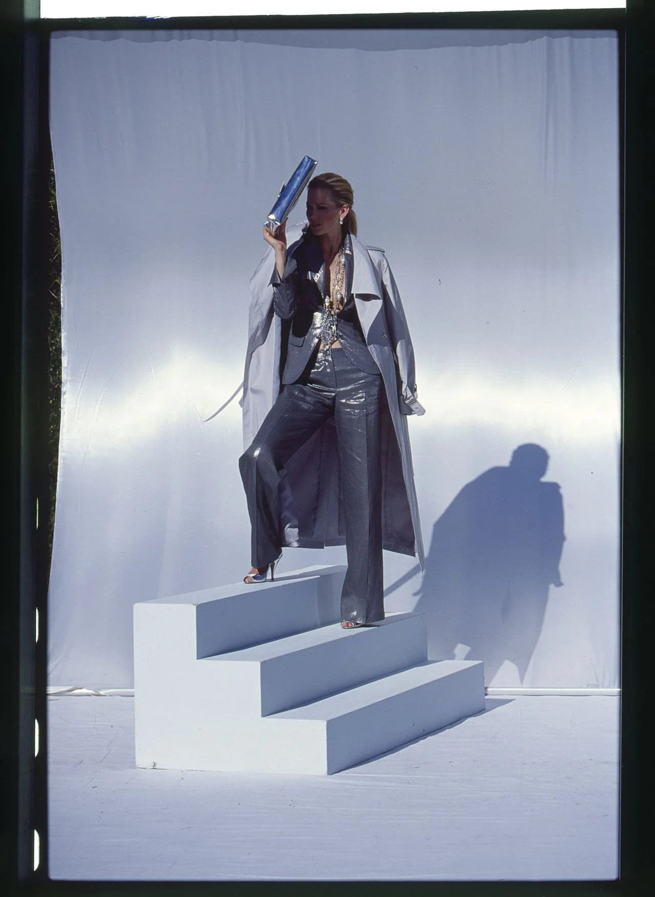
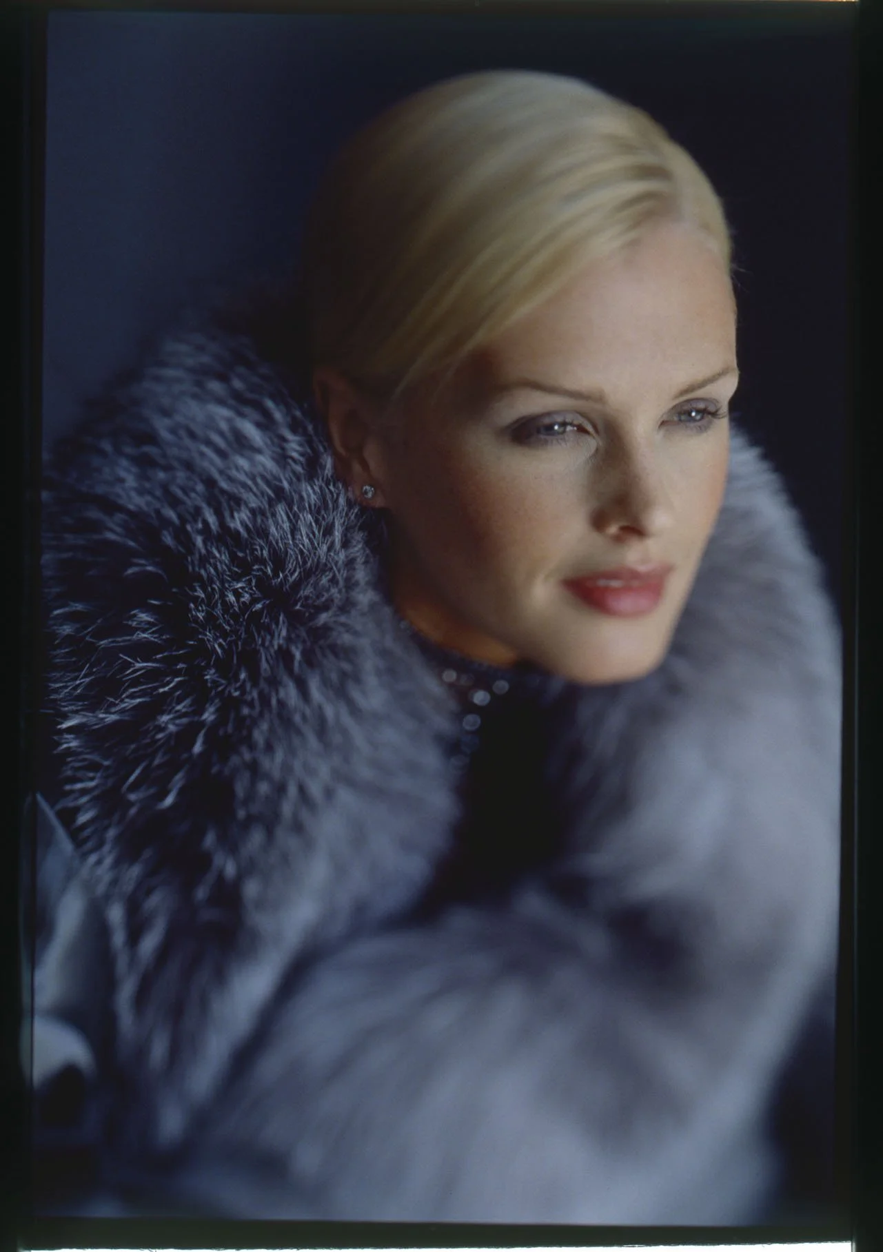
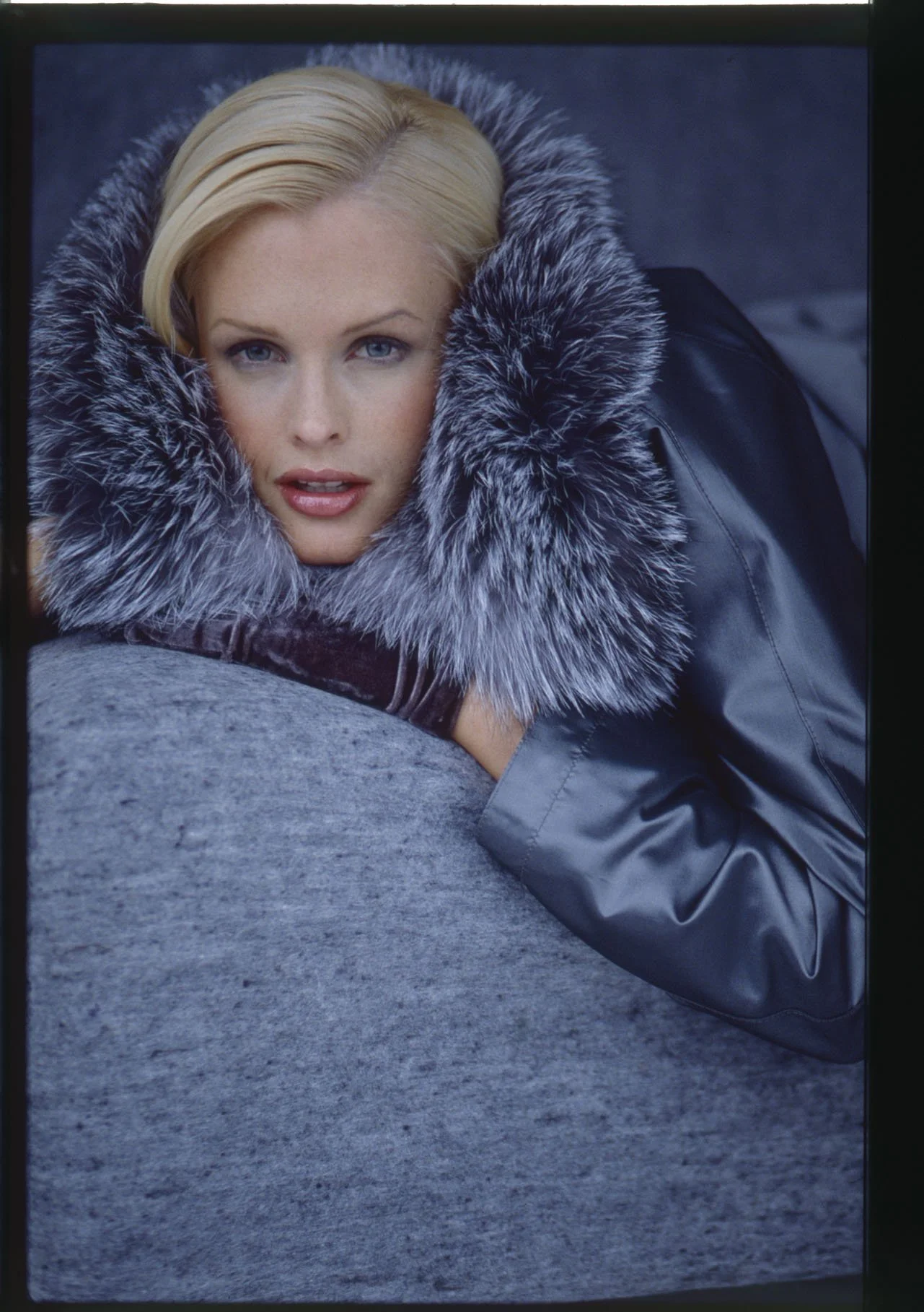
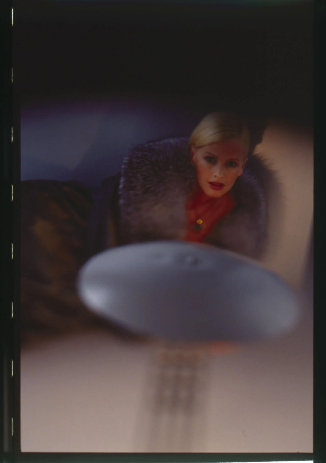
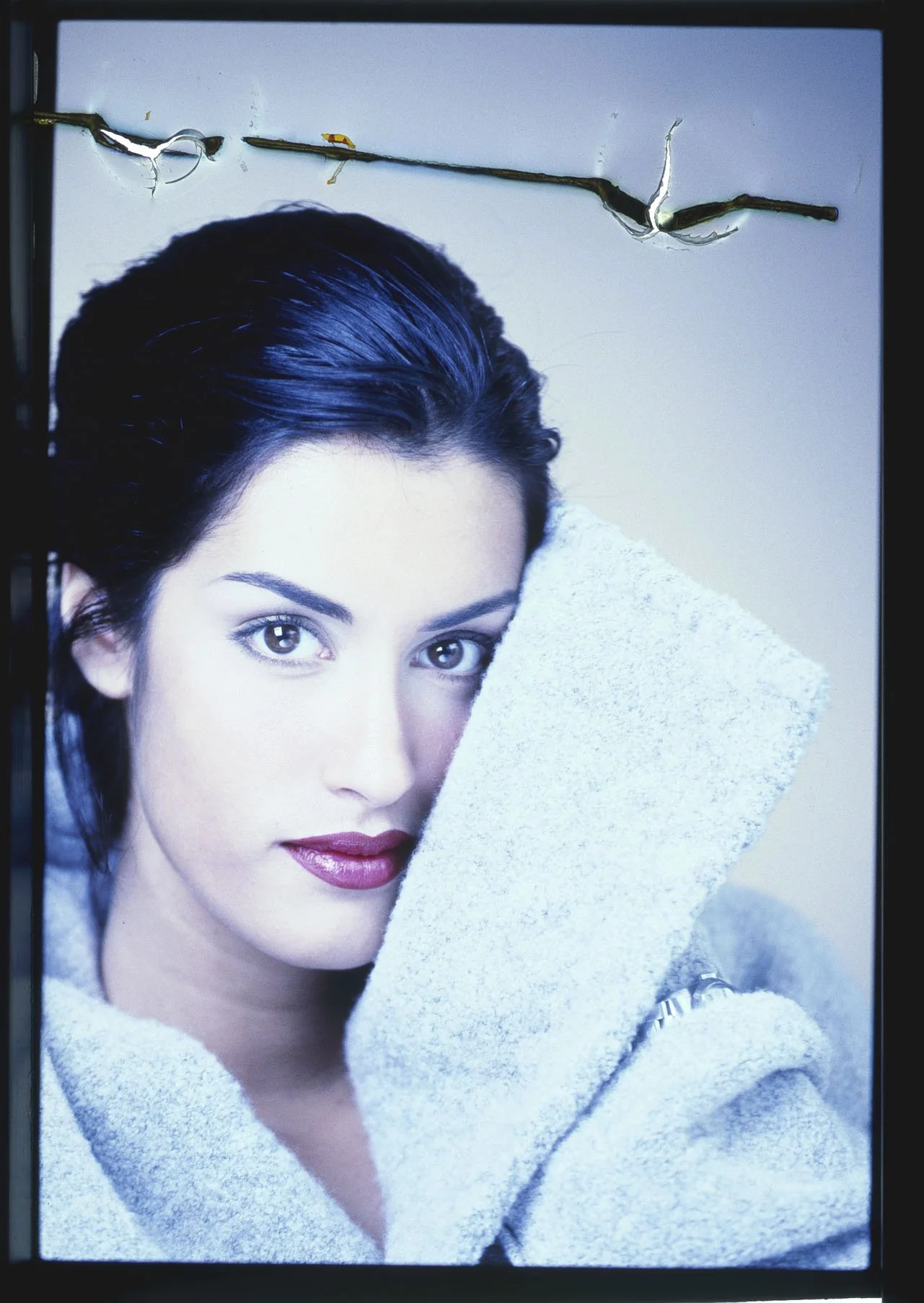
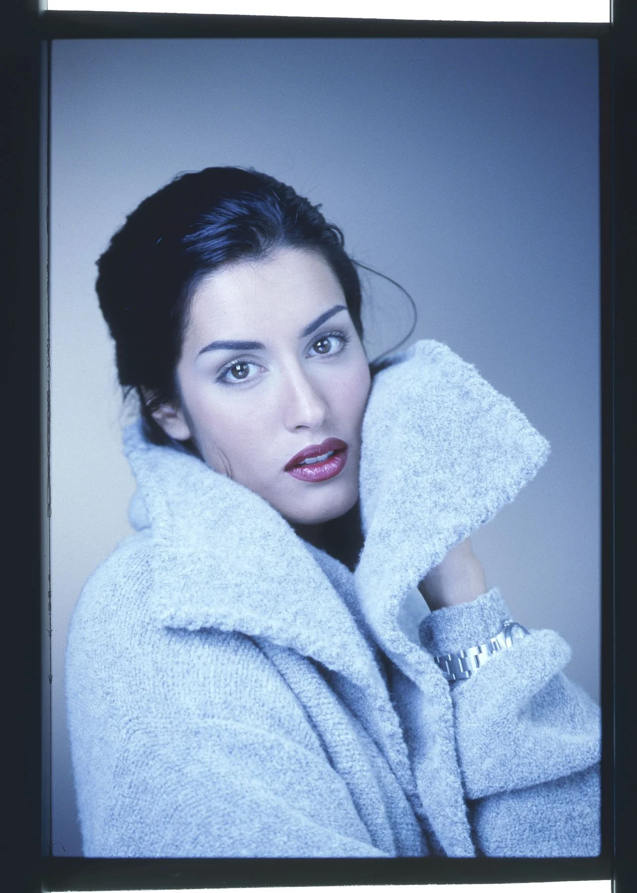
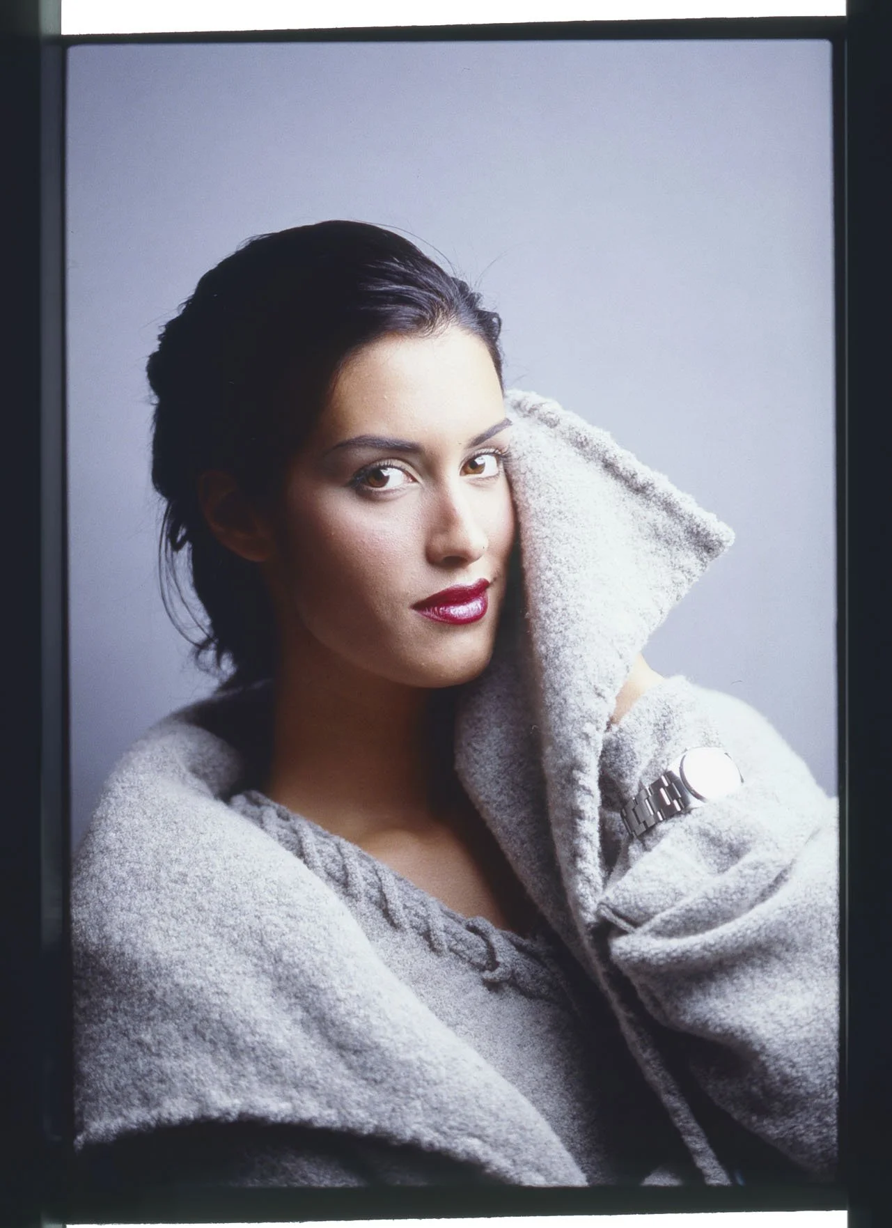
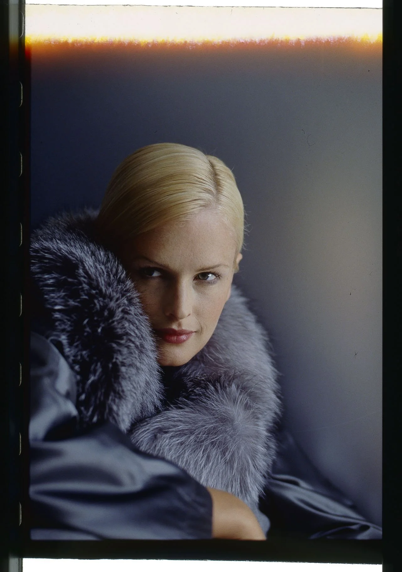
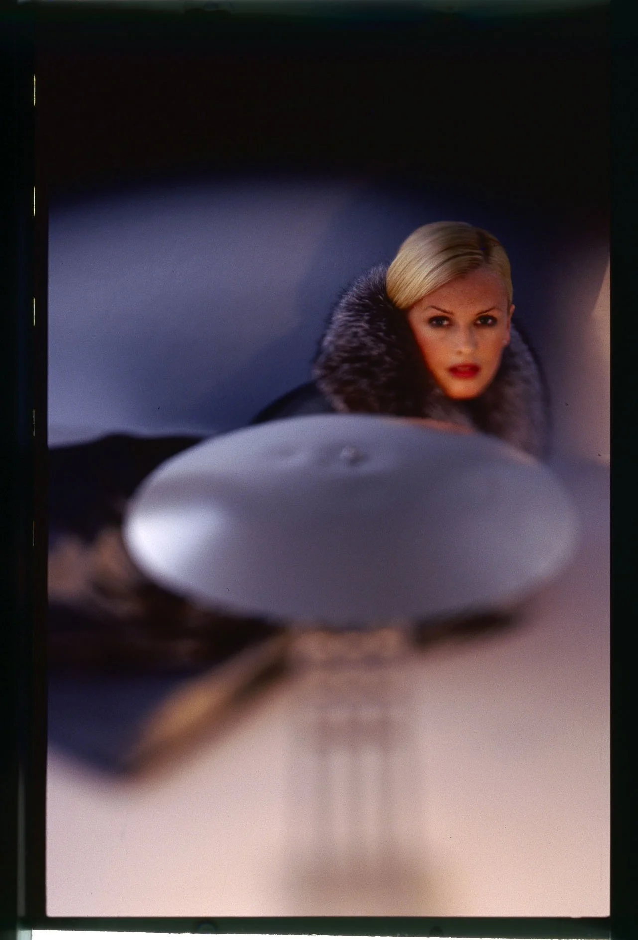
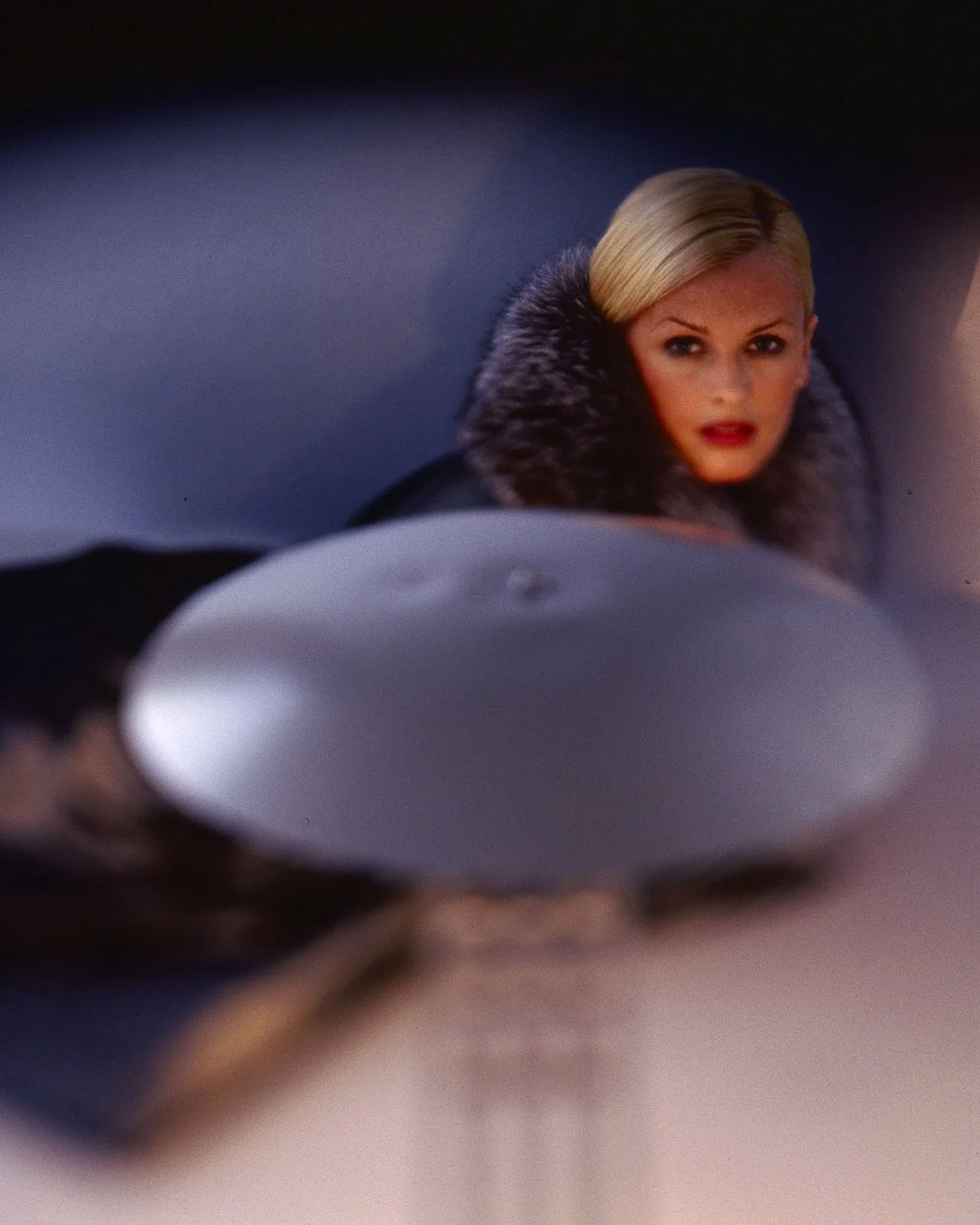
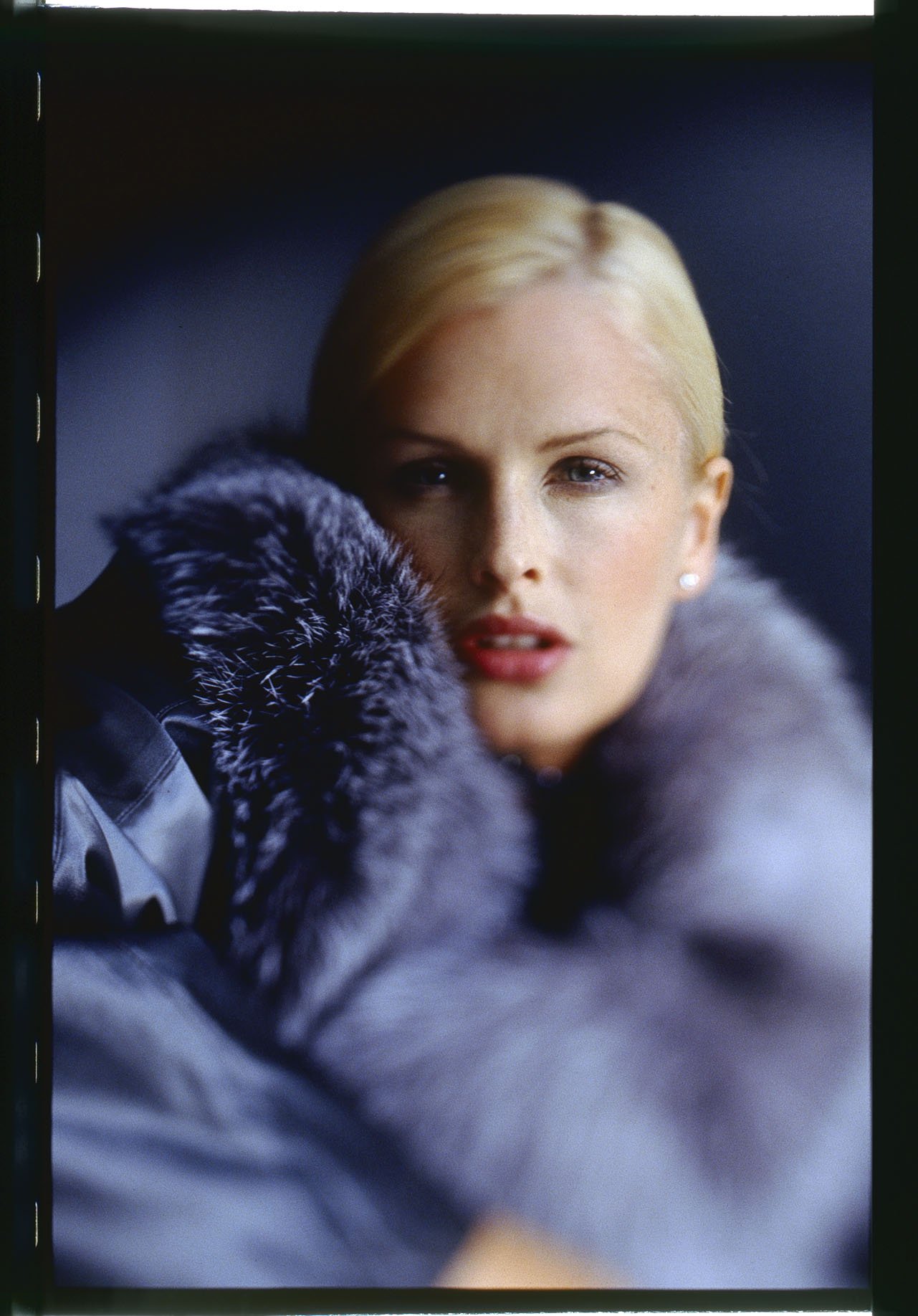
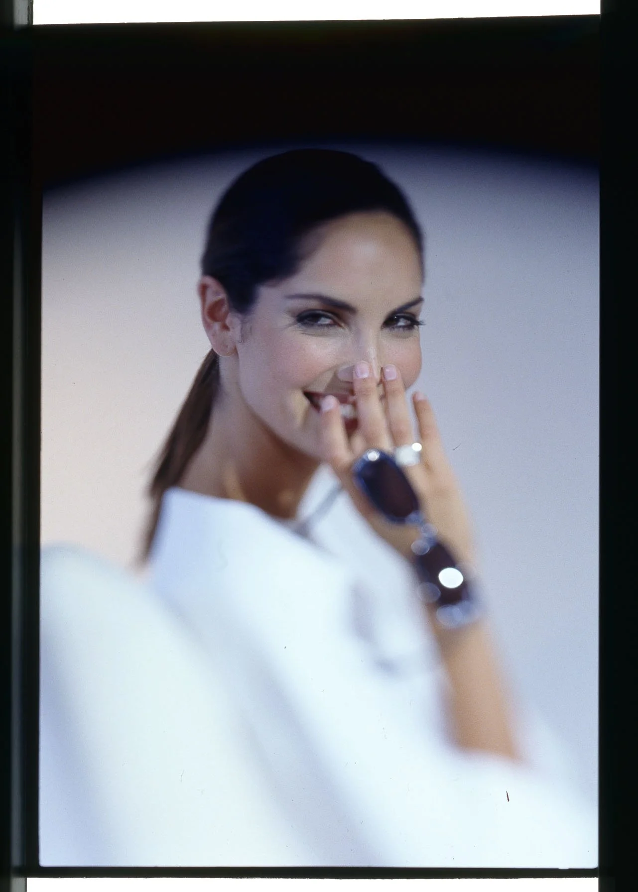
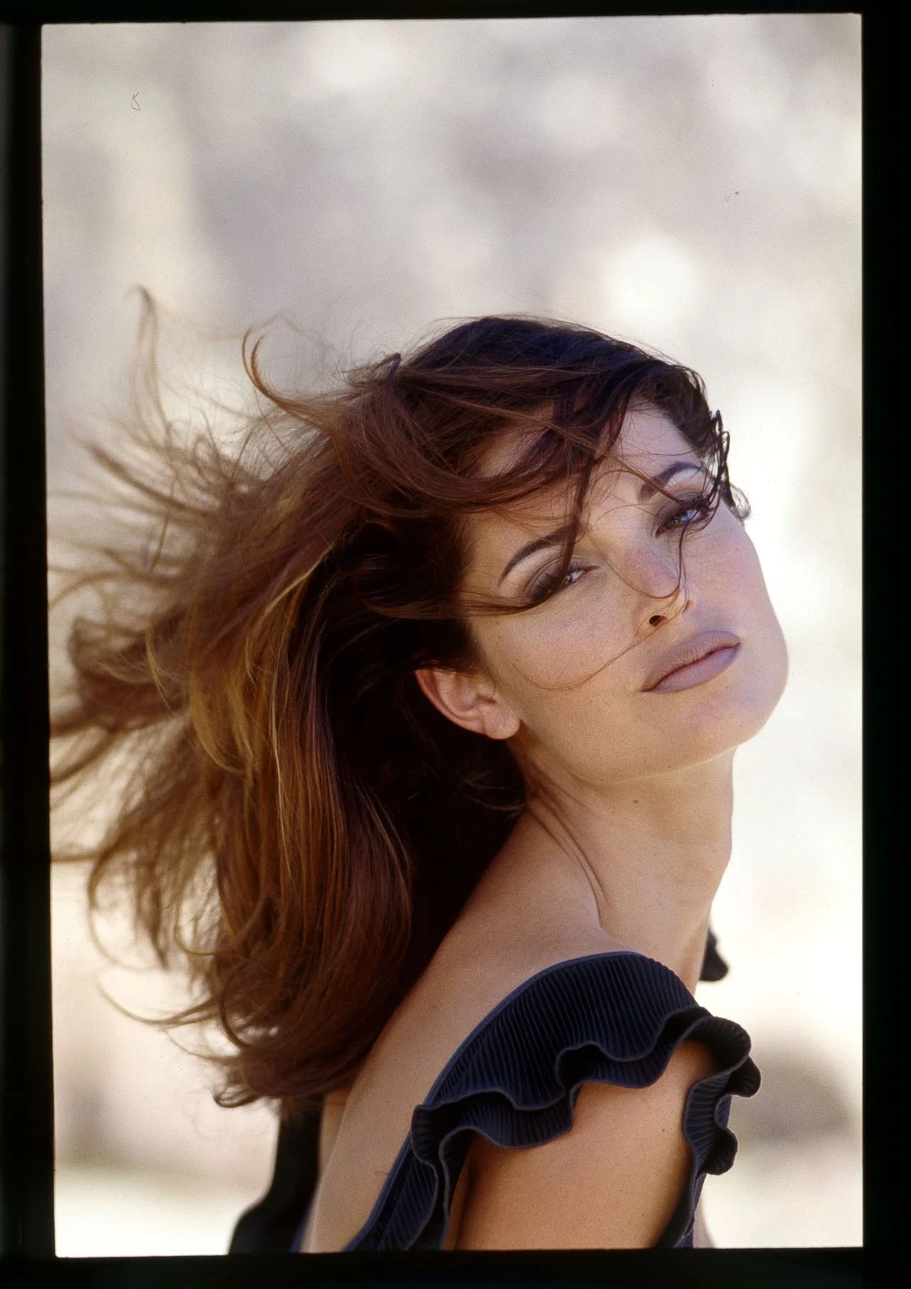
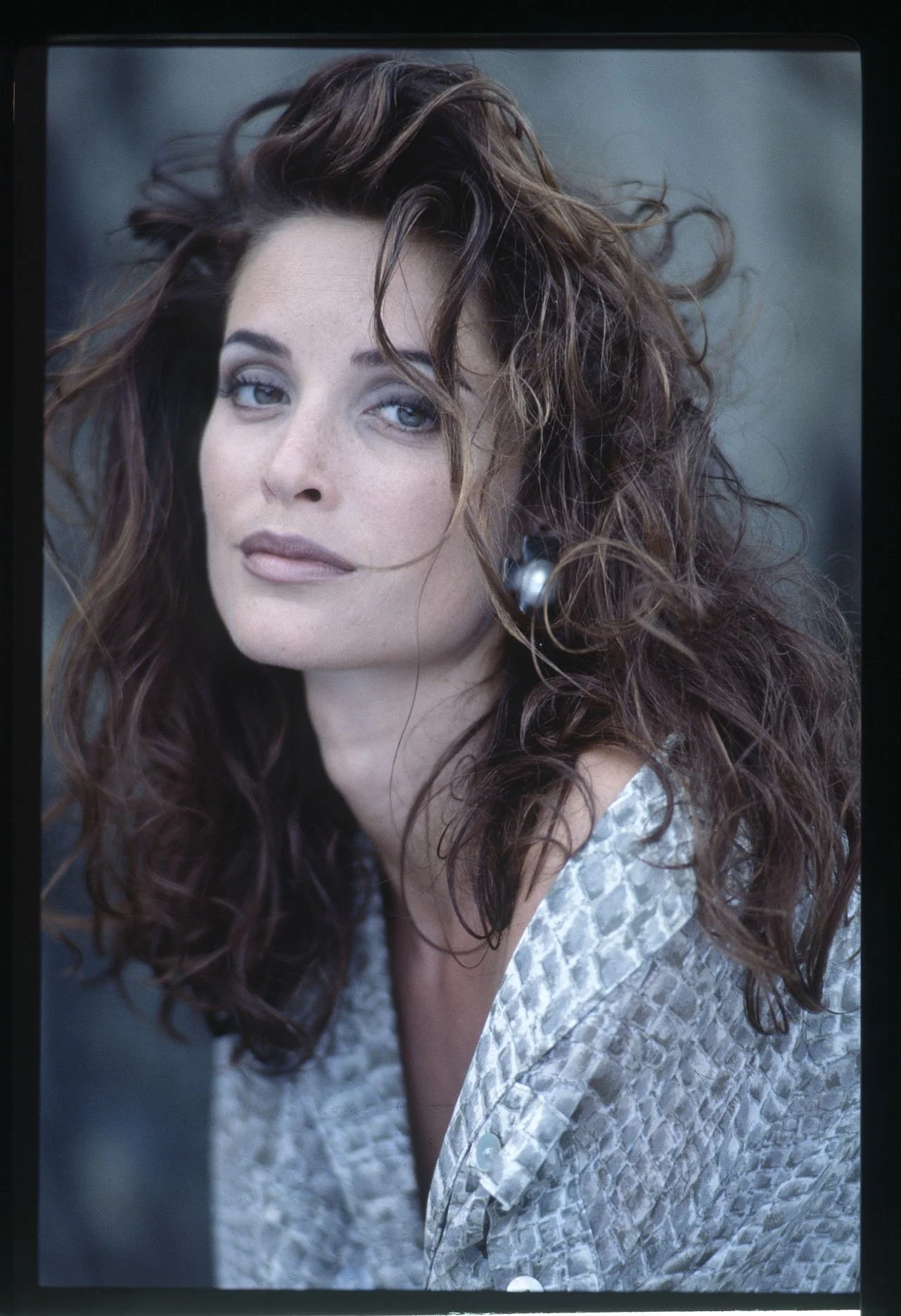
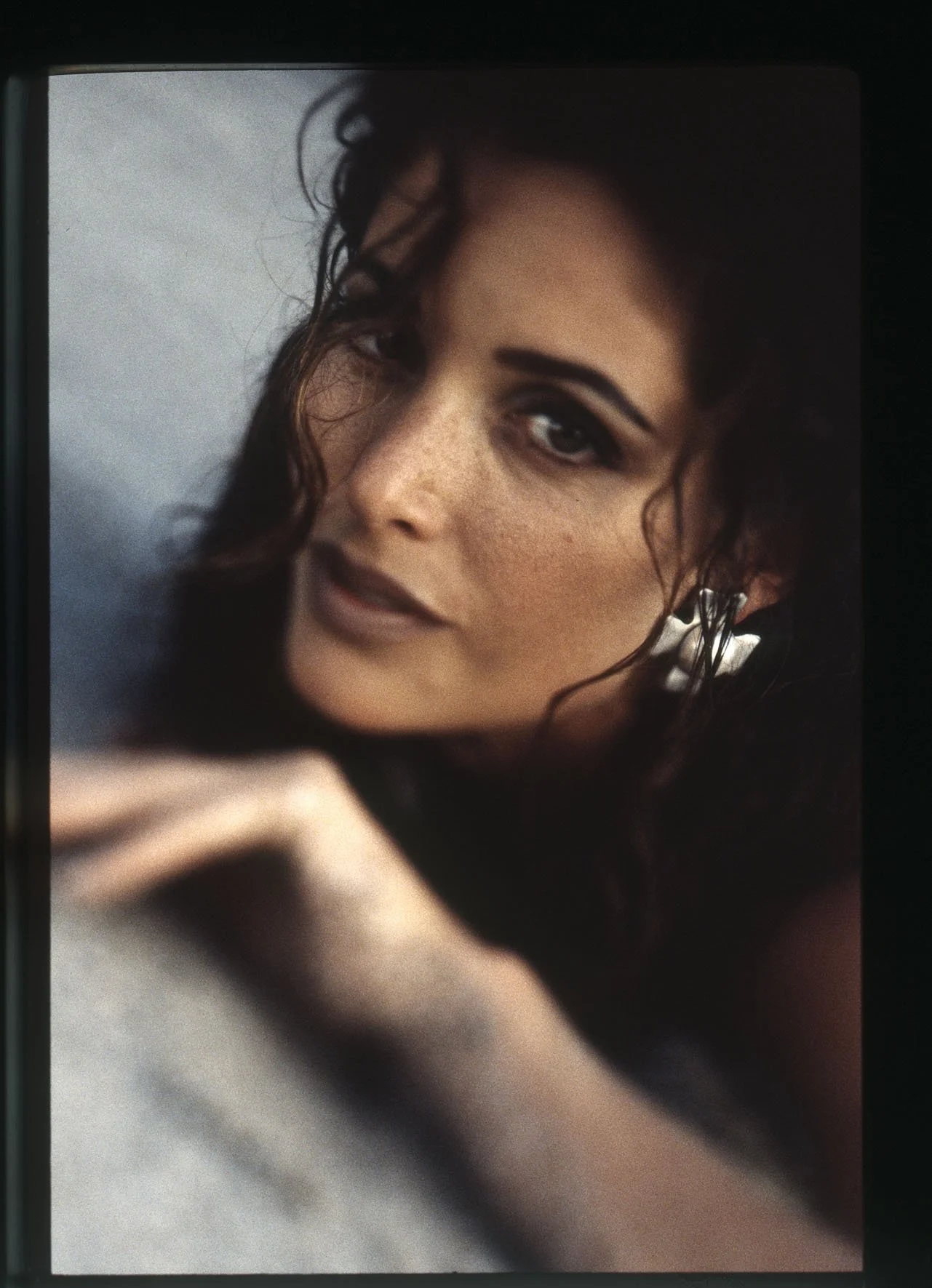
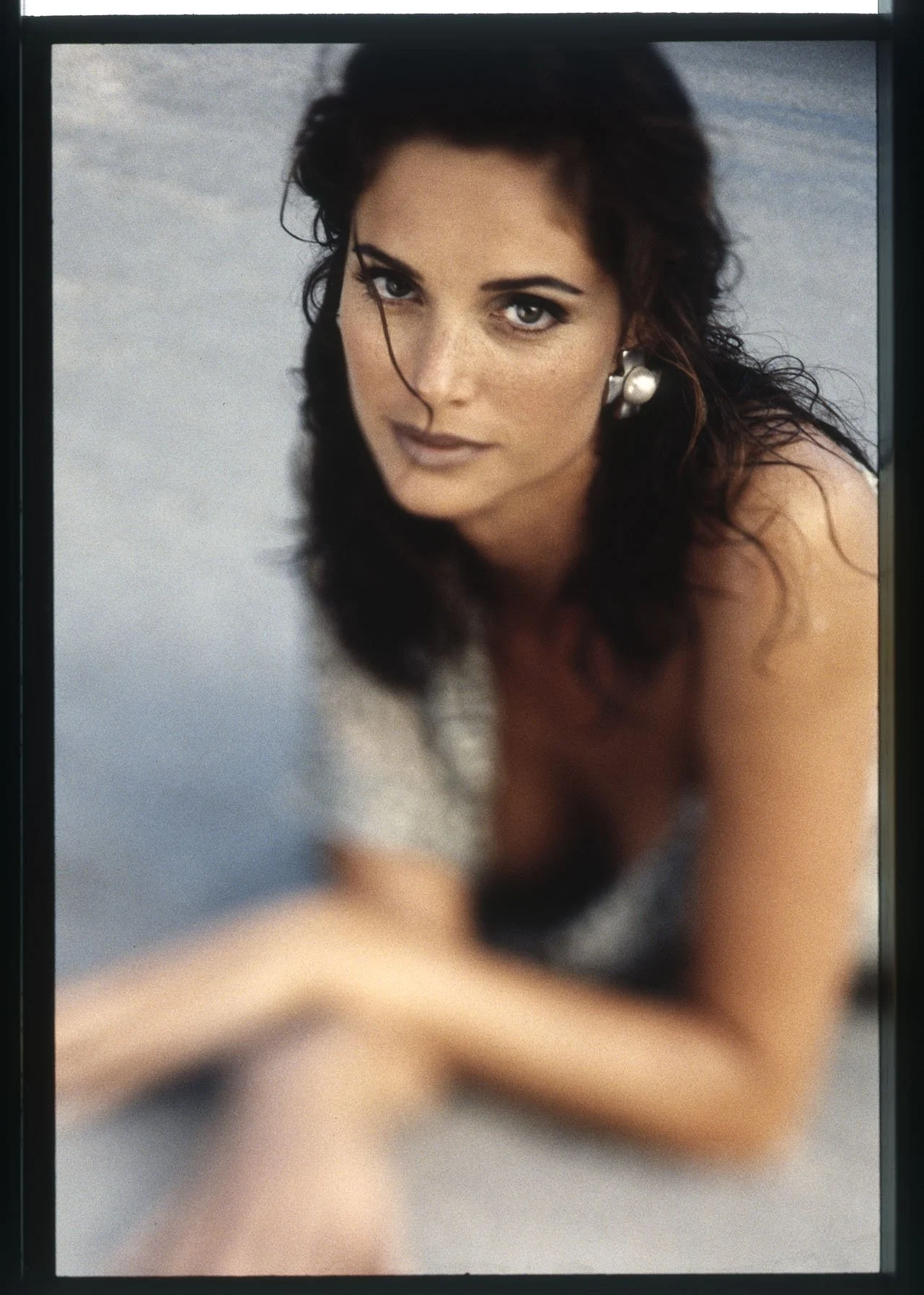
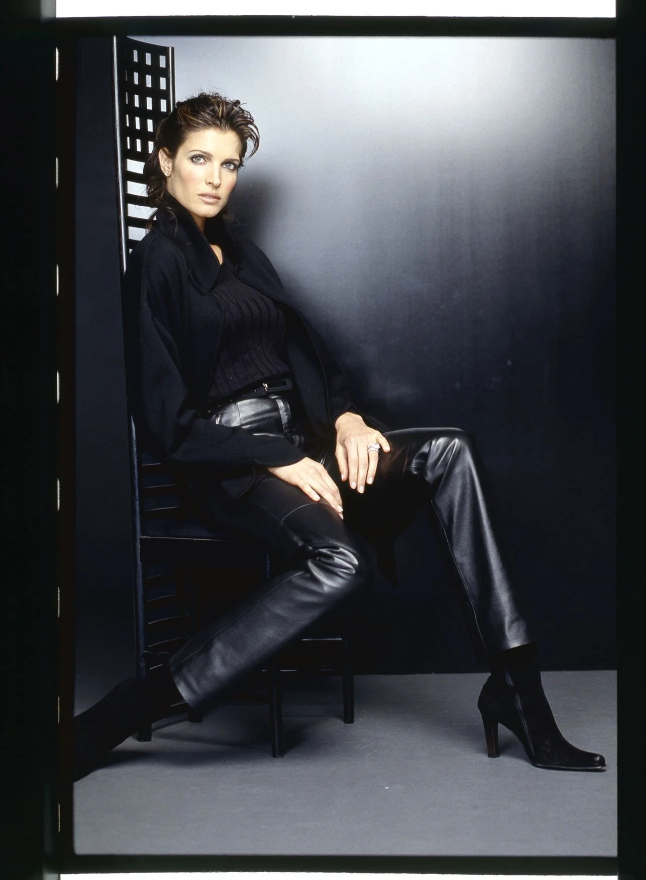
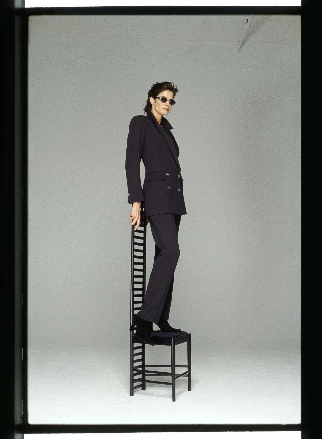
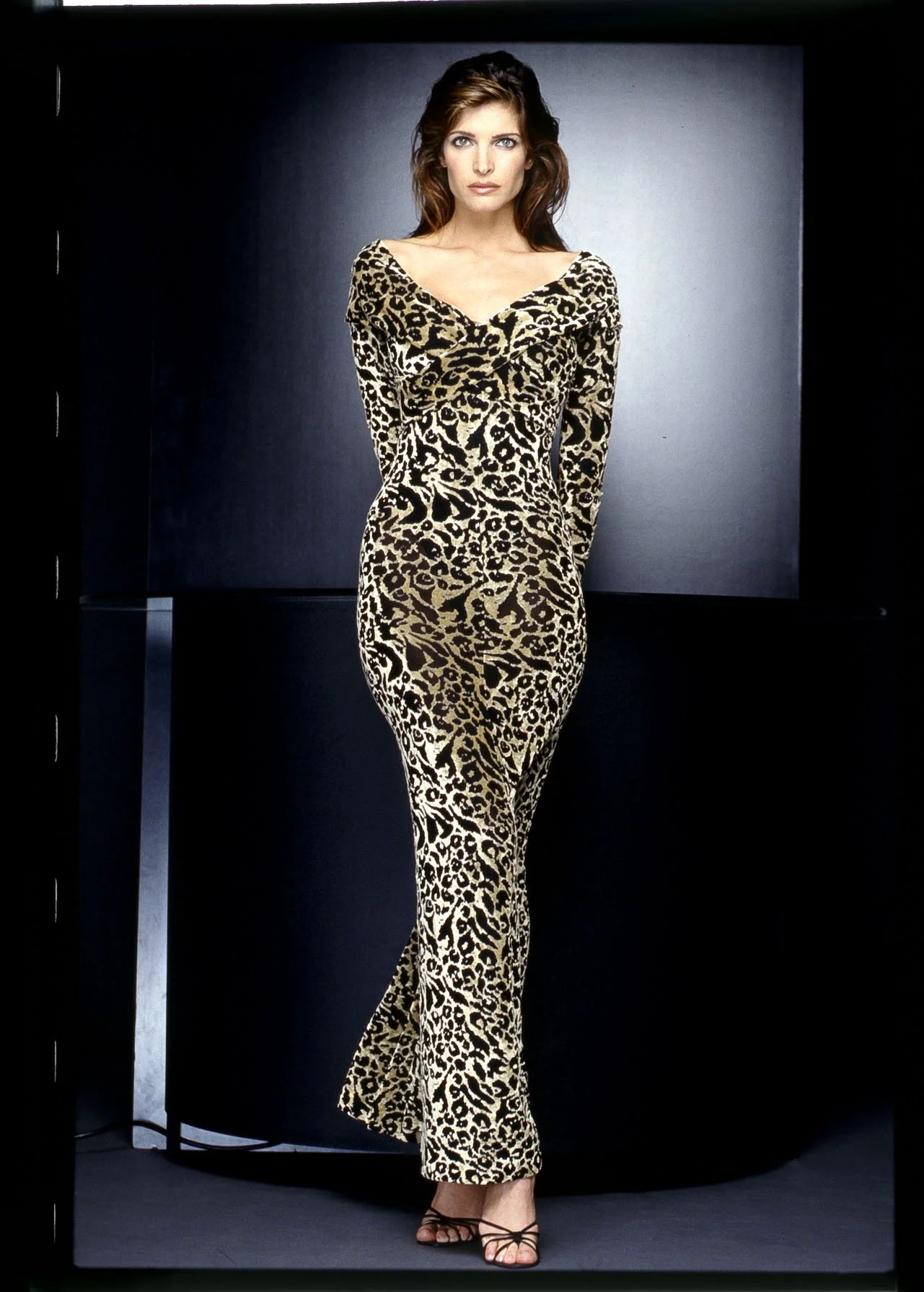
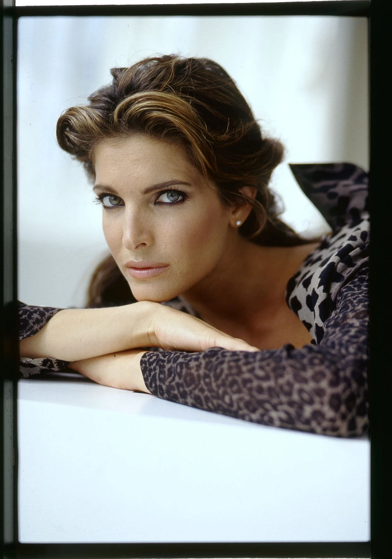
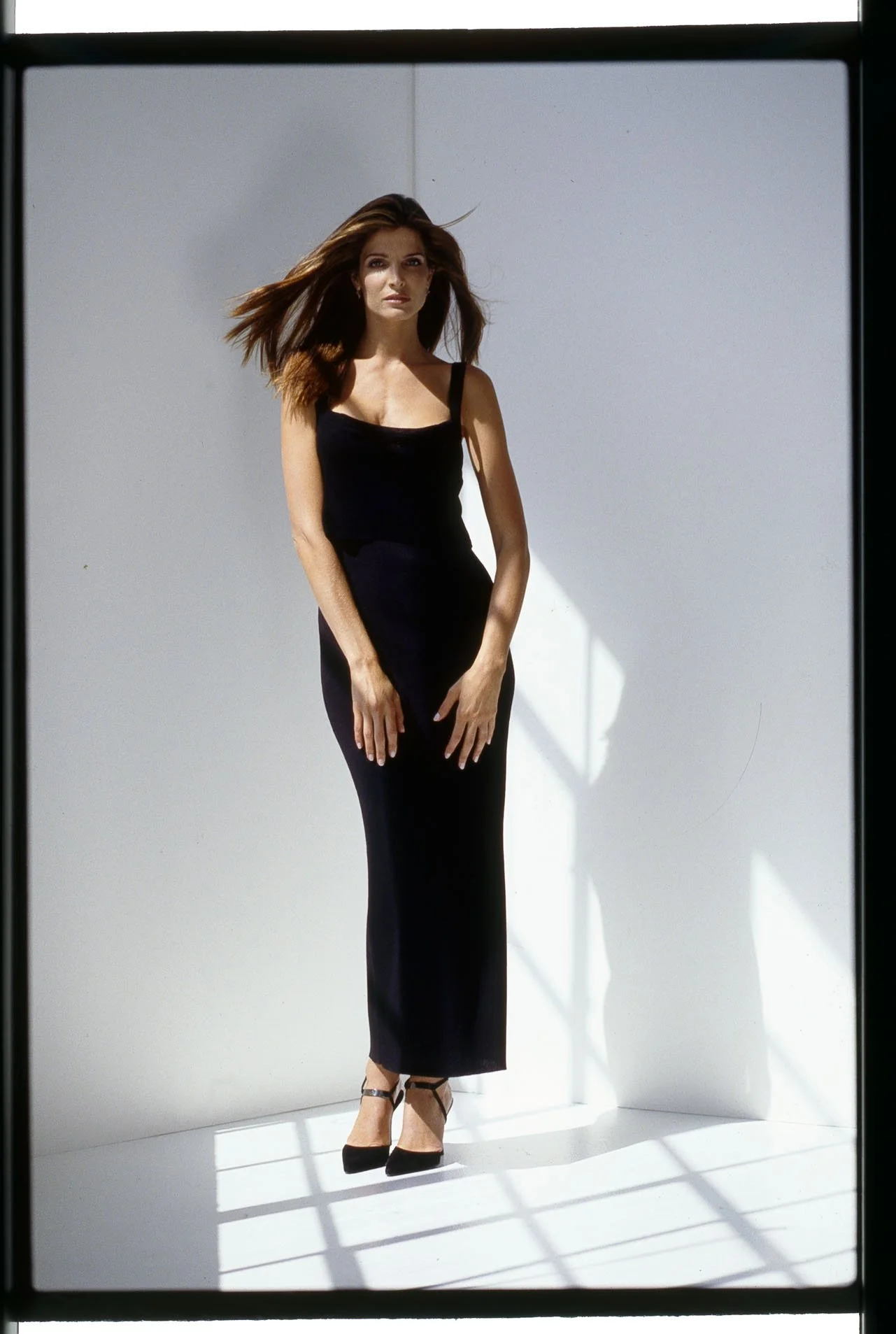
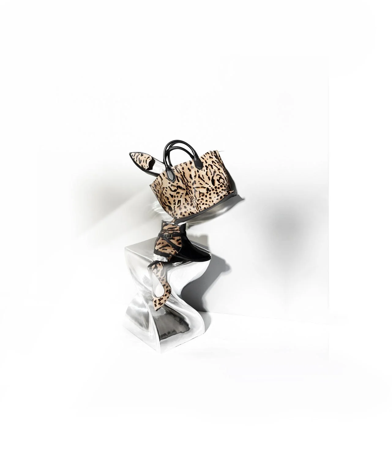
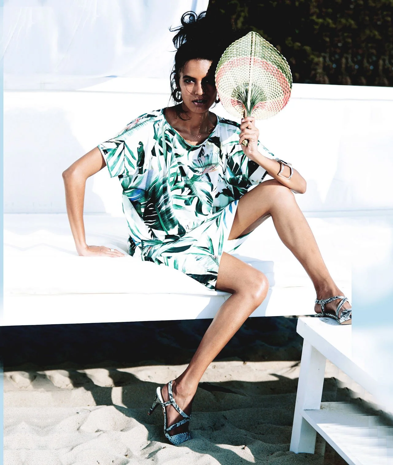
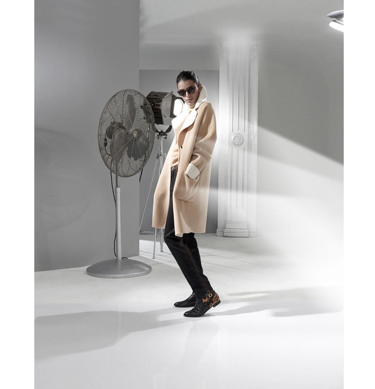
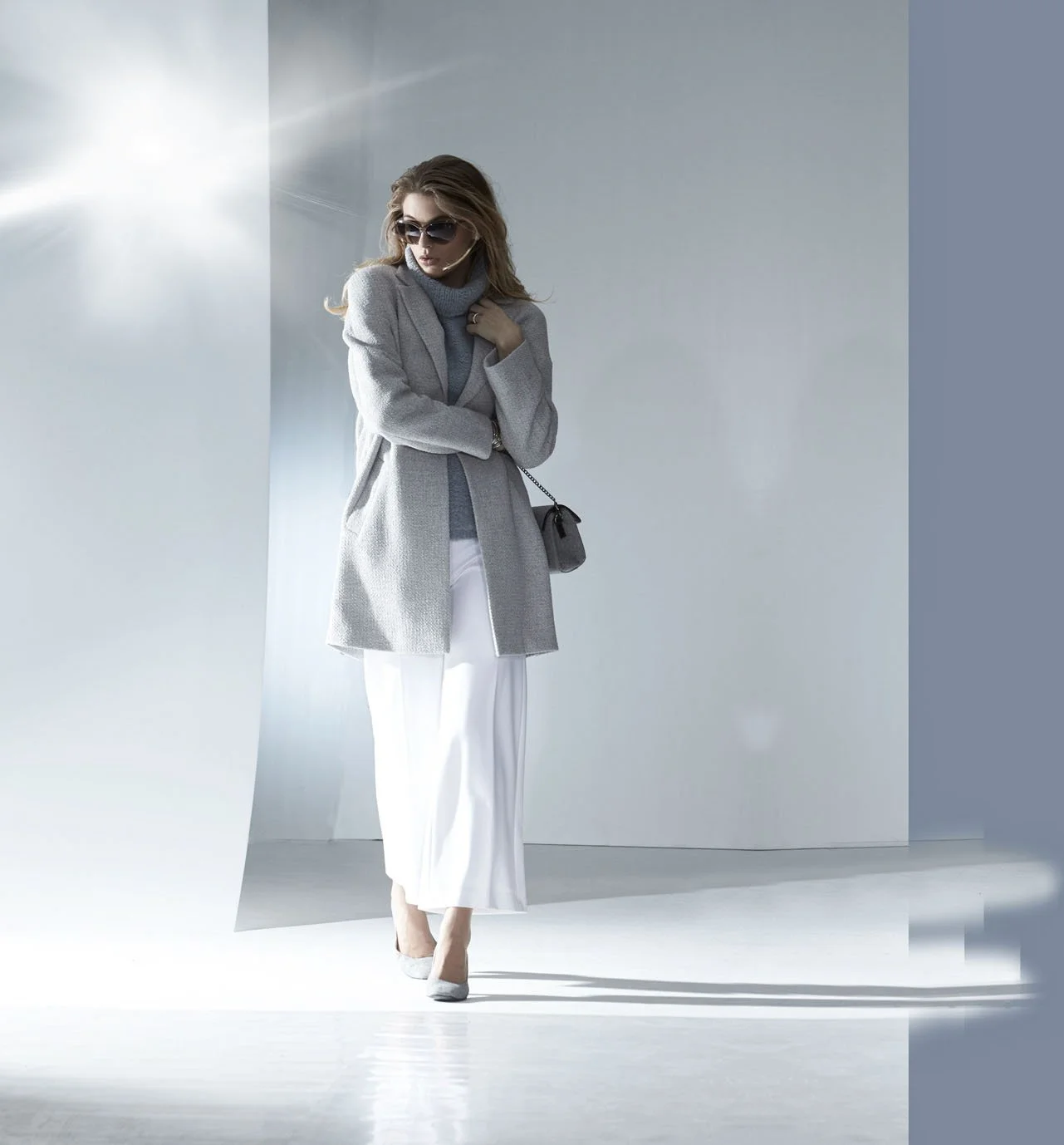
Capturing the glitz and glamour of the runway—that is the essence of high-fashion photography. Whether creating dramatic shots of models in luxury gowns or capturing close-ups of Dior’s jewelry, Ulrich Pracht has mastered the art of adornment. He creates daring images that fuse exquisite accessories with unbridled sensuality. He drapes costume jewelry—crafted from semi-precious stones, pearls, and gold chains—amidst flowing fabrics, allowing the gems to sparkle against the models' smooth skin under the glare of the spotlights. With their sinuous lines, this photographic series perfectly embodies the visual language of Art Nouveau: fluid transitions between skin, hair, and fabric contrast with the intricate structures of the precious jewels.
For his Dior series, Ulrich Pracht selected self-assured women who gaze into the camera with a provocative intensity. He captures them biting sensually into a melon or reaching for ripe grapes, infusing the world of high-fashion photography with a radiant energy with every click of the shutter. With precisely the right energy, he orchestrates the interplay of movement, color, and light within the studio space: moments of stillness and repose alternate with the blur of motion—such as when a model strikes a flamenco pose, yet holds exquisite jewelry in her hands rather than castanets. Or when he captures a soprano clarinetist entering into a passionate liaison with her gleaming gold instrument and the jewelry adorning her neck and hands. It is the decorator within Ulrich Pracht who imbues these sets with their playfully luxurious aesthetic, thereby giving expression to the true opulence of Dior. Through his lens, Ulrich Pracht reveals a heart of gold—one that captures not only the external beauty of the female form but also its graceful inner essence. In this way, he reveals to the viewer what it means to embody true elegance in the world of high fashion. Employing a shallow depth of field, he focuses on his central motif—a thread running through his entire body of work: the power of beauty—at once an insoluble enigma and an object of adoration. And he leaves the viewer bewildered by the sudden intrusion of sensuality that radiates from the images...











04.7
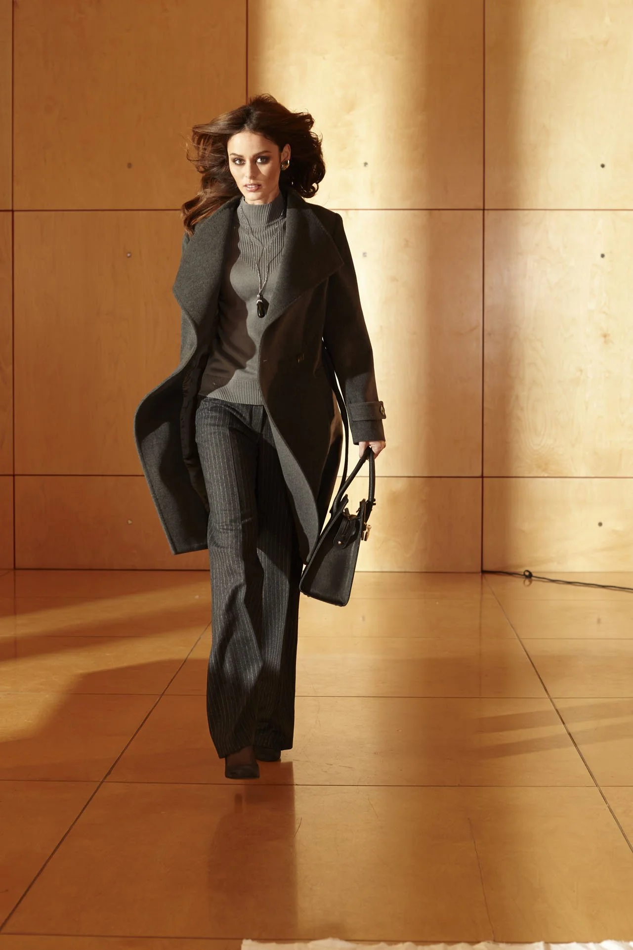
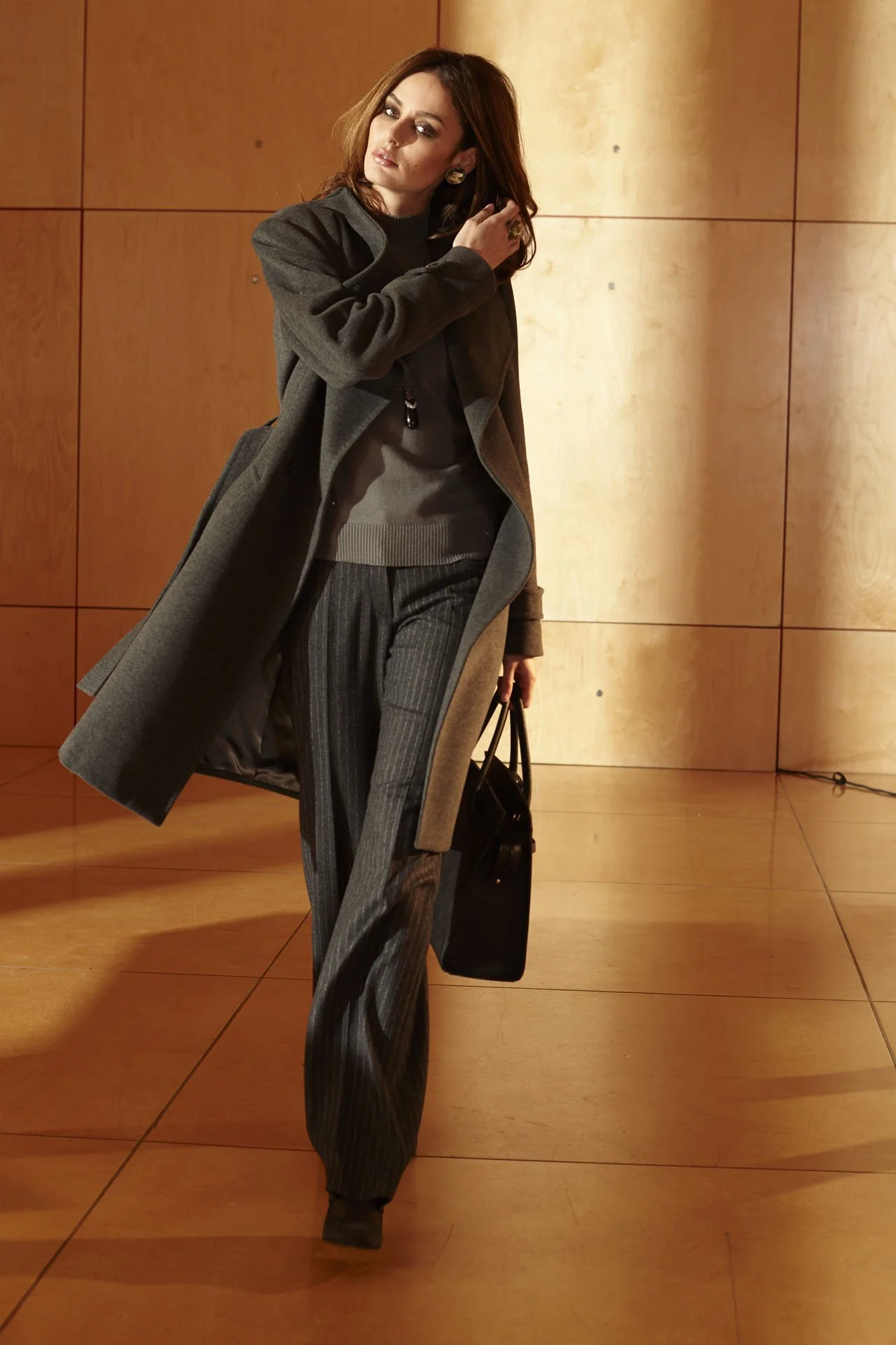
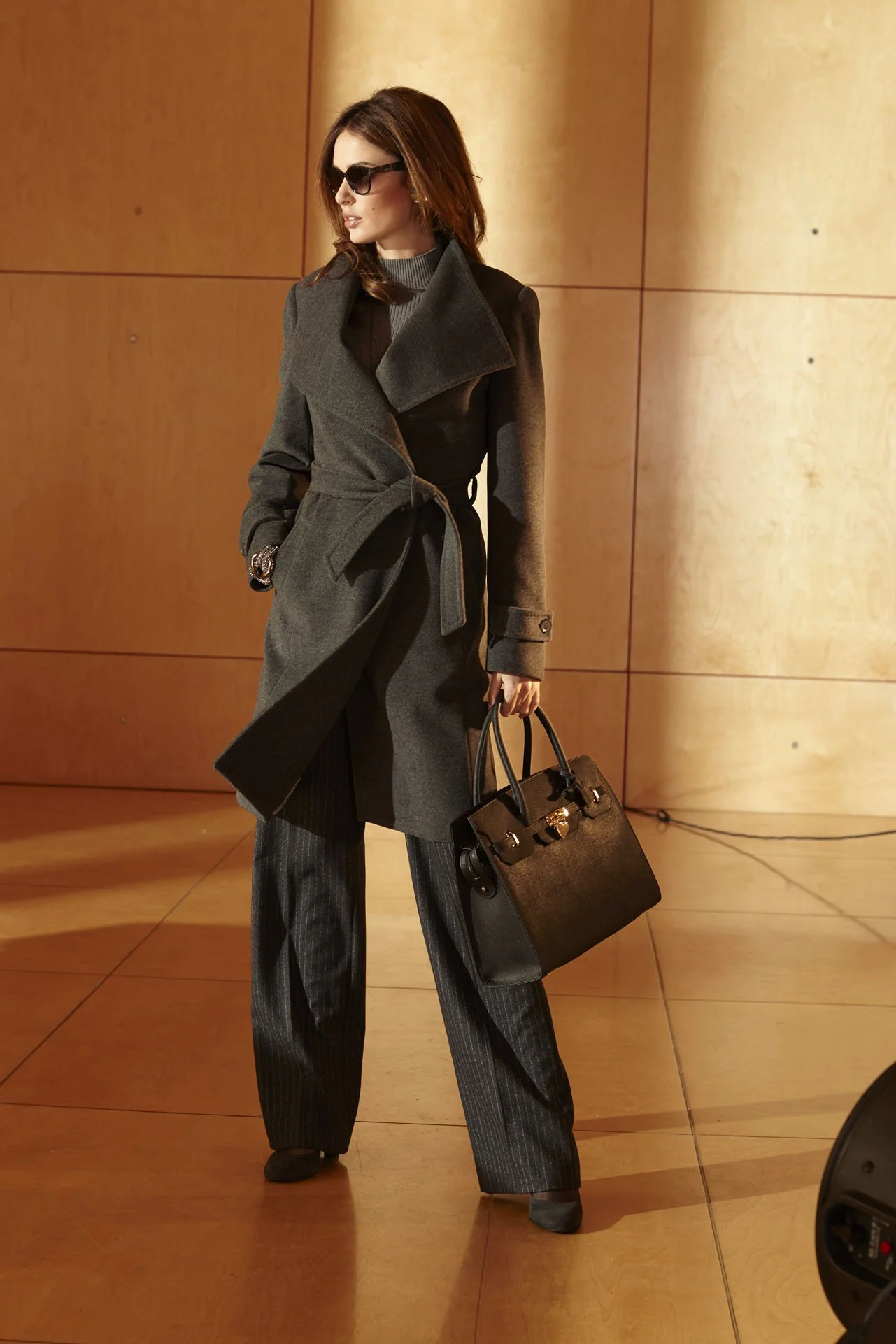
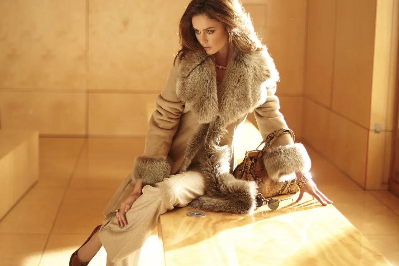
CLASS INTER
Enthusiasm and Risk.
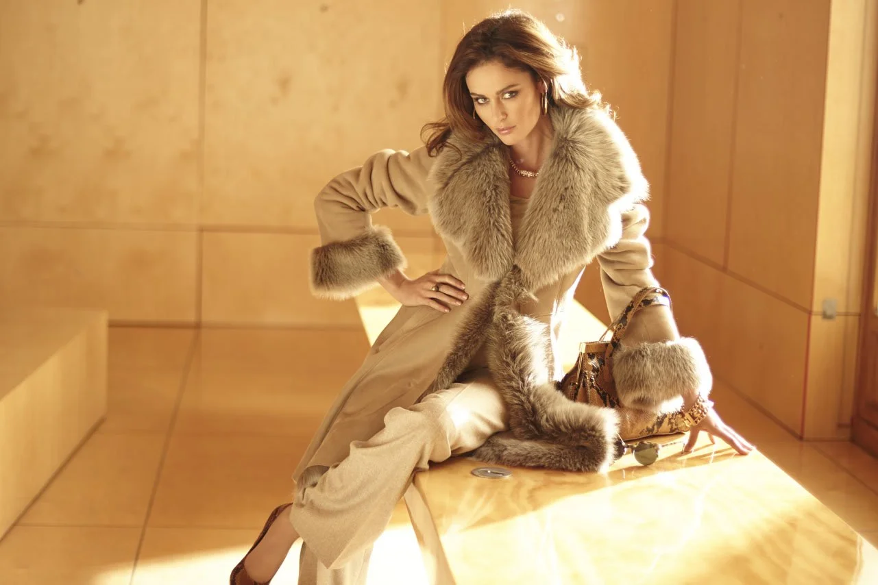
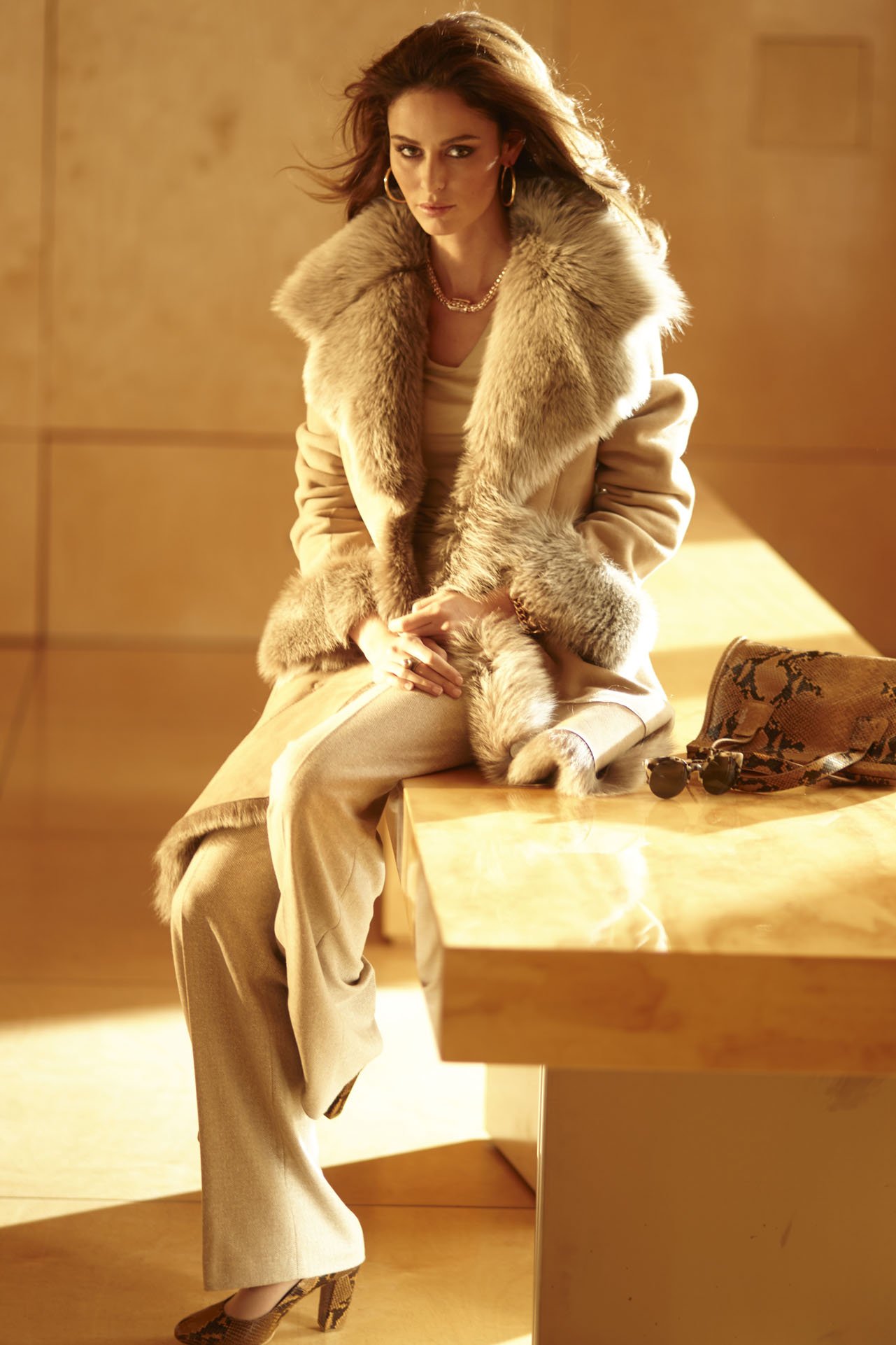
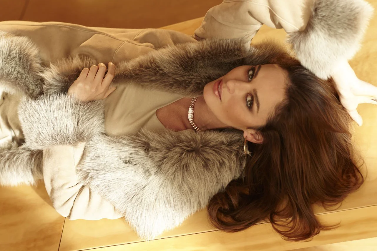
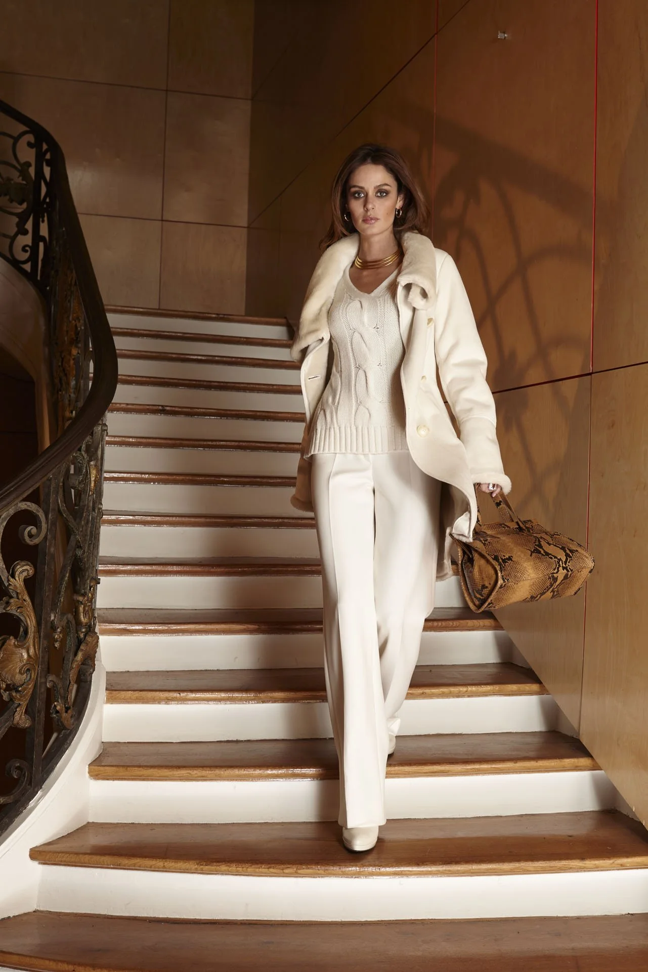
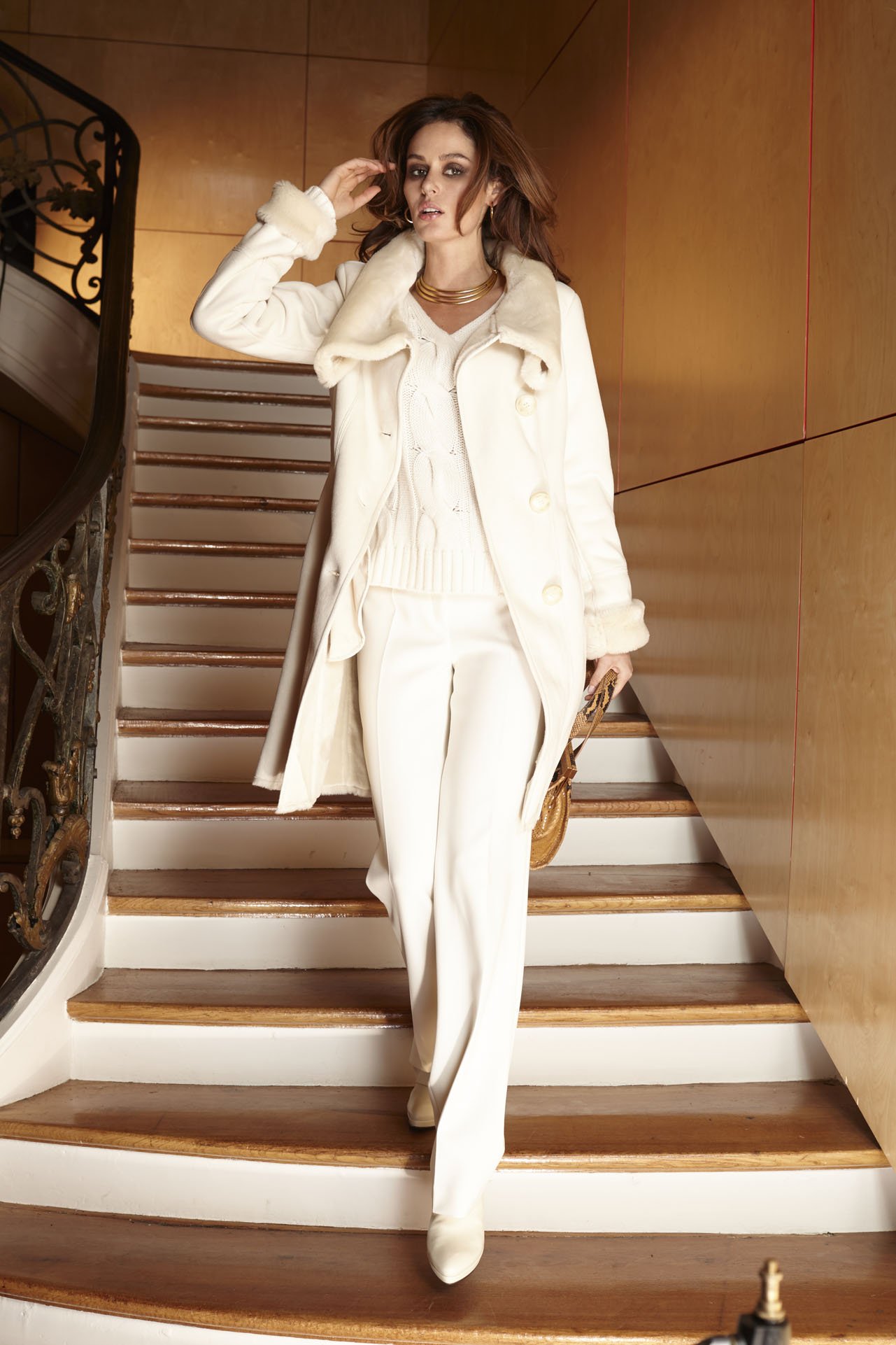
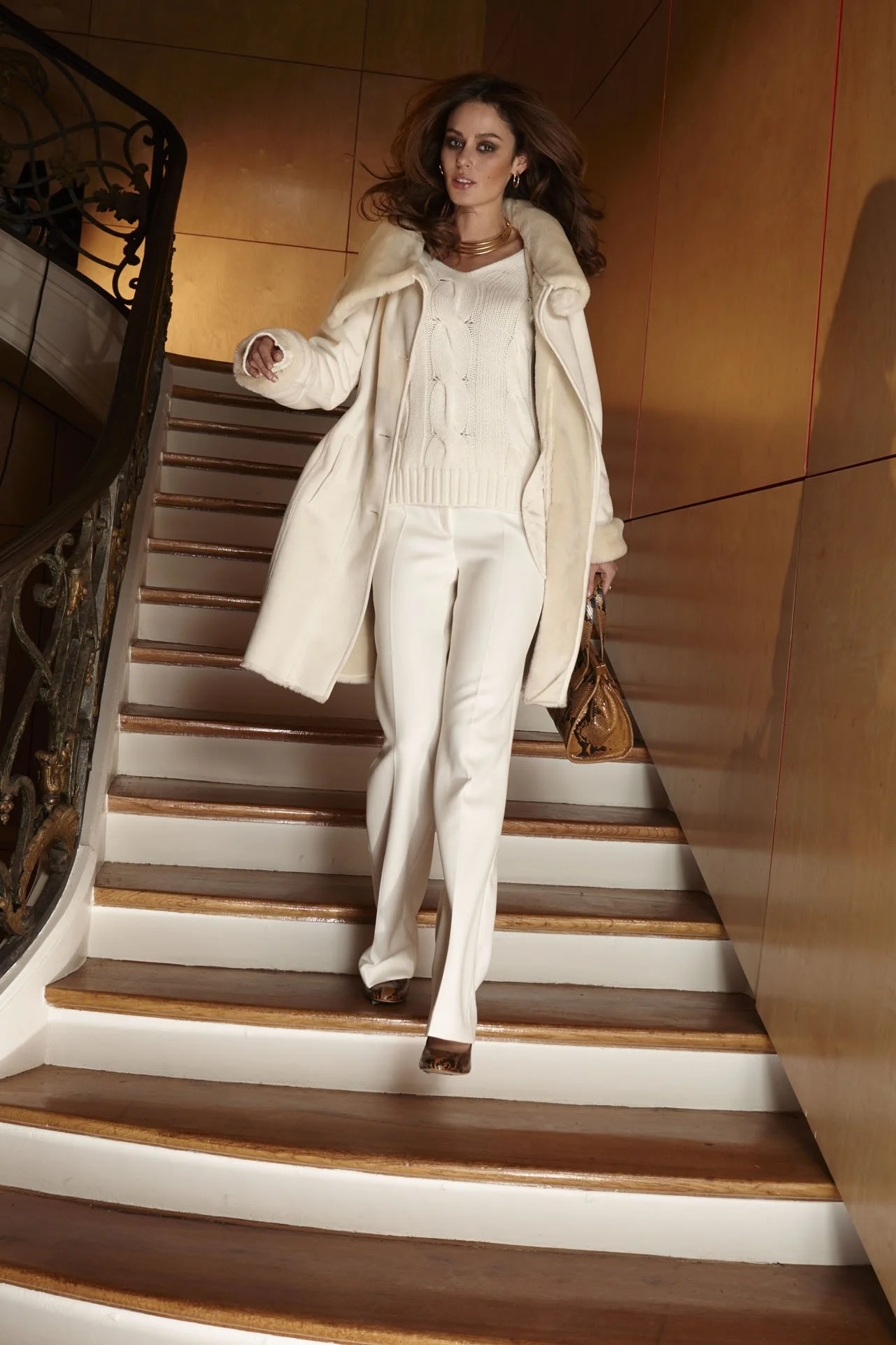
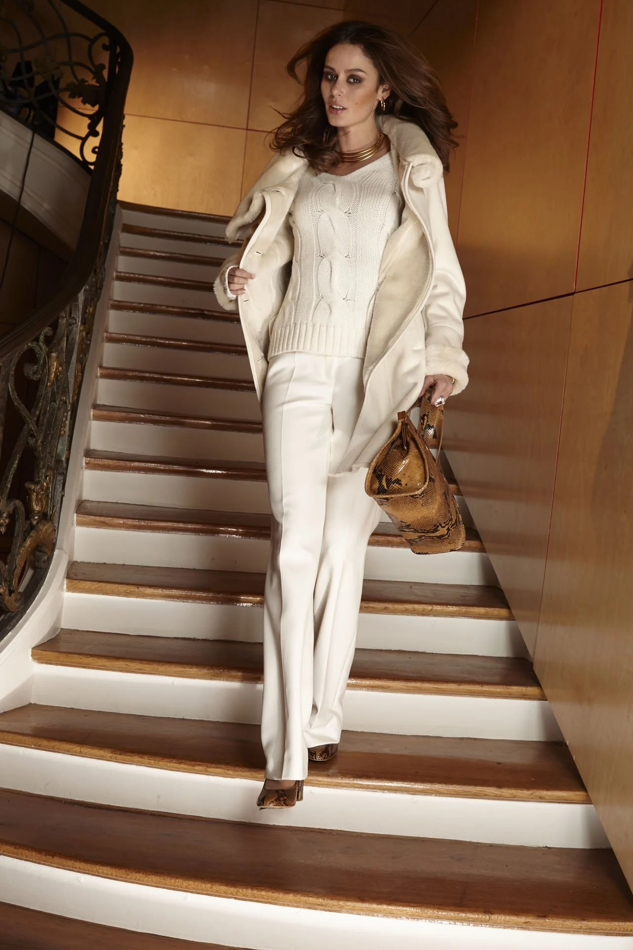
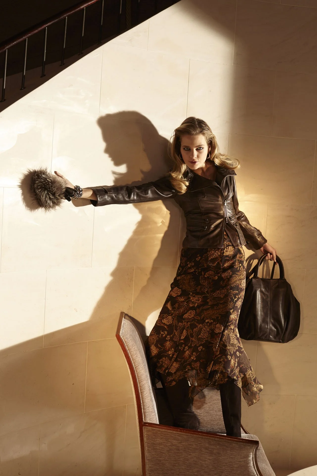
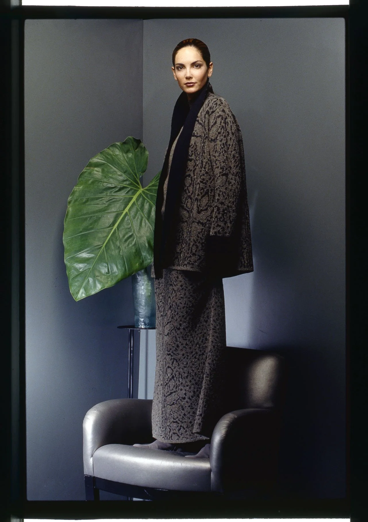
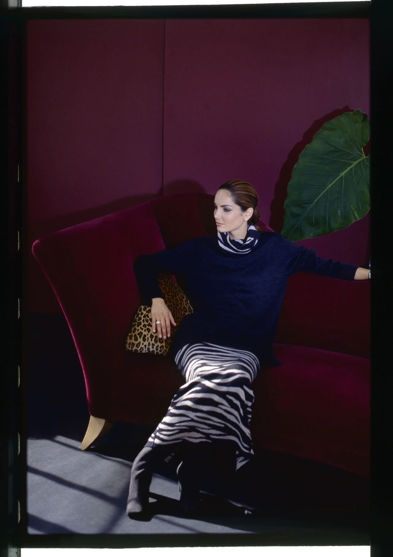
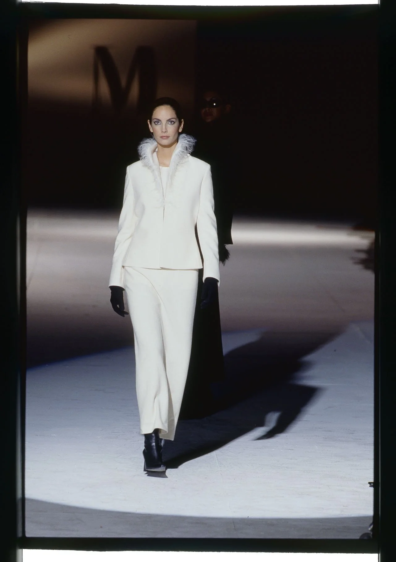
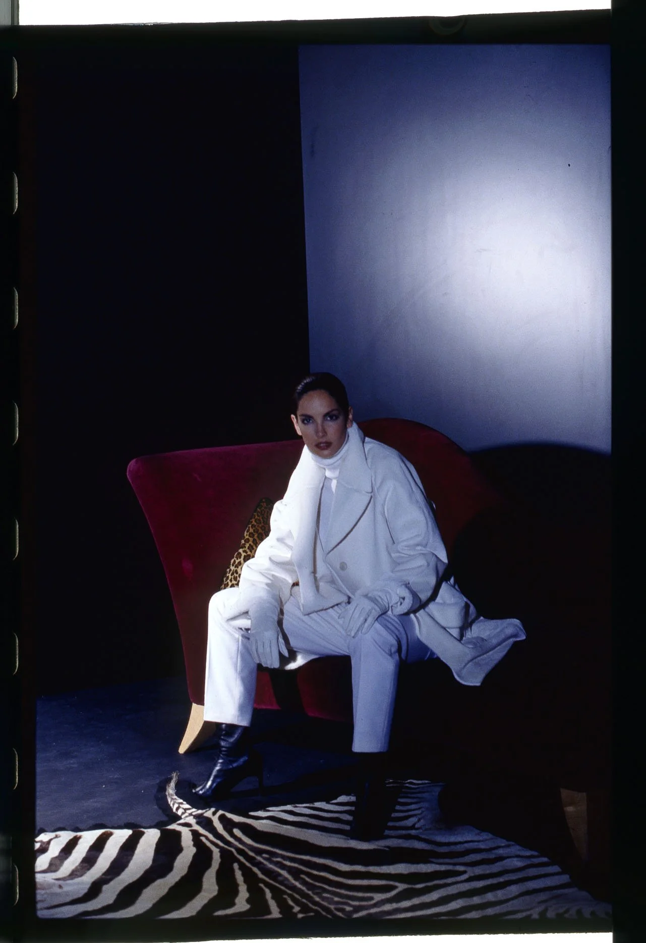
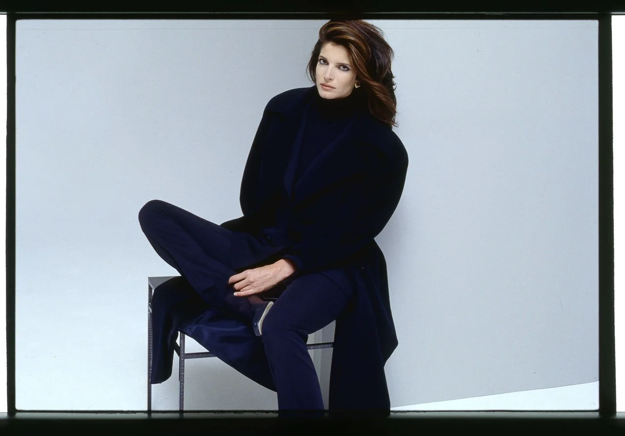
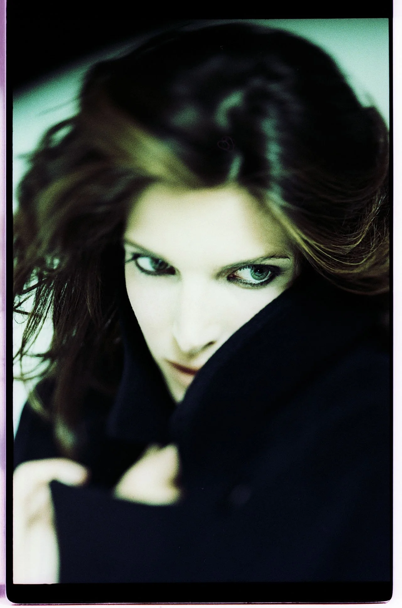
The art of dressing well is a gift bestowed upon some, but not others. One person who has truly mastered this art is a refined lady from Hamburg’s high society named Fahning. As the Managing Director of Class International, she curates collections with great sensitivity—endeavoring, as a newcomer, to establish her fashion brand within the upscale segment of the mail-order market, a fiercely competitive arena. "Fashion is communication" is her credo—a belief that prompted her to invite Ulrich Pracht for a meeting. "She had taken notice of me through my work for Caren Pfleger and Dior," he recalls, "and received me in her elegant designer office located in Hamburg’s exclusive Pöseldorf villa district." Ms. Fahning presented the photographer with her aesthetic vision—a concept as exquisite as it was costly—which, as would later become apparent, was unfortunately built upon a shaky financial foundation.
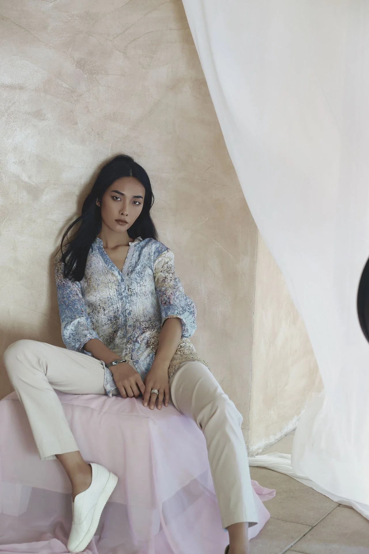
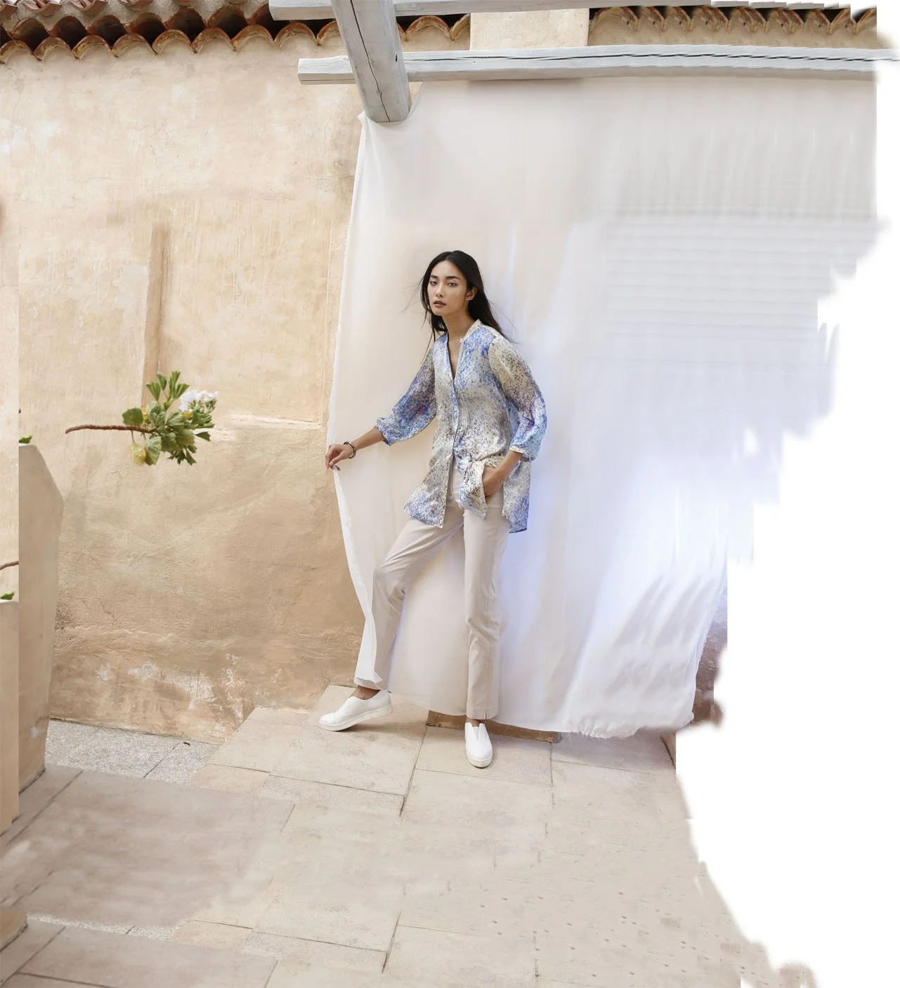
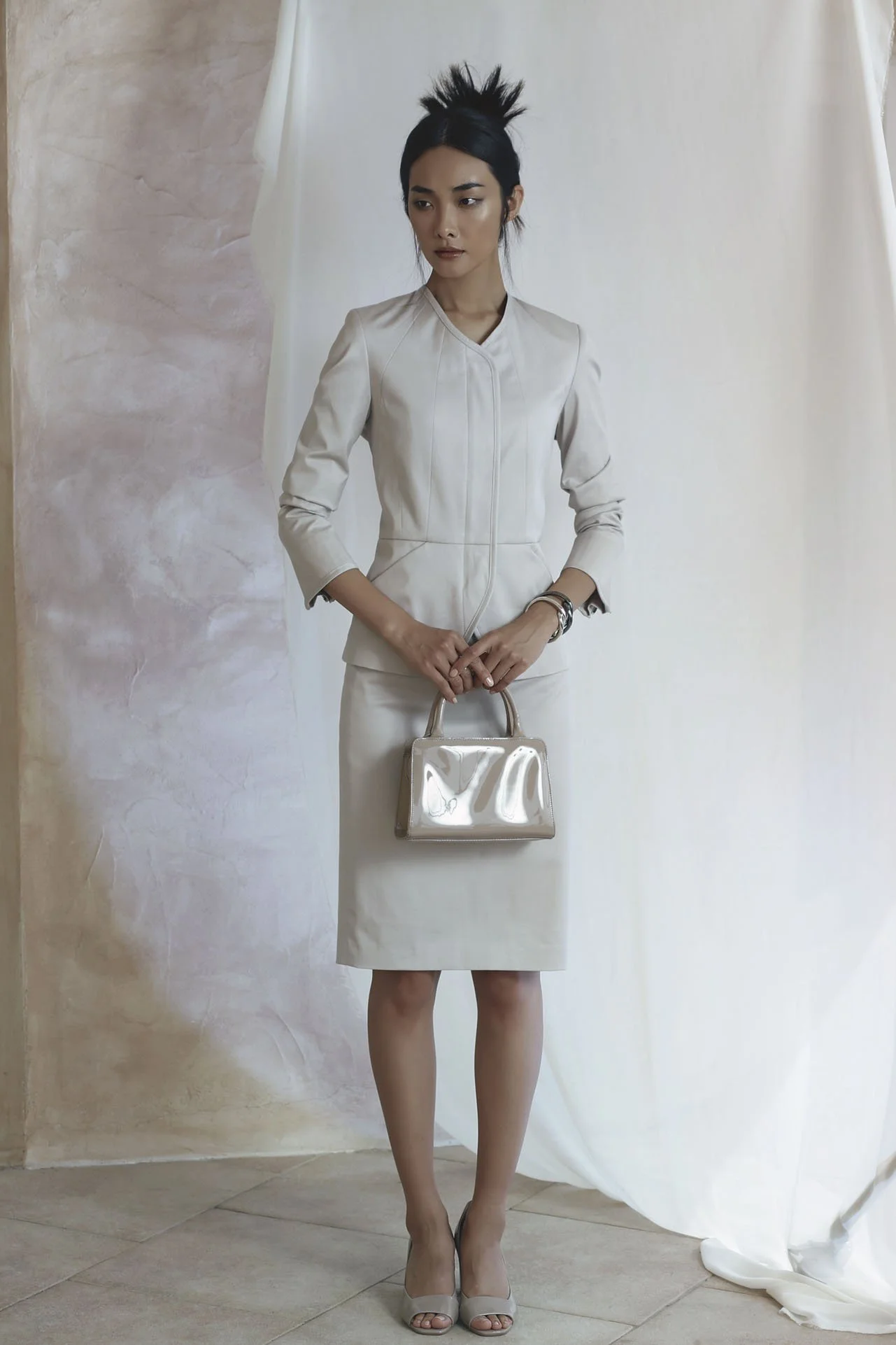
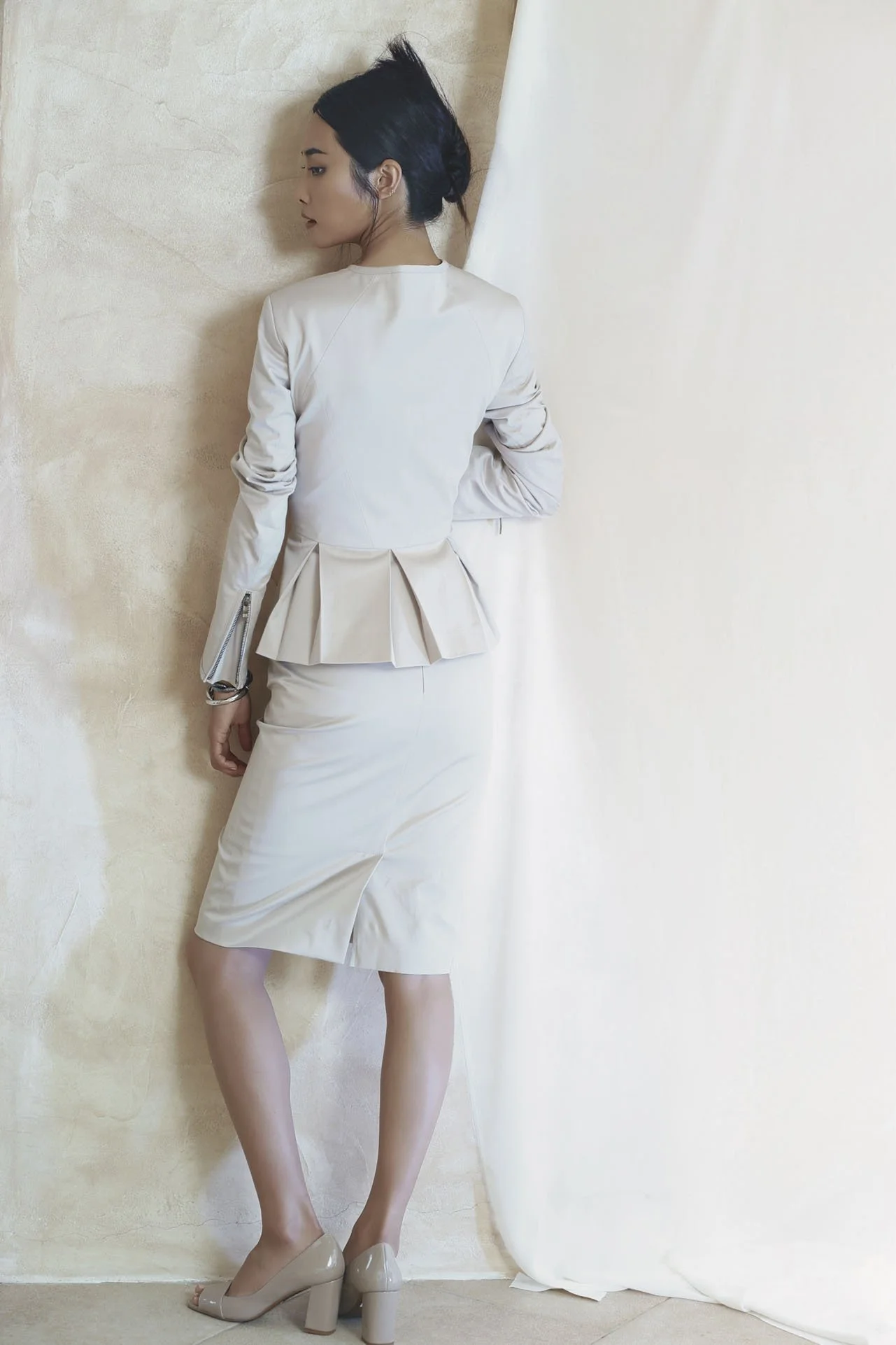
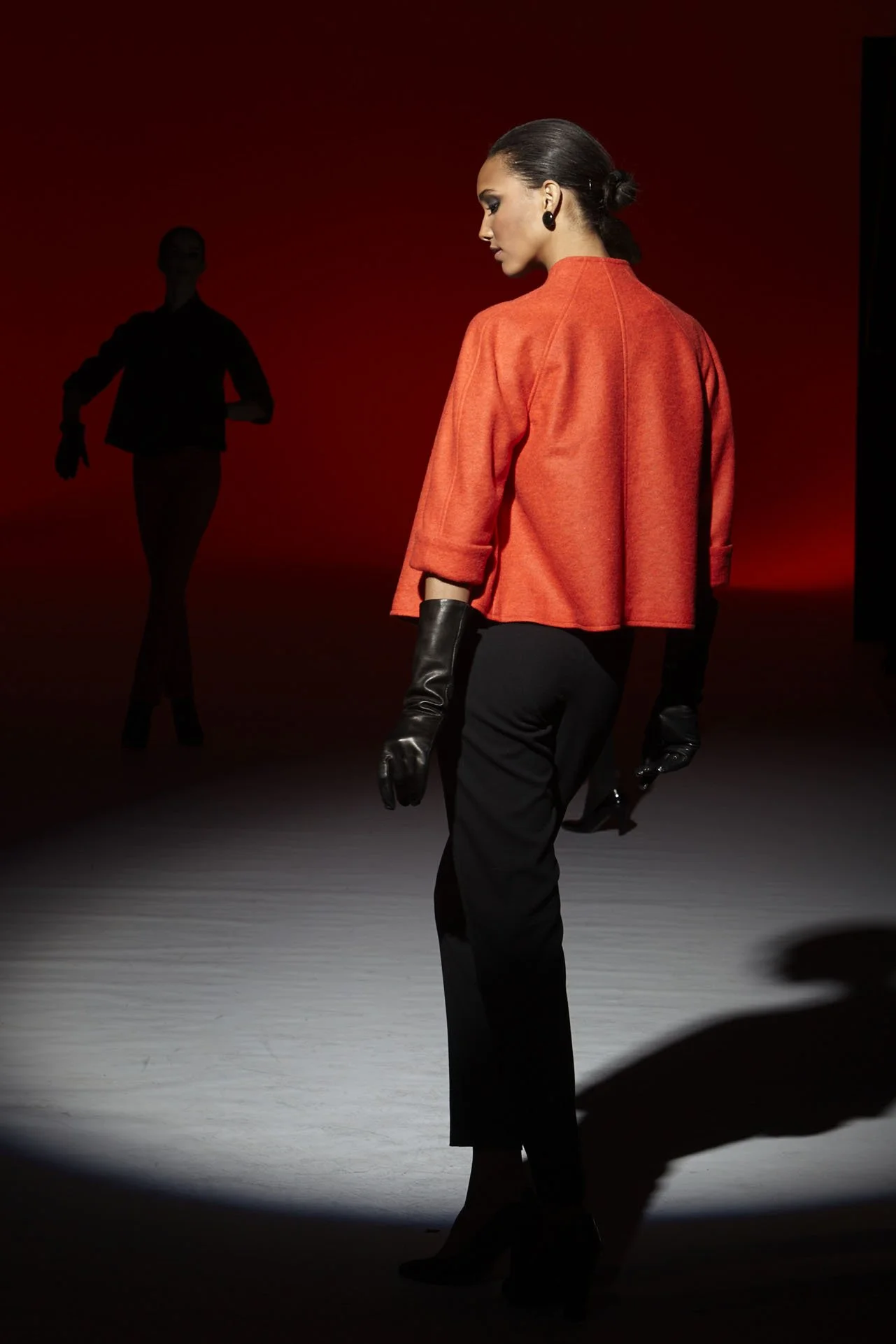
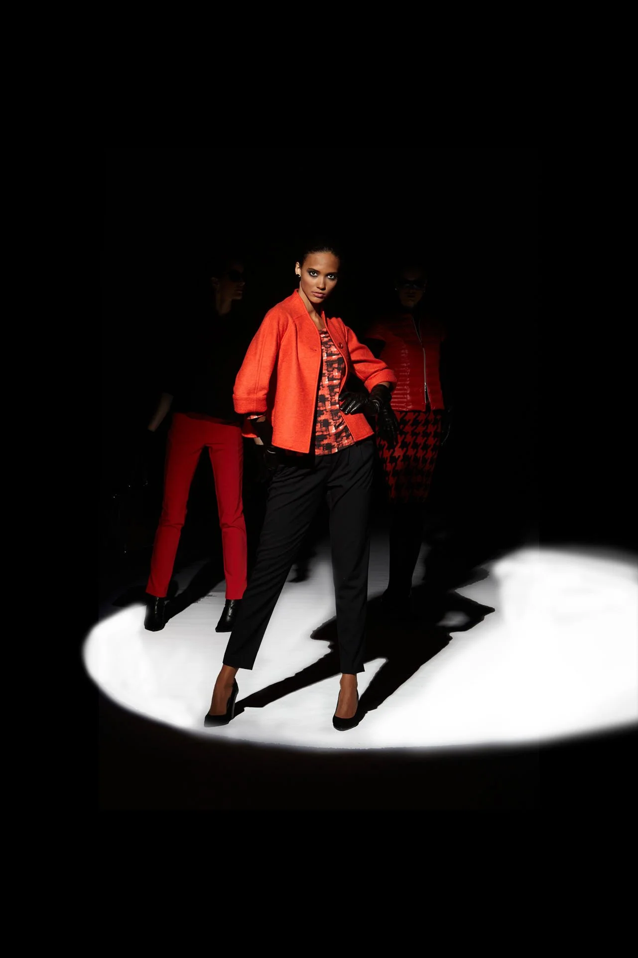
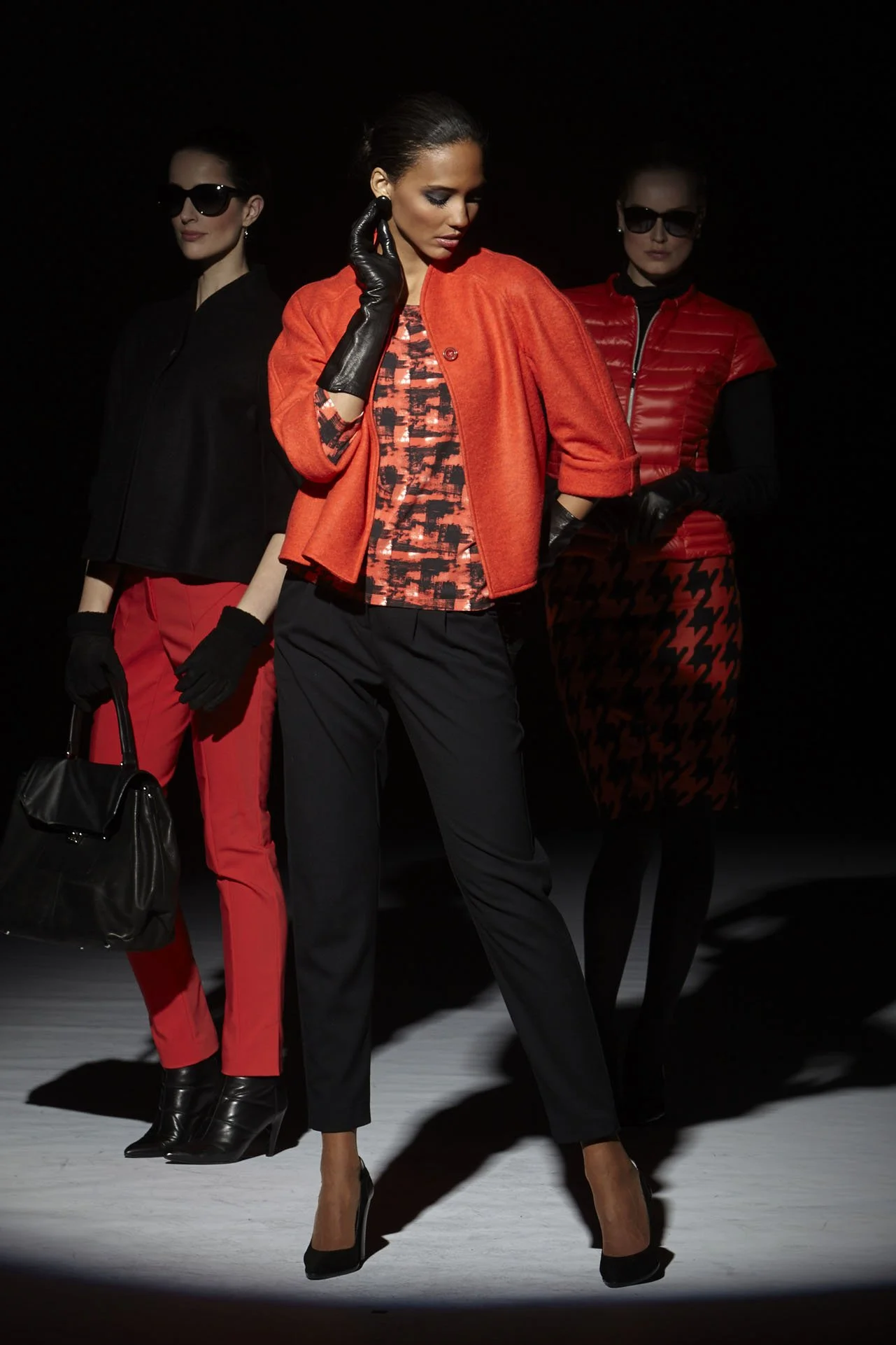
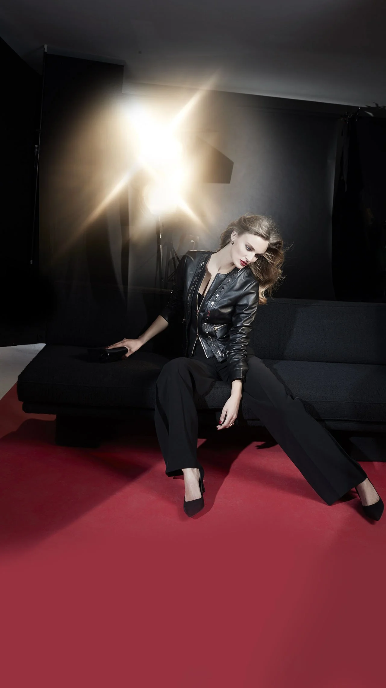
A diverse range of lifestyles—spanning everything from sportswear to evening wear—defines the look of the collection, infused with the Managing Director’s personal touches. It is a collection driven by a singular ambition: true to the brand’s name, to showcase "international class" through an inspiring blend of trends, zeitgeist, and glamour—executed with impeccable style and taste. "I took the risk, guided by the motto: 'Nothing ventured, nothing gained!'—and set to work with boundless enthusiasm. Through artistic inspiration, fantastic lighting, and vibrant colors, I succeeded in creating photographs that, with a brilliant, almost magical interplay, captivate the eye and ignite the imagination." Ulrich Pracht was left feeling both agitated and aggrieved when, after several seasons, the refined lady informed him that the company had filed for bankruptcy. Reportedly, ownership had been transferred—split 50-50—to the Otto Group and an English fashion mail-order firm. She left me out in the cold, saddled with liabilities exceeding half a million Deutschmarks. Despite holding a court judgment, to this very day I haven’t seen a single penny—hardly the conduct of a reputable merchant, such as one would expect from the refined Hanseatic city of Hamburg. Fortunately—thank God—I was able to weather the blow and have written it off under the motto: "Risk is also opportunity." Even though it didn't work out, at least I gained the experience!